
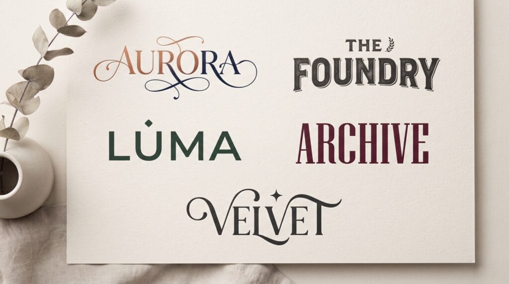
A strong wordmark logo design turns a brand name itself into the main visual identity. Instead of relying on a separate icon or symbol, a wordmark uses typography, spacing, letterform details, and proportion to create something distinctive enough to be remembered on its own.
This approach works especially well for brands with short or recognizable names. It can feel simple, modern, elegant, playful, premium, or bold depending on the typeface and how the letters are customized.
The challenge is that simplicity leaves little room to hide weak decisions.
In a symbol-heavy logo, a basic wordmark may act as supporting text. In a true wordmark logo design, the lettering must carry the entire personality of the brand.
That means every detail matters, including letter width, spacing, stroke weight, terminals, curves, ligatures, capitalization, and overall rhythm.
This guide explores practical wordmark logo examples and design techniques that can help create stronger, more memorable branding.
What Is a Wordmark Logo Design?
A wordmark is a logo built primarily from the brand name.
It may use:
- A standard typeface
- Customized typography
- Hand lettering
- Custom letterforms
- Modified ligatures
- Unique spacing
The goal is to make the name itself visually distinctive.
A wordmark logo design differs from:
- Symbol logos
- Mascot logos
- Emblems
- Monograms
- Combination marks
Some brands eventually pair a wordmark with a symbol, but the typography should still be strong enough to stand independently.
Why Wordmark Logo Design Works
Wordmarks have a major advantage: they build name recognition directly.
Customers see the brand name every time they see the logo.
This can be useful for new businesses that still need to establish awareness.
Strong wordmarks can also be highly flexible.
They can work across:
- Websites
- Packaging
- Social media
- Signage
- Business cards
- Clothing
- Advertising
A simple wordmark logo design can also remain relevant for a long time because it does not depend heavily on fashionable symbols.
However, the typography must be carefully chosen.
1. Minimalist Sans Serif Wordmark
Minimal sans serif wordmarks can feel clean, modern, and confident.
They often use:
- Simple letterforms
- Generous spacing
- Controlled weight
- Minimal decoration
This style works well for:
- Technology
- Architecture
- Fashion
- Consulting
- Modern consumer brands
What Makes It Effective
The power comes from restraint.
Small spacing adjustments or one modified letter can create enough personality without making the logo complicated.
For a minimalist wordmark logo design, the quality of the typography becomes especially important.
2. Elegant Serif Wordmark Logo Design
Serif typography can communicate sophistication, tradition, heritage, or editorial elegance.
High-contrast serif wordmarks are especially common in:
- Fashion
- Beauty
- Jewelry
- Hospitality
- Premium lifestyle brands
The contrast between thick and thin strokes can make the logo feel refined.
Customize the Details
Instead of leaving the typeface completely unchanged, adjust:
- Serifs
- Terminals
- Crossbars
- Stroke connections
- Letter spacing
These small modifications can make the identity feel more ownable.
3. Bold Wordmark Logo Design
Bold wordmarks create strong visual impact.
They may use:
- Heavy sans serif type
- Wide letters
- Condensed lettering
- Strong geometric forms
This direction works well for:
- Sports
- Food
- Entertainment
- Streetwear
- Youth brands
A bold wordmark logo design should still remain readable.
Avoid adding so much compression or distortion that customers struggle to identify the name.
4. Lowercase Wordmark Examples
Lowercase wordmarks can feel:
- Friendly
- Modern
- Casual
- Approachable
They often work well for digital products, creative studios, and lifestyle brands.
Lowercase lettering can reduce formality and make the brand feel more conversational.
Watch Letter Rhythm
Lowercase words contain more varied shapes than uppercase text.
Ascenders, descenders, and rounded forms create natural rhythm.
Use that variation as part of the design.
5. Uppercase Wordmark Logo Design
Uppercase wordmarks often communicate strength, structure, and confidence.
They are commonly used for:
- Fashion
- Luxury
- Architecture
- Sports
- Professional services
Uppercase letters can also create a more uniform silhouette.
However, all caps can feel overly rigid if spacing is too tight.
Generous tracking often helps uppercase wordmark logo design feel more premium.
6. Script Wordmark Logo Design
Script lettering can create personality and movement.
It works well for:
- Beauty
- Fashion
- Food
- Wedding brands
- Personal brands
- Creative businesses
Script wordmarks can feel elegant or casual depending on the lettering style.
Prioritize Readability
Highly decorative scripts may look beautiful but become difficult to read.
Avoid excessive flourishes, especially around small letters.
A successful script wordmark logo design should remain readable at practical sizes.
7. Handwritten Wordmark Examples
Handwritten logos can make a brand feel personal and human.
They work particularly well for:
- Handmade products
- Creative studios
- Cafes
- Lifestyle brands
- Independent creators
The lettering does not need to look perfectly polished.
Small imperfections can become part of the charm.
However, intentional imperfection is different from poor construction.
The wordmark should still have balanced spacing and clear rhythm.
8. Geometric Wordmark Logo Design
Geometric wordmarks use shapes based on circles, squares, and controlled proportions.
This can make the identity feel:
- Modern
- Technical
- Precise
- Structured
Geometric wordmark logo design is especially suitable for technology, architecture, finance, and digital products.
Customizing one or two letters can help avoid looking like a default geometric font.
9. Condensed Wordmark Logo Design
Condensed typography makes a wordmark feel tall and compact.
It can communicate:
- Speed
- Energy
- Efficiency
- Modernity
Condensed wordmarks work well for sports, media, fashion, and urban brands.
The main challenge is spacing.
If letters are too narrow and too close together, readability drops quickly.
10. Wide Wordmark Logo Design
Wide typography creates a more open, stable visual presence.
It can feel:
- Premium
- Calm
- Modern
- Spacious
Wide wordmark logo design can work well for architecture, luxury, furniture, and contemporary design brands.
It requires enough horizontal space, so designers should also create responsive alternatives when needed.
Also Read: Script Logo Fonts for Better Branding Results
11. Wordmark Logo Design With Custom Ligatures
Ligatures connect two or more letters into one custom detail.
For example, designers may combine:
- AV
- TH
- LA
- ST
- RN
Custom ligatures can make a logo feel distinctive without requiring a separate symbol.
Use Ligatures Selectively
Do not connect every possible letter.
One strong interaction is usually enough.
The connection should support readability rather than turning the name into a puzzle.
12. Wordmarks With Modified Letters
One of the strongest ways to customize typography is to modify one memorable letter.
Possible changes include:
- Removing part of a stroke
- Extending a terminal
- Creating a custom crossbar
- Changing a curve
- Adding negative space
This technique helps transform a standard font into a unique wordmark logo design.
The modified letter can sometimes become a secondary brand symbol later.
13. Wordmark Logo Design Using Negative Space
Negative space can create subtle visual ideas inside letterforms.
For example:
- An arrow inside an A
- A hidden shape between two letters
- A cut creating a secondary symbol
This can add meaning without increasing complexity.
The hidden detail should remain visible at practical sizes.
If it disappears when the logo becomes small, simplify it.
14. Minimal Luxury Wordmark Design
Luxury wordmarks often rely on:
- Elegant serif typography
- High contrast
- Generous tracking
- Restrained color
- Strong spacing
The key is refinement.
Do not assume that thin letters automatically create luxury.
Proportion, spacing, and typography quality matter more.
A luxurious wordmark logo design often feels expensive because nothing looks accidental.
15. Playful Wordmark Logo Design
Playful brands can use:
- Rounded letters
- Irregular baselines
- Custom shapes
- Bright colors
- Friendly typography
This direction works well for:
- Food brands
- Children’s products
- Entertainment
- Creative businesses
Keep the personality controlled.
Too many playful details can make the wordmark harder to use consistently.
16. Retro Wordmark Logo Design
Retro wordmarks draw inspiration from past decades.
Possible styles include:
- 1950s script
- 1970s rounded serif
- 1980s geometric display
- 1990s bold condensed type
Vintage-inspired wordmark logo design can create strong personality quickly.
However, avoid copying old type styles too literally.
A modern interpretation usually feels more usable across digital platforms.
17. Monoline Wordmark Logo Design
Monoline lettering uses strokes with relatively consistent thickness.
This can create a clean and friendly appearance.
It works well for:
- Beauty
- Wellness
- Lifestyle
- Creative services
The simplicity makes the wordmark easy to adapt.
But very thin monoline letters can disappear at small sizes, so always test reproduction.
18. Wordmark Logo Design With Extended Letters
Designers can create distinction by extending:
- Crossbars
- Ascenders
- Descenders
- Horizontal strokes
For example, the crossbar of a T could extend over nearby letters.
This can create a signature shape without adding a separate icon.
The extension should feel integrated rather than decorative.
19. Wordmark Logo Design With Letter Overlap
Overlapping letters can make a wordmark more compact and expressive.
This technique works best when:
- The letters remain readable
- Overlap is controlled
- The silhouette remains clear
It can feel experimental, fashion-forward, or artistic.
Avoid overlapping so many letters that the brand name becomes difficult to understand.
20. Wordmark Design With Custom Baselines
The baseline does not always need to be perfectly horizontal.
A subtle shift can add personality.
For example:
- One letter may sit slightly higher
- The word may rise gently
- Selected characters may descend
This works particularly well for playful or creative brands.
For professional or luxury identities, baseline experimentation should be more restrained.
Typography Choices for Wordmark Logo Design
Typography is the foundation of the entire identity.
Evaluate typefaces based on:
- Brand personality
- Readability
- Letter shapes
- Available weights
- Width
- Licensing
- Long-term usability
Do not select a font only because it looks stylish in a sample.
Type the actual brand name.
Some fonts look beautiful in full alphabets but perform poorly with specific letter combinations.
A strong wordmark logo design needs to work with the exact characters in the name.
Also Read: Clean Logo Fonts That Look Simple but Professional
Adjust Kerning Carefully
Kerning is the spacing between specific letter pairs.
Automatic spacing is not always suitable for logos.
Look carefully at combinations such as:
- AV
- WA
- TO
- LY
- RT
Optical spacing matters more than equal numeric measurements.
The goal is to make the gaps feel visually balanced.
Poor kerning can make an otherwise strong logo feel amateur.
Test Letter Spacing at Different Sizes
Tracking that feels elegant at large size may become too wide when the logo is small.
Create size tests.
Compare the logo on:
- Website header
- Social profile
- Product label
- Business card
- Mobile screen
Adjust spacing if needed.
Some brands create slightly different optical versions for very small applications.
Create Custom Letterforms
Custom lettering creates stronger ownership.
You can start with a typeface and modify it, or build the wordmark completely from scratch.
Explore:
- Custom curves
- New terminals
- Unique serifs
- Modified proportions
- Original ligatures
Custom wordmark logo design can make the brand harder to imitate.
However, every modification should have a reason.
Do not distort letters simply to make them look different.
Pair Wordmark Logo Design With a Symbol
A wordmark can later be paired with a secondary symbol.
For example:
The customized first letter may become an app icon.
A ligature may become a favicon.
A small geometric detail may become a packaging pattern.
This creates a flexible identity system.
The wordmark should still remain the primary recognition element.
Choose Colors for Wordmark Logo Design
Wordmarks often benefit from simple color systems.
Common approaches include:
- Black and white
- One brand color
- Neutral plus accent
- Dark and light versions
Color should support the identity, but the logo should not depend on it.
Test the wordmark logo design in black first.
If the typography works without color, it will be easier to use across print, embroidery, engraving, and digital media.
Use Wordmarks on Packaging
Wordmarks work especially well on packaging because the brand name remains immediately visible.
Test the logo on:
- Boxes
- Bottles
- Labels
- Bags
- Stickers
Check whether the typography remains clear against different materials and backgrounds.
Premium packaging may also use techniques such as embossing, debossing, foil, or spot finishes.
The wordmark should still work without those effects.
Wordmark Logo Design for Websites
Website headers often have limited vertical space.
A horizontal wordmark usually works naturally.
However, long names may require:
- Responsive versions
- Reduced spacing
- Secondary marks
Test the logo on both desktop and mobile.
Do not allow the wordmark to become so small that the brand name becomes unreadable.
Wordmark Logo Design for Social Media
Social avatars are often square or circular.
Long wordmarks may not fit well.
This is where a secondary symbol or initial can help.
Possible solutions include:
- First letter
- Custom ligature
- Monogram
- Shortened mark
The main wordmark can still appear on posts, banners, and profile headers.
Helpful Tools for Wordmark Logo Design
Several tools can help designers create and refine professional wordmarks.
Adobe Illustrator
Illustrator is ideal for:
- Typography customization
- Vector editing
- Kerning
- Custom letterforms
- Production-ready logo files
Affinity Designer
Affinity Designer provides professional vector tools for refining wordmarks and custom typography.
Glyphs
Glyphs can help designers explore deeper letterform construction and custom typographic systems.
FontLab
FontLab is useful for advanced letter editing and custom type development.
Procreate
Procreate can help with hand-drawn wordmark sketches, especially for script or handwritten concepts.
Figma
Figma is useful for early exploration, digital brand systems, and testing wordmarks in interface environments.
The strongest tool is the one that gives you enough control over typography and vector structure.
Common Wordmark Logo Design Mistakes
Using a Font Without Customization
A standard font can work, but consider whether the wordmark needs more ownership.
Poor Kerning
Spacing problems are especially visible in text-based logos.
Choosing Style Over Readability
The brand name should remain clear.
Using Too Many Effects
Shadows, gradients, and outlines should not compensate for weak typography.
Ignoring Small Sizes
Always test practical applications.
Choosing Fonts Without Proper Licensing
Make sure commercial logo use is permitted.
Following Typography Trends Too Closely
Build a wordmark that can remain useful beyond one visual trend.
Wordmark Logo Design Checklist
Before approving a wordmark, confirm that:
- The typography fits the brand personality.
- The brand name is easy to read.
- Letter spacing feels balanced.
- Important letter pairs have been kerned manually.
- Custom details feel intentional.
- The logo works in one color.
- The wordmark works on light backgrounds.
- The wordmark works on dark backgrounds.
- Small-size applications remain clear.
- Mobile use has been tested.
- Packaging applications have been tested.
- A secondary mark exists if necessary.
- The logo does not rely on special effects.
- The typeface license permits the intended use.
- Final vector files are prepared properly.
Also Read: Typography Logo Trends You Should Follow for Better Results
Final Thoughts
The best wordmark logo design examples prove that a brand does not always need a separate symbol to become memorable.
Typography itself can carry personality, recognition, and meaning.
Start with the name.
Study the shapes of the letters and look for opportunities to create distinction through spacing, custom terminals, ligatures, negative space, proportion, or subtle structural changes.
Choose a typeface that fits the brand rather than simply following current trends.
Then refine it carefully.
Kerning, tracking, stroke weight, and letter rhythm can make the difference between a logo that feels ordinary and one that feels professionally designed.
Test the wordmark in realistic environments such as websites, packaging, social media, signage, and small digital applications.
Most importantly, keep the brand name readable.
A clever typographic idea loses value when customers cannot understand what it says.
With thoughtful typography, controlled customization, and consistent application, wordmark logo design can create a distinctive identity that remains simple, flexible, and memorable across a wide range of brand touchpoints.
For high-quality fonts to boost your income, check out Letter Crafted. Our professional fonts are perfect for branding, marketing, and content creation. So, don’t miss this opportunity.