
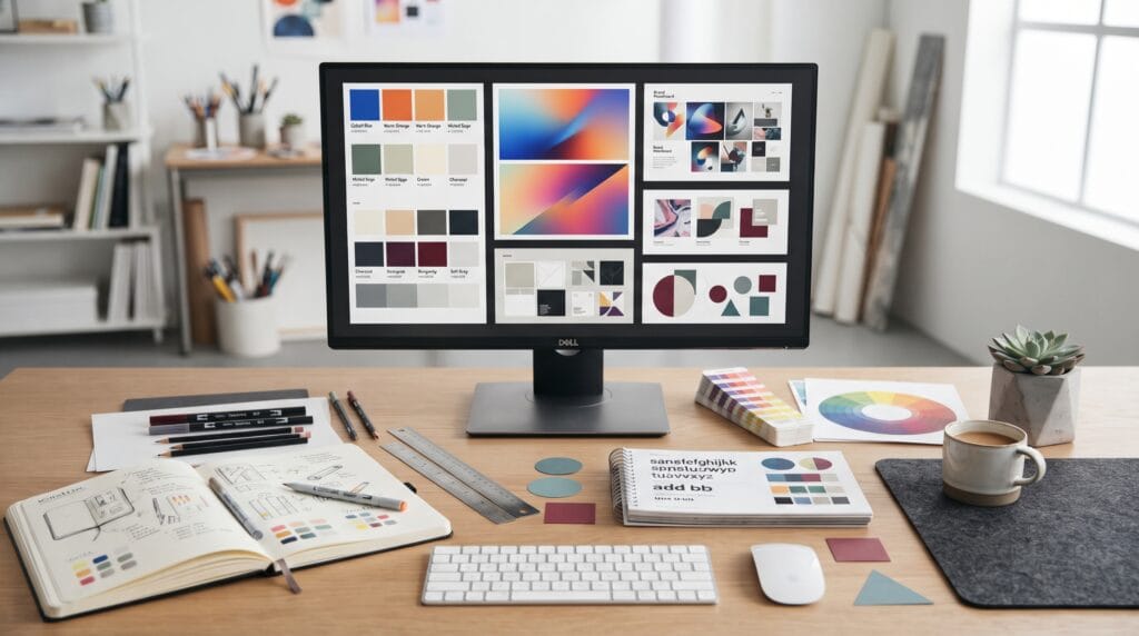
The best colors for graphic design are not always the brightest, trendiest, or most complicated choices. Professional color design comes from selecting colors that support the message, create clear hierarchy, and work well together across different layouts. A simple palette with strong contrast can often look more polished than a design that uses many unrelated colors.
Color influences how people experience a design.
It can communicate:
- Confidence
- Energy
- Calmness
- Luxury
- Creativity
- Technology
- Nature
- Warmth
Designers use color in:
- Branding
- Posters
- Websites
- Packaging
- Social media
- Advertising
- Presentations
- Editorial layouts
Understanding the best colors for graphic design helps beginners and freelancers make stronger decisions instead of choosing colors only because they look attractive individually.
How to Choose the Best Colors for Graphic Design
Start with the purpose of the design.
Ask:
What should this design feel like?
- A financial brand may need to feel stable and trustworthy.
- A fashion campaign may need to feel bold and expressive.
- A wellness brand may need to feel calm and natural.
- A technology company may want a modern and intelligent look.
The answer helps narrow the palette.
Instead of starting with:
Which color do I like?
start with:
Which color supports the message?
This small change makes color selection more strategic.
Best Colors for Graphic Design With Blue
Blue is one of the most versatile colors in visual design.
It can communicate:
- Trust
- Professionalism
- Technology
- Stability
- Calmness
Different shades create different moods.
Navy Blue
Navy feels professional and established.
It works well for:
- Corporate branding
- Finance
- Consulting
- Business presentations
Pair navy with:
White + light gray + muted gold for a premium professional look.
Cobalt Blue
Cobalt feels more energetic and modern.
It can work well for:
- Technology
- Creative brands
- Digital products
- Contemporary posters
Try:
Cobalt blue + cream + black for a strong modern contrast.
Blue remains one of the best colors for graphic design because it can adapt to both conservative and creative applications.
Best Colors for Graphic Design With Black and White
Black and white create one of the strongest and most timeless combinations.
This palette works because it provides maximum visual simplicity.
Black can communicate:
- Sophistication
- Confidence
- Strength
- Luxury
White creates:
- Space
- Clarity
- Contrast
- Minimalism
Black and white are especially effective for:
- Fashion
- Editorial design
- Branding
- Portfolios
- Typography-led layouts
Add One Accent Color
A black-and-white palette becomes more flexible when paired with one accent.
For example:
- Black + white + red feels bold.
- Black + white + cobalt feels modern.
- Black + white + gold feels luxurious.
One accent color can create emphasis without making the design feel crowded.
Best Colors for Graphic Design With Cream and Beige
Warm neutrals have become popular in modern branding because they feel softer than pure white.
Cream and beige can communicate:
- Warmth
- Natural quality
- Sophistication
- Calmness
- Lifestyle appeal
These colors work well for:
- Beauty
- Interior design
- Fashion
- Wellness
- Handmade products
Try:
Cream + charcoal + warm brown for a refined natural palette.
Or:
Beige + black + muted orange for a contemporary editorial feel.
The best colors for graphic design often include neutral shades because they give brighter colors room to stand out.
Best Colors for Graphic Design With Green
Green is strongly associated with nature, growth, health, and balance.
However, different greens create very different impressions.
Sage Green
Sage feels calm and sophisticated.
It works well for:
- Wellness
- Home decor
- Natural products
- Lifestyle brands
Pair:
Sage + cream + warm brown for a soft organic palette.
Emerald Green
Emerald feels deeper and more premium.
It can work for:
- Luxury branding
- Hospitality
- Fashion
- Packaging
Try:
Emerald + cream + gold for a more elegant direction.
Green can feel both modern and timeless when the shade is chosen carefully.
Best Colors for Graphic Design With Orange
Orange communicates energy and warmth.
It works especially well when a design needs to feel:
- Friendly
- Creative
- Energetic
- Youthful
Bright orange can become overwhelming when used across an entire layout.
Instead, use it as an accent.
For example:
Charcoal + cream + orange creates a strong modern combination.
Muted orange or terracotta can feel more sophisticated.
Try:
Terracotta + beige + dark brown for branding with a warmer personality.
Orange is one of the best colors for graphic design when you want energy without relying on bright red.
Best Colors for Graphic Design With Red
Red attracts attention quickly.
It can communicate:
- Energy
- Passion
- Urgency
- Confidence
- Strength
This makes it useful for:
- Posters
- Advertising
- Fashion
- Calls to action
However, too much red can become aggressive.
Use it carefully.
Modern Red Palette
Try:
Deep red + cream + charcoal feels more refined than bright red combined with pure white.
Another option is:
Burgundy + beige + black which creates a more premium mood.
Red works best when designers control where it appears.
Best Colors for Graphic Design With Purple
Purple can communicate:
- Creativity
- Imagination
- Innovation
- Luxury
Bright violet often feels futuristic.
Muted purple feels more sophisticated.
For technology or creative projects, try:
Violet + deep navy + soft white
For beauty or lifestyle branding:
Muted lavender + cream + charcoal
Purple is especially useful when designers want something less predictable than blue.
Also Read: Graphic Design Color Palettes for Better Visual Results
Best Colors for Graphic Design With Yellow
Yellow is energetic and optimistic.
It can immediately attract attention.
Use yellow for:
- Highlights
- Icons
- Buttons
- Posters
- Youth-focused branding
A professional yellow palette might use:
Mustard + navy + cream rather than very bright yellow.
Mustard creates warmth while remaining easier to control.
Another modern option is:
Soft yellow + charcoal + white
Yellow is powerful, so a small amount can be enough.
Best Colors for Graphic Design With Gray
Gray is an important supporting color.
It can create:
- Structure
- Neutrality
- Professionalism
- Modern simplicity
Different gray values can separate content without introducing additional hues.
For example:
- Light gray background
- Dark gray text
- Blue accent
This works well for:
- Websites
- Dashboards
- Corporate design
- Presentations
Gray gives brighter colors more impact.
It is one of the most useful background colors in professional design systems.
Modern Color Combination – Navy, Cream, and Gold
This palette feels:
- Premium
- Professional
- Established
Use:
- Navy (Primary background)
- Cream (Supporting background)
- Gold (Accent)
It works well for:
- Luxury services
- Business branding
- Packaging
- Hospitality
Avoid using too much gold.
Treat it as a highlight rather than a dominant color.
Modern Color Combination – Cobalt, Orange, and White
This combination feels more energetic.
It works particularly well for:
- Creative studios
- Technology
- Marketing
- Posters
Use cobalt as the main color.
Orange can create contrast.
White provides breathing room.
This is one of the best colors for graphic design combinations when a project needs to feel bold but still organized.
Modern Color Combination – Sage, Beige, and Charcoal
This palette feels:
- Calm
- Natural
- Modern
- Comfortable
It works well for:
- Home brands
- Wellness
- Natural products
- Lifestyle design
Charcoal prevents the palette from becoming too soft.
It also creates stronger typography contrast.
Modern Color Combination – Burgundy, Cream, and Black
This combination feels elegant and sophisticated.
It can be useful for:
- Fashion
- Restaurants
- Beauty
- Editorial design
Burgundy provides personality.
Cream adds warmth.
Black provides structure.
This palette can create a premium appearance without using metallic colors.
Modern Color Combination – Teal, White, and Navy
Teal combines some of the calmness of blue with the natural feeling of green.
It works well for:
- Healthcare
- Technology
- Sustainability
- Professional services
Try:
- Navy (Text and structure)
- White (Background)
- Teal (Accent)
This creates a clean and contemporary look.
Use the 60-30-10 Color Approach
A simple way to organize colors is:
- 60% dominant color
- 30% secondary color
- 10% accent color
For example:
- 60% cream
- 30% navy
- 10% orange
This is not a strict rule.
However, it can help beginners avoid using every color equally.
A controlled hierarchy makes the palette look more intentional.
Also Read: Festival Graphic Design Styles for Better Marketing Results
Best Colors for Graphic Design Need Strong Contrast
A beautiful color palette can still fail if text becomes difficult to read.
Always test contrast between:
- Text and background
- Buttons and labels
- Icons and surfaces
- Headlines and images
Avoid combinations where the foreground and background are too similar.
For example:
Light gray text on white may look minimal but can become difficult to read.
Professional design should balance aesthetics with usability.
Use Neutrals to Control Strong Colors
Bright colors become more effective when surrounded by neutrals.
Suppose you use:
Electric blue
Instead of combining it with five other bright colors, place it beside:
- White
- Cream
- Gray
- Charcoal
This helps the blue become the focal point.
The best colors for graphic design often work because designers control the visual environment around them.
Build a Color System Instead of a Random Palette
Professional design often needs more than three colors.
You may need colors for:
- Backgrounds
- Text
- Borders
- Highlights
- Buttons
- States
Create a system.
For example:
- Primary Blue
- Primary Dark
- Primary Light
- Neutral 100
- Neutral 500
- Neutral 900
- Accent Orange
This makes the design easier to expand across multiple pages and applications.
Test Colors With Typography
Some palettes look good as swatches but perform poorly in real layouts.
Test your colors with:
- Headlines
- Paragraphs
- Buttons
- Labels
- Captions
A dark blue may work beautifully as a headline but feel too heavy as a full background.
An orange may work well as an accent but reduce readability when used behind small text.
Always test colors in context.
Best Colors for Graphic Design Should Match the Audience
Color preference can depend on:
- Industry
- Age
- Culture
- Product
- Price point
A playful children’s brand and a corporate law firm should not use the same visual approach.
Ask:
Who needs to trust or understand this design?
Then build the palette around that audience.
Professional does not always mean dark blue and gray.
Professional means appropriate, consistent, and intentional.
Avoid Too Many Colors
Beginners often add colors because the design feels incomplete.
However, the problem may actually be:
- Weak hierarchy
- Poor spacing
- Unclear layout
Color cannot fix every problem.
Start with three to five core colors.
Add more only when there is a clear reason.
A limited palette usually looks more polished.
Common Color Mistakes in Graphic Design
Choosing Colors Only Because They Are Trendy
Trends change quickly.
Using Too Many Bright Colors
Too much saturation creates competition.
Ignoring Contrast
Important content must remain readable.
Making Every Element an Accent
Accent colors lose power when used everywhere.
Choosing Colors Separately
Colors should be tested as combinations.
Forgetting the Audience
The palette should match the project.
Ignoring Print and Screen Differences
Colors may appear differently across media.
Best Colors for Graphic Design Checklist
Before finalizing a palette, review:
- Clear design purpose
- Defined audience
- Primary color
- Secondary color
- Neutral colors
- Accent color
- Strong text contrast
- Readable buttons
- Consistent color usage
- Professional mood
- Brand relevance
- Digital testing
- Print testing when required
- Accessible color combinations
- Flexible palette system
A simple checklist can prevent many common color problems.
Also Read: 7 Essential Elements of Graphic Design for Better Visual Work
Final Thoughts
The best colors for graphic design are the colors that support the message, audience, and purpose of the project.
There is no single perfect palette for every design.
- Blue can feel professional.
- Black and white can feel timeless.
- Cream and beige can create warmth.
- Green can feel natural.
- Orange adds energy.
- Red creates emphasis.
- Purple can communicate creativity.
The real skill comes from combining these colors thoughtfully.
- Start with one strong primary color.
- Add useful neutrals.
- Choose one or two secondary colors.
- Reserve accent colors for important moments.
- Then test everything in real layouts.
- Do not judge colors only from a palette card.
- See how they perform with typography, images, buttons, backgrounds, and actual content.
Professional color design is less about finding a magical combination and more about creating relationships that work consistently.
By understanding hierarchy, contrast, mood, audience, and accessibility, designers can choose the best colors for graphic design with more confidence and create work that feels modern, polished, and visually effective.
For high-quality fonts to boost your income, check out Letter Crafted. Our professional fonts are perfect for branding, marketing, and content creation. So, don’t miss this opportunity.