
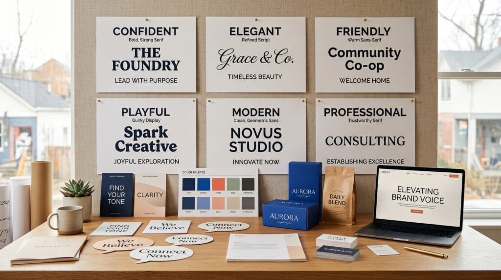
Strong brand voice and typography examples show how words and typefaces work together to shape the way people perceive a brand. A company can sound confident, playful, sophisticated, friendly, rebellious, or calm through its written tone, but typography gives that voice a visible personality. When the language and type style support each other, the entire brand feels more intentional and recognizable.
Typography is therefore more than choosing a font that looks attractive. It influences hierarchy, readability, emotion, and visual consistency. The same message set in an elegant serif can feel premium, while a rounded sans serif may make it feel more approachable.
For designers and brand strategists, understanding this relationship makes it easier to create identities that communicate clearly before the audience reads every word.
What Are Brand Voice and Typography?
Brand voice is the consistent personality expressed through a company’s words.
It influences website copy, advertisements, social media posts, emails, product descriptions, packaging, customer service, and other communication.
A brand might describe its voice as:
- Professional
- Friendly
- Bold
- Playful
- Sophisticated
- Minimal
- Reassuring
- Energetic
Typography is the visual system used to present those words.
It includes more than the font family. Typography also covers size, weight, spacing, alignment, capitalization, line height, hierarchy, and how multiple typefaces work together.
The strongest brand voice and typography examples make the verbal and visual personality feel like parts of the same system.
Why Brand Voice and Typography Examples Matter
Imagine two companies using the same sentence:
“Designed for your everyday life.”
One places it in a high-contrast serif with generous spacing and a restrained black-and-cream palette.
The other uses a bold rounded sans serif in bright colors.
The words are identical, but the emotional impression is very different.
Typography changes how language feels before it is fully processed.
This makes type an important part of positioning.
A luxury brand may need restraint and elegance. A children’s brand may benefit from warmth and playfulness. A technology company may want precision and clarity.
Studying brand voice and typography examples helps designers connect these abstract personality traits to concrete visual choices.
Brand Voice and Typography Examples for Luxury Brands
Luxury branding often communicates refinement, exclusivity, confidence, and timelessness.
Typography should usually feel controlled rather than loud.
Elegant Serif Typography
High-contrast serif fonts can create an editorial and sophisticated appearance.
Thin hairlines, refined proportions, and generous spacing are frequently associated with fashion, beauty, jewelry, hospitality, and premium lifestyle brands.
The verbal voice might use short, confident statements rather than excessive explanation.
For example:
- “Crafted with intention.”
- “Made to endure.”
- “Quietly distinctive.”
Pairing this type of copy with elegant serif typography reinforces a premium personality.
Avoid overcrowding layouts. White space is often just as important as the font itself.
Brand Voice and Typography Examples for Friendly Brands
Friendly brands need to feel approachable, clear, and human.
Rounded sans serif fonts often work well because soft shapes can reduce formality.
A friendly verbal voice may use conversational language such as:
- “Let’s make things easier.”
- “Everything you need, right here.”
- “Made for everyday moments.”
Typography can support this tone with medium weights, comfortable spacing, and clear lowercase forms.
Extremely condensed or aggressive typography may conflict with the approachable personality.
Among useful brand voice and typography examples, friendly brands demonstrate how subtle letter shapes can influence emotional tone without requiring decorative graphics.
Bold Brand Voice and Typography
Bold brands often want to communicate confidence, energy, disruption, or ambition.
Strong typography can become one of the most recognizable parts of the identity.
Heavy Sans Serif Fonts
Heavy grotesk or geometric sans serif typefaces can create visual authority.
Large headlines, strong weights, tight compositions, and high contrast can make messages feel immediate.
Copy might include statements such as:
- “Move differently.”
- “Build what matters.”
- “Challenge the ordinary.”
The typography and language both communicate confidence.
However, bold does not mean making every element huge.
If every piece of text has maximum weight, the design loses hierarchy.
Use strong display typography for key messages while supporting it with simpler body text.
Playful Brand Voice and Typography Examples
Playful brands can experiment more freely with typography.
This may include irregular shapes, unexpected letterforms, bright colors, hand-drawn styles, or unusual scale relationships.
A playful voice might use humor, informal phrases, or surprising language.
Examples include:
- “Serious flavor. Zero boring.”
- “Make Monday less Monday.”
- “Tiny product. Big personality.”
Typography can reinforce these messages through rounded display fonts, expressive lettering, or unconventional compositions.
Still, readability matters.
A playful display typeface may work beautifully for headlines but become difficult to read in paragraphs.
Strong brand voice and typography examples often use expressive fonts selectively rather than throughout the entire identity.
Minimalist Brand Voice and Typography
Minimal branding depends heavily on restraint.
There are fewer visual elements available to communicate personality, so details become more noticeable.
A minimalist brand voice is usually concise, direct, and calm.
Typography often uses clean sans serif families, controlled spacing, and a limited range of weights.
For example:
- “Better essentials.”
- “Simply made.”
- “Designed to last.”
The typography should allow the message to breathe.
Large amounts of decorative styling can weaken a minimalist identity.
Instead, create interest through proportion, spacing, grid structure, and carefully controlled hierarchy.
Brand Voice and Typography Examples for Technology Brands
Technology brands frequently balance innovation with clarity.
If a product feels too futuristic, it can become intimidating. If it feels too generic, it may lose distinction.
Modern sans serif typography often works well for technology because it communicates efficiency and readability.
The voice might be:
- “Work smarter.”
- “Everything connected.”
- “Built for what’s next.”
Neutral typography can support this copy while allowing product imagery, interface elements, or brand colors to provide more personality.
Some technology brands also use custom typefaces to create a distinctive identity without sacrificing usability.
Also Read: Brand Voice 2026: The Best Voice Styles for 2026 Brands
Editorial Brand Voice and Typography
Editorial brands often use typography as a primary visual element.
Magazines, cultural platforms, creative publications, and fashion brands may combine expressive headlines with more neutral reading fonts.
Serif typography can create authority and storytelling depth, while sans serif supporting text can make navigation and digital reading easier.
An editorial voice may sound observant, knowledgeable, or provocative.
For example:
- “Ideas shaping tomorrow.”
- “Inside the new creative culture.”
- “Design beyond the surface.”
These brand voice and typography examples demonstrate how font pairing can create different communication layers within the same brand.
Brand Voice and Typography for Wellness Brands
Wellness branding often aims to communicate calm, trust, care, and simplicity.
Typography should generally avoid feeling overly aggressive.
Soft serif fonts, humanist sans serifs, and restrained scripts can all work depending on the positioning.
A wellness brand might say:
- “Make space to breathe.”
- “Small rituals, better days.”
- “Care begins with balance.”
Generous line spacing and softer weights can make the visual experience feel calmer.
Natural colors and spacious layouts can reinforce this effect, but typography remains central because it shapes how the message is received.
Professional Brand Voice and Typography Examples
Professional brands need to communicate competence and reliability without becoming cold or outdated.
This applies to consulting, finance, legal services, software, architecture, and other business-focused industries.
A professional voice may be direct and confident:
- “Clarity for complex decisions.”
- “Strategy built around results.”
- “Experience that moves business forward.”
Typography might use a neutral sans serif or sophisticated serif depending on the positioning.
Consistency matters more than decoration.
A professional identity should use the same typographic rules across presentations, websites, proposals, reports, and marketing materials.
Brand Voice and Typography for Creative Brands
Creative brands have more freedom to make typography part of the concept itself.
Design studios, artists, photographers, fashion labels, and creative agencies often use expressive type to show personality.
This could involve oversized letterforms, experimental spacing, custom typography, or contrasting font families.
The verbal voice may also be more distinctive.
Examples include:
- “Make something worth noticing.”
- “Ideas should feel alive.”
- “Ordinary is optional.”
The key is maintaining enough consistency that experimentation still feels recognizable.
Without rules, expressive typography can quickly become visual noise.
Match Font Categories to Brand Personality
Different font categories naturally carry different associations.
These are not strict rules, but they provide useful starting points.
Serif Fonts
Serif typography can communicate tradition, sophistication, authority, craftsmanship, or editorial character.
It works especially well for luxury, publishing, hospitality, fashion, and heritage brands.
Sans Serif Fonts
Sans serif typography can feel modern, clear, neutral, approachable, technical, or efficient.
It is extremely versatile and commonly used across technology, startups, consumer brands, and digital products.
Script Fonts
Script fonts can communicate elegance, personality, creativity, romance, or handmade character.
They often work best as accent typography rather than body text.
Display Fonts
Display fonts are designed to attract attention.
They can make brands feel playful, bold, experimental, retro, futuristic, or highly distinctive.
The best brand voice and typography examples use font categories intentionally rather than selecting them only because they are visually appealing.
Use Font Pairing to Strengthen Brand Voice
Many visual identities use more than one typeface.
A common strategy is combining an expressive display font with a highly readable supporting font.
For example:
- An elegant serif headline + clean sans serif body text can feel sophisticated but modern.
- A bold sans serif headline + neutral grotesk body can feel energetic and practical.
- A script accent + classic serif can create a romantic or handcrafted mood.
The fonts should contrast enough to establish hierarchy while still feeling related.
Avoid combining multiple highly expressive typefaces. They can compete for attention.
Brand Voice and Typography Examples Through Hierarchy
Typography communicates voice not only through font choice but also through hierarchy.
Consider a confident brand.
It may use:
- Large bold headlines
- Short supporting sentences
- Strong contrast between heading and body sizes
- Minimal secondary text
A calm brand might use:
- Moderate headline sizes
- More generous spacing
- Lighter weights
- Subtle contrast
Neither approach is inherently better.
The correct system depends on the intended personality.
This is why studying brand voice and typography examples requires looking beyond individual typefaces.
Also Read: Brand Voice Strategy: How to Sound Consistent Everywhere
Capitalization Changes Brand Personality
Even capitalization can affect tone.
ALL CAPS can feel authoritative, energetic, technical, or luxurious depending on the font and spacing.
Lowercase typography can feel informal, contemporary, friendly, or understated.
Title Case often appears more formal or structured.
Sentence case generally feels natural and easy to read.
Use capitalization deliberately and maintain consistent rules throughout the identity.
Random capitalization patterns can make even strong typography feel unpolished.
Spacing Is Part of Brand Voice
Tracking, line spacing, and margins influence how typography feels.
- Luxury brands often use generous letter spacing and large amounts of white space.
- Bold youth-oriented brands may use tighter compositions.
- Editorial designs may create dramatic relationships between oversized headlines and smaller text.
- Friendly interfaces often rely on comfortable spacing for easy scanning.
Typography should never be evaluated only by looking at individual letters.
The surrounding space is part of the design language.
Create a Brand Typography System
Once the visual direction is established, document the rules.
A basic typography system should define:
- Primary typeface
- Secondary typeface
- Headline styles
- Body styles
- Button styles
- Caption styles
- Font weights
- Font sizes
- Line heights
- Letter spacing
- Capitalization rules
For digital products, include responsive sizes for desktop, tablet, and mobile.
This system helps maintain the personality demonstrated in your brand voice and typography examples across different platforms.
Keep Brand Voice Consistent Across Touchpoints
A brand should not feel sophisticated on its website and suddenly become casual on packaging unless the shift is intentional.
Consistency builds recognition.
Review:
- Website
- Social media
- Packaging
- Advertising
- Presentations
- Product interfaces
- Printed materials
The exact typography may need to adapt to each format, but the underlying personality should remain recognizable.
This is especially important as more designers, writers, and marketers begin working with the brand.
Test Typography With Real Brand Copy
Never choose typography using only placeholder text.
Use actual headlines, product descriptions, calls to action, and brand statements.
A typeface that looks impressive when displaying the word “Typography” may behave very differently when used with real marketing language.
- Test short and long headings.
- Test numbers, punctuation, prices, and buttons.
- Check multiple screen sizes.
The most useful brand voice and typography examples come from realistic communication scenarios rather than isolated font specimens.
Avoid Common Brand Typography Mistakes
One common mistake is selecting fonts based entirely on trends.
A fashionable typeface may attract attention today but fail to match the brand’s long-term personality.
Another problem is using too many fonts.
Multiple typefaces can weaken recognition and make visual communication feel inconsistent.
Other mistakes include poor readability, weak hierarchy, insufficient contrast, inconsistent weights, and typography that conflicts with the written tone.
For example, serious financial copy paired with a playful novelty font may create an unintended message.
Always judge type in context.
How to Choose Typography for Your Brand Voice
Begin with personality rather than fonts.
Choose three to five words that describe how the brand should feel.
For example:
“Confident, modern, direct.”
Or:
“Warm, natural, thoughtful.”
Then identify typefaces that express those characteristics.
Compare options using the same brand message.
Ask:
- Does this feel trustworthy?
- Does it match the audience?
- Is it readable?
- Does it work digitally?
- Can it support different content types?
- Would it still feel appropriate several years from now?
These questions create a stronger foundation than selecting a font simply because it looks attractive.
Also Read: Brand Storytelling Guide to Make Your Content More Engaging
Final Thoughts on Brand Voice and Typography Examples
The best brand voice and typography examples demonstrate that typography is not separate from communication. It is part of the communication.
Words tell people what a brand says, while typography influences how those words feel.
Luxury brands can use refined serif typography and restrained language to communicate sophistication. Friendly brands may combine conversational copy with rounded sans serifs. Bold brands can use heavy display typography and direct statements, while minimalist brands often rely on simplicity and spacing.
There is no universal font that creates a strong brand.
The goal is alignment.
Choose typography that supports the personality, positioning, and audience of the brand. Then build clear rules for hierarchy, spacing, font pairing, and application.
When brand voice and typography consistently support each other, visual communication becomes more recognizable and convincing.
Use these brand voice and typography examples as starting points rather than strict formulas. Test different combinations, evaluate them with real content, and refine the system until the verbal and visual personality feel like one cohesive brand.
For high-quality fonts to boost your income, check out Letter Crafted. Our professional fonts are perfect for branding, marketing, and content creation. So, don’t miss this opportunity.