
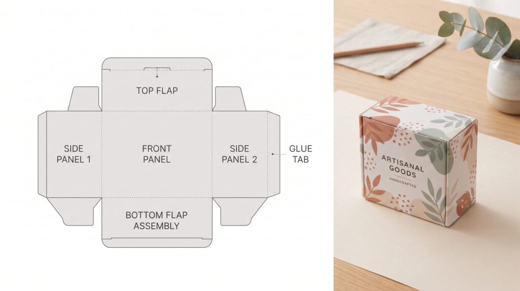
A clear packaging dieline tutorial can help designers move from a flat template to accurate, print-ready packaging without creating costly production problems. A dieline shows where a package will be cut, folded, glued, perforated, or finished, so every piece of artwork must fit around that structure correctly.
Packaging artwork is different from designing a poster or social graphic. A design may look perfect on screen but fail once the box is folded. Text can end up upside down, logos can cross cut lines, and important information may disappear into glue areas.
That is why understanding dielines is essential for packaging designers.
A good packaging dieline tutorial should cover both visual design and production preparation. Designers need to understand panels, bleed, safe areas, spot colors, folds, artwork orientation, proofs, and the requirements of the printer or manufacturer.
This guide explains the complete process from receiving a dieline to preparing final production files.
What Is a Packaging Dieline?
A dieline is a flat technical template that shows how a package will be produced.
It usually contains information such as:
- Cut lines
- Fold lines
- Glue areas
- Bleed
- Safe zones
- Perforations
- Windows
- Panels
When printed and cut, the flat shape folds into the final package.
Common dieline formats include:
- Folding cartons
- Rigid box wraps
- Sleeves
- Labels
- Pouches
- Display packaging
- Food boxes
A professional packaging dieline tutorial starts with one important rule, use the production dieline supplied or approved by the printer whenever possible.
Why Packaging Dielines Matter
Dielines connect creative design with manufacturing.
They help ensure that:
- Artwork fits the package structure
- Text appears on the correct panel
- Important elements stay away from cuts
- Background graphics extend into bleed
- Glue areas remain clear
- Finishing effects are placed correctly
Packaging errors can become expensive after production starts.
A small mistake repeated across thousands of boxes may require reprinting the entire run.
That makes dieline accuracy just as important as visual quality.
Packaging Dieline Tutorial with Understand the Main Lines
Different printers may use different conventions, so always review the supplied legend.
However, most dielines include several common line types.
Cut Lines
Cut lines show where the packaging material will be cut.
These lines define the final outer shape.
Do not place important text directly on or too close to a cut line.
Small production tolerances can cause information to be trimmed.
Fold Lines
Fold lines show where the material will bend.
They may also be called crease or score lines depending on the production process.
Artwork can cross fold lines, but be careful with:
- Small text
- Thin decorative elements
- Faces
- Logos
Important details can become distorted when folded.
Glue Areas
Glue areas indicate where panels will be attached during assembly.
Avoid placing critical artwork in these zones unless the manufacturer specifically says it is safe.
1. Get the Final Dieline Before Designing
Do not build final packaging artwork using estimated dimensions.
Ask the client or printer for the approved dieline.
It may be supplied as:
- AI
- EPS
The printer should ideally confirm:
- Dimensions
- Material
- Cut structure
- Fold positions
- Glue areas
- Bleed
- Special finishing requirements
Using the final template early prevents major redesign later.
If structural dimensions change, the entire artwork may need adjustment.
2. Never Change the Dieline Without Approval
This is one of the most important rules in any packaging dieline tutorial.
Do not:
- Move fold lines
- Change panel widths
- Resize tabs
- Adjust glue flaps
- Modify cut shapes
unless the structural designer or manufacturer approves the change.
The dieline may have been engineered around material thickness, production equipment, and assembly requirements.
A small visual adjustment can cause a real manufacturing problem.
3. Create a Clean Illustrator File
Adobe Illustrator is commonly used for packaging dielines because it handles vectors, layers, spot colors, and print production well.
Create a clear layer structure.
For example:
- Layer 1: Artwork
- Layer 2: Text
- Layer 3: Finishes
- Layer 4: Dieline
Keep the dieline layer on top and lock it.
This makes the technical structure visible without accidentally editing it.
A well-organized file also makes production handoff easier.
4. Use Spot Colors for Technical Lines
Printers often request cut, fold, foil, varnish, or embossing elements as separate spot colors.
For example:
- Cut
- Crease
- Foil
- Spot UV
- White ink
Create the spot colors using the exact names requested by the printer.
Do not guess naming conventions if production instructions have been provided.
Some workflows use technical spot colors with overprint enabled.
Always confirm this with the supplier.
5. Understand Bleed in Packaging Dielines
Bleed extends artwork beyond the cut edge.
This prevents unwanted white lines if the cutting process shifts slightly.
The exact bleed amount depends on the printer.
A common range may be several millimeters, but you should always use the supplier’s specification.
Backgrounds, photographs, colors, and patterns that reach the edge should extend into the bleed.
Do Not Extend Important Content Into Bleed
Logos, small text, and key product information should remain inside safe areas.
Bleed is extra artwork for trimming, not a place for essential content.
6. Packaging Dieline Tutorial for Safe Areas
A safe area is the distance between important content and a cut or fold.
Keep critical information away from structural edges.
This includes:
- Brand name
- Product name
- Ingredients
- Instructions
- Barcodes
- Legal text
Safe margins make the artwork more tolerant of small production variation.
The printer may specify exact distances.
If not, ask before final production.
7. Identify Every Packaging Panel
Before placing artwork, label each panel temporarily.
For a carton, you may have:
- Front
- Back
- Left side
- Right side
- Top
- Bottom
- Glue flap
This makes orientation easier.
Use temporary notes on a non-printing layer.
Remove them before export.
A physical paper prototype can also help you understand which panel connects to which.
8. Check Artwork Orientation
Panel orientation causes many packaging mistakes.
A side panel may look correct in the flat dieline but become upside down after folding.
Before developing final artwork:
- Print the dieline.
- Cut it out.
- Fold it.
- Label the panels.
This basic prototype can reveal orientation problems immediately.
It is one of the most useful steps in a packaging dieline tutorial because a flat file can be visually misleading.
9. Establish the Front Panel Hierarchy
The front panel usually carries the strongest branding.
A simple hierarchy might include:
- Brand
- Product name
- Product type
- Main benefit
- Variant or flavor
- Net quantity
Do not treat every element as equally important.
Customers should understand the product quickly.
Packaging needs both branding and practical information.
10. Place Side-Panel Information Carefully
Side panels often contain supporting content such as:
- Brand story
- Usage instructions
- Product benefits
- Ingredients
- Features
Check how the package will sit on a shelf.
A panel may become visible next to the front face, which means it contributes to shelf presentation.
Keep spacing comfortable and avoid running text too close to folds.
Also Read: Packaging Color Psychology Guide for Better Brand Perception
11. Design the Back Panel for Readability
The back panel usually contains the most information.
It may include:
- Ingredients
- Instructions
- Warnings
- Contact details
- Website
- Recycling information
- Barcode
Use clear hierarchy.
Avoid shrinking text simply to make everything fit.
If there is too much information, discuss content priorities with the client.
A successful packaging dieline tutorial does not solve every layout problem by reducing font size.
12. Keep Glue Flaps Clear
Glue areas may become hidden during assembly.
Do not place critical graphics there.
In some cases, ink or coatings can also interfere with adhesion.
The manufacturer’s dieline should indicate what must remain clear.
When in doubt, ask.
Production information takes priority over visual preference.
13. Check Fold Crossings
Large background graphics can cross folds easily.
Small detailed artwork requires more care.
Be cautious when folds cross:
- Letterforms
- Faces
- Fine illustrations
- QR codes
- Barcodes
A fold can alter the appearance or readability.
Sometimes it is better to reposition the element rather than force it across a structural line.
14. Packaging Dieline Tutorial for Barcodes
Barcodes require clear reproduction.
Do not:
- Stretch them
- Distort them
- Place them across folds
- Place them too close to cuts
- Reduce them beyond approved size
Maintain appropriate quiet space around the barcode.
Test the final printed proof if possible.
The client should provide approved barcode data.
15. Add QR Codes Carefully
QR codes can link customers to:
- Product information
- Tutorials
- Promotions
- Brand stories
- Digital manuals
Keep enough contrast around the code.
Avoid placing it:
- Across folds
- On heavily textured backgrounds
- Too close to trimming
- At extremely small sizes
Test the printed version with multiple devices.
16. Use the Correct Color Mode
Most traditional print workflows use CMYK or spot colors, though requirements vary.
Confirm:
- Color profile
- Ink system
- Spot colors
- Rich black specifications
Do not assume RGB artwork will reproduce exactly as it appears on screen.
Bright neon or highly saturated colors may shift significantly in CMYK.
A technical packaging dieline tutorial should always account for the final printing process.
17. Understand Spot Colors
Spot colors can be useful when:
- Brand color accuracy is important
- Printing uses limited inks
- Metallic colors are required
- Special effects need separation
Pantone systems are commonly used in some production workflows, but the exact color system should be agreed with the printer.
Do not convert a required spot color into CMYK without approval.
18. Prepare Images Correctly
Raster images should have enough effective resolution at final print size.
Check:
- Effective DPI
- Cropping
- Color profile
- Sharpness
- Linked files
Do not enlarge a small image dramatically and assume it will remain sharp.
Also confirm that photography and visual assets are properly licensed.
19. Use Fonts Carefully
Typography is part of both branding and production.
Before final delivery:
- Check font licenses
- Package required font files when permitted
- Follow printer requirements
- Keep an editable master file
Some printers prefer outlined text for final production.
Others may accept embedded fonts in PDF.
Follow their specifications.
Do not outline text too early because it becomes more difficult to edit.
20. Packaging Dieline Tutorial for Special Finishes
Special finishes may require dedicated spot-color layers.
Examples include:
- Foil stamping
- Spot UV
- Embossing
- Debossing
- White ink
- Varnish
Create clear production separations.
For example:
FOIL GOLD
or another exact name requested by the printer.
Do not rely on a visual mockup to communicate production finishes.
The printer needs accurate technical artwork.
21. Prepare Die-Cut Windows
Some packages contain windows that reveal the product inside.
The dieline should show the window cut.
Check:
- Window position
- Distance from folds
- Structural strength
- Artwork around the window
The window may also require a transparent film depending on the packaging system.
This should be coordinated with the manufacturer.
22. Design Repeating Patterns Across Panels
Patterns can extend beautifully across packaging, but folds and cuts can interrupt them.
When using repeating patterns:
- Extend into bleed
- Check fold transitions
- Avoid critical motifs near cut edges
- Test physical assembly
Perfect visual alignment between panels may require printer tolerances that are difficult to guarantee.
Do not build concepts that depend on extremely precise edge-to-edge registration unless the supplier confirms feasibility.
23. Use Overprint Carefully
Overprint settings can create unexpected print results if used incorrectly.
Technical lines may sometimes be set to overprint, but artwork usually needs careful review.
Use Illustrator’s Overprint Preview when preparing production files.
Check:
- Black elements
- Spot colors
- White objects
- Finishing separations
White set to overprint can disappear in certain workflows.
Prepress review is essential.
Also Read: Sustainable Packaging Design for Better Marketing Results
24. Build a Physical Prototype
Print the dieline at actual size.
It does not need to use the final material.
Even regular paper can help verify:
- Panel orientation
- Hierarchy
- Text size
- Fold positions
- Logo placement
- Artwork continuity
Cut and fold it manually.
A prototype often reveals problems that are almost impossible to notice on a flat monitor.
25. Create 3D Packaging Mockups
Three-dimensional mockups help evaluate presentation.
They can show:
- Front visibility
- Side-panel interaction
- Shelf appearance
- Logo scale
- Overall hierarchy
However, mockups do not replace technical production checks.
A beautiful 3D render can still be based on an incorrect dieline.
Use mockups for presentation and dielines for production.
Packaging Dieline Tutorial for Prepress
Before export, perform a detailed prepress review.
Check:
- Correct dieline
- Correct dimensions
- Bleed
- Safe areas
- Image resolution
- CMYK and spot colors
- Font handling
- Linked images
- Overprint settings
- Finishing layers
Also remove unused:
- Swatches
- Hidden artwork
- Temporary notes
- Old concepts
Keep the final production file clean.
Review Artwork at Actual Size
Zooming in at 400% can create a false sense of readability.
Print the package at 100% size.
Inspect:
- Body text
- Ingredients
- Legal information
- Barcodes
- Icons
- Small logos
Ask whether real customers can comfortably read the information.
Packaging often needs to work under imperfect lighting and viewing conditions.
Check Product Variants
Brands may have several:
- Flavors
- Colors
- Sizes
- Fragrances
- Product types
Before production, confirm that each variant contains the correct:
- Product name
- Color
- Ingredients
- Barcode
- Weight
- Legal information
Do not assume duplicated artwork has been updated correctly.
Variant errors are easy to introduce during repetitive production work.
Use Clear Version Control
Packaging files can become confusing after several revision rounds.
Avoid filenames such as:
box_FINAL_final_NEW_v5_REALFINAL.ai
Use a controlled naming system.
For example:
Brand_Product_Variant_250g_Production_v03.ai
Archive old versions separately.
Good version control is a practical part of any professional packaging dieline tutorial.
Prepare Print-Ready PDF Files
The printer may request a PDF standard such as a specific PDF/X format or another workflow.
Do not guess.
Ask for:
- PDF settings
- Bleed requirements
- Marks
- Color profile
- Font handling
- Spot-color requirements
When exporting, preserve the technical elements the printer needs.
Check the exported PDF rather than assuming the Illustrator file translated perfectly.
Do Not Add Printer Marks Unless Requested
Crop marks and other printer marks may or may not be required.
Packaging production often uses the dieline itself for cutting rather than standard trim marks.
Follow supplier instructions.
Adding unnecessary marks can complicate the production file.
Review the Final PDF
Open the exported production file and inspect it again.
Check:
- Page size
- Bleed
- Line positioning
- Color separations
- Missing images
- Text
- Finishes
If professional preflight software is available, use it.
Never send a file to production without reviewing the exported version.
Request a Printer Proof
A proof allows you to review the artwork before the full production run.
Proof types vary.
They may include:
- Digital PDF proof
- Printed color proof
- Structural sample
- Production prototype
Review:
- Text
- Position
- Color
- Image quality
- Barcode
- Finishes
A digital proof cannot always reproduce paper, foil, embossing, or final material exactly.
Review a Physical Production Sample
For important projects, a physical sample is extremely valuable.
Inspect:
- Cut accuracy
- Folding
- Glue
- Color
- Finish
- Structure
- Material
- Product fit
Open and close the package.
View it from the customer’s perspective.
If possible, place it next to competing products.
This final stage connects the packaging dieline tutorial back to the real-world result.
Helpful Tools for Packaging Dielines
Adobe Illustrator
Illustrator is commonly used for dielines, vector artwork, spot colors, typography, and production-ready packaging files.
Adobe Photoshop
Photoshop is useful for image preparation, texture work, and presentation mockups.
Adobe Acrobat Pro
Acrobat can help review PDFs, inspect production files, and perform certain preflight checks.
Esko ArtiosCAD
ArtiosCAD supports professional structural packaging design and engineering workflows.
Pacdora
Pacdora can help with early dieline exploration and 3D packaging visualization. Always verify final structures with the actual manufacturer.
Blender
Blender can be useful for custom packaging renders and realistic presentation visuals.
Software supports the workflow, but printer specifications remain the final production authority.
Common Packaging Dieline Mistakes
Modifying the Dieline Without Approval
Never change structural dimensions casually.
Forgetting Bleed
Background artwork should extend beyond cut lines when required.
Putting Text Too Close to Cuts
Use appropriate safe areas.
Getting Panel Orientation Wrong
Build a paper prototype.
Placing Artwork Inside Glue Areas
Keep production zones clear.
Ignoring Fold Positions
Check important details around creases.
Using Low-Resolution Images
Review effective resolution at final size.
Mixing RGB and Print Artwork
Follow the printer’s required color workflow.
Forgetting Special-Finish Separations
Use clearly labeled production layers.
Sending Files Without Proofing
Always review the final exported file.
Packaging Dieline Tutorial Checklist
Before sending artwork to production, confirm that:
- The printer-approved dieline is being used.
- Dieline dimensions have not been changed.
- Cut lines are correctly identified.
- Fold lines are correctly identified.
- Glue areas are clear.
- Bleed follows printer requirements.
- Important content remains inside safe areas.
- All panels have the correct orientation.
- Text is readable at actual size.
- Images have sufficient resolution.
- Color mode follows printer specifications.
- Spot colors are named correctly.
- Barcodes are positioned correctly.
- QR codes have been tested.
- Fonts are handled correctly.
- Finishing layers are separated.
- Overprint settings have been reviewed.
- Product variants contain correct information.
- A physical mockup has been assembled.
- The print-ready PDF has been reviewed.
- Printer proof has been checked.
Also Read: Modern Snack Packaging Design Trends for Better Branding
Final Thoughts
A reliable packaging dieline tutorial is ultimately about combining good design with production accuracy.
Start with the final approved structure.
Understand every cut line, fold, glue flap, panel, bleed area, and safe zone before developing artwork. Keep the dieline locked on a separate layer and avoid changing technical dimensions without approval.
Then build the design around how the package will actually fold.
Check orientation using a paper prototype, test typography at real size, and make sure important information remains away from cuts and folds.
As the project moves toward production, pay attention to color, image resolution, fonts, barcodes, overprint, spot colors, and special finishing separations.
Finally, export according to the printer’s specifications and review proofs carefully.
Packaging design is successful only when the printed object works as well as the flat artwork.
By following a consistent packaging dieline tutorial workflow, designers can reduce production mistakes, communicate more effectively with printers, and prepare packaging files that move more confidently from Illustrator to the final manufactured product.
For high-quality fonts to boost your income, check out Letter Crafted. Our professional fonts are perfect for branding, marketing, and content creation. So, don’t miss this opportunity.