
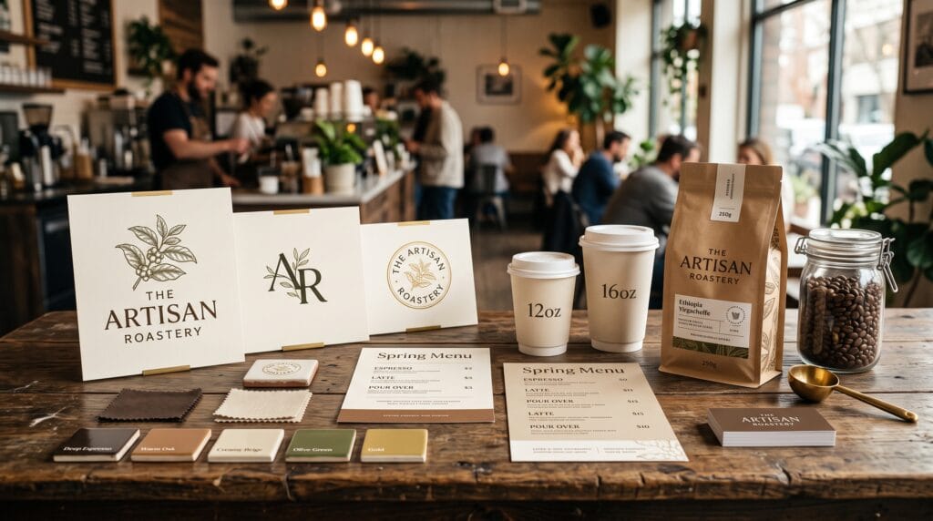
A successful café is more than great coffee and delicious food, it is an experience. Customers often form their first impression long before they taste a drink, and your brand identity plays a major role in that experience. From your logo and color palette to your packaging, signage, menus, and social media presence, every visual element influences how customers perceive your business. Choosing the right cafe logo color ideas helps communicate your café’s personality, attract your ideal audience, and create a memorable brand.
Colors evoke emotions, influence purchasing decisions, and reinforce brand recognition. Warm earthy tones can create a cozy atmosphere, while modern monochrome palettes communicate sophistication. Whether you’re opening a specialty coffee shop, neighborhood café, bakery, espresso bar, or premium coffee brand, this guide explores the best cafe logo color ideas, branding strategies, and design principles to help your business stand out in 2026.
Why Cafe Branding Matters
Strong branding provides numerous advantages.
Benefits include:
- Increases brand recognition
- Builds customer trust
- Creates memorable experiences
- Encourages customer loyalty
- Supports premium pricing
- Differentiates your café from competitors
- Improves marketing consistency
People often remember how a brand makes them feel, not just what it sells.
Understanding Color Psychology
Color psychology helps communicate your brand personality.
Different colors create different emotional responses:
- Brown – Warmth, authenticity, coffee, comfort
- Green – Freshness, sustainability, organic products
- Black – Premium quality, elegance, sophistication
- White – Simplicity, cleanliness, minimalism
- Beige – Comfort, calmness, handcrafted quality
- Gold – Luxury and exclusivity
- Orange – Energy and friendliness
- Red – Passion and appetite stimulation
- Blue – Trust and professionalism (used carefully in food branding)
The best palette depends on your café’s concept and target audience.
Cafe Logo Color Ideas
1. Classic Coffee Brown
Brown remains the most recognizable café color.
Best for:
- Coffee shops
- Roasters
- Espresso bars
- Artisan cafés
Pair with:
- Cream
- Beige
- White
- Dark charcoal
Brown reflects warmth, tradition, and the natural origins of coffee beans.
2. Earthy Green Branding
Green communicates sustainability and freshness.
Ideal for:
- Organic cafés
- Vegan cafés
- Eco-conscious brands
- Farm-to-table coffee shops
Popular combinations:
- Forest Green + Cream
- Olive Green + Beige
- Sage Green + Brown
These cafe logo color ideas create a calm and welcoming atmosphere.
3. Black and White Minimalism
Minimal branding creates a timeless appearance.
Advantages include:
- Elegant presentation
- Easy brand recognition
- Premium perception
- Versatile packaging
This style works particularly well for modern specialty coffee brands.
4. Beige and Cream
Neutral colors create a relaxed environment.
Perfect for:
- Boutique cafés
- Bakery cafés
- Lifestyle coffee shops
- Scandinavian-inspired interiors
Soft neutrals pair beautifully with natural wood textures.
5. Warm Terracotta and Clay
Earth-inspired colors have become increasingly popular.
Benefits include:
- Cozy atmosphere
- Handmade aesthetic
- Contemporary appeal
- Natural warmth
These tones complement ceramic tableware and rustic interiors.
6. Gold Accents
Gold should be used sparingly.
Suitable for:
- Luxury cafés
- Signature blends
- Premium packaging
- High-end coffee experiences
Gold works best as an accent rather than the primary brand color.
7. Deep Charcoal
Dark neutral colors create sophistication.
Pair charcoal with:
- Copper
- Beige
- White
- Gold
This combination works well for premium urban cafés.
8. Soft Pastel Branding
Pastel palettes create friendly and modern identities.
Popular colors include:
- Dusty Pink
- Sage Green
- Light Peach
- Lavender
- Powder Blue
These cafe logo color ideas appeal to lifestyle-focused cafés and dessert shops.
9. Rustic Vintage Colors
Vintage-inspired cafés often use:
- Dark Brown
- Olive Green
- Burnt Orange
- Mustard
- Cream
These colors reinforce authenticity and nostalgia.
10. Modern Monochrome
Monochrome branding focuses on:
- Black
- White
- Gray
Benefits include:
- Clean identity
- Flexible applications
- Premium feel
- Strong contrast
Monochrome designs are especially effective for minimalist brands.
Also Read: Minimal Logo Design Techniques for Professional Results
Popular Cafe Color Combinations
| Color Palette | Brand Personality |
|---|---|
| Brown + Cream | Warm and welcoming |
| Black + Gold | Luxury and premium |
| Olive Green + Beige | Organic and sustainable |
| Charcoal + Copper | Modern industrial |
| Terracotta + Cream | Cozy and handcrafted |
| Sage Green + White | Fresh and minimalist |
| Navy + Gold | Elegant café concept |
| Beige + Dark Brown | Artisan coffee shop |
Choose combinations that align with your target audience and overall concept.
Typography for Cafe Logos
Typography shapes how customers perceive your café.
Popular font styles include:
Serif Fonts
Best for:
- Luxury cafés
- Traditional coffee houses
- Boutique bakeries
Sans-Serif Fonts
Ideal for:
- Modern coffee shops
- Urban cafés
- Minimalist branding
Script Fonts
Suitable for:
- Artisan cafés
- Handmade bakeries
- Boutique dessert shops
Use script fonts sparingly to preserve readability.
Logo Style Ideas
Popular café logo styles include:
- Coffee cup icons
- Coffee bean illustrations
- Monograms
- Minimal line art
- Vintage badges
- Circular emblems
- Wordmark logos
- Hand-drawn illustrations
Keep the design simple enough to work across signage, cups, menus, and digital platforms.
Building a Complete Cafe Brand Identity
A strong visual identity extends beyond the logo.
Maintain consistency across:
- Storefront signage
- Menus
- Coffee cups
- Packaging
- Loyalty cards
- Staff uniforms
- Website
- Social media
- Email marketing
Every customer touchpoint should reinforce your brand.
Recommended Branding Tools
| Tool | Purpose |
| Adobe Illustrator | Professional logo design |
| Adobe Photoshop | Image editing |
| Canva | Marketing materials |
| Figma | Brand systems and mockups |
| Coolors | Color palette generation |
| Adobe Color | Color harmony exploration |
| ChatGPT | Brand messaging and content ideas |
| Notion | Brand guidelines |
| Procreate | Hand-drawn logo concepts |
| Mockup World | Branding presentations |
These tools support every stage of the branding process, from concept development to final presentation.
Also Read: Ecommerce Logo Design That Make Your Brand Look Professional
Common Cafe Branding Mistakes
Avoid these common mistakes:
- Using too many colors
- Following short-lived trends
- Choosing unreadable fonts
- Ignoring logo scalability
- Creating inconsistent branding
- Overcomplicating the logo
- Forgetting mobile and social media applications
- Neglecting packaging design
Simple, consistent branding often has the greatest long-term impact.
Frequently Asked Questions
1. What is the best color for a café logo?
There is no single best color. Brown, cream, green, black, beige, and charcoal are among the most popular because they communicate warmth, quality, and authenticity. The right choice depends on your café’s concept and audience.
2. How many colors should a café logo use?
Most successful logos use two or three primary colors. A limited palette improves recognition, versatility, and consistency across print and digital materials.
3. Should café logos include coffee cups or beans?
Not necessarily. While coffee cups and beans are recognizable symbols, many successful cafés use typography, abstract marks, or monograms to create distinctive brand identities.
4. How important is branding for a new café?
Branding is essential. A cohesive visual identity helps customers recognize your business, builds trust, and supports long-term marketing across signage, packaging, social media, and in-store experiences.
Cafe Branding Checklist
- Define your brand personality
- Choose a memorable color palette
- Design a versatile logo
- Select consistent typography
- Create brand guidelines
- Design menus and packaging
- Maintain consistent social media branding
- Use professional photography
- Deliver a consistent customer experience
- Review and refine your branding as your business grows
Best Practices for Cafe Branding Success
To make the most of your cafe logo color ideas:
- Choose colors that reflect your café’s atmosphere, values, and target audience.
- Keep your logo simple, memorable, and adaptable for signs, menus, packaging, and digital platforms.
- Maintain consistent branding across every customer touchpoint to strengthen recognition.
- Use typography that complements your visual identity while remaining easy to read.
- Balance creativity with practicality by ensuring your logo works in both color and monochrome.
- Incorporate high-quality photography and cohesive graphic design into your marketing materials.
- Review your branding periodically to ensure it continues to align with your business as it grows.
A thoughtful branding strategy creates an inviting identity that customers remember long after they finish their coffee.
Also Read: Logo Color Palette How to Choose 3 Brand Colors
Conclusion on Cafe Logo Color Ideas
Choosing the right cafe logo color ideas is about more than aesthetics, it’s about creating an emotional connection with customers and communicating your café’s unique personality. Whether you prefer warm earthy browns, elegant monochrome designs, organic greens, or modern minimalist palettes, consistent branding helps build trust, increase recognition, and encourage customer loyalty. By combining effective color psychology, thoughtful typography, memorable logo design, and cohesive branding across every touchpoint, your café can establish a distinctive identity that supports long-term success in an increasingly competitive market.
For high-quality fonts to boost your income, check out Letter Crafted. Our professional fonts are perfect for branding, marketing, and content creation. So, don’t miss this opportunity.