
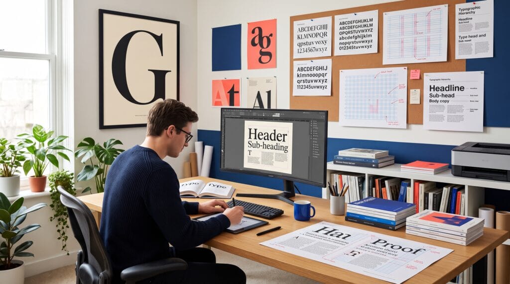
A strong typography tutorial teaches more than how to choose attractive fonts. It shows you how to organize information, create visual rhythm, improve readability, and guide attention through a design. Typography influences how people understand a message before they consciously notice the typeface.
Beginners often focus on finding the perfect font. Professional designers focus on the complete type system, hierarchy, size, weight, spacing, alignment, contrast, line length, and consistency. When these elements work together, even a simple layout can look polished and intentional.
This guide explains the core principles of typography, practical exercises, common mistakes, and a repeatable workflow for improving posters, websites, social media graphics, branding, packaging, and editorial layouts.
Why Typography Skills Matter
Typography is one of the most important tools in visual communication. Images can create emotion, but type usually delivers the detailed message. Strong typography helps viewers understand what to read first, what information belongs together, and what action to take next.
Better typography can help you:
- Create clear visual hierarchy
- Improve readability and accessibility
- Build a recognizable brand personality
- Make layouts feel balanced and professional
- Communicate tone without relying on decoration
- Reduce clutter by organizing information
- Design consistently across print and digital formats
Typography Tutorial Fundamentals
Understand Type Families and Styles
A typeface is the overall design family, while a font is a specific style within that family, such as regular, italic, semibold, or black. Modern design tools sometimes use the terms interchangeably, but understanding the distinction helps you build more controlled systems.
The major categories include:
- Serif: letterforms with finishing strokes, often associated with tradition, editorial design, and long-form reading
- Sans serif: clean letterforms without finishing strokes, commonly used for interfaces, signage, and modern branding
- Slab serif: heavier, block-like serifs that feel bold and confident
- Script: letterforms inspired by handwriting or calligraphy
- Display: expressive typefaces designed for headlines rather than long paragraphs
- Monospaced: characters that occupy equal horizontal space, often associated with code and technical content
Use Typography Hierarchy
Hierarchy tells readers where to begin and how to move through the content. A successful design makes the headline, supporting information, body copy, and call to action visibly different without making them feel disconnected.
Create hierarchy by changing:
- Size
- Weight
- Color
- Case
- Spacing
- Position
- Typeface
- Background contrast
Start with three levels: headline, subheading, and body text. Once those levels work clearly, add captions, labels, or metadata only when necessary.
Typography Scale Example
Text Role | Suggested Size | Weight | Purpose |
Main headline | 36-56 pt | Bold or black | Capture attention |
Section heading | 22-32 pt | Semibold or bold | Organize major topics |
Subheading | 16-20 pt | Medium or semibold | Introduce detail |
| Body text | 10-12 pt print / 16-18 px web | Regular | Support comfortable reading |
| Caption | 8-10 pt / 12-14 px | Regular or medium | Provide secondary information |
Typography Tutorial for Font Pairing
Font pairing should create contrast while preserving harmony. The easiest approach is to combine typefaces with different roles rather than two fonts competing for the same job.
Reliable Font Pairing Methods
Serif plus sans serif: Use one for headlines and the other for body copy. The structural contrast creates a clear hierarchy.
One family, multiple weights: Use a single type family with regular, medium, semibold, and bold styles. This creates consistency and is ideal for interfaces.
Display plus neutral text face: Use an expressive display font for short headlines and a restrained serif or sans serif for reading.
Shared visual characteristics: Pair fonts with similar proportions, x-heights, or geometric qualities so the combination feels intentional.
Font Pairing Rules for Beginners
- Use two typefaces before experimenting with three
- Assign each typeface a clear role
- Avoid pairing fonts that look almost identical
- Test numbers, punctuation, and special characters
- Check whether the family includes enough weights
- Review the pairing at small and large sizes
Also Read: Graphic Design Typography Mistakes and How to Fix Them
Typography Tutorial for Spacing
Kerning, Tracking, and Leading
Spacing can make an average font look professional or make a beautiful font look careless. Three terms are especially important:
Kerning: The space between individual letter pairs. Adjust it when combinations such as AV, To, Wa, or Yo appear uneven.
Tracking: The overall spacing across a word, line, or paragraph. Slightly increased tracking can help uppercase labels, while excessive tracking weakens body text.
Leading: The vertical distance between lines of text. Comfortable leading improves reading flow and prevents paragraphs from feeling crowded.
Practical Spacing Guidelines
- Use tighter leading for large headlines
- Use more generous leading for body copy
- Avoid extreme tracking in lowercase paragraphs
- Check spacing optically, not only numerically
- Zoom out to judge rhythm and zoom in to correct letter pairs
Improve Readability and Legibility
Legibility describes how easily individual characters can be recognized. Readability describes how comfortably a longer passage can be read. A decorative headline may be legible at a large size but unsuitable for paragraphs.
Control Line Length
Lines that are too long make it difficult for the eye to find the next line. Lines that are too short create constant interruptions. For many text layouts, approximately 45 to 75 characters per line provides a comfortable starting point.
Choose Appropriate Alignment
Left-aligned text is usually easiest to read because every line begins in a predictable position. Centered text works best for short, formal, or decorative content. Justified text can look elegant in editorial design, but it requires careful control to avoid uneven word spacing.
Use Strong Contrast
Text must stand apart from its background. Size, weight, and color all contribute to contrast. Avoid placing thin type over busy photographs unless you add a solid panel, gradient, shadow, or sufficient tonal separation.
Typography Tutorial for Layout and Composition
Use a Grid
A grid creates consistent relationships between text, images, margins, and empty space. It does not limit creativity. It gives the design a structure that makes intentional variation more effective.
Common grid options include:
- Single-column grid for simple reading
- Multi-column grid for editorial layouts
- Modular grid for dashboards and content cards
- Baseline grid for aligning lines across columns
Create Visual Rhythm
Rhythm develops through repeated spacing, alignment, text sizes, and intervals. A consistent space before every H2 heading, for example, helps viewers understand the structure without consciously analyzing it.
White space is part of typography. It separates groups, emphasizes important elements, and prevents the design from feeling crowded.
Apply Alignment Consistently
Most strong layouts have a visible alignment logic. Text blocks, images, labels, and buttons should connect to shared edges or grid lines. Small alignment errors often make a design feel less professional even when viewers cannot identify the exact problem.
Also Read: Graphic Design Layout Ideas: How to Use White Space Better
Step-by-Step Typography Exercise
- Choose a short content sample: Use a headline, a short paragraph, a date, and a call to action.
- Set the body text first: Choose a readable typeface, comfortable size, and appropriate line length.
- Create three hierarchy levels: Design the headline, subheading, and body copy without adding decorative effects.
- Adjust spacing: Refine leading, paragraph spacing, and margins before changing colors.
- Test one font pairing: Add a contrasting typeface only if it improves the hierarchy.
- Build a grid: Align text and supporting elements to a consistent column structure.
- Review at actual size: Check print at 100 percent or view digital work on the intended screen.
- Remove one unnecessary element: Simplification often improves typography more than adding another style.
Typography Tutorial for Different Design Projects
Typography for Posters
Posters require fast recognition. Use a strong focal headline, clear event details, and enough contrast for viewing from a distance. Expressive typography can work well, but important information must remain readable.
Typography for Websites and Apps
Digital typography must adapt across screen sizes. Build a responsive scale, use consistent text styles, and test line length on mobile devices. Buttons, labels, form fields, and error messages should follow the same type system.
Typography for Branding
Brand typography should communicate personality and remain practical across many formats. A brand may use a distinctive display face for identity and a versatile supporting family for websites, presentations, packaging, and internal documents.
Typography for Social Media
Social content competes for attention on small screens. Use larger text, fewer words, strong contrast, and simple hierarchy. Avoid placing important copy near interface controls or image edges.
Typography for Packaging
Packaging combines brand expression with functional information. Product names, variants, ingredients, instructions, and legal text must remain organized. Test the design at actual package size because type that looks comfortable on a monitor may be too small in print.
Best Tools for Practicing Typography
Tool | Best For | Typography Strength |
| Posters, logos, lettering | Precise vector type control | |
| Editorial and print layouts | Advanced styles, grids, and long documents | |
| Web and interface design | Reusable text styles and responsive systems | |
| Canva | Fast social and marketing layouts | Accessible templates and simple hierarchy tools |
| Font managers | Organizing large font libraries | Tagging, previewing, and comparing families |
Common Typography Mistakes
1. Using too many fonts
Multiple typefaces create competing voices. Begin with one family or one carefully selected pair.
2. Weak hierarchy
When every element has similar size and weight, viewers do not know where to begin.
3. Ignoring spacing
Default spacing is not always appropriate. Adjust leading, margins, and paragraph intervals deliberately.
4. Stretching type
Horizontal or vertical distortion damages letter proportions. Choose a condensed or extended family instead.
5. Using effects before fundamentals
Shadows, outlines, gradients, and textures cannot fix poor hierarchy or spacing.
6. Following trends blindly
A fashionable type style may not match the audience, message, or long-term brand needs.
7. Testing only on a large monitor
Always review work at final size and on the intended device or material.
Also Read: Photoshop Text Effect Tutorial for Better Design Results
30-Minute Typography Practice Routine
5 minutes – Analyze one professional layout. Identify its hierarchy, alignment, font roles, and spacing.
10 minutes – Recreate the layout using different content without copying decorative details.
5 minutes – Create a second version using only one type family.
5 minutes – Adjust only spacing and alignment. Do not change fonts.
5 minutes – Compare both versions and write down three improvements for the next exercise.
Typography Quality Checklist
- The headline is the clear starting point
- Each text style has a defined role
- Body text is comfortable to read
- Line length is appropriate for the format
- Leading and paragraph spacing feel consistent
- Font pairings create useful contrast
- Text and background have sufficient contrast
- Alignment follows a visible grid
- Decorative effects do not reduce clarity
- The layout works at final size
Frequently Asked Questions of Typography Tutorial
1. What should a beginner learn first in typography?
Begin with hierarchy, alignment, spacing, and readability. These principles improve design quality more reliably than collecting many fonts.
2. How many fonts should one design use?
Two typefaces are enough for most beginner projects. A single family with multiple weights can also create a complete and professional system.
3. What is the easiest font pairing method?
Pair a serif with a sans serif, or combine a distinctive headline face with a neutral body face. Give each one a separate role.
4. How do I know whether spacing is correct?
Check both close-up details and the overall rhythm. The layout should feel even, readable, and organized without awkward gaps or crowded areas.
5. Can decorative fonts be used professionally?
Yes, when they support the message and are used selectively. Decorative fonts work best for short headlines, logos, or accents rather than long paragraphs.
6. How often should designers practice typography?
Short, regular practice is more effective than occasional long sessions. Rebuilding one layout several times a week can quickly improve judgment.
Conclusion on Typography Tutorial
A useful typography tutorial gives you a repeatable way to make design decisions. Start with readable body text, create a clear hierarchy, control spacing, build an alignment system, and add contrast only where it improves communication.
Typography improves through observation and practice. Study successful layouts, recreate their structure, test alternatives, and review your work at final size. When hierarchy, spacing, readability, and font choice work together, your designs become clearer, more confident, and more professional.
For high-quality fonts to boost your income, check out Letter Crafted. Our professional fonts are perfect for branding, marketing, and content creation. So, don’t miss this opportunity.