
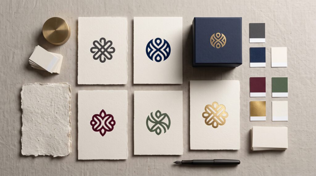
Logo color psychology explores how color can influence the impressions people form about a brand. For luxury and premium identities, those impressions often involve quality, character, and the kind of experience a business wants to offer. However, no color automatically makes a logo feel expensive, trustworthy, or exclusive. Its effect depends on the wider design and the audience encountering it.
A dark symbol on textured paper creates a different experience from the same symbol on a bright screen. Context changes how the choice appears.
This guide offers a practical framework for exploring premium palettes. Use it to develop design directions and questions for evaluation, rather than treating color associations as guaranteed outcomes.
Understand Logo Color Psychology Beyond Fixed Meanings
Color guides often assign one emotion to each hue. That can be a convenient starting point, but it becomes misleading when treated as a universal rule.
People bring different experiences, preferences, and cultural references to a design.
Treat Color Associations as Possibilities
Instead of saying that gold creates luxury, ask what a particular gold treatment contributes to the identity.
Does it suit the product, audience, and material? Does it remain attractive without special lighting?
Useful logo color psychology involves those questions. A color choice should support a specific brand direction rather than depend on a label attached to the hue.
Begin with the complete experience you want to create.
Start Logo Color Psychology With Brand Positioning
Luxury and premium businesses do not all share the same personality.
One may emphasize craftsmanship and heritage. Another may offer precise technology, contemporary fashion, or a quiet hospitality experience.
The palette should reflect that difference.
Describe the Intended Character First
Choose a few useful qualities, such as:
- Warm and personal.
- Restrained and architectural.
- Expressive and fashion-focused.
- Traditional and established.
- Natural and tactile.
Then explain what those qualities mean for the business.
Effective logo color psychology starts with positioning because the same palette can suit one premium identity and feel unrelated to another. Define the direction before choosing a familiar “luxury” combination.
Use Dark Palettes With Deliberate Contrast
Charcoal, deep navy, and dark brown are possible directions for a restrained identity.
Their usefulness comes partly from how they interact with the surrounding space and lighter elements.
Darkness alone does not create refinement.
Compare Several Dark Treatments
Place the same logo in charcoal, navy, and brown while keeping the layout unchanged.
Review each version on a light background and within a realistic application.
Charcoal may provide a neutral direction, while brown can introduce a warmer visual character. Treat those descriptions as design observations to evaluate, not promises about audience response.
With logo color psychology, contrast and context help determine whether the palette supports the intended impression.
Explore Warm Neutrals for Premium Identities
Cream, ivory, beige, and warm gray can provide alternatives to a stark black-and-white presentation.
They may suit a brand direction built around softness, tactile materials, or a quieter composition.
However, subtle colors still need clear separation.
Keep Neutral Palettes Readable
Compare the logo against the actual background where it will appear.
A pale mark on a pale surface may look delicate in a large presentation but become difficult to recognize at a smaller size.
Thoughtful logo color psychology includes visibility. If the identity becomes unclear, its intended personality may not communicate effectively.
Use darker elements where needed and test the palette without relying on a carefully lit mockup.
Also Read: Best Logo Color Combinations for Tech, Retail, and Services
Consider Deep Accent Colors Beyond Black and Gold
A premium identity can explore burgundy, forest green, plum, or other deep colors.
The choice should connect with the brand rather than simply provide an unusual alternative.
A distinctive palette still needs a coherent purpose.
Give the Accent a Defined Role
Decide whether the color belongs in the logo, the background, or supporting materials.
For example, a dark-green symbol on ivory creates a different balance from an ivory symbol on a large green surface.
Good logo color psychology considers how much color appears, not only which hue is selected.
Compare restrained and expansive applications before deciding how the palette should function across the identity.
Distinguish Metallic Effects From Flat Color
A gold-colored shape and metallic foil are different visual treatments.
Foil changes with light and the viewing angle. A flat digital color does not reproduce that physical behavior.
Plan for both where necessary.
Build a Usable Nonmetallic Version
Review the logo without shine, texture, or special finishing.
It should remain recognizable when reproduced as a simple solid mark.
For logo color psychology, this distinction matters because the material may contribute strongly to the premium impression. Do not assume that a shiny presentation proves the underlying color combination works in every setting.
Prepare a flat alternative that fits ordinary digital and printed applications.
Keep Logo Color Psychology Connected to the Full Identity
The logo rarely appears alone.
Its impression is shaped by spacing, composition, imagery, materials, and the surrounding information.
A restrained palette can still feel cluttered when the layout contains too many competing elements.
Evaluate the Complete Presentation
Place the logo on a simple card, a website header, and relevant packaging or signage.
Keep the supporting design consistent with the brand direction.
If the intended identity is quiet and precise, review whether crowded layouts undermine that idea.
Effective logo color psychology works within a larger system. Color should cooperate with the composition rather than carry the entire responsibility for making the brand feel premium.
Consider Audience and Cultural Context
A business may serve people with different expectations of luxury.
The palette familiar within one category or region may communicate something else in another setting.
Avoid assuming your own associations represent everyone.
Ask Open Questions About the Design
Show realistic applications and ask viewers what they notice.
Invite descriptions of the character, category, and clarity before explaining your intended meaning.
These questions make logo color psychology more practical:
- What kind of business might use this identity?
- Which qualities does the presentation suggest?
- Does anything feel inconsistent?
- Is the logo easy to distinguish?
- What would you expect from the brand?
Look for patterns while leaving room for different interpretations.
Also Read: Logo Color Palette How to Choose 3 Brand Colors
Use Logo Color Psychology to Compare Directions Fairly
Changing several design elements at once makes it difficult to understand the effect of the palette.
A new symbol, background, and material can influence the impression alongside the color.
Keep comparisons focused.
Hold the Layout Constant
Use the same logo, scale, spacing, and application when reviewing color alternatives.
Then compare how each palette changes the overall presentation.
You might test three directions: charcoal and ivory, burgundy and cream, or navy with a restrained accent.
For logo color psychology, this approach supports clearer discussion. It does not prove that one palette will produce a specific commercial result, but it helps you evaluate visual differences more deliberately.
Test Premium Logo Colors Across Real Applications
An attractive screen preview cannot show every production condition.
Color can appear different across displays, printing methods, materials, and lighting.
Review the applications that matter most.
Create a Practical Color Test List
Check:
- Light and dark backgrounds.
- Small digital profile images.
- One-color reproduction.
- Printed cards or labels.
- Relevant packaging surfaces.
- Signage viewed from a realistic distance.
Where possible, inspect physical samples before committing to a large production run.
Useful logo color psychology includes this practical review. The palette needs to communicate clearly outside the ideal conditions of the original presentation.
Avoid Common Premium Palette Mistakes
A palette can become less effective when the concept depends on familiar shortcuts rather than a clear brief.
Watch for:
- Adding gold without a relevant design reason.
- Using too many dark accent colors.
- Depending on metallic effects for recognition.
- Choosing subtle combinations with weak contrast.
- Treating personal preference as audience evidence.
- Copying the appearance of an established identity.
Return to the business’s character and intended applications.
A premium direction does not need to be unusual at every point. It needs considered choices that work together and remain recognizable.
Document the Palette for Consistent Use
Once a direction is approved, record the intended colors and their roles.
Specify which backgrounds work, when the one-color version is appropriate, and how metallic treatments relate to flat alternatives.
Include examples rather than relying on color values alone.
A clear reference helps future materials remain connected to the identity.
Consistency also makes later evaluation easier. If every application introduces a different shade or treatment, it becomes difficult to judge whether the original palette is doing its job.
Also Read: Gold Logo Design Ideas for Luxury and Premium Brands
Conclusion – Build Premium Impressions Through Considered Choices
Logo color psychology is most useful as a framework for exploring perception, not a formula for guaranteeing luxury.
Start with positioning, compare palettes in context, and review how contrast and materials influence the result.
Then test the identity across its everyday applications and document the approved system.
A premium logo does not need one prescribed color. It needs a palette that fits the business, supports recognition, and contributes coherently to the experience the brand intends to offer.
For high-quality fonts to boost your income, check out Letter Crafted. Our professional fonts are perfect for branding, marketing, and content creation. So, don’t miss this opportunity.