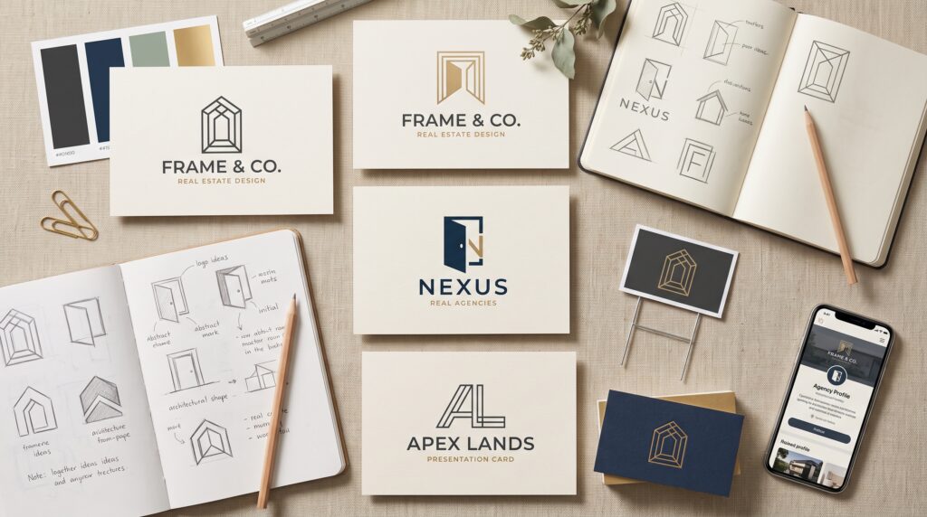
Real estate company logo design gives a new agency a recognizable mark for signs, business cards, listing materials, and digital profiles. A useful logo helps people identify the business without requiring a detailed explanation. It should reflect the agency’s direction while remaining clear in the places where prospective clients will encounter it.
For a new agency, the challenge is balancing personality with practical use. A logo may look impressive on a large presentation screen but become unclear on a property sign or small profile image.
This guide explains how to develop a focused brief, compare concepts, and prepare a logo system that supports everyday branding. Begin with the agency’s purpose, then make visual decisions around real applications.
Start Real Estate Company Logo Design With Positioning
Before sketching symbols, describe the agency in plain language.
Who do you serve? Which properties do you handle? What kind of experience do you want clients to associate with your business?
A residential agency serving first-time buyers may need a different direction from a commercial property specialist.
Define the Agency Before Defining the Mark
Write a short internal statement covering the audience, service, and intended character.
For example, an agency might focus on helping local families understand their options through clear, approachable communication.
Effective real estate company logo design begins with that direction. It gives you a way to judge concepts beyond personal preference and prevents the brief from becoming a collection of unrelated visual ideas.
Give Real Estate Company Logo Design a Focused Brief
A design brief should explain what the logo needs to do.
Include the company name, any supporting wording, the intended audience, and the most important applications.
Also identify practical constraints before the work begins.
List the Required Logo Applications
Your agency may need the logo for:
- Property signs.
- Business cards.
- Listing brochures.
- Website headers.
- Social profiles.
- Email signatures.
- Office identification.
Rank these according to their importance.
With real estate company logo design, application matters. A concept intended mainly for signs needs careful distance testing, while a mark used frequently in profile images also needs a compact form that remains recognizable.
Explore More Than Familiar Property Symbols
Roofs, keys, and houses can communicate the property category, but they are not the only available direction.
An architectural frame, abstract doorway, or carefully constructed initial may also suit the agency.
The choice should follow the brief rather than habit.
Choose a Symbol With a Clear Role
Ask what the symbol contributes.
Does it help identify the agency, communicate its character, or create a recognizable shape?
Avoid combining several property references merely to make the business category obvious.
Strong real estate company logo design usually benefits from a focused idea. A single clear form can be easier to recognize than a building, key, roofline, and landscape placed inside one badge.
Make the Company Name Easy to Recognize
The agency name often carries much of the logo’s meaning.
A distinctive symbol cannot compensate for a company name that becomes difficult to read in everyday use.
Give the name enough visual importance.
Review Name Length and Supporting Wording
Test the complete name rather than a shortened placeholder.
Long names may need a different arrangement from short ones. Supporting phrases should remain secondary without becoming unnecessarily tiny.
Check spacing between letters and words, especially when the name contains unusual combinations.
In real estate company logo design, the name and symbol should feel connected. Their relationship needs to remain balanced rather than making one element look like an afterthought.
Also Read: Gold Logo Design Ideas for Luxury and Premium Brands
Choose Colors Through Context and Contrast
Color should support the agency’s identity and work across its materials.
Avoid assuming that one shade automatically communicates trust, luxury, or success to every audience.
Review the palette within the actual composition.
Test Color Before Adding Complexity
Begin with a restrained palette.
Compare the logo on light and dark backgrounds, then check a one-color version.
Make sure important elements remain distinguishable without relying on subtle color differences.
Thoughtful real estate company logo design does not need many colors to feel distinctive. A clear structure and consistent application can provide recognition without creating unnecessary production difficulties.
Also consider how the palette relates to property photographs and other surrounding content.
Keep Real Estate Company Logo Design Simple Enough to Scale
A logo may appear on a large sign one day and a small digital image the next.
Fine lines, tiny details, and narrow internal spaces can become unclear when reduced.
Simplification should preserve the idea rather than remove its character.
Review the Smallest Useful Version
Reduce the logo to a realistic size and inspect the result.
Check whether the company name remains legible and whether the symbol’s internal spaces stay open.
If the design depends on a tiny decorative detail, consider whether that detail is necessary.
Useful real estate company logo design survives changes in scale because its essential structure is clear. A logo should not require a large preview to explain what makes it recognizable.
Test the Logo on Property Signs
Property signs are important real-world applications for many agencies.
The logo needs to work alongside contact details and listing information rather than competing with everything else.
A realistic mockup can reveal problems early.
Review the Complete Sign Layout
Place the logo within a sign using actual content.
Check the hierarchy between the agency name, property message, and contact information.
Print a sample where practical and view it from a relevant distance.
For real estate company logo design, judging the logo alone is not enough. The mark should function as part of a useful communication piece, with enough space and contrast to remain identifiable.
Prepare Logo Variations for Different Spaces
One arrangement may not fit every format.
A wide website header and a square profile image have different proportions.
Create a small set of deliberate variations rather than repeatedly improvising new versions.
Build a Manageable Logo System
Useful variations may include:
- A primary arrangement.
- A horizontal version.
- A compact version.
- A symbol-only version, where appropriate.
- Light-background and dark-background options.
- A one-color version.
Keep their shapes and proportions connected.
Good real estate company logo design provides flexibility without losing consistency. Each version should look like part of the same identity, not a separate logo developed for convenience.
Also Read: Travel Logo Inspiration for Luxury, Adventure, and Local Tours
Compare Concepts Before Choosing a Direction
Presenting concepts without criteria can turn the decision into a vote on favorite colors.
Return to the brief and review what each option does well.
Use the same applications for every comparison.
Ask Useful Logo Review Questions
Consider:
- Is the company name understandable?
- Does the concept fit the agency’s positioning?
- Is the main idea visually clear?
- Does it work at small sizes?
- Can it function in one color?
- Does it fit the essential applications?
These questions make real estate company logo design easier to evaluate consistently.
Invite feedback from people who understand the agency, but ask them to explain their observations. “It feels wrong” provides less direction than identifying a specific readability or balance problem.
Prepare Files the Agency Can Actually Use
A finished presentation is not the same as a useful delivery package.
Your team needs files suitable for different outputs, along with a clear understanding of which version to use.
Discuss these requirements before final delivery.
Organize Logo Assets Clearly
Keep editable vector artwork and appropriate raster exports.
Label variations according to their purpose, such as light background, dark background, or compact use.
Include a brief reference explaining spacing, approved colors, and unsuitable modifications.
Practical real estate company logo design includes this handoff. Clear organization helps staff avoid stretching the mark, changing colors, or using a low-resolution file in a large application.
Keep the Logo Consistent After Launch
Recognition develops through repeated use.
Apply the approved logo across listing materials, profiles, signage, and correspondence.
When creating a new layout, select the appropriate variation instead of rebuilding the mark.
Assign someone to maintain the current files and remove outdated versions from shared working folders.
If a problem appears, identify the cause before changing the logo. A poor sign layout or unsuitable background may need adjustment even when the underlying mark works well.
Consistency depends on everyday decisions as much as the original design.
Also Read: Dental Clinic Logo Design Ideas for Better Recognition and Trust
Conclusion – Build an Identity Your Agency Can Use Confidently
Real estate company logo design works best when positioning, readability, simplicity, and practical applications guide the process.
Start with a focused brief. Explore a clear visual idea, test the complete agency name, and compare concepts in realistic settings.
Then prepare a manageable set of variations and usable files.
Your new agency does not need a complicated mark to look considered. It needs a recognizable identity that fits the business and remains clear wherever clients encounter it.
For high-quality fonts to boost your income, check out Letter Crafted. Our professional fonts are perfect for branding, marketing, and content creation. So, don’t miss this opportunity.