
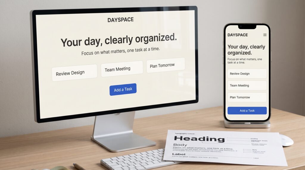
This UI typography tutorial explains how to make interface text easier to read, understand, and act on. Typography influences how people scan a dashboard, complete a form, and recognize the next step. Even a visually attractive screen can feel confusing when headings compete, labels look faint, or paragraphs become difficult to follow.
You do not need an elaborate font collection to improve an interface. Start with a clear content structure, choose a suitable typeface, and create consistent relationships between text styles. Throughout this guide, imagine you are designing a project-management dashboard with a page heading, task cards, filters, and a simple form.
Start Your UI Typography Tutorial With Real Content
Before choosing font sizes, list the information your screen needs to communicate. For our dashboard, that might include the page title, project names, task descriptions, deadlines, and action labels.
Next, assign each piece a role. A project name helps someone identify an item. A deadline adds context. A button tells them what they can do.
This step gives your typography a purpose. Without it, you may enlarge text simply because an area looks empty.
Use realistic wording rather than repeating short placeholder phrases. Include one long project name and a detailed task description. These examples expose layout problems early.
Practice: Sketch the dashboard using plain text. Decide what users should notice first, second, and third before styling anything.
Choose Fonts in Your UI Typography Tutorial
A useful interface typeface should remain clear in the situations where your product will use it. Examine ordinary words, small labels, numbers, and punctuation.
Look closely at characters that might be confused, such as a lowercase “l,” an uppercase “I,” and the number “1.” Also compare how dates, prices, and percentages appear.
For this UI typography tutorial, begin with one font family that provides the weights you need. This keeps the first version manageable and makes inconsistencies easier to spot.
Check the font’s license and required language coverage before building around it. Test actual interface strings rather than judging only a large alphabet specimen.
Practice: Compare two candidates using the same task card. Choose the one that makes the content easiest to distinguish at its intended size.
Build Hierarchy With This UI Typography Tutorial
Hierarchy gives text roles a recognizable order. A page title should feel different from a task name, while supporting information should remain readable without competing for attention.
Create that order through a combination of size, weight, spacing, and placement. Avoid relying on a tiny size difference alone.
For the dashboard, make the page heading prominent, task names moderately emphasized, and descriptions regular in weight. Keep deadlines quieter through placement and restrained styling.
The goal of this UI typography tutorial is a screen people can scan without having to study every line.
Practice: Look at your design at a reduced zoom. Can you still identify the page title, group headings, and main action? If everything feels equally strong, simplify the hierarchy.
Define a Practical Interface Type Scale
A type scale is a small set of sizes with assigned uses. The following values are starting points for this exercise, rather than requirements for every product.
| Text role | Starting size | Suggested weight |
|---|---|---|
| Page heading | 30 px | Bold |
| Section heading | 22 px | Semibold |
| Card title | 18 px | Semibold |
| Body text | 16 px | Regular |
| Label or button | 16 px | Medium |
| Supporting detail | 14 px | Regular |
Test these values with your chosen font. Two typefaces at the same nominal size can feel different because their letterforms and proportions differ.
As you follow this UI typography tutorial, resist adding a new size for every small problem. First check whether spacing, width, or weight would resolve it.
Practice: Apply the scale across three screens and note where a role genuinely needs adjustment.
Also Read: How to Design a WordPress Blog That Looks Professional
Adjust Spacing in Your UI Typography Tutorial
Readable typography needs room both inside and around text blocks. Start by reviewing line spacing in task descriptions.
As an experiment, give 16 px body text a 24 px line height. Then compare a slightly tighter and looser version using the same paragraph. Choose based on the font, available width, and reading experience.
Next, examine grouping. A label should sit close enough to its field that the relationship is obvious. Separate unrelated sections more clearly.
This UI typography tutorial uses spacing to communicate structure rather than decorate empty areas.
Practice: Remove borders from a form temporarily. Can you still tell which label, input, and helper message belong together? If the relationships become unclear, revise the spacing.
Control Line Length and Text Wrapping
A paragraph can become uncomfortable when stretched across an entire desktop panel. Very narrow columns create a different problem by forcing frequent line breaks.
Give descriptions a sensible maximum width and inspect their actual wrapping. A card containing three words will not reveal the same problems as one containing a detailed explanation.
Pay special attention to long project names, email addresses, and translated text. Decide how each component should behave when content grows.
For this UI typography tutorial, allow important task names to wrap before considering truncation. If you shorten text visually, provide a practical way to access the full wording.
Practice: Replace your shortest heading with a much longer one. Check whether the card grows naturally without covering its actions.
Balance Weight and Contrast for Readability
Text needs enough visual distinction from its background to remain easy to read. Pale supporting text may look elegant on a large monitor yet become difficult in ordinary viewing conditions.
Keep useful information readable, including timestamps, helper messages, and form instructions. Supporting content is still content people may need.
Use font weight with similar care. If every label and sentence is bold, emphasis loses its purpose. Reserve stronger weights for clear roles.
During this UI typography tutorial, check selected, disabled, and error states as well as the default screen. Do not make an error understandable through color alone, include a clear message.
Practice: Review the interface in grayscale to inspect hierarchy, then check the actual color combinations separately.
Apply Your UI Typography Tutorial to Forms and Buttons
Forms bring several text roles together in a small area. Each field may need a label, an entered value, an example, and a message explaining a problem.
Make those roles distinct without creating a collection of unrelated styles. Keep labels visible and write helper text that answers a likely question.
Button wording also matters. “Create project” describes an outcome more clearly than a vague label such as “Go.”
Align text carefully inside controls, leaving enough space around the words. Test longer labels before fixing a narrow button width.
Practice: Design a project-creation form in its empty, completed, and error states. Check whether the typography helps someone understand what to do in each version.
Also Read: Complete Website Tutorial for Beginners and Business Owners
Test Responsive Typography Across Screen Sizes
A desktop layout gives text more room than a phone screen. Simply shrinking every style can make the smaller interface harder to use.
Instead, review the layout and content relationships. A large heading may need a smaller size, while body text can remain comfortable and the surrounding panels become simpler.
Allow buttons and cards to accommodate wrapped text. Avoid fixed heights that work only when every label stays on one line.
Continue this UI typography tutorial with browser text enlargement or zoom testing. Look for clipped words, overlapping controls, and information that becomes inaccessible.
Practice: Review the same dashboard on a wide screen, a narrow screen, and with enlarged text. Record problems by component so you can fix their underlying rules.
Turn Typography Decisions Into Reusable Styles
Once the design works, document the styles rather than leaving each text block independent.
Name styles according to their roles, such as page title, card title, body, label, and supporting text. Record the font family, size, weight, line height, and intended use.
Role-based names explain why a style exists. They also make it easier to update a group of related elements consistently.
Your UI typography tutorial should end with a repeatable system, not a single polished screen.
Practice: Build one reusable task-card component and one form-field component. Change their content several times. Confirm that the same typography rules continue to work without manual fixes.
Review Your Interface With a Reading Task
A final review should focus on what someone can understand and complete. Ask another person to find an overdue task, identify its project, and create a new item.
Observe where they pause. They may miss a deadline because it looks decorative or mistake a heading for an interactive element.
Ask them to explain what they expected rather than whether the screen looks good. Their answer gives you something specific to improve.
Revisit the affected text role, spacing, or wording, then repeat the task. Keep a short record of changes so you understand which adjustment helped.
Also Read: Figma Grid Tutorial: How to Create Better UI Layouts
Conclusion – Make Interface Typography Easier to Use
This UI typography tutorial gives you a practical process, organize real content, choose a readable font, establish hierarchy, and test the results across different conditions.
Begin with one screen and a limited set of styles. Use realistic text, inspect uncomfortable line breaks, and check how the interface behaves when people enlarge it.
Clear typography helps people find information and act with confidence. Your strongest decisions will come from understanding the content and watching how the design works in practice.
For high-quality fonts to boost your income, check out Letter Crafted. Our professional fonts are perfect for branding, marketing, and content creation. So, don’t miss this opportunity.