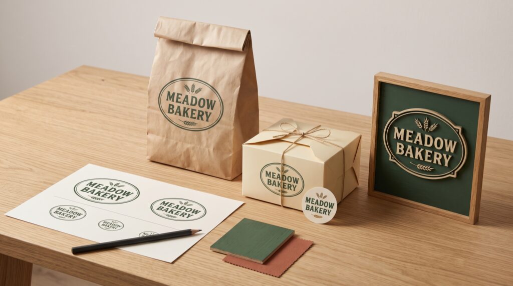
Badge logos bring a business name, symbol, and supporting details into a contained shape. That structure can look distinctive on a package or storefront, but it also creates challenges. Small lettering may disappear on a label, while decorative borders can compete with the name when the mark appears on a sign.
A useful design needs more than an attractive large-scale presentation. It should remain recognizable across different sizes, materials, and viewing conditions. This guide explains how to develop a flexible badge identity, using a fictional neighborhood bakery as an example, from organizing the lettering to checking finished samples.
Start Badge Logos With Real Applications
List where the mark will appear before refining its details. A bakery might need a bag stamp, a box label, a window graphic, and a sign above the entrance.
Record the available space and how people will encounter each application. Someone holding a box can look closely, while a person walking past the shop needs to understand the sign more quickly.
These differences help you decide what the design must prioritize.
Begin with the smallest application and the most demanding distant view. If the name struggles in either setting, revise the structure before adding decoration.
Give Badge Logos a Clear Information Hierarchy
A badge can hold several pieces of information, but they do not all need equal emphasis. Decide what viewers should recognize first, second, and third.
For the bakery, the business name should lead. A simple bread symbol might support recognition, while a short descriptor explains the offer.
Keep secondary information modest. A location, date, and slogan can easily crowd the main message when combined.
A practical hierarchy might be:
| Element | Intended role |
|---|---|
| Business name | Primary identification |
| Main symbol | Supporting visual recognition |
| Short descriptor | Clarifies the business |
| Optional detail | Adds context where space permits |
Use this order to guide size, weight, and placement.
Choose Badge Shapes That Fit the Wording
Circles, ovals, shields, and rectangular emblems create different spaces for lettering. Choose a shape that accommodates the name rather than forcing the name into a preferred outline.
A long business name may fit an oval more comfortably than a compact circle. A shield can offer a strong silhouette, but its narrowing base may limit the space for supporting words.
Sketch several arrangements with the actual text.
When developing badge logos, examine the empty areas as carefully as the filled ones. Uneven gaps can make an otherwise symmetrical mark feel awkward or unbalanced.
Keep Badge Logo Lettering Readable
Decorative lettering can establish personality, but readability needs to survive reduction. Inspect fine strokes, narrow counters, and letters that join in confusing ways.
Curved text deserves special attention. A tight arc can change spacing and make the beginning or end of a word difficult to follow.
Adjust the size and curvature together. Avoid stretching letters simply to fill the available path.
Test your business name in plain black before introducing color or texture. Ask someone unfamiliar with the project to read it.
If the same letters repeatedly cause hesitation, investigate the typography rather than relying on context to explain the name.
Simplify Badge Logos for Small Packaging
A detailed primary mark may need a related version for small labels. The smaller variation can retain the name and main silhouette while removing a slogan or secondary border.
Decide which elements make the identity recognizable. Keep those features consistent across versions.
For the bakery, a compact badge might include only the business name, bread symbol, and outer shape. The full version could add the descriptor.
This approach helps badge logos adapt without becoming unrelated designs.
Compare the versions side by side, then examine each at its intended size. Removing detail should improve clarity while preserving the character of the mark.
Also Read: Minimalist Photography Logo Design for a Professional Look
Place Badge Logos Within the Packaging Layout
The logo is one part of a package. Product names, variations, instructions, and other information still need a clear place.
Avoid enlarging the badge until everything else becomes difficult to arrange. Establish the relationship between brand identification and product identification first.
For a bakery box label, the badge might sit above “Almond Cookies,” with the product details grouped separately below.
Give the mark breathing room around its border. A badge already contains several elements, so surrounding text can make it feel crowded quickly.
Review the complete label, rather than judging the logo in isolation. Customers need to understand both the business and the item.
Check Curves, Seams, and Package Edges
Flat artwork does not reveal every packaging problem. A circular badge may bend around a jar, disappear over a bag fold, or sit too close to a box edge.
Apply a printed sample to the intended package where practical. Examine the normal front view and rotate the object to inspect visibility.
Keep essential lettering away from areas that become hidden or distorted.
For badge logos on flexible bags, check the package both empty and filled. The surface may behave differently once the product is inside.
Use these observations to adjust placement or select a more suitable variation before producing a larger quantity.
Design Badge Logos for Sign Viewing Conditions
A sign needs to communicate within its setting. Consider its size, placement, surrounding visual activity, and the directions from which people approach.
The business name should remain the clearest part of the badge. Supporting text that works on packaging may contribute little when viewed from across the street.
Prepare a sign version with fewer details if necessary. Keep the same core shape and lettering so the identity remains connected.
Test badge logos at a realistic viewing distance. An enlarged mockup on a monitor can make small wording appear more useful than it will be in place.
Balance Borders and Decorative Elements
Borders, ribbons, stars, and flourishes can reinforce the badge structure. They can also draw attention away from the name.
Start with one useful boundary and add details selectively. Check whether each addition improves organization or simply fills empty space.
Pay attention to border weight. An outer line that feels appropriate at a large size may become too heavy in a small stamp.
Likewise, multiple narrow rings can merge when reduced.
Compare a decorated version with a simplified one. If the simpler mark communicates more clearly, keep decorative treatments for applications where their detail can be appreciated.
Also Read: Bold Logo Design Inspiration for Colorful and Energetic Brands
Create Dependable Color and Single-Color Versions
Color can distinguish a brand, but the design should also function in a single color. This provides a useful foundation for stamps, simple printing, and other limited applications.
Check whether overlapping shapes remain understandable without different colors separating them.
Create a reversed version for darker backgrounds and inspect its internal spaces. Do not assume that changing black to white will always preserve the same visual balance.
When applying badge logos, choose backgrounds that keep the name and silhouette clear.
Review the logo alongside actual packaging colors. A combination that works on white may need a different treatment on kraft paper or a photograph.
Match Badge Logos to the Production Method
Printing, cutting, engraving, and dimensional fabrication place different demands on artwork. Discuss the intended result with the person producing it before finalizing fine details.
Ask which lines, gaps, and materials need attention for that particular process. Use the resulting requirements to refine the relevant version.
Keep a clean vector master for scalable artwork. Prepare production files according to the agreed specifications rather than assuming one export fits every supplier.
For badge logos, inspect enclosed spaces and small decorative shapes carefully. A successful digital preview does not establish whether every part can be reproduced clearly in the chosen material.
Test Badge Logos Before Final Approval
Use a small set of realistic checks to compare the design across applications.
Review Packaging at Actual Size
Print the label, position it on the package, and look at it under ordinary lighting. Confirm that the name, symbol, and product information remain distinct.
Check more than one package from the range.
Inspect Sign Visibility
Review a scaled preview in context and, where possible, a physical sample. Step back and identify what remains readable.
Remove information that contributes clutter without helping recognition.
Ask for Unprompted Feedback
Show the design to someone who has not seen the brief. Ask what name they read and what type of business they expect.
Specific questions provide more useful feedback than asking whether the logo looks attractive.
Prepare a Practical Badge Logo Guide
Document the approved variations so future applications remain consistent. Explain which version belongs on a small label, a sign, or a dark background.
Include spacing rules, color values, and examples of unsuitable treatments. Show why stretching, excessive reduction, or added shadows can weaken the design.
Name the files clearly and keep outdated versions away from the active folder.
A concise guide helps staff and suppliers use badge logos with fewer improvised changes. Review it when a new application reveals a genuine need for another version.
Also Read: Simple Circle Logo Design Ideas for Better Branding
Conclusion – Build a Badge Identity That Works Beyond the Mockup
Effective badge logos balance character with readable information. Their shape supports the name, their details survive the intended size, and their variations remain recognizably related.
Begin with real packaging and sign requirements. Establish hierarchy, simplify where needed, and test the artwork in its actual setting.
Those decisions give your business a mark that can travel from a small box label to a storefront while continuing to look clear, deliberate, and connected.
For high-quality fonts to boost your income, check out Letter Crafted. Our professional fonts are perfect for branding, marketing, and content creation. So, don’t miss this opportunity.