
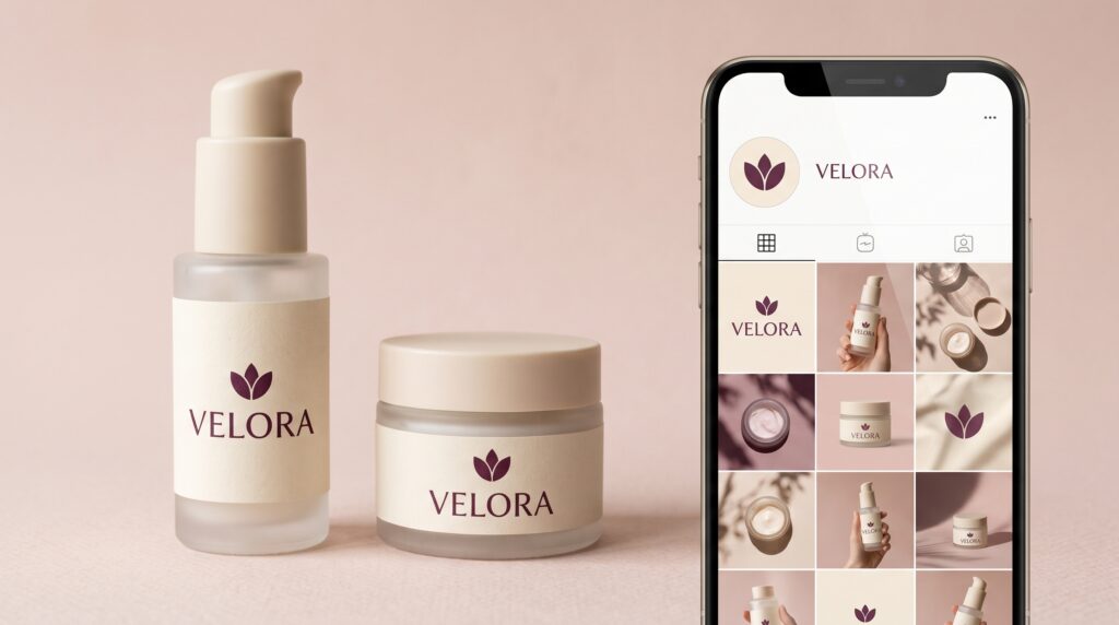
A beauty logo needs to remain recognizable in places that offer very different amounts of space. It may appear on a narrow bottle, a small jar lid, a social profile image, and a product launch graphic. A design that looks elegant on a large presentation board can become difficult to read when those everyday applications arrive.
The solution begins with planning a flexible identity rather than squeezing one arrangement into every format. This guide explains how to develop useful variations, protect readability, and test your decisions. Imagine a fictional skincare business preparing labels and social content for its first coordinated product collection.
Start Your Beauty Logo With Real Applications
Before adjusting letterforms or choosing a symbol, list where the identity will appear. Include actual packaging shapes and digital placements.
A tall bottle label has different proportions from a square social post. A circular profile crop creates another challenge, especially when the business name is long.
Collect measurements or working templates for your intended applications. Then arrange them together so you can see the range of spaces the logo must accommodate.
For the fictional skincare business, the priority list might include a bottle front, a jar lid, a shipping sticker, a profile image, and a product announcement.
Design against those requirements from the beginning.
Build a Flexible Beauty Logo Family
Your main logo does not need to perform every task alone. Develop a small set of related arrangements that retain recognizable details.
A horizontal version may suit a website header. A stacked version could fit a square label, while a compact symbol may work inside a profile image.
Keep the family connected through consistent letterforms, proportions, and symbol construction.
| Logo version | Possible application |
|---|---|
| Primary arrangement | Product fronts and brand introductions |
| Stacked arrangement | Square labels and compact layouts |
| Compact mark | Profile images and small stickers |
| Single-color version | Simple print applications |
| Reversed version | Dark backgrounds |
Create variations because the applications require them. An unnecessary collection can make choosing the correct file more confusing.
Make Beauty Logo Typography Readable at Small Sizes
Lettering carries much of the identity in a wordmark. Examine how the name reads when reduced, particularly if you use fine strokes, tightly joined letters, or decorative details.
A script may feel expressive at a large size while becoming difficult to distinguish on a small bottle. Closely spaced capitals can create a similar problem.
Print the name at its likely label size and review it without zooming in. Also check it as a small image on a phone.
If readability weakens, adjust spacing, simplify details, or develop a carefully related small-use version.
Choose typography according to both the intended personality and the practical reading task.
Give the Beauty Logo and Product Name Different Roles
Packaging contains several layers of information. The customer needs to identify the brand, understand the product, and distinguish the variation.
Decide how these elements relate before making any one of them larger.
For a cleanser label, the beauty logo may establish the brand while “Daily Cleanser” explains the item. A variation name can sit beneath it at a supporting level.
Avoid making every line equally decorative or prominent. That forces readers to work out the structure themselves.
Prepare several labels together and compare their hierarchy. The brand should remain recognizable while each product retains a clear identity.
Also Read: Fitness Logo Design Ideas for a Strong Brand Identity
Protect Clear Space Around Your Beauty Logo
A logo needs room to remain distinct from nearby text, borders, and images. Establish a repeatable spacing rule rather than adjusting each application by eye.
You could use a recognizable part of the mark as a reference unit. Document the minimum space around the logo and illustrate it in a simple diagram.
Then test the rule on the smallest label.
Clear space also matters in social layouts. A logo pressed against a photograph’s edge or surrounded by competing stickers may lose its presence.
Give the mark enough separation to be understood. If the available space becomes too crowded, revise the surrounding composition before shrinking everything.
Adapt the Beauty Logo to Curved Packaging
A flat label artwork does not show exactly how the design will appear on a bottle or jar. Curvature can move parts of the name out of view, while seams and edges may interrupt the composition.
Position the most important elements within the area customers can comfortably see from the intended front view.
Use a physical sample or a realistically wrapped mockup to inspect the result. Rotate the package and examine where the name begins to disappear.
For a long wordmark, a stacked arrangement may provide a more practical solution.
Also check the relationship between the logo, product information, label edges, and closure. The package should look considered as a complete object.
Choose Beauty Logo Colors for Reliable Contrast
A color palette needs to work across backgrounds and materials. Pale lettering on a pale label may look subtle on screen but become difficult to read in an ordinary photograph.
Create a dependable high-contrast version before exploring decorative finishes.
Test the beauty logo on light and dark backgrounds, alongside product photography, and in a single color. A reversed version should be checked carefully rather than assumed to work automatically.
Materials can change the appearance, too. A glossy surface, transparent container, or textured stock introduces different conditions.
Inspect representative samples where possible. Treat screen previews as part of the process rather than the final answer.
Simplify the Beauty Logo for Social Profile Images
Profile images give the identity a small, often cropped space. A full business name with a tagline may become unreadable.
Test a compact version inside both a square and a circular crop. Leave enough breathing room around the edges so the mark does not feel cramped.
If you use initials or a symbol, make sure its relationship with the wider identity is clear. Supporting account information can provide the full business name.
Review the profile image on a phone at its normal display size. Avoid judging only the enlarged upload preview.
The goal is a recognizable presence, with a shape and contrast that remain clear.
Also Read: Travel Logo Inspiration for Luxury, Adventure, and Local Tours
Keep Social Content Connected Without Repeating the Same Layout
A recognizable feed does not require identical graphics. Use a shared palette, typography system, and approach to spacing while allowing each post to serve its content.
Place the beauty logo where it supports the composition. Some branded announcements may need a visible mark, while a product photograph already shows the identity on the package.
Avoid adding another large logo simply to fill an empty corner.
Create a few practical templates like a product introduction, an informational post, and a promotional announcement. Give each one a defined logo treatment.
Consistency comes from related decisions, even when the content and arrangement change.
Photograph the Beauty Logo Clearly on Products
Product photography brings packaging and digital branding together. Check whether the logo remains readable at the angle you choose.
Reflections, shadows, and props can cover important lettering. Turn the product slightly, adjust the light, or simplify the setting before changing the label design.
Include at least one straightforward view that clearly shows the front of the package. More atmospheric images can complement that view.
Review the photograph at the size it will appear in a post or product listing. A logo visible in the original file may become difficult to identify after the image is reduced.
Keep the presentation accurate to what customers will receive.
Prepare Beauty Logo Files Your Team Can Use
Organized files help prevent inconsistent versions from spreading across packaging and social content.
Name each asset according to its purpose, arrangement, and background. For example, distinguish a primary dark mark from a compact light version.
Include editable master artwork and suitable exported files. Keep a vector master for scaling, and prepare transparent-background images where needed for digital layouts.
Explain which files belong to print production and which are ready for routine social use. Confirm production requirements with the person preparing the actual output.
Store approved assets together and move outdated versions away from the active folder. A clear starting point reduces avoidable improvisation.
Test the Identity Before Launch
Review the beauty logo as a working system rather than a collection of attractive mockups.
Check Labels at Actual Size
Print sample artwork and place it on the intended packaging where practical. Examine readability, hierarchy, wrapping, and placement.
Check the smallest package first, then compare the collection together.
Review Social Assets on a Phone
Inspect the profile crop, feed graphic, and product photograph at normal viewing size. Check whether the name or compact mark remains identifiable.
Also review busy backgrounds and darker images.
Ask Someone Unfamiliar With the Brand
Show the applications without explaining them first. Ask what name they read, which product they see, and whether the assets appear related.
Use repeated misunderstandings to guide revisions rather than asking only whether the designs look attractive.
Also Read: Creative Bakery Logo Design Ideas That Look Professional
Conclusion – Keep Your Beauty Logo Consistent as the Brand Grows
A short usage guide makes the system easier to maintain. Include approved variations, clear-space rules, background options, and examples of correct placement.
When you introduce a new product or campaign format, begin with those rules. Add a variation only when the existing options cannot serve the application well.
Keep notes about any production adjustments so the next label does not repeat the same problem.
Your beauty logo becomes more useful when it can adapt without losing its recognizable character. Clear typography, thoughtful variations, realistic samples, and organized assets give you a practical foundation across both packaging and social media.
For high-quality fonts to boost your income, check out Letter Crafted. Our professional fonts are perfect for branding, marketing, and content creation. So, don’t miss this opportunity.