
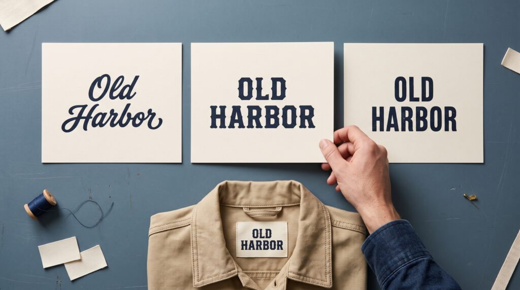
Vintage logo fonts can give a brand warmth, personality, and a sense of familiarity. A rounded script may suggest a friendly neighborhood business, while a sturdy serif can support a more traditional identity. The strongest choice connects those visual qualities with the business you are building and the people you want to reach.
Choosing a font involves more than finding lettering that looks old. Your name needs to remain readable, fit its everyday applications, and work alongside supporting information. This guide explains how to compare options and turn a promising type style into a practical foundation for your logo.
Start With What Your Vintage Logo Fonts Should Communicate
Define the brand’s character before opening a font menu. Choose a few useful descriptions, such as welcoming, adventurous, refined, or playful.
Then connect those words with the customer experience. A relaxed bakery may want approachable lettering, while a workshop producing durable goods may need something more structured.
Avoid collecting personality words that point in conflicting directions. “Delicate, rugged, formal, and cheerful” gives you too many competing goals.
Write a short brief describing the business, its audience, and the intended impression. Use it to evaluate options rather than allowing a particularly attractive font to change the project’s direction.
Choose a Vintage Direction Before Choosing a Font
“Vintage” covers many visual approaches. Decide which qualities interest you instead of combining every nostalgic detail.
You might explore compact lettering, generous rounded forms, expressive scripts, decorative serifs, or geometric shapes. Describe the features you want to investigate.
For example, “rounded letters with a welcoming rhythm” provides a clearer starting point than “something retro.”
When reviewing vintage logo fonts, separate lettering from surrounding effects. A warm paper texture or muted palette can make almost any specimen feel nostalgic.
Inspect the type in plain black first. You should be able to explain what you like about the letterforms themselves.
Compare Vintage Logo Fonts by Structure
Different type styles create different relationships between weight, movement, and detail. Use those characteristics to narrow your options.
| Type direction | Qualities to examine | Potential challenge |
|---|---|---|
| Script | Flow, joins, rhythm, swashes | Letters may become difficult to distinguish |
| Slab serif | Weight, sturdy terminals, width | Dense forms may need more breathing room |
| Decorative serif | Contrast, unusual details, character | Fine elements may weaken at small sizes |
| Rounded display | Soft shapes, generous curves, personality | Spacing needs careful attention |
| Condensed display | Narrow proportions, compact footprint | Tight internal spaces can reduce clarity |
These are comparison points rather than fixed rules about which business should use each style.
Choose two or three directions that suit the brief, then test your name.
Test Vintage Logo Fonts With Your Actual Brand Name
A font specimen shows the letters selected to present the typeface. Your business name may contain a completely different combination.
Set the complete name before making a shortlist. Examine repeated letters, awkward joins, and changes in visual rhythm.
A script might look beautiful with one sequence but become tangled with another. A condensed font may handle a short name well while making a longer one feel crowded.
Compare vintage logo fonts using the same wording, approximate visual size, and background. This makes differences easier to judge.
Avoid letting one option benefit from a polished mockup while another appears as an unfinished text line.
Also Read: Vintage Logo AI Prompts for Better Retro Branding Results
Prioritize Readability Before Adding Character
A logo needs to identify the business. Decorative personality becomes less useful when people cannot confidently read the name.
Look for ambiguous letters, crowded joins, and flourishes that resemble additional characters. Pay particular attention to the beginning and ending of the word.
Show the name to someone unfamiliar with the project. Ask what they read before explaining the intended answer.
If several people misunderstand the same part, investigate the letterform or spacing.
Useful vintage logo fonts provide character while leaving the name recognizable. You may need to simplify an alternate or choose a different style rather than correcting every problem individually.
Match Vintage Logo Fonts to Everyday Applications
List the places where the logo will appear. Include the smallest and most constrained applications, not only the most attractive presentation.
A shop sign, narrow label, website header, and circular profile image offer different spaces. Your lettering needs a workable response to each.
Test the wordmark at actual viewing sizes. A long horizontal name may need a related stacked arrangement for compact placements.
When selecting vintage logo fonts, consider stroke thickness and internal spaces. Small counters or delicate joins may become less distinct when reduced.
Keep notes on which options remain clear across the applications that matter most to your business.
Adjust Letter Spacing With Care
A font gives you a starting arrangement, but the specific word may need refinement. Look at the spaces between letters as shapes within the whole name.
Some pairs may appear too open, while others feel crowded. Adjust them in context rather than trying to make every numerical spacing value identical.
Step back regularly and review the complete word. A close-up view can make a tiny issue feel more significant than it is.
For vintage logo fonts with connected letters, check whether spacing changes interrupt the intended joins.
Create a few versions and compare them at normal size before choosing the most balanced arrangement.
Pair Vintage Logo Fonts With Supporting Typography
Your logo may appear alongside a descriptor, location, or short tagline. Supporting text should establish a clear hierarchy instead of competing for attention.
Begin with one expressive font for the name and a simpler style for secondary information. Contrast can come from structure, weight, or spacing.
Keep the supporting text readable. Small uppercase letters with excessive spacing can become difficult to follow on compact labels.
When pairing vintage logo fonts, test the full wording rather than a convenient placeholder. A long descriptor may require a different arrangement.
You do not need multiple display fonts to create a rich identity. One distinctive wordmark can carry plenty of personality.
Also Read: Simple Circle Logo Design Ideas for Better Branding
Customize Vintage Logo Fonts With Restraint
Customization can help adapt a typeface to your name. You might refine a terminal, shorten a swash, or adjust a letter’s width.
Start by identifying the problem or opportunity. A useful modification improves recognition, balance, or the connection with your brand.
Avoid changing several letters simply to make the result look more complicated. Each adjustment should work with the typeface’s underlying structure.
Compare the customized version with the original. Check whether you have introduced inconsistent stroke weight or an awkward join.
Keep editable working files and record your changes. Review the font’s permitted uses before building a commercial identity around it.
Use Texture Without Depending on It
Texture can add atmosphere, but it should not be the only source of vintage character. A logo needs to work as a clean, solid shape too.
Build the primary version without distressing. Then develop a textured treatment if it serves particular applications.
Check whether worn details interfere with important letter parts. The effect can become especially noticeable on small packaging or low-resolution images.
Strong vintage logo fonts should remain recognizable when the texture is removed.
Treat distressed artwork as a controlled variation. Keep its purpose clear so it does not automatically appear on every label, profile image, and document.
Evaluate Vintage Logo Fonts in Realistic Mockups
Mockups help you see how lettering interacts with materials, images, and layout. Use them after the basic wordmark is readable.
Place the same shortlisted options on the same applications. Compare a package front, a plain website header, and a small social profile treatment.
Keep lighting and presentation consistent. Otherwise, an attractive scene can influence your preference more than the actual lettering.
Also inspect flat artwork outside the mockup. Perspective and texture can conceal weak spacing.
For printed applications, review a physical sample where practical. A convincing image does not establish how the final material will reproduce fine details.
Organize Your Vintage Logo Fonts Shortlist
A short comparison record makes the decision easier to explain. Note strengths, concerns, and unresolved questions for each option.
Review Brand Fit
Return to the original brief. Describe how the lettering supports the intended personality and which features create that impression.
Avoid relying only on whether the team likes the style.
Check Practical Performance
Compare readability, spacing, small-size behavior, and flexibility. Identify any application that would need a separate arrangement.
A font that performs well across your priority uses may be more practical than one that requires repeated repairs.
Confirm the Working Requirements
Check available characters, file formats, and permitted usage. Keep the relevant records with your project files.
Before finalizing, make sure the people responsible for using the identity can access the correct assets and understand their purpose.
Also Read: Gold Logo Design Ideas for Luxury and Premium Brands
Conclusion – Choose Lettering You Can Build Around
Choosing vintage logo fonts becomes easier when you connect visual character with practical use. Define the brand’s personality, explore a focused direction, and compare your actual name across realistic applications.
Refine spacing and supporting typography before adding decorative treatments. Then review the complete system, including compact and single-color versions.
The right choice gives you more than a nostalgic impression. It provides readable, recognizable lettering that can support the business wherever its name needs to appear.
For high-quality fonts to boost your income, check out Letter Crafted. Our professional fonts are perfect for branding, marketing, and content creation. So, don’t miss this opportunity.