
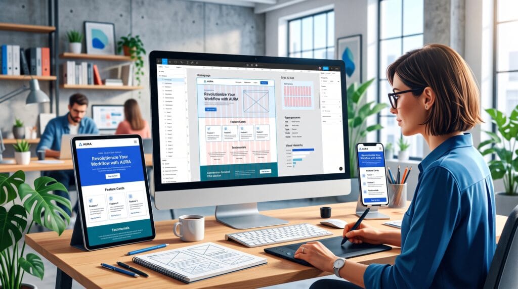
Strong website layout design gives users a clear path through information, actions, and decisions. It determines what visitors notice first, how quickly they understand the page, and whether they can complete a task without confusion. A beautiful interface can still fail when its structure is weak, while a simple page can feel professional when the layout is clear and intentional.
Website layouts are not merely arrangements of boxes. They are systems that combine hierarchy, grids, spacing, typography, imagery, navigation, responsive behavior, and accessibility. Every section should support the user’s goal while reinforcing the business objective of the page.
This guide explains the website layout design principles every designer should know, including practical methods for building wireframes, organizing content, creating responsive systems, improving usability, and avoiding common layout mistakes.
Why Website Layout Design Matters
A website layout controls how people experience content before they read every word. Users often scan a page quickly, looking for recognizable headings, navigation, images, prices, benefits, or calls to action. A strong layout helps them locate those elements without unnecessary effort.
Effective website layout design can help:
- Create a clear reading and interaction path
- Reduce cognitive effort and user confusion
- Improve navigation and content discovery
- Support brand recognition and visual consistency
- Increase trust through professional presentation
- Make content easier to scan on small screens
- Guide attention toward important actions
- Improve accessibility and usability
The best layouts balance user needs with business goals. They do not force visitors toward an action before providing enough context. Instead, they create a logical sequence that builds understanding and confidence.
Website Layout Design Starts With Content
Define the Page Goal
Before opening a design tool, define the primary goal of the page. A homepage may introduce the brand and route users to key areas. A landing page may persuade visitors to request a demo. A product page may help users compare options and complete a purchase.
A page with too many equal goals usually creates a weak hierarchy. Choose one primary action and a small number of supporting actions.
Organize the Content Before Styling
Create a content outline before selecting colors, fonts, or imagery. Group information according to what users need to know and the order in which they need it.
A practical content sequence may include:
- The main value proposition
- Evidence that the offer is relevant
- Key benefits or features
- How the process works
- Proof, testimonials, or results
- Frequently asked questions
- A clear call to action
The exact sequence varies by page type, but the principle remains the same: content should lead the layout rather than being forced into a decorative template.
Use Visual Hierarchy in Website Layout Design
Visual hierarchy tells users what is most important. It uses size, weight, color, placement, contrast, and spacing to create an order of attention.
Create One Dominant Entry Point
Most pages need a clear starting point. This may be the headline, a product image, a search field, or a featured action. When several elements compete at the same visual intensity, users must decide where to look.
The dominant element should communicate the page purpose quickly. Supporting content should be visually quieter but still easy to find.
Build Clear Information Levels
A reliable hierarchy often includes:
- Primary headline
- Supporting headline or short explanation
- Section headings
- Body content
- Labels and metadata
- Primary and secondary actions
Keep these levels consistent across the site. When every page invents a new heading scale, users lose the benefits of familiarity.
Use Contrast With Purpose
Contrast can be created through scale, color, weight, shape, or empty space. Use it to clarify priority, not to decorate every section. If everything is bold, bright, or oversized, nothing feels important.
Also Read: Graphic Design Layout Ideas How to Use White Space Better
Grid Systems for Better Website Layout Design
A grid provides an invisible structure for aligning content. It creates consistent margins, columns, gaps, and relationships between sections. A grid does not make every page look the same. It creates rules that support controlled variation.
Choose the Right Grid
Common website grid systems include:
Single-column grid – Useful for articles, simple landing pages, and focused mobile layouts.
Multi-column grid – Useful for marketing pages, dashboards, ecommerce, and editorial layouts.
Modular grid – Useful for cards, galleries, product listings, and interfaces with repeated content blocks.
Asymmetrical grid – Useful when a design needs energy or editorial character while maintaining alignment.
Use Consistent Gutters and Margins
Gutters are the spaces between columns. Margins create space around the content area. Inconsistent gutter widths can make a page feel unstable, while margins that are too narrow can make content feel crowded.
Create spacing values as part of the design system. For example, a site might use increments of 4, 8, 16, 24, 32, 48, and 64 pixels. A limited scale makes spacing decisions faster and more consistent.
Break the Grid Intentionally
A full-width image, overlapping card, or offset heading can create emphasis. However, breaking the grid works only when the underlying structure is strong. Random misalignment looks like an error, while deliberate contrast feels designed.
White Space Is a Structural Tool
White space, also called negative space, is the empty area around elements. It improves grouping, readability, rhythm, and focus. It does not need to be white. It is simply space without competing content.
Use Proximity to Show Relationships
Elements placed close together appear related. Elements separated by more space appear to belong to different groups. This principle can reduce the need for borders, boxes, and decorative dividers.
For example, a heading should usually sit closer to the paragraph it introduces than to the previous section. A form label should be closer to its input field than to another label.
Create a Consistent Vertical Rhythm
Vertical rhythm is the repeated pattern of spacing between headings, paragraphs, images, cards, and sections. Consistency helps users understand the structure without consciously analyzing it.
Use larger spacing between major sections and smaller spacing within related content groups. This creates a natural reading pace.
Avoid Empty Space Without Purpose
Generous spacing can create elegance, but excessive spacing can make users scroll without gaining value. Every gap should support grouping, focus, rhythm, or comfort.
Typography in Website Layout Design
Typography affects the layout because text size, line length, weight, and line height determine the shape of every content block. A design can change dramatically when the final copy replaces placeholder text.
Control Line Length
Long lines are difficult to follow, while very short lines interrupt reading. For many desktop paragraphs, approximately 45 to 75 characters per line is a useful starting range. Mobile layouts naturally use shorter lines.
Create a Responsive Type Scale
Headlines should reduce gracefully on smaller screens. Avoid scaling every type size by the same percentage. Instead, define readable values for mobile, tablet, and desktop while preserving the hierarchy.
Separate Reading Type From Display Type
Expressive fonts can add personality to headlines, but body text should remain comfortable and stable. Limit the number of typefaces and assign each a clear role.
Also Read: Graphic Design Typography Mistakes and How to Fix Them
Navigation and Orientation Principles
Make Navigation Predictable
Users should not need to learn a new navigation system on every page. Keep the main menu, search, account access, and important utility links in familiar positions.
Navigation labels should describe destinations clearly. Avoid creative wording when standard terms such as Services, Pricing, Contact, or About are easier to understand.
Show Users Where They Are
Active navigation states, breadcrumbs, page titles, and section indicators help users understand their location. This is especially important on large websites, ecommerce stores, documentation platforms, and dashboards.
Keep Important Actions Visible
A primary action should be easy to locate, but it should not overwhelm every section. Use a consistent button style and repeat the action at logical points after users receive enough information to decide.
Responsive Website Layout Design
Responsive design is not the process of shrinking a desktop page. It requires reorganizing content for different screen sizes, input methods, and viewing conditions.
Design Mobile Content Priority
Mobile screens reveal whether the hierarchy is truly clear. Decide which content must appear first, which elements can collapse, and which supporting details can move later in the page.
On small screens:
- Stack columns in a meaningful order
- Increase touch target sizes
- Reduce unnecessary decorative elements
- Keep navigation simple
- Avoid text embedded inside images
- Use comfortable side padding
- Test long headings and translated content
Use Flexible Components
Cards, media blocks, tables, forms, and navigation components should adapt to available space. Define minimum and maximum widths rather than relying on a single fixed dimension.
Images should crop predictably, text should wrap without collisions, and buttons should remain readable when labels are longer than expected.
Design Beyond Standard Breakpoints
Do not assume every visitor uses one of three common device widths. Test layouts continuously between breakpoints. A page may look correct at 375 and 1440 pixels but break at an intermediate width.
Accessibility in Website Layout Design
Accessible layouts support more users and usually improve usability for everyone. Accessibility should be part of the design process rather than a correction added before launch.
Maintain Sufficient Contrast
Text, icons, controls, and focus states must remain visible against their backgrounds. Do not rely on subtle gray text for important information.
Support Keyboard and Screen Reader Flow
The visual order should match the logical reading order in the page structure. A layout that visually rearranges content without preserving a meaningful document order can confuse keyboard and screen reader users.
Do Not Rely on Color Alone
Status, errors, selected states, and required fields should use labels, icons, patterns, or messages in addition to color. This makes the interface more understandable in different viewing conditions.
Respect Zoom and Text Enlargement
Layouts should remain functional when users enlarge text or zoom the page. Fixed-height containers often create clipping. Allow content areas to grow naturally.
Website Layout Design for Conversion
Conversion-focused design does not mean filling the page with buttons. It means reducing uncertainty and making the next useful action clear.
Place Calls to Action After Relevant Context
A call to action is more persuasive after the user understands the benefit, process, price, or evidence. Place actions at decision points rather than at arbitrary intervals.
Reduce Friction Around Forms
Keep forms focused on essential information. Group related fields, write clear labels, explain unusual requests, and show helpful error messages near the problem.
Use Proof Near Decisions
Testimonials, ratings, security details, guarantees, client logos, and results are most useful when placed near the claims or actions they support. Proof should reduce a specific concern, not merely fill space.
Common Website Layout Patterns
Pattern | Best Use | Strength | Risk |
Single column | Articles and focused landing pages | Clear reading path | Can feel repetitive |
Split screen | Two equal choices or strong image-text pairs | Immediate contrast | Weak when priorities are unequal |
Card grid | Products, services, dashboards, resources | Scalable and scannable | Too many equal cards reduce hierarchy |
| Z-pattern | Simple marketing pages | Supports natural scanning | Less useful for dense content |
| F-pattern | Text-heavy pages and listings | Matches common scanning behavior | Important content may be ignored on the right |
| Bento grid | Visual portfolios and modern landing pages | Creates variety within structure | Can become decorative and inconsistent |
A Step-by-Step Website Layout Design Workflow
- Define the audience and page goal – Clarify who the page serves, what information users need, and the primary action.
- Create a content inventory – List every required heading, paragraph, image, feature, form, proof element, and action.
- Prioritize the content – Rank elements by user importance and business value.
- Sketch low-fidelity layouts – Explore several structures without investing time in visual styling.
- Choose a grid and spacing system – Define columns, margins, gutters, and reusable spacing values.
- Build the hierarchy – Set the order of attention through scale, position, contrast, and grouping.
- Design responsive behavior – Decide how each component stacks, resizes, hides, or changes across widths.
- Create reusable components – Standardize headings, buttons, cards, forms, media blocks, and section patterns.
- Add visual styling – Apply typography, color, imagery, and brand details after the structure works.
- Test with real content – Use realistic copy, long names, errors, empty states, and varied image sizes.
- Review accessibility – Check contrast, reading order, keyboard states, zoom behavior, and touch targets.
- Validate with users – Observe whether people can understand the page and complete key tasks.
Also Read: Modern Web Design Ideas That Improve User Experience
Tools for Website Layout Design
Design tools are useful only when they support a clear process. A strong workflow often includes:
Wireframing tools – For testing structure, user flows, and information priority.
Interface design tools – For responsive components, prototypes, design systems, and developer collaboration.
Content tools – For organizing page copy, approvals, and content states.
Accessibility tools – For checking contrast, focus states, and common usability barriers.
Browser testing tools – For reviewing layouts across screen sizes, devices, and rendering environments.
Popular options include Figma, Adobe XD alternatives, Sketch, Penpot, Framer, Webflow, browser developer tools, and dedicated accessibility checkers. The best tool is the one that supports iteration, shared components, realistic content, and clear handoff.
Common Website Layout Design Mistakes
1. Designing before understanding the content
Placeholder copy hides real layout problems such as long headings, uneven cards, and complex explanations.
2. Using too many alignment rules
A page feels unstable when sections use unrelated widths, margins, and starting points.
3. Treating every section as equally important
Repeated large headings, colorful backgrounds, and oversized cards flatten the hierarchy.
4. Overusing full-screen sections
Large sections can create dramatic presentation but often increase scrolling without improving understanding.
5. Ignoring empty and error states
Interfaces must work when data is missing, a search has no results, or a form contains an error.
6. Designing only the ideal desktop view
Real users bring small screens, large screens, zoom settings, long content, and different input methods.
7. Hiding essential content for minimalism
A clean design should simplify access, not remove context users need to decide.
8. Using animation without purpose
Motion should explain changes, confirm actions, or guide attention rather than delay content.
Website Layout Design Checklist
- The primary page goal is clear
- The first screen communicates the page purpose
- The hierarchy has one dominant entry point
- Content groups are separated by meaningful spacing
- Columns, gutters, and margins follow a consistent grid
- Headings and body text use a clear type scale
- Navigation labels are predictable
- The primary action is easy to find
- Mobile content order is intentional
- Components adapt between breakpoints
- Text and controls have sufficient contrast
- The logical reading order matches the visual layout
- Forms use clear labels and useful error messages
- The layout works with realistic content
- The page has been tested at multiple widths
Frequently Asked Questions
1. What is website layout design?
Website layout design is the process of organizing content, navigation, imagery, controls, and actions within a responsive page structure. It combines visual hierarchy, grids, spacing, typography, accessibility, and interaction.
2. What is the most important website layout principle?
Clarity is the most important principle. Users should quickly understand the page purpose, information order, and next useful action.
3. How many columns should a website grid use?
There is no universal number. Many desktop systems use 12 columns because they divide flexibly, while mobile layouts often behave like one or a few columns. The grid should match the content and component needs.
4. Should designers start with mobile or desktop?
Either approach can work, but designers should define content priority early and test both small and large screens throughout the process. Mobile design is especially useful for exposing weak hierarchy.
5. How much white space should a website use?
Use enough space to separate unrelated groups, improve readability, and create focus. The correct amount depends on content density, brand personality, screen size, and user task.
6. What makes a website layout responsive?
A responsive layout adapts content, components, spacing, navigation, and imagery to different screen sizes and input methods without losing usability or hierarchy.
7. How can layout improve conversions?
Layout improves conversion by clarifying value, reducing friction, placing proof near decisions, and making the next action easy to understand and complete.
Conclusion
Professional website layout design begins with content, user goals, and a clear information hierarchy. Grids create structure, white space creates relationships, typography shapes reading, and responsive rules keep the experience usable across devices.
The strongest designers do not treat layout as decoration. They use it to reduce confusion, support accessibility, guide decisions, and create consistent digital experiences. By applying these principles, testing with real content, and reviewing the page at multiple widths, designers can create websites that look polished and work effectively.
For high-quality fonts to boost your income, check out Letter Crafted. Our professional fonts are perfect for branding, marketing, and content creation. So, don’t miss this opportunity.