
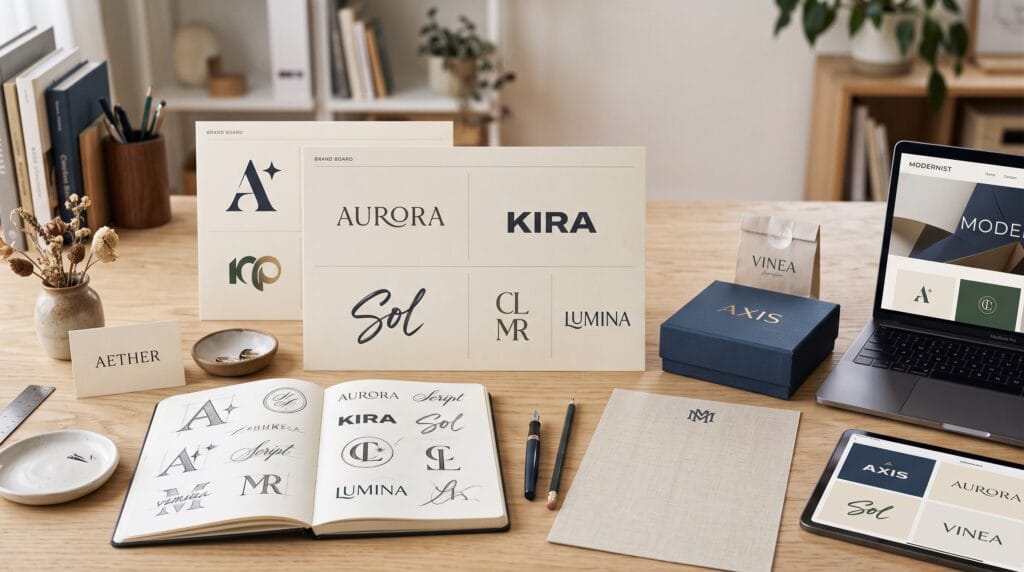
Brand typography examples can teach designers how letterforms shape identity, personality, and recognition. A logo may contain only a few letters, yet its typography can communicate whether a brand feels luxurious, playful, innovative, dependable, traditional, or energetic. This is why typography is one of the most important decisions in logo design.
Strong typographic logos are rarely created by choosing a popular font and typing the company name. Designers usually refine spacing, adjust proportions, modify individual letters, and test how the wordmark performs across different sizes and platforms.
Studying creative brand typography examples helps designers understand the thinking behind successful wordmarks. Instead of copying a particular style, designers can learn how typeface selection, custom lettering, rhythm, contrast, and visual balance contribute to a stronger logo.
Why Brand Typography Examples Matter in Logo Design
Typography often becomes the most recognizable element of a visual identity. Even when a brand uses a symbol, customers may still remember the shape and style of its wordmark.
Effective typography can help a logo:
- Communicate brand personality
- Improve name recognition
- Create visual distinction
- Support readability
- Build emotional connections
- Work across multiple platforms
- Establish a professional appearance
- Remain memorable over time
Poor typography can make a strong business idea appear generic or untrustworthy. Common problems include weak spacing, inappropriate fonts, excessive decoration, and poor readability at small sizes.
By analyzing brand typography examples, designers can see how successful identities balance creativity with practical use.
1. Minimalist Brand Typography Examples
Minimalist wordmarks use simple letterforms, controlled spacing, and limited decoration. They often appear easy to create, but every detail must be carefully considered.
Typical characteristics include:
- Clean sans-serif typefaces
- Limited font weights
- Simple geometric structures
- Balanced kerning
- Neutral proportions
- Strong use of white space
Minimal typography works well for technology companies, architecture studios, fashion labels, and professional services.
Why Minimalist Wordmarks Work
A minimalist logo removes unnecessary elements and gives the brand name more visual authority. It can also remain clear across websites, packaging, mobile apps, signage, and social media.
However, simplicity can become generic. Designers must introduce subtle distinction through custom spacing, altered terminals, unusual proportions, or modified letters.
The strongest minimalist brand typography examples feel simple without appearing ordinary.
2. Serif Brand Typography Examples
Serif typography can communicate heritage, expertise, elegance, and authority. Serif wordmarks are common in luxury, editorial, hospitality, beauty, and financial branding.
Common features include:
- High-contrast strokes
- Refined terminals
- Traditional proportions
- Elegant curves
- Strong uppercase lettering
- Carefully controlled spacing
A serif logo can feel established even when the business is relatively new.
Using Serif Fonts Without Looking Outdated
The success of a serif wordmark depends on the typeface and how it is applied. A traditional serif combined with heavy decoration may look old-fashioned, while a modern serif with clean spacing can feel contemporary.
Designers can modernize serif typography by:
- Increasing white space
- Simplifying letter details
- Using lighter weights
- Creating unexpected proportions
- Pairing it with minimal layouts
- Customizing selected characters
These brand typography examples show that serif fonts can be both timeless and modern.
3. Sans-Serif Brand Typography Examples
Sans-serif wordmarks are widely used because they are clean, adaptable, and readable. They are especially popular in technology, ecommerce, transportation, media, and digital services.
Typical features include:
- Simple letterforms
- Clear shapes
- Consistent stroke widths
- Strong screen readability
- Flexible weights
- Modern appearance
Although sans-serif logos are common, designers can still create distinction through customization.
Making Sans-Serif Logos More Memorable
Small changes can create a unique identity. Designers may modify:
- The crossbar of an A
- The tail of an R
- The angle of an M
- The curve of an S
- The shape of a terminal
- The width of certain letters
- The spacing between repeated characters
These subtle changes can transform an ordinary font into a recognizable wordmark.
Creative brand typography examples often prove that small typographic adjustments can have a major visual impact.
4. Custom Lettering Brand Typography Examples
Custom lettering gives designers complete control over every character. Instead of relying on an existing font, the logo is drawn specifically for the brand.
Custom lettering is useful when a company needs:
- A distinctive visual identity
- Strong trademark potential
- Unique letter relationships
- A specific emotional tone
- Better control over proportions
- A logo that competitors cannot easily imitate
The process usually begins with sketches before moving into vector software.
When Custom Lettering Works Best
Custom lettering is especially effective when the brand name is short and the logo will appear frequently. It can also help solve unusual letter combinations that look awkward in standard fonts.
However, originality should not come at the expense of readability. A logo must still be understood quickly.
The best custom brand typography examples combine originality, clarity, and strategic relevance.
5. Handwritten Brand Typography Examples
Handwritten typography creates a personal, human, and approachable impression. It is often used for food, beauty, lifestyle, photography, handmade goods, and creative services.
Handwritten logos may feel:
- Friendly
- Authentic
- Artistic
- Casual
- Personal
- Energetic
- Elegant
The exact mood depends on the lettering style. A loose brush script feels different from a delicate signature or playful marker style.
Avoiding Common Script Logo Problems
Script logos can become difficult to read when letters overlap excessively or when decorative swashes are overused.
Designers should test:
- Letter connections
- Stroke thickness
- Small-size readability
- Capital letter complexity
- Spacing around the wordmark
- Contrast on different backgrounds
Successful handwritten brand typography examples feel natural but remain controlled.
Also Read: Brand Color Guide Checklist for Better Color Contrast
6. Bold Display Brand Typography Examples
Bold display typography creates immediate impact. It is commonly used in sports, entertainment, food, fashion, gaming, and youth-focused brands.
Typical characteristics include:
- Heavy font weights
- Condensed proportions
- Strong uppercase text
- Unusual shapes
- Sharp angles
- Dramatic contrast
- Tight spacing
Bold logos are useful when a brand needs to stand out in crowded environments such as packaging shelves, event posters, social feeds, or apparel.
Creating Impact Without Losing Clarity
A strong display font may look impressive at a large size but fail when reduced. Designers must test the logo on small screens, product labels, and profile images.
A simplified secondary version may be required for smaller applications.
These brand typography examples show how impact and practicality must work together.
7. Retro Brand Typography Examples
Retro typography draws inspiration from historical periods such as the 1950s, 1970s, 1980s, or 1990s. It can create nostalgia and emotional familiarity.
Popular retro styles include:
- Vintage scripts
- Rounded display fonts
- Western serifs
- Psychedelic lettering
- Athletic typography
- Art deco forms
- Pixel-inspired fonts
Retro typography works well for cafes, clothing brands, entertainment projects, music businesses, and products with a nostalgic story.
Making Retro Typography Feel Current
A retro logo should not look like an unmodified historical copy. Designers can modernize the style through cleaner layouts, simplified details, contemporary color palettes, and improved spacing.
The strongest retro brand typography examples combine familiar visual references with modern execution.
8. Luxury Brand Typography Examples
Luxury logos often use refined typography, balanced proportions, and generous spacing. They avoid visual clutter and rely on precision.
Common features include:
- Elegant serif typefaces
- Thin or high-contrast strokes
- Wide letter spacing
- Uppercase wordmarks
- Minimal supporting graphics
- Controlled alignment
Luxury typography creates confidence through restraint.
Why Spacing Matters in Luxury Logos
Generous tracking can make a wordmark feel calm and exclusive. However, too much spacing can weaken readability or disconnect individual letters.
Designers should adjust spacing optically rather than relying entirely on automatic settings.
Luxury brand typography examples demonstrate how small spacing decisions can change the perceived value of a brand.
9. Playful Brand Typography Examples
Playful logos often use irregular shapes, rounded letters, bright colors, and unusual arrangements. They are common in children’s products, entertainment, snacks, education, and creative technology.
Playful typography may include:
- Uneven baselines
- Rounded terminals
- Custom characters
- Mixed letter sizes
- Soft geometric shapes
- Illustrative details
- Friendly lowercase forms
Keeping Playful Logos Professional
Playfulness should still be intentional. Random changes can make the design feel disorganized.
A strong playful wordmark usually follows a consistent visual rule. For example, every letter may have rounded corners, or the baseline may shift according to a controlled rhythm.
These brand typography examples show that fun and professionalism can exist together.
10. Monogram Brand Typography Examples
Monograms combine initials into a compact visual symbol. They are especially useful for personal brands, fashion labels, hospitality companies, and businesses with long names.
A monogram can be created by:
- Overlapping letters
- Sharing strokes
- Mirroring shapes
- Using negative space
- Building a geometric grid
- Connecting initials
- Creating a decorative frame
Monograms can function independently or alongside a full wordmark.
Designing a Clear Monogram
The initials should remain recognizable without becoming overly complicated. Designers must also test whether the symbol still works at small sizes.
Strong monogram brand typography examples balance letter recognition with visual unity.
Also Read: Brand Storytelling Guide to Make Your Content More Engaging
Typography Principles Behind Better Logos
Great typographic logos are built using several important principles.
Typeface Personality
Every typeface communicates a mood. Designers should choose fonts based on brand strategy rather than personal preference.
Kerning
Kerning refers to the space between individual letter pairs. Poor kerning can make a professional logo appear unfinished.
Tracking
Tracking adjusts spacing across an entire word or group of letters. It can change whether a wordmark feels compact, relaxed, luxurious, or energetic.
Proportion
The height, width, stroke thickness, and internal space of letters influence balance and readability.
Contrast
Contrast can be created through weight, scale, color, spacing, or letterform style. It helps establish visual emphasis.
Consistency
Custom modifications should follow a shared logic. If one letter has rounded corners, similar letters may need compatible treatment.
These principles appear repeatedly across successful brand typography examples.
How to Analyze Brand Typography Examples
Designers and students can use a structured process when studying wordmarks.
Ask the following questions:
- What personality does the typography communicate?
- Does the style match the industry and audience?
- Is the wordmark easy to read?
- Which letters have been customized?
- How does spacing affect the logo?
- Does the logo work at different sizes?
- Is the typography distinctive?
- Can it function in black and white?
- Does it feel current without depending on a temporary trend?
- How does the typography support the broader brand system?
This approach helps designers understand why a logo works rather than simply deciding whether they like it.
Common Typography Mistakes in Logo Design
Designers should avoid:
- Using too many typefaces
- Choosing fonts without considering the brand strategy
- Ignoring kerning
- Distorting fonts horizontally or vertically
- Adding too many decorative effects
- Using unreadable scripts
- Copying popular logo styles too closely
- Ignoring small-size applications
- Forgetting font licensing
- Relying entirely on automatic spacing
A logo should remain effective after trends change. Strong design decisions are based on strategy, clarity, and adaptability.
Best Tools for Creating Typographic Logos
1. Adobe Illustrator
Adobe Illustrator is one of the most widely used tools for creating vector logos and custom typography.
Best for:
- Vector wordmarks
- Letterform modification
- Kerning adjustments
- Custom lettering
- Logo export
2. Affinity Designer
Affinity Designer provides professional vector tools and is a strong alternative for designers who prefer a one-time purchase model.
Best for:
- Vector logo design
- Node editing
- Custom lettering
- Brand identity projects
- Professional exports
3. Figma
Figma is useful for collaborative logo exploration, brand presentations, and digital identity systems.
Best for:
- Team collaboration
- Digital logo testing
- Brand system development
- Interface applications
- Feedback and review
4. FontBase
FontBase helps designers organize, compare, and preview large font collections.
Best for:
- Font management
- Typeface comparison
- Family previews
- Project collections
- Font activation
5. Glyphs
Glyphs is a professional type-design application for creating custom fonts and refining letterforms.
Best for:
- Typeface creation
- Custom glyphs
- Advanced letterform design
- Font family development
- OpenType features
6. FontLab
FontLab provides advanced tools for drawing, editing, spacing, and producing professional fonts.
Best for:
- Professional type design
- Letterform refinement
- Font production
- Spacing and kerning
- Variable fonts
7. Procreate
Procreate is useful for sketching handwritten wordmarks and exploring custom lettering on an iPad.
Best for:
- Hand-lettering sketches
- Brush lettering
- Logo ideation
- Visual experimentation
- Early concepts
8. Canva
Canva helps beginners test typography combinations and create quick logo concepts.
Best for:
- Beginners
- Simple wordmarks
- Typography experiments
- Brand kits
- Presentation mockups
A Practical Process for Creating Better Typographic Logos
Follow this step-by-step process:
- Define the brand personality.
- Research competitors and industry styles.
- Choose several typography directions.
- Sketch custom ideas before using software.
- Test multiple typefaces.
- Adjust kerning and proportions.
- Customize selected letters.
- Test the logo in black and white.
- Check readability at small sizes.
- Apply the wordmark to realistic mockups.
- Collect feedback from relevant users.
- Prepare primary and secondary versions.
Avoid choosing the first attractive font. Strong typographic logos usually develop through several rounds of refinement.
Also Read: Holiday Branding Ideas for Christmas, New Year, and More
Final Thoughts on Brand Typography Examples
Creative brand typography examples demonstrate that better logos begin with strategic thinking rather than decoration. Typeface selection, spacing, proportion, hierarchy, and customization all influence how a brand is perceived.
Minimalist typography can communicate clarity, while serif wordmarks suggest heritage and authority. Handwritten lettering creates personality, bold display fonts add energy, and monograms transform initials into memorable symbols.
Designers should study diverse brand typography examples to understand how different styles solve different branding problems. The goal is not to copy a successful logo but to identify the principles behind it.
By applying lessons from strong brand typography examples, designers can create logos that are more distinctive, readable, adaptable, and aligned with the brands they represent.
For high-quality fonts to boost your income, check out Letter Crafted. Our professional fonts are perfect for branding, marketing, and content creation. So, don’t miss this opportunity.