
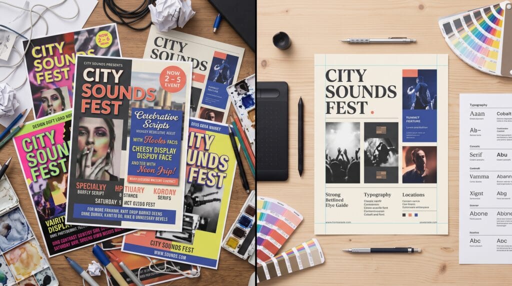
Understanding the most common graphic design mistakes beginners make is an important step toward producing professional, balanced, and effective visual work. New designers often focus on learning software, effects, and creative techniques without giving enough attention to fundamental principles such as hierarchy, typography, spacing, color, and consistency. Although design tools are important, strong graphic design depends more on clear communication and thoughtful decisions than technical effects.
Every designer makes mistakes while learning. These early errors are part of developing creative judgment and building practical experience. However, recognizing the most frequent graphic design mistakes beginners make can help you improve faster, avoid frustrating revisions, and create work that communicates its message more clearly.
This guide explores common beginner design problems and explains how to correct them through better planning, stronger visual principles, and more intentional creative choices.
Why Graphic Design Mistakes Beginners Make Are Valuable
Mistakes are not always signs of failure. They often reveal which skills need more practice and which design principles have not yet become familiar.
Beginner designers may understand how to use editing software but still struggle to decide why a particular font, color, or composition should be used. This gap between software knowledge and visual judgment is normal.
Reviewing the graphic design mistakes beginners make helps develop a stronger design process. Instead of adding elements without a clear purpose, you begin asking useful questions:
- Who is the design for?
- What message should viewers notice first?
- Is the text readable?
- Does the design match the brand?
- Is every element necessary?
- Does the layout work at different sizes?
These questions encourage more deliberate and professional design decisions.
1. Designing Without a Clear Purpose
One of the most common graphic design mistakes beginners make is starting a project before understanding its purpose.
A design may look attractive but still fail if it does not communicate the correct message. Before opening your design software, identify the goal of the project.
A promotional poster, for example, may need to encourage event registrations. A logo should help people recognize a brand. A social media graphic may need to attract attention and direct users toward a specific action.
How to Avoid This Graphic Design Mistake
Begin every project with a simple creative brief. Include:
- The main objective
- The target audience
- The required message
- The desired action
- The brand personality
- The final format and dimensions
A clear brief helps you evaluate whether each creative decision supports the project’s purpose.
2. Using Too Many Fonts
Typography is a powerful design tool, but using too many typefaces can make a layout look disorganized.
Beginners sometimes choose several fonts because each one looks interesting individually. However, when multiple decorative fonts appear together, they compete for attention and weaken visual consistency.
This is one of the easiest graphic design mistakes beginners make to recognize and correct.
How to Choose Better Font Combinations
Limit most projects to two or three typefaces:
- One font for headings
- One font for body copy
- An optional accent font
Choose fonts that provide contrast without creating conflict. A bold sans serif heading can work well with a readable serif body font. You can also create variety by using different weights from one type family.
Always prioritize readability over decoration.
3. Ignoring Visual Hierarchy
Visual hierarchy tells viewers where to look first, second, and third. Without hierarchy, every element competes for equal attention.
A design with a large headline, smaller supporting text, and a clearly visible call to action is easier to understand than one where every line has the same size and weight.
Ignoring hierarchy is among the most damaging graphic design mistakes beginners make because it affects the entire communication process.
Ways to Create Strong Visual Hierarchy
Use the following elements intentionally:
- Size
- Weight
- Color
- Contrast
- Position
- Spacing
- Repetition
The most important information should be the easiest to notice. Supporting details should remain visible without competing with the main message.
4. Poor Alignment and Inconsistent Spacing
Small alignment problems can make an otherwise attractive design feel unfinished.
Beginners sometimes position elements by eye without using grids, guides, or consistent margins. This can create awkward spacing and visual imbalance.
Common alignment problems include:
- Uneven margins
- Text boxes that do not line up
- Inconsistent gaps between elements
- Images placed too close to text
- Misaligned icons
- Unbalanced columns
How to Improve Alignment
Use grids and alignment tools available in your design software. Establish consistent spacing values and repeat them throughout the layout.
For example, you might use a smaller gap between a heading and its paragraph, then a larger gap between separate sections.
Consistent spacing creates rhythm and makes the composition feel intentional.
5. Overcrowding the Layout
Trying to include too much information is another of the most frequent graphic design mistakes beginners make.
Beginners may worry that empty areas look unfinished, so they fill every available space with text, graphics, icons, borders, or decorative effects. The result is often visually exhausting.
White space is not wasted space. It helps viewers separate information, understand relationships, and focus on important content.
How to Use White Space Effectively
Remove elements that do not support the message. Increase margins around important content and give text enough room to breathe.
A simple layout with a clear message is usually more effective than a complicated layout filled with unnecessary decoration.
Also Read: Graphic Design for Branding That Makes Products Look Better
6. Choosing Colors Without a Strategy
Color should support the mood, message, and identity of a design. Random color choices can make work appear inconsistent or difficult to read.
Poor color decisions include:
- Using too many colors
- Choosing colors with weak contrast
- Combining clashing tones
- Ignoring brand colors
- Using bright colors everywhere
- Placing light text on a light background
These graphic design mistakes beginners make can reduce readability and weaken emotional impact.
How to Build a Better Color Palette
Start with a limited palette consisting of:
- One primary color
- One or two supporting colors
- One accent color
- Neutral shades
Use color contrast to guide attention. Bright or saturated colors should highlight important details rather than dominate the entire layout.
Also test designs in grayscale to confirm that the hierarchy remains clear without relying entirely on color.
7. Using Low-Quality Images
Pixelated, stretched, or poorly cropped images immediately reduce design quality.
Beginners may download small images and enlarge them beyond their original resolution. They may also use photographs that do not match the project’s visual style.
Low-quality imagery is one of the most noticeable graphic design mistakes beginners make, especially in printed materials and large-format graphics.
How to Use Images Professionally
Choose high-resolution images appropriate for the final output. Use consistent lighting, color treatment, and composition across multiple photographs.
Avoid stretching images disproportionately. Crop with intention and maintain the original aspect ratio whenever possible.
For print projects, confirm that images have sufficient resolution. For digital designs, optimize file size without making the image blurry.
8. Applying Too Many Effects
Shadows, gradients, strokes, glows, textures, and filters can add depth when used carefully. However, combining too many effects often makes a design appear outdated or distracting.
Beginners sometimes use effects to make a design feel more creative. In reality, strong typography and composition usually create more professional results than excessive decoration.
How to Avoid Excessive Effects
Use effects only when they improve clarity or support the visual concept.
For example, a subtle shadow may help text separate from a photograph. A gradient may create depth or guide attention. Neither effect should become more noticeable than the content itself.
Before applying an effect, ask whether the design works without it.
9. Ignoring Readability
A visually impressive design is unsuccessful when people cannot read the message.
Readability problems include:
- Text that is too small
- Long paragraphs in uppercase
- Decorative fonts used for body copy
- Insufficient line spacing
- Weak color contrast
- Text placed over busy images
- Paragraphs that are too wide
Many graphic design mistakes beginners make occur because the designer views the project at full screen instead of testing how it will appear in real use.
How to Improve Text Readability
Use comfortable font sizes, clear typefaces, and appropriate line spacing. Keep body copy within a manageable width and avoid placing important text over complicated backgrounds.
Test the design at its final size. A social media graphic should be checked on a phone, while a printed flyer should be reviewed as a physical-size preview.
10. Following Trends Without Understanding Them
Design trends can provide inspiration, but copying them without understanding their purpose can make work feel generic.
A trendy style may not suit every brand, audience, or message. For example, a playful experimental font might work for a music festival but not for a legal firm.
Following trends blindly is one of the subtler graphic design mistakes beginners make because the result may look modern while still being strategically inappropriate.
How to Use Design Trends Wisely
Study why a trend works and identify the principles behind it. Then adapt those ideas to the project rather than copying the appearance exactly.
Use trends as inspiration, not as a replacement for original thinking.
Also Read: Graphic Design Color Palettes for Better Visual Results
11. Forgetting the Target Audience
Personal taste should not control every design decision. A successful design must connect with the people it is intended to reach.
A designer may prefer minimalist neutral colors, but a children’s event may require brighter and more energetic visuals. Similarly, a complex experimental layout might not suit an audience that needs quick, practical information.
Understanding the audience helps you choose appropriate:
- Colors
- Fonts
- Imagery
- Language
- Layout
- Visual style
Audience research prevents design from becoming purely decorative.
12. Failing to Maintain Brand Consistency
Brand consistency helps audiences recognize and trust a business. Using different colors, fonts, image styles, and logo treatments across every design weakens that recognition.
This is one of the most important graphic design mistakes beginners make when creating content for businesses.
How to Maintain Visual Consistency
Create or follow a basic brand guide that defines:
- Logo usage
- Brand colors
- Typography
- Photography style
- Icon style
- Spacing rules
- Tone and personality
Templates can also help maintain consistency across social media graphics, presentations, advertisements, and marketing materials.
13. Skipping Feedback and Revisions
Beginners may become emotionally attached to their first design idea. They may view feedback as criticism rather than an opportunity to improve the work.
Professional design usually involves multiple drafts. Feedback can reveal problems that are difficult to notice after working on a project for several hours.
How to Receive Feedback Productively
Ask specific questions instead of simply asking whether someone likes the design.
Useful questions include:
- What did you notice first?
- Is the message clear?
- Is anything difficult to read?
- Does the design match the intended audience?
- Which part feels unnecessary?
Evaluate feedback based on the project’s objective rather than personal preference.
14. Exporting Files Incorrectly
A strong design can still fail if it is exported in the wrong format, dimensions, or color mode.
Common export problems include:
- Using RGB files for professional printing
- Uploading files that are too large
- Exporting blurry images
- Forgetting bleed
- Converting transparent backgrounds to white
- Sending editable files instead of final files
- Using the wrong dimensions for social platforms
How to Prepare Final Design Files
Confirm the technical requirements before beginning the project. Check:
- File format
- Dimensions
- Resolution
- Color mode
- Bleed and margins
- Transparency
- Maximum file size
Keep editable source files organized so that future revisions can be completed efficiently.
A Checklist for Avoiding Graphic Design Mistakes Beginners Make
Before completing a project, review the design using this checklist:
- Is the main message immediately clear?
- Does the layout have a strong hierarchy?
- Are the fonts readable and consistent?
- Is the color palette controlled?
- Are all images high quality?
- Is spacing consistent?
- Does every element have a purpose?
- Does the design match the target audience?
- Are brand guidelines being followed?
- Has the design been tested at its final size?
- Are the export settings correct?
- Has another person reviewed the work?
This final review can catch many graphic design mistakes beginners make before the design is published, printed, or presented to a client.
Also Read: Graphic Design Layout Ideas How to Use White Space Better
Final Thoughts on Graphic Design Mistakes
Recognizing the most common graphic design mistakes beginners make can significantly improve the quality of your creative work. Poor typography, weak hierarchy, overcrowded layouts, inconsistent spacing, random color choices, and unnecessary effects are all problems that can be corrected through practice and careful review.
Focus on clear communication before decoration. Use grids, simplify your color palette, improve readability, and make every element support the project’s objective. Most importantly, remain open to feedback and allow your design skills to develop over time.
The best designers are not those who never make mistakes. They are the ones who recognize problems, understand why they happened, and apply what they learned to the next project. By studying the graphic design mistakes beginners make and practicing the solutions in this guide, you can build stronger creative judgment and produce more polished, professional designs.
For high-quality fonts to boost your income, check out Letter Crafted. Our professional fonts are perfect for branding, marketing, and content creation. So, don’t miss this opportunity.