
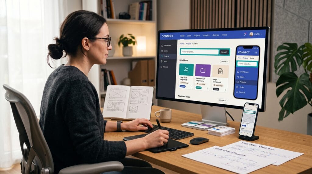
Strong UX design tips can help designers create digital experiences that feel faster, clearer, and easier to use. When users can quickly understand where they are, find what they need, and interact without unnecessary barriers, websites and apps become more useful for a much wider audience. Navigation and accessibility should therefore be considered together rather than treated as separate parts of the design process.
Good user experience is not about adding more visual effects or complicated interactions. It is about reducing friction.
Every menu, button, form, heading, search box, and interaction should help users move toward their goal. The following techniques can help designers create interfaces that are easier to navigate while supporting people with different abilities, devices, and browsing habits.
UX Design Tips for Clearer Navigation
Navigation is one of the most important parts of any interface.
Users should understand where they can go without having to study the screen.
A navigation system becomes harder to use when it contains too many options, unclear labels, unpredictable behavior, or inconsistent placement.
One of the most practical UX design tips is to simplify navigation before adding anything new.
Ask whether every menu item is necessary. Combine closely related pages when appropriate and move secondary options away from the primary navigation.
The goal is not to make navigation minimal at any cost. The goal is to make important choices easy to recognize.
Use Familiar Navigation Patterns
Users already understand many common digital conventions.
A logo in the upper-left corner often returns to the homepage. A magnifying glass typically represents search. A shopping cart icon represents a cart or basket.
Using familiar patterns reduces the amount of learning required.
Designers sometimes replace recognizable patterns simply to make an interface feel more original. This can create confusion without adding meaningful value.
Innovation is useful when it improves the experience. It becomes a problem when users have to guess how basic controls work.
Familiarity can make an interface feel faster because people spend less time interpreting it.
UX Design Tips for Better Menu Labels
Menu labels should describe destinations clearly.
Generic labels such as “Explore,” “Discover,” or “Solutions” can work in some contexts, but they may also hide important information.
Whenever possible, use terms that match what users are actually looking for.
For example, a design resource website might use:
- Fonts
- Templates
- Tutorials
- Pricing
- About
- Contact
These labels immediately communicate what users can expect.
Avoid internal company terminology that customers may not understand.
One useful UX design tip is to test navigation labels with someone unfamiliar with the project. Ask them what they expect to find after clicking each item.
Their answers can reveal confusing terminology quickly.
Create a Strong Visual Hierarchy
Users rarely read every element on a page in equal detail.
They scan.
Visual hierarchy helps them recognize what is most important first.
Size, spacing, typography, contrast, alignment, and position all influence how information is perceived.
A clear page might contain a prominent H1 heading, a short supporting paragraph, a primary action, and secondary information below.
When everything has equal visual weight, users must work harder to determine what matters.
Good hierarchy improves both navigation and accessibility because it creates a predictable structure.
These UX design tips are especially valuable for content-heavy websites where visitors need to scan quickly.
UX Design Tips for Accessible Typography
Typography strongly influences usability.
Small text, tight line spacing, low contrast, or overly decorative fonts can make content difficult to read.
Body text should remain comfortable across desktop and mobile devices.
Use sufficient line height so paragraphs do not feel crowded. Keep line lengths manageable and separate content into shorter sections.
Font size is also important.
Avoid using very small typography simply to fit more content on the screen.
Readers should not need to zoom just to understand basic text.
Decorative fonts can work for headlines or branding, but important instructions and interface labels usually benefit from highly readable typefaces.
Maintain Strong Color Contrast
Low-contrast interfaces can look elegant in mockups but become difficult to use in real situations.
Light gray text on a white background is a common example.
Text, icons, buttons, form boundaries, and other important elements should have enough contrast to remain recognizable.
Do not depend entirely on color to communicate meaning.
For example, if a form field contains an error, changing the border to red may not be sufficient. Add an icon or clear message explaining the problem.
This is one of the most important accessibility-focused UX design tips because users experience color differently.
Contrast also matters for people viewing screens in bright sunlight, on lower-quality displays, or with reduced brightness.
Make Interactive Elements Easy to Identify
Users should not have to guess what they can click or tap.
Buttons should look like buttons. Links should be distinguishable from ordinary text.
Consistency matters.
If your primary action uses a filled button style on one page, using completely different styling for the same type of action elsewhere may create unnecessary confusion.
Interactive states should also be visible.
A button can respond to hover, focus, pressed, disabled, and loading states.
Providing clear visual feedback helps users understand what the interface is doing.
UX Design Tips for Keyboard Accessibility
Not everyone navigates websites using a mouse.
Some users rely on keyboards, switch devices, or assistive technology.
Interactive elements should therefore be reachable through keyboard navigation.
When users press the Tab key, focus should move through important interactive elements in a logical order.
A visible focus indicator should show which element is currently selected.
Do not remove focus outlines simply because they interfere with the visual design.
Instead, create a focus style that fits the design system while remaining clearly visible.
Keyboard accessibility benefits power users as well as people who depend on keyboard navigation.
Also Read: How to Improve Website UX Design for Better Results
Keep Forms Simple and Accessible
Forms are common sources of user frustration.
Every unnecessary field increases effort.
Before adding a field, ask whether the information is genuinely required at that moment.
If a newsletter signup only needs an email address, do not ask for five additional details without a clear reason.
Labels should remain visible instead of relying entirely on placeholder text.
Placeholders disappear when users begin typing, which means they cannot always function as reliable labels.
Provide Helpful Error Messages
Error messages should explain what happened and how to fix it.
“Invalid input” provides little guidance.
“Enter an email address in the format name@example.com” is much more useful.
Good error handling is one of the most practical UX design tips because mistakes are part of normal interaction.
The interface should help users recover rather than punish them for making an error.
Design Larger Touch Targets
Mobile users interact with fingers rather than precise mouse pointers.
Very small icons or buttons can be difficult to select accurately.
Important touch targets should provide enough size and spacing to reduce accidental taps.
Avoid placing several tiny actions extremely close together.
This is especially important for navigation menus, form controls, close buttons, pagination, and ecommerce interfaces.
A design can look beautifully compact on a large monitor while becoming frustrating on a phone.
Always test interfaces on actual mobile devices rather than relying entirely on desktop previews.
UX Design Tips for Mobile Navigation
Mobile navigation should prioritize the actions users are most likely to need.
Limited screen space does not mean every desktop menu item needs to be hidden without thought.
Identify primary tasks first.
An ecommerce site might prioritize search, categories, account access, and the shopping cart.
A content website might prioritize categories, search, and recent content.
When using hamburger menus, organize the options clearly instead of simply transferring the entire desktop navigation into a long list.
Mobile UX design tips should also consider one-handed use. Frequently used controls can be easier to reach when they are positioned thoughtfully.
Improve Search for Faster Navigation
Search becomes increasingly important as a website grows.
Users who already know what they want may prefer searching rather than browsing multiple menus.
Make the search field or icon easy to find.
For large catalogs or content libraries, consider autocomplete, filters, suggestions, and helpful empty states.
Search results should clearly distinguish relevant information.
Avoid returning pages without explaining why they match the query.
If there are no results, provide alternatives such as related terms, popular categories, or corrected spelling.
Good search design provides users with another navigation path when menus are not efficient enough.
Use Breadcrumbs on Complex Websites
Breadcrumbs show users where they are within a site structure.
For example:
Home > Resources > UX Design > Accessibility
This is especially useful for ecommerce stores, documentation sites, large blogs, and websites with several category levels.
Breadcrumbs improve orientation and provide quick access to higher-level pages.
However, they should supplement the primary navigation rather than replace it.
These UX design tips are most useful when users can arrive deep inside a website directly from search engines or external links.
Reduce Cognitive Load
Every decision requires mental effort.
When interfaces present too many options simultaneously, users may hesitate or abandon the task.
Reduce cognitive load by grouping related information and revealing complexity gradually.
For example, an advanced settings panel does not need every configuration option permanently visible.
Secondary controls can appear only when users need them.
Use clear sections, meaningful spacing, concise copy, and predictable patterns.
Simplification does not mean removing useful functionality.
It means presenting functionality in a way that is easier to understand.
Write Clear Interface Copy
Microcopy includes button labels, form instructions, notifications, errors, confirmation messages, and other small pieces of interface text.
Good microcopy helps users understand what will happen next.
Compare:
“Submit”
with:
“Create Account”
The second label communicates a clearer result.
Similarly, “Delete project permanently” communicates greater consequence than a vague “OK” button.
Clear language reduces uncertainty and supports accessibility for users who may already find complex interfaces difficult to understand.
UX Design Tips for Screen Reader Support
Screen readers interpret the structure and content of digital interfaces for users who cannot rely primarily on visual presentation.
Semantic HTML and properly structured content are therefore important.
Use actual heading elements for headings rather than simply making ordinary text larger.
Use buttons for button actions and links for navigation.
Images that communicate meaningful information should include useful alternative text.
Decorative images may not require descriptive alt text if they add no informational value.
Form controls should have proper labels, and interactive elements need meaningful accessible names.
Accessibility works best when it is built into the structure from the beginning rather than added as a final patch.
Also Read: UX Writing Guide for Better User Engagement and Clarity
Design Consistent Interfaces
Consistency helps users transfer knowledge from one section of a product to another.
Buttons performing similar actions should look similar.
Navigation should not unexpectedly change position between pages.
Spacing, typography, icons, forms, and interaction patterns should follow a coherent system.
Design systems can help teams maintain this consistency as products grow.
A design system might define:
- Typography
- Colors
- Buttons
- Forms
- Spacing
- Icons
- Navigation patterns
- Alerts
- Cards
- Accessibility states
Consistency is one of the simplest UX design tips for making complex products feel easier to use.
Give Immediate Feedback After User Actions
Users need confirmation that the interface received their action.
After pressing a button, changing a setting, submitting a form, or uploading a file, the system should respond.
Feedback might include a loading indicator, confirmation message, progress bar, animation, or status change.
Without feedback, users may repeat the action because they assume nothing happened.
This can cause duplicated submissions or frustration.
Feedback should be fast, clear, and proportional to the action.
Small interactions need subtle responses. Important actions may require more explicit confirmation.
Make Loading States Useful
Waiting is sometimes unavoidable, but uncertainty makes waiting feel longer.
If content requires time to load, communicate that the system is working.
Progress indicators, skeleton screens, or clear loading states can reduce uncertainty.
For longer processes, explain what is happening when practical.
Avoid leaving users staring at an apparently frozen interface.
Performance itself is also part of UX.
Optimize unnecessary scripts, large images, complex animations, and other assets that slow the experience.
Faster interfaces often feel easier to use even when the underlying structure is unchanged.
UX Design Tips for Accessible Images and Media
Images, video, and audio should not create unnecessary barriers.
Meaningful images should have descriptive alternative text.
Videos containing spoken information may benefit from captions, while important audio content should have an accessible text alternative when appropriate.
Avoid placing essential information only inside an image where it cannot be easily interpreted by assistive technologies.
Autoplaying media can also create problems, particularly when sound begins unexpectedly.
Give users control.
Accessibility is ultimately about providing multiple ways to understand and interact with content.
Test Navigation With Real Users
Designers understand their own interfaces too well.
What appears obvious to the creator may be confusing to someone seeing the product for the first time.
Usability testing helps reveal these differences.
Give participants realistic tasks instead of explaining how the interface works.
For example:
- “Find the pricing for the professional plan.”
- “Change your account password.”
- “Locate an article about accessibility.”
Observe where users hesitate, choose incorrect paths, or become confused.
These moments are more valuable than simply asking whether they like the design.
Use Analytics Alongside UX Research
Analytics can reveal what users do at scale.
You may discover pages with unusually high exits, navigation items that receive few clicks, or forms that users frequently abandon.
However, analytics usually tells you what happened rather than why.
Combine quantitative data with qualitative research such as interviews, usability tests, support feedback, and surveys.
Together, these methods help designers identify stronger improvement opportunities.
Data should support design judgment rather than replace it.
Common UX Navigation and Accessibility Mistakes
One common mistake is prioritizing appearance over clarity.
Another is hiding essential actions behind unfamiliar icons.
Designers may also create insufficient color contrast, tiny text, complex menus, inaccessible forms, or interactions that only work with a mouse.
Other problems include:
- Missing focus states
- Unclear error messages
- Inconsistent navigation
- Small touch targets
- Excessive animation
- Weak heading hierarchy
- Missing image alt text
- Confusing button labels
- Poor mobile layouts
Using these UX design tips as a review checklist can catch many problems before launch.
Build Accessibility Into the UX Process
Accessibility should not be something a team checks only after development is complete.
Consider it during wireframing, visual design, prototyping, content writing, development, and testing.
For example, contrast can be checked while selecting colors.
Keyboard flows can be considered when designing interactions.
Heading structure can be planned while organizing content.
Alternative text requirements can be identified when selecting imagery.
Designing accessibly from the beginning is generally easier than rebuilding inaccessible patterns later.
It can also lead to better experiences for everyone.
Also Read: UX Design Tools You Should Know for Better Results
Final Thoughts on UX Design Tips
The most useful UX design tips usually come back to one principle: reduce unnecessary effort.
Users should not need to study a website before understanding how to navigate it. They should not struggle with tiny text, unclear buttons, inaccessible forms, or confusing menu structures.
Create familiar navigation, establish strong hierarchy, write clear labels, support keyboard interaction, maintain good contrast, and design responsive touch targets.
Then test your assumptions with real users.
Accessibility and fast navigation reinforce each other. When information is clearly structured and interactions are predictable, digital products become easier for a much broader range of people to use.
Apply these UX design tips throughout the design process rather than treating usability as a final check. The result will be interfaces that feel faster, clearer, more inclusive, and more enjoyable to navigate.
For high-quality fonts to boost your income, check out Letter Crafted. Our professional fonts are perfect for branding, marketing, and content creation. So, don’t miss this opportunity.