
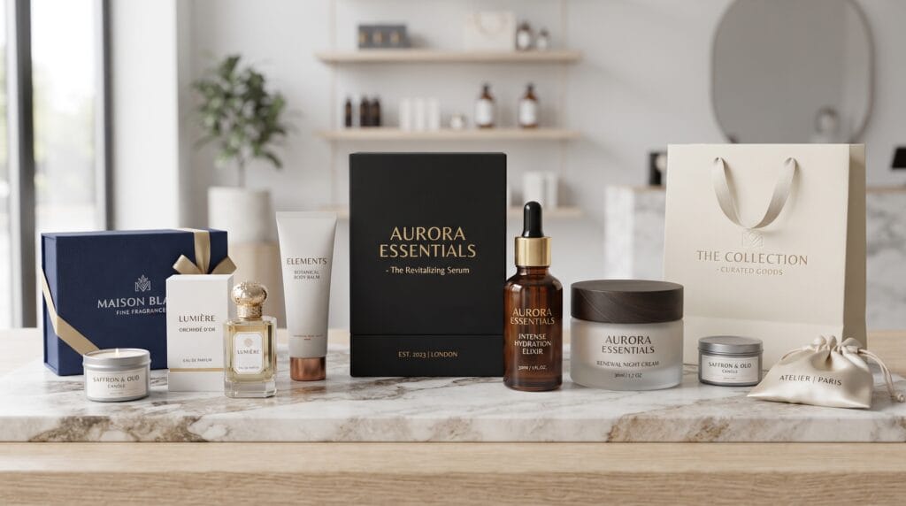
Great luxury packaging design makes a product feel valuable before the customer even opens it. Premium packaging is not simply about expensive boxes, metallic foil, or elegant typography. It combines materials, structure, color, texture, graphics, and carefully considered details to create an experience that supports the brand’s positioning.
For premium products, packaging often becomes part of the product itself. A perfume box, jewelry case, cosmetic bottle, or luxury gift package can influence how customers judge quality before they have actually used what is inside.
This means every design decision matters.
The right paper texture can create a tactile impression. Thoughtful typography can communicate sophistication. A carefully engineered opening experience can build anticipation.
The best luxury packaging design feels intentional rather than excessive. This guide explores practical ideas designers and premium brands can use to create packaging that feels distinctive, refined, and memorable.
Why Luxury Packaging Design Matters
Packaging is one of the most physical parts of a brand identity.
Customers may see a logo online, but packaging gives them something they can hold, open, keep, photograph, or give to someone else.
For premium brands, packaging can help communicate:
- Product quality
- Exclusivity
- Craftsmanship
- Brand personality
- Attention to detail
- Product positioning
A well-designed package can also create stronger consistency between the product and its price.
If an expensive product arrives in packaging that feels cheap or poorly constructed, the experience may reduce perceived value.
Strong luxury packaging design should make the presentation feel appropriate for the product inside.
1. Minimalist Luxury Packaging Design
Luxury does not require complicated decoration.
Minimal packaging can create a premium impression through:
- Generous negative space
- Controlled typography
- Restrained colors
- High-quality materials
- Precise alignment
Imagine a matte ivory perfume box with a small black serif wordmark centered on the front.
There may be no illustration or decorative pattern.
The quality comes from proportion, material, typography, and restraint.
Minimalism works particularly well for fashion, cosmetics, fragrance, jewelry, and premium lifestyle products.
2. Black and Gold Packaging
Black and gold remain popular in premium branding because the combination can communicate elegance and exclusivity.
However, use metallic accents selectively.
Gold can appear through:
- Foil stamping
- Metallic ink
- Small borders
- Logo details
- Product names
Avoid covering every surface with metallic decoration.
A small gold wordmark against a deep black background can feel more refined than a heavily ornamented package.
3. Luxury Packaging Design With Elegant Typography
Typography can completely change the personality of packaging.
Premium brands often use:
- High-contrast serif fonts
- Refined sans serifs
- Custom lettering
- Elegant scripts
- Carefully spaced capitals
A luxury skincare package might use a sophisticated serif for the product name and a clean sans serif for ingredients and supporting information.
Create Clear Hierarchy
A simple hierarchy could be:
- Brand Name
- Product Name
- Product category
- Size or quantity
- Supporting information
Good luxury packaging design should feel elegant without making essential information difficult to read.
4. Embossed Packaging
Embossing raises part of the design above the material.
It can highlight:
- Logos
- Monograms
- Patterns
- Product names
- Decorative elements
Because embossing relies on physical depth rather than only color, it adds a tactile quality.
A blind emboss, where no ink or foil is added, can be particularly sophisticated.
For example, a cream-colored box with a blind embossed monogram can create a quiet premium effect.
5. Debossed Luxury Packaging Design
Debossing presses the design into the material.
The technique works beautifully on:
- Thick paper
- Rigid boxes
- Leather-like materials
- Premium labels
A debossed wordmark can feel subtle while still adding physical character.
Consider combining debossing with restrained typography rather than several competing finishing techniques.
6. Foil Stamping for Premium Details
Foil stamping can introduce metallic or reflective details.
Common choices include:
- Gold
- Silver
- Copper
- Rose gold
- Holographic foil
Foil works particularly well for small details.
For example, a matte navy package could feature a copper foil logo.
The contrast between the soft surface and reflective foil creates visual interest without requiring complex graphics.
7. Textured Paper Packaging
Texture can communicate quality before customers read any words.
Possible materials include:
- Uncoated paper
- Linen-textured stock
- Cotton paper
- Soft-touch surfaces
- Specialty textured papers
Material choice should support the brand.
A handmade fragrance brand may benefit from tactile natural paper, while a premium technology product may need a smoother and more precise surface.
Material is a fundamental part of luxury packaging design, not simply a surface for printed graphics.
8. Monochromatic Luxury Packaging Design
A monochromatic palette uses one main color with variations in shade, texture, or finish.
For example:
- Deep green box
- Dark green typography
- Gloss green logo
- Matte green background
This creates subtle contrast without introducing additional colors.
Monochromatic packaging can feel particularly sophisticated when different finishes interact with light.
9. Neutral Color Packaging
Neutral colors often support understated luxury.
Consider:
- Ivory
- Cream
- Beige
- Warm gray
- Charcoal
- Soft brown
These colors work well with premium paper textures and restrained typography.
Neutral luxury packaging design can also make the product feel timeless rather than tied to a temporary color trend.
10. Deep Jewel-Tone Packaging
Premium packaging does not need to be neutral.
Deep colors can create rich visual character.
Examples include:
- Emerald
- Burgundy
- Sapphire
- Plum
- Deep teal
Pair these colors with subtle metallic accents or warm neutral typography.
Jewel tones are particularly effective for fragrances, chocolates, beverages, jewelry, and gift products.
11. Rigid Box Luxury Packaging Design
Rigid boxes create a strong physical impression because they retain their shape.
They are commonly used for:
- Jewelry
- Watches
- Electronics
- Fragrances
- Gift sets
- Premium accessories
A rigid box can include:
- Magnetic closures
- Custom inserts
- Ribbons
- Fabric lining
- Foil details
However, every addition should serve the product experience.
More components do not automatically create more luxury.
12. Drawer-Style Packaging
Drawer boxes create an opening experience similar to revealing an object from a case.
The customer pulls an inner tray from an outer sleeve.
This format can work well for:
- Jewelry
- Chocolate
- Cosmetics
- Accessories
- Gift products
A ribbon pull can add a tactile detail.
Keep the opening mechanism smooth and intuitive.
Poor construction can quickly undermine the premium impression.
Also Read: Packaging Design Strategy for Better Shelf Impact and Branding
13. Magnetic Closure Boxes
Magnetic closures can create a satisfying opening and closing experience.
They are often used for:
- Premium gifts
- Electronics
- Beauty products
- Fashion accessories
The design can remain visually minimal while the physical construction communicates quality.
For effective luxury packaging design, structural details should feel effortless to the customer.
14. Sleeve Packaging
A printed sleeve can slide over a box, bottle, tray, or container.
Sleeves provide opportunities for:
- Seasonal editions
- Product variations
- Limited releases
- Gift packaging
The base packaging can remain consistent while the sleeve introduces new graphics.
This can create flexibility without redesigning the entire packaging system.
15. Luxury Packaging Design With Custom Inserts
Custom inserts help present products neatly.
Materials may include:
- Paperboard
- Molded pulp
- Fabric-covered structures
- Foam where appropriate
- Other product-specific materials
A well-designed insert prevents movement while framing the product visually.
When customers open the package, the product should appear intentionally positioned rather than simply stored inside a box.
16. Premium Packaging With Ribbons
Ribbon can add a ceremonial feeling to packaging.
It works particularly well for:
- Jewelry
- Fashion
- Gifts
- Beauty
- Wedding products
Use ribbon selectively.
The material, width, and color should fit the overall identity.
A subtle branded ribbon can feel more sophisticated than an oversized decorative bow.
17. Pattern-Based Luxury Packaging Design
Patterns can give premium packaging more personality.
Create patterns using:
- Monograms
- Geometric forms
- Botanical elements
- Custom symbols
- Letterforms
Patterns can appear on the exterior or be hidden inside the package.
An understated exterior with an expressive interior pattern can create a pleasant surprise during unboxing.
18. Monogram Packaging
Monograms work naturally with premium branding.
They can be used as:
- Foil marks
- Embossed details
- Repeat patterns
- Seals
- Interior graphics
A custom monogram can help connect packaging with the wider visual identity.
Keep the letterforms distinctive but readable enough to retain their connection to the brand.
19. Luxury Packaging Design With Illustration
Illustration can make premium packaging feel artistic and collectible.
Possible approaches include:
- Botanical drawings
- Engraving-inspired artwork
- Minimal line art
- Abstract illustration
- Hand-painted elements
Illustration works especially well for:
- Perfume
- Tea
- Chocolate
- Wine
- Beauty
- Specialty food
Avoid using artwork purely as decoration.
The illustration should support the product story.
20. Photography-Based Premium Packaging
Photography can work in luxury packaging when used with restraint.
Rather than covering the entire package, consider:
- Cropped editorial imagery
- Monochrome portraits
- Artistic product photography
- Abstract macro photography
Photography should feel intentionally art-directed.
Generic stock imagery can quickly reduce the sense of exclusivity.
21. Luxury Packaging Design for Beauty Products
Beauty packaging often needs to balance elegance with practical information.
Consider:
- Refined typography
- Clear product hierarchy
- Consistent color coding
- Premium labels
- Tactile finishes
Skincare collections may use the same structural design while changing accent colors between products.
This builds consistency without making every package identical.
22. Luxury Packaging for Perfume
Fragrance packaging provides strong opportunities for storytelling.
Designers can explore:
- Rigid boxes
- Custom bottle labels
- Foil stamping
- Embossing
- Decorative interiors
- Premium typography
The package should reflect the fragrance personality.
A woody fragrance may use deep earthy colors, while a light floral scent may use pale neutrals and delicate details.
23. Premium Jewelry Packaging
Jewelry packaging should protect the product while making the reveal feel special.
Common elements include:
- Small rigid boxes
- Soft interior surfaces
- Minimal logos
- Monograms
- Drawstring pouches
Because jewelry is often purchased as a gift, presentation becomes particularly important.
A beautiful box can remain with the customer long after the purchase.
24. Luxury Fashion Packaging
Fashion packaging can extend the retail experience beyond the store.
Possible elements include:
- Shopping bags
- Garment boxes
- Tissue paper
- Stickers
- Hang tags
- Ribbons
Keep the visual identity consistent across all components.
A strong luxury packaging design system should feel recognizable even when the logo is small.
Also Read: Packaging Color Psychology Guide for Better Brand Perception
25. Premium Food Packaging
Food packaging can also create a high-end experience.
Premium categories include:
- Chocolate
- Tea
- Coffee
- Confectionery
- Specialty ingredients
- Gourmet gifts
Use typography, materials, color, and structure to differentiate the product.
However, never allow visual luxury to reduce clarity around required food information.
Sustainable Luxury Packaging Design
Sustainability and premium presentation do not need to conflict.
Brands can explore:
- Recyclable paper
- Reusable boxes
- Reduced plastic
- Minimal components
- Responsible material sourcing
- Efficient structural design
The goal is not simply to make packaging look environmentally friendly.
The material and production choices should support genuine environmental objectives.
Reduce Unnecessary Layers
Premium packaging sometimes becomes excessive.
A product may be wrapped, placed in a tray, placed inside another box, and then inserted into an additional sleeve.
Ask whether every layer is necessary.
Thoughtful reduction can actually make luxury packaging design feel more modern and confident.
Design the Unboxing Experience
Unboxing begins before the product becomes visible.
Think about the sequence:
Outer packaging → Opening mechanism → Interior message → Product reveal → Supporting materials
Each stage can contribute to the experience.
For example, a small message printed inside the lid can create a personal touch.
Avoid adding too many steps simply to make unboxing longer.
The process should feel enjoyable rather than inconvenient.
Use Interior Packaging as a Design Opportunity
The inside of a box is often overlooked.
Consider adding:
- A secondary color
- Pattern
- Short message
- Illustration
- Brand story
This creates contrast between the restrained exterior and expressive interior.
Interior details can also encourage customers to photograph and share the packaging.
Create a Consistent Packaging Family
Premium brands often sell multiple products.
Build a system that can expand.
Keep consistent:
- Logo placement
- Typography
- Structural principles
- Material direction
- Information hierarchy
Then differentiate products through:
- Color
- Pattern
- Illustration
- Product names
A strong luxury packaging design system makes individual products feel connected when displayed together.
Typography Tips for Luxury Packaging Design
Typography should communicate premium positioning without sacrificing clarity.
Use a limited type system.
For example:
Display serif: brand and product names
Sans serif: ingredients, descriptions, and technical information
Pay attention to:
- Kerning
- Tracking
- Line spacing
- Alignment
- Hierarchy
Avoid using too many typefaces.
Two well-chosen families are often enough.
Choose Premium Colors Carefully
Luxury is not limited to black, gold, and white.
Premium brands can successfully use:
- Pastels
- Earth tones
- Deep blues
- Rich reds
- Muted greens
- Monochromatic palettes
The important factor is control.
Colors should feel intentional and work consistently across materials and printing methods.
Always discuss color reproduction with the printer because screens cannot perfectly represent every printed result.
Design for Touch as Well as Sight
Packaging is physical.
Think about what customers feel when they:
- Hold the box
- Slide the sleeve
- Lift the lid
- Touch the paper
- Remove the product
Tactile details can create a stronger impression than additional graphics.
This is why paper stock, coating, embossing, and construction are so important in luxury packaging design.
Helpful Tools for Luxury Packaging Design
Adobe Illustrator
Useful for:
- Dielines
- Vector artwork
- Typography
- Spot colors
- Foil and finishing layers
- Print-ready files
Adobe Photoshop
Useful for packaging mockups, textures, photography, and realistic presentation images.
Adobe InDesign
Helpful for packaging projects containing larger amounts of structured text or multi-page supporting materials.
Blender
Useful for creating three-dimensional packaging visualizations and presentation renders.
Adobe Dimension or Similar 3D Mockup Tools
3D visualization can help evaluate packaging before physical prototypes are produced.
Pantone Guides
Physical color references can help designers and printers discuss specific colors more accurately when Pantone systems are appropriate to the production process.
Digital mockups are useful, but always create physical prototypes when possible.
Work Closely With the Printer
Packaging design is not complete when the artwork looks good on screen.
Discuss:
- Paper stock
- Ink
- Foil
- Embossing
- Coatings
- Folding
- Cutting
- Glue areas
- Tolerances
Production capabilities vary between printers.
Ask for technical specifications before preparing final artwork.
This prevents expensive revisions later.
Common Luxury Packaging Design Mistakes
Using Too Many Premium Effects
Foil, embossing, gradients, patterns, ribbons, and metallic inks do not all need to appear together.
Choosing Appearance Over Function
The packaging must protect and present the product effectively.
Making Typography Too Small
Elegant typography still needs to be readable.
Ignoring Production Costs
Design within realistic manufacturing requirements.
Creating Excessive Packaging
More material does not automatically create more value.
Ignoring Sustainability
Consider the full packaging system, not only appearance.
Skipping Physical Prototypes
A digital mockup cannot reveal every structural or material problem.
Luxury Packaging Design Checklist
Before sending premium packaging to production, confirm that:
- The design reflects the brand positioning.
- The structure protects the product.
- Typography remains readable.
- The color system is consistent.
- Materials support the intended experience.
- Logo placement is clear.
- Foil and finishing layers are correctly prepared.
- Dielines have been checked.
- Bleed and safe areas are correct.
- Required product information is included.
- Barcodes and legal information are accurate.
- Interior packaging has been considered.
- The unboxing sequence feels natural.
- Sustainability has been evaluated.
- Production costs are realistic.
- A physical prototype has been reviewed.
- Printer specifications have been followed.
Also Read: How to Keep Packaging Design Consistency Across Product Lines
Final Thoughts
Successful luxury packaging design is built through thoughtful details rather than decoration alone.
Premium materials can help, but material cost is only one part of the experience. Typography, proportion, structure, color, texture, finishing, and the way customers open the package all influence how valuable the product feels.
Start with the brand.
Understand its audience, price position, personality, and product story. Then choose design elements that reinforce those qualities.
Use foil because it adds meaningful contrast, not simply because foil looks expensive. Choose textured paper because it supports the tactile experience, not because every luxury package needs specialty stock.
Consider sustainability and usability at the same time.
Finally, test the design physically.
A beautiful screen mockup cannot tell you exactly how a box will fold, how a surface will feel, or how smoothly a drawer package will open.
When strategy, typography, materials, structure, and production work together, luxury packaging design can transform a simple container into a memorable part of the brand experience.
For high-quality fonts to boost your income, check out Letter Crafted. Our professional fonts are perfect for branding, marketing, and content creation. So, don’t miss this opportunity.