
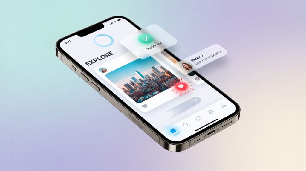
Microinteraction UI examples show how small interface details can have a surprisingly large impact on user experience. A button changing color after a click, a heart icon responding when someone likes a post, or a progress indicator showing that a file is uploading may seem simple. However, each interaction helps users understand what is happening and what they should do next.
Good microinteractions make digital products feel responsive rather than static. They can confirm actions, communicate status, reduce uncertainty, and add personality to an interface without distracting users.
For UI and UX designers, studying effective microinteraction UI examples is a practical way to understand how feedback and motion can support usability. The goal is not to add animation everywhere. Instead, microinteractions should solve small communication problems within the interface.
What Are Microinteractions in UI Design?
A microinteraction is a small interface response that occurs after a user performs an action or when the system communicates a change.
It usually focuses on one specific task.
Common examples include:
- Tapping a like button
- Switching dark mode on
- Receiving a form validation message
- Refreshing a page
- Adjusting a volume slider
- Saving an item
- Uploading a file
- Turning notifications on or off
- Dragging an item into a new position
These interactions often happen in less than a few seconds.
The best microinteraction UI examples feel so natural that users may barely notice them. Yet without them, the interface could feel confusing, slow, or unfinished.
Why Microinteraction UI Examples Matter for UX
Microinteractions are not simply decorative animations.
Their primary purpose is communication.
Whenever users interact with a digital product, they need confirmation that the system recognized their action. Without visible feedback, users may click the same button repeatedly or wonder whether something has gone wrong.
Microinteractions help prevent this uncertainty.
They can also guide attention toward important changes without requiring additional text.
For example, when someone adds a product to a shopping cart, a subtle cart animation immediately confirms that the action worked.
Microinteractions Provide Immediate Feedback
Feedback is one of the most important functions of a microinteraction.
Consider a button labeled Save.
If nothing happens visually after clicking it, the user may wonder:
- Was the document saved?
- Is the system loading?
- Did the click register?
- Should I click again?
A small loading state followed by a checkmark can answer these questions instantly.
This is why many successful microinteraction UI examples revolve around confirmation.
Microinteraction UI Examples for Buttons
Buttons are among the most common places to use microinteractions.
Because buttons represent actions, users expect them to respond immediately.
A button can change through several states:
- Default
- Hover
- Pressed
- Loading
- Success
- Disabled
Each state communicates something different.
For example, when users hover over a desktop button, the background may shift slightly. When they click it, the button can compress for a fraction of a second.
After submission, the button might display a spinner before changing to a success icon.
These small transitions create a clear interaction sequence.
Use Button Feedback Without Overdoing Animation
Button animation should remain subtle.
Large bouncing effects, excessive movement, or long transitions can make basic actions feel slower.
Instead, good button microinteractions usually last only a short moment.
The purpose is to communicate:
“Your action has been recognized.”
Not:
“Look at this animation.”
That distinction is important when designing professional interfaces.
Microinteraction UI Examples for Form Validation
Forms are another area where microinteractions can significantly improve usability.
Traditional forms sometimes display every error only after the user presses Submit.
That creates unnecessary frustration.
Modern interfaces can provide feedback while users complete each field.
For example, when someone enters a valid email address, a small checkmark might appear beside the field.
If the address is incorrect, the border may change and a short message can explain what needs fixing.
Effective microinteraction UI examples for forms help users correct mistakes before submitting the entire form.
Show Clear Success and Error States
Error feedback should never depend only on color.
Instead, combine visual changes with:
- Icons
- Short messages
- Labels
- Accessible status updates
For example:
Password must contain at least eight characters.
This is more helpful than simply turning the field red.
Microinteractions should reduce confusion rather than create additional guessing.
Toggle and Switch Microinteraction UI Examples
Toggle switches communicate binary settings such as:
- On or off
- Public or private
- Light or dark mode
- Notifications enabled or disabled
The movement of the switch itself is a microinteraction.
When users tap it, the control should immediately change position and visually communicate the new state.
A dark mode switch provides an especially clear example.
As the toggle moves, the interface may smoothly transition from a bright background to a darker palette.
This creates both confirmation and continuity.
Among common microinteraction UI examples, toggles are particularly useful because the animation mirrors the change in system state.
Also Read: Website Color Scheme Ideas for Better Visual Design
Loading and Progress Microinteraction UI Examples
Waiting without information can make digital products feel slower than they actually are.
Progress microinteractions help solve this problem.
Instead of leaving users staring at an unchanged screen, the interface can show that something is happening.
Common patterns include:
- Loading spinners
- Progress bars
- Skeleton screens
- Upload percentages
- Processing indicators
- Animated status icons
For a short wait, a spinner may be enough.
For longer processes, users usually benefit from more specific progress information.
Show Progress for Longer Tasks
Imagine uploading a large video.
A simple loading spinner provides very little information.
A progress indicator reading:
Uploading 68%
is more useful because users can estimate how much of the task remains.
This principle applies to:
- File uploads
- Software installation
- Checkout processes
- Account setup
- Multi-step forms
Good feedback can make waiting feel more predictable.
Swipe and Gesture Microinteraction UI Examples
Mobile interfaces rely heavily on gestures.
Because gestures do not always have visible controls, feedback becomes especially important.
Common gesture-based microinteractions include:
- Swipe to delete
- Pull to refresh
- Drag and drop
- Swipe between images
- Long press
- Pinch to zoom
A familiar example is pull-to-refresh.
As the user drags the screen downward, an icon appears and reacts to the gesture. After reaching the refresh threshold, the icon changes state and communicates that releasing the screen will refresh the content.
These microinteraction UI examples connect physical movement with digital feedback.
Microinteractions for Likes and Favorites
Social platforms provide many recognizable examples of microinteraction design.
Tap a heart icon and it might:
- Fill with color
- Expand briefly
- Show a small burst
- Update the like count
This instant feedback makes the interaction satisfying while confirming the action.
However, similar patterns are useful beyond social media.
Favorite buttons can appear in:
- Shopping websites
- Travel apps
- Recipe websites
- Music platforms
- Portfolio websites
- Inspiration boards
The interaction should remain brief enough that it never interferes with browsing.
Navigation Microinteraction UI Examples
Navigation can also benefit from small interactive responses.
- A menu icon might transform into a close icon when opened.
- A navigation underline can smoothly move toward the active section.
- A mobile menu may slide into view rather than suddenly appearing.
These changes help users understand how interface elements relate to one another.
Useful navigation microinteraction UI examples include:
- Animated hamburger menus
- Active menu indicators
- Tab transitions
- Expanding dropdown arrows
- Breadcrumb state changes
- Hover effects
The animation should reinforce location and hierarchy.
Microinteractions for Notifications
Notifications communicate that something new requires attention.
A small badge appearing beside an inbox icon is one example.
Another is a bell icon briefly moving when a new notification arrives.
The animation does not need to be dramatic.
In fact, subtle feedback is usually better because users may see these signals frequently throughout the day.
Too much movement can quickly become distracting.
Designers should consider both visibility and frequency when creating notification microinteractions.
Also Read: UI UX Consistency for More Professional Interfaces
Microinteraction UI Examples for E-Commerce
E-commerce interfaces contain many opportunities for helpful microinteractions.
Consider adding an item to a shopping cart.
Instead of simply updating a number in the header, the interface might briefly animate the product toward the cart icon.
The cart badge then changes from:
2 → 3
This makes the relationship between the action and the result immediately understandable.
Other e-commerce microinteraction UI examples include:
- Wishlist heart animations
- Quantity selector feedback
- Coupon validation
- Shipping calculators
- Checkout progress indicators
- Product image zoom
- Size selection states
- Payment confirmation
Each interaction can make the buying process feel more responsive.
Microinteraction UI Examples for Onboarding
Onboarding often asks users to complete several steps before they can start using a product.
Microinteractions can help make this process feel easier.
A progress indicator might show:
Step 2 of 4
Completed steps can receive checkmarks, while the active step remains highlighted.
Small transitions between screens can also create continuity.
Instead of treating onboarding as several disconnected pages, motion can make the process feel like one connected journey.
This can be especially useful for:
- SaaS platforms
- Productivity apps
- Finance applications
- Educational platforms
- Account registration
- Profile creation
How to Design Better Microinteractions
Successful microinteractions usually begin with purpose.
Before adding motion, ask:
What information does the user need at this moment?
Then determine whether motion or visual feedback can communicate it more clearly.
Keep Microinteractions Fast
Most microinteractions should feel immediate.
Long animations can interrupt workflows.
Users should not have to wait for an animation before completing their next action.
Make Feedback Easy to Understand
Animations should reinforce meaning.
For example:
- A checkmark communicates success.
- A spinner communicates processing.
- A shake can communicate an error.
- A progress bar communicates completion status.
Avoid movement that has no understandable relationship to the user’s action.
Maintain Visual Consistency
Microinteraction behavior should feel consistent throughout the interface.
If buttons use subtle transitions on one screen, dramatically bouncing buttons elsewhere may feel disconnected.
Create consistent rules for:
- Animation duration
- Easing
- Hover states
- Loading behavior
- Success feedback
- Error feedback
This makes the interface feel like one complete system.
Avoid These Microinteraction UI Mistakes
Although microinteractions can improve engagement, too many can create visual noise.
One common mistake is animating nearly every element.
If icons, buttons, backgrounds, menus, cards, and text are constantly moving, users may struggle to focus on the actual content.
Another problem is using slow animation.
A beautiful transition is not helpful if users must wait for it repeatedly.
Designers should also consider accessibility.
Some users experience discomfort from excessive motion. Interfaces should respect reduced-motion preferences whenever possible.
Effective microinteraction UI examples balance personality with usability.
Test Microinteractions With Real Users
A microinteraction may look impressive during design review but behave differently during real use.
Testing helps designers understand whether feedback is actually useful.
Observe questions such as:
- Do users recognize that an action succeeded?
- Do they understand loading states?
- Are transitions slowing them down?
- Can they identify interactive elements?
- Are error messages noticeable?
- Does animation distract from important content?
Microinteractions should make tasks clearer.
If users notice the animation more than the task itself, the interaction may need simplification.
Build Microinteractions Into the Design System
Product teams can improve consistency by documenting microinteraction patterns inside their design system.
For example, define standard behavior for:
Button Feedback
Specify hover, pressed, loading, success, and disabled states.
Form Feedback
Define how validation, warnings, and errors appear.
Loading States
Choose consistent patterns for short and long waits.
Navigation Motion
Document how menus, tabs, drawers, and dropdowns transition.
Reduced Motion
Create alternative behaviors for users who prefer less animation.
Including these patterns in the design system prevents teams from designing the same interactions differently across every screen.
Also Read: How to Create a Better Website Layout Design from Scratch
Final Thoughts on Microinteraction UI Examples
The most effective microinteraction UI examples demonstrate that good user experience is often built through small details. A simple button response, progress indicator, toggle animation, form validation message, or favorite icon can make an interface feel significantly clearer and more responsive.
Microinteractions work best when they support communication rather than decoration.
Every animation should have a reason to exist.
Ask what users need to know after performing an action, then provide immediate and understandable feedback.
When used carefully, microinteraction UI examples can improve usability, strengthen engagement, reduce uncertainty, and create a more polished digital product. The best microinteractions may only last a fraction of a second, but their effect on the overall experience can be much greater.
For high-quality fonts to boost your income, check out Letter Crafted. Our professional fonts are perfect for branding, marketing, and content creation. So, don’t miss this opportunity.