
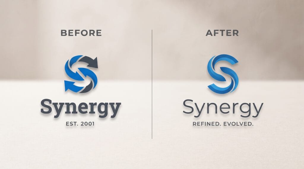
Brand logo redesign case studies can teach brand managers far more than simply looking at before-and-after logos. A successful redesign usually reflects a larger business decision involving positioning, customer perception, digital usability, growth, or changing market conditions. The strongest redesigns preserve recognizable brand equity while improving the identity for current and future applications.
A logo redesign does not always require a dramatic visual transformation.
Sometimes the most effective changes involve improving typography, simplifying shapes, refining proportions, updating colors, or creating a more flexible logo system.
This guide explores practical brand logo redesign case studies and the lessons brand managers can apply when evaluating or planning a visual identity update.
Why Brand Logo Redesign Case Studies Matter
Studying redesigns helps teams understand why certain visual changes work.
A logo is often one of the most visible parts of a brand, but it must operate within a much larger identity system.
Companies may redesign their logos because:
- The existing identity looks outdated
- The business has changed direction
- The company is entering new markets
- The logo performs poorly on digital screens
- The identity has become inconsistent
- The company has merged with another business
- Customer perception needs to change
- The brand has expanded beyond its original products
Good brand logo redesign case studies reveal how visual decisions connect to business objectives.
The purpose is not simply to create something newer.
The redesign should solve a clear problem.
1. Brand Logo Redesign Case Studies for Simplification Can Improve Flexibility
Many modern logo redesigns involve simplification.
This often means removing:
- Complex shadows
- Fine details
- Multiple outlines
- Small decorative elements
- Unnecessary gradients
A simpler logo can be easier to reproduce across digital and physical environments.
Imagine a retail brand with an older emblem containing detailed illustrations, small text, and several colors.
The logo might look acceptable on:
- Store signage
- Large packaging
- Printed brochures
However, it may become difficult to recognize when used as:
- Social profile image
- Mobile app icon
- Favicon
- Small product label
A redesign could retain the recognizable symbol while reducing unnecessary detail.
What Brand Managers Can Learn
Simplification should not mean removing every distinctive characteristic.
Ask:
- Which parts create recognition?
- Which details disappear at small sizes?
- What can be removed without losing identity?
- Does the logo still feel unique after simplification?
The best brand logo redesign case studies often show that simplification works when designers preserve the strongest visual idea.
2. Brand Logo Redesign Case Studies for Typography Can Modernize a Brand
Sometimes the symbol does not need major changes.
Updating the typography can significantly change how the identity feels.
Imagine a technology company using a narrow, highly stylized wordmark created many years ago.
The typeface may feel:
- Difficult to read
- Too decorative
- Outdated
- Inconsistent with the current product
A redesign might introduce a cleaner wordmark with improved:
- Letter spacing
- Proportions
- Weight
- Readability
The brand can immediately feel more contemporary without abandoning its established identity.
Use Custom Typographic Details
A completely standard typeface can sometimes make a redesigned logo feel generic.
Small customizations may create stronger ownership.
Designers might adjust:
- Letter terminals
- Curves
- Crossbars
- Connections
- Spacing
- Individual characters
Subtle changes can make typography distinctive while maintaining readability.
3. Brand Logo Redesign Case Studies for Preserve Valuable Brand Equity
One of the biggest risks in a redesign is removing elements customers already recognize.
Imagine a food company that has used the same distinctive symbol for several decades.
Customers may associate that symbol with:
- Familiarity
- Product quality
- Childhood memories
- Reliability
Replacing it with a completely unrelated mark could weaken recognition.
A more careful redesign might retain:
- Core symbol
- General silhouette
- Recognizable colors
while improving:
- Typography
- Spacing
- Proportions
- Reproduction
This evolutionary approach is often safer for established brands.
Evolution Versus Revolution
Before redesigning, decide whether the brand needs:
Evolution
or:
Revolution
Evolution works when the current identity still has valuable recognition.
Revolution may be appropriate when:
- The business has fundamentally changed
- The old identity has negative associations
- The company is repositioning dramatically
- A merger has created a new organization
Many useful brand logo redesign case studies demonstrate that a redesign does not need to look completely different to be successful.
4. Brand Logo Redesign Case Studies for Design for Digital First
Older logos were often designed primarily for print.
Modern identities must work across:
- Mobile apps
- Websites
- Social media
- Video
- Digital advertising
- Smart devices
A complicated logo may look impressive on a printed brochure but fail when displayed at 24 pixels.
A digital-focused redesign may require:
- Simpler shapes
- Stronger contrast
- Flexible lockups
- Responsive logo versions
- Clear icons
Create Responsive Logo Variations
Instead of forcing one logo into every space, create several versions.
For example:
- Full logo: Wordmark + symbol
- Compact logo: Shortened wordmark + symbol
- Icon: Symbol only
Each version should still feel like the same brand.
Responsive branding is especially important for companies with many digital touchpoints.
Also Read: Simple Circle Logo Design Ideas for Better Branding
5. Brand Logo Redesign Case Studies for Color Can Change Brand Perception
Color has a major influence on how customers perceive identity.
Imagine a financial company using a very dark, traditional color palette.
If the company wants to appear more accessible and digital, the redesign might introduce:
- Brighter primary colors
- Softer supporting colors
- More contrast
Alternatively, a luxury company may reduce its palette and use more restrained colors.
Color changes can communicate:
- Energy
- Trust
- Sophistication
- Innovation
- Sustainability
- Approachability
Do Not Change Color Without a Reason
Established colors can carry significant recognition.
Before making dramatic changes, evaluate:
- Customer recognition
- Competitor colors
- Accessibility
- Digital performance
- Packaging requirements
Strong brand logo redesign case studies usually show that color changes support a larger positioning decision.
6. Brand Logo Redesign Case Studies for Remove Unnecessary Complexity
Some identities become complicated over time.
Different departments may create:
- Alternative logos
- Extra colors
- Additional fonts
- Unofficial icons
- Inconsistent templates
Eventually, customers may encounter several different versions of the same brand.
A redesign project can help simplify the entire system.
Instead of creating more assets, the new identity might reduce the number of approved options.
For example:
- One primary logo
- One secondary logo
- One icon
- One core color palette
- Two main fonts
Fewer options can improve consistency.
From Detailed Emblem to Simple Symbol
Consider a fictional outdoor company called NorthPeak.
Its original logo contains:
- Mountain illustration
- Sun
- Trees
- Circular border
- Company name
- Small tagline
The logo works on large signs but becomes unreadable on mobile.
The redesign keeps the mountain shape but removes the other elements.
The new identity uses:
- Simplified mountain symbol
- Bold sans serif wordmark
- Dark green and neutral palette
- Symbol-only app icon
The brand still feels connected to nature, but the identity becomes much easier to use.
Lesson From This Logo Redesign
The strongest element was the mountain.
Everything else competed with it.
This example demonstrates one of the most useful lessons from brand logo redesign case studies:
Identify the strongest recognizable idea and let it lead the identity.
Updating Typography Without Losing Recognition
Imagine a fictional cafe brand called Morning Lane.
Its existing logo uses:
- Handwritten script
- Decorative flourishes
- Small tagline
As the company expands into packaged products, the script becomes difficult to read on supermarket shelves.
The redesign keeps the brand name but introduces:
- Custom serif wordmark
- Simpler letterforms
- Stronger contrast
- Small monogram
The warm personality remains, but readability improves.
Lesson From This Logo Redesign
The redesign solves a practical problem without completely abandoning the personality customers already know.
This is often a better approach than following design trends without considering the existing audience.
Building a Flexible Digital Identity
Imagine a software business called FlowDesk.
The original identity consists only of a long horizontal wordmark.
This creates problems for:
- App icons
- Social avatars
- Browser tabs
- Mobile navigation
The redesigned identity introduces:
- Wordmark
- Abstract F symbol
- Compact lockup
- App icon
- Motion version
The company now has a flexible system rather than one rigid logo.
Lesson From This Logo Redesign
A redesign should consider applications that may not have existed when the original logo was created.
This is why modern brand logo redesign case studies often focus on systems rather than a single mark.
7. Brand Logo Redesign Case Studies for Test Against Competitors
A logo may look attractive in isolation but disappear when placed beside competitors.
Before approving a redesign, compare it with brands in the same category.
Review:
- Shapes
- Typography
- Colors
- Symbols
- Overall personality
If every competitor uses:
- Blue
- Geometric sans serif
- Abstract circular icon
using the same visual language may make differentiation difficult.
However, being different only for the sake of difference can also create problems.
The goal is to create distinction that remains appropriate for the market.
8. Brand Logo Redesign Case Studies for Build the Identity Beyond the Logo
A redesigned logo cannot carry the entire brand.
The visual identity should also define:
- Typography
- Color
- Photography
- Illustration
- Icons
- Layout
- Patterns
- Motion
Imagine a new logo that looks modern but is placed inside outdated website layouts and inconsistent social graphics.
Customers may barely notice the redesign.
A stronger project considers how the logo works within a complete visual system.
Show Real Brand Applications
Before approving a redesign, test it on:
- Website header
- Mobile interface
- Packaging
- Social profile
- Business cards
- Advertising
- Signage
Mockups help reveal weaknesses that are not obvious when viewing the logo alone.
9. Brand Logo Redesign Case Studies for Avoid Trend-Driven Redesigns
Design trends change quickly.
A brand identity should ideally remain useful longer than a short trend cycle.
Avoid redesigning simply because:
- Gradients are popular
- Everyone is using minimal logos
- A certain font style is trending
- Competitors recently redesigned
Ask whether the change solves a real brand problem.
A redesign based entirely on current aesthetics may quickly feel dated again.
The strongest brand logo redesign case studies balance contemporary design with long-term recognition.
Also Read: Travel Logo Inspiration for Luxury, Adventure, and Local Tours
10. Brand Logo Redesign Case Studies for Prepare for Customer Reactions
People can become emotionally attached to familiar logos.
Even a carefully designed update may receive negative reactions initially.
Brand managers should therefore prepare communication explaining:
- Why the identity changed
- What remains familiar
- How the redesign reflects the business
- Where the new identity will appear
Avoid assuming immediate public reaction is the only measure of success.
A logo should also be evaluated according to longer-term factors such as:
- Recognition
- Consistency
- Usability
- Brand perception
- Business relevance
How to Know When Your Logo Needs a Redesign
Consider redesigning when the current identity:
- Does not reflect the business anymore
- Looks visibly outdated
- Performs poorly at small sizes
- Is difficult to reproduce
- Has too many inconsistent versions
- Cannot adapt to new products
- Does not differentiate the brand
- Creates accessibility problems
Do not redesign just because the logo has existed for several years.
A strong identity can remain effective for decades.
Common Logo Redesign Mistakes
Changing Too Much
Removing all recognizable elements can weaken brand equity.
Following Trends Blindly
Trendy design may not support long-term recognition.
Ignoring Small Sizes
Always test digital applications.
Creating Only One Logo Version
Modern brands usually need flexible lockups.
Ignoring Typography
The wordmark often matters as much as the symbol.
Skipping Competitor Research
Understand the visual environment surrounding the brand.
Redesigning the Logo Without the System
Update the broader visual identity as necessary.
Brand Logo Redesign Case Studies Checklist
Before approving a redesign, check that you have:
- Defined the reason for redesigning
- Audited the existing identity
- Identified valuable brand equity
- Researched competitors
- Defined positioning
- Tested logo concepts
- Improved typography
- Reviewed color choices
- Created responsive logo versions
- Tested small sizes
- Checked monochrome reproduction
- Reviewed accessibility
- Created digital applications
- Created physical applications
- Developed supporting visual elements
- Documented brand guidelines
- Planned internal rollout
- Planned external communication
Do not judge the redesign only by how attractive the logo looks in a presentation.
Test whether the system works in the real world.
Also Read: Logo Variation Tips for New Businesses and Digital Products
Final Thoughts
The most useful brand logo redesign case studies show that successful redesign is not simply about making an old logo look modern.
A strong redesign begins with understanding why change is necessary.
It may simplify an overly complex symbol, improve typography, modernize color, strengthen digital performance, or create a more flexible identity system.
At the same time, brand managers should protect valuable recognition whenever possible.
Study what customers already associate with the brand.
Keep strong elements.
Improve weak ones.
Test the identity across real applications before launching it.
The strongest brand logo redesign case studies also demonstrate that a logo should never be evaluated alone. Typography, color, photography, layouts, icons, packaging, websites, and motion all influence the way customers experience the brand.
Use redesign as an opportunity to improve the entire visual system.
When approached strategically, brand logo redesign case studies can provide valuable lessons for building identities that feel more relevant, distinctive, flexible, and consistent without sacrificing the recognition the brand has already earned.
For high-quality fonts to boost your income, check out Letter Crafted. Our professional fonts are perfect for branding, marketing, and content creation. So, don’t miss this opportunity.