
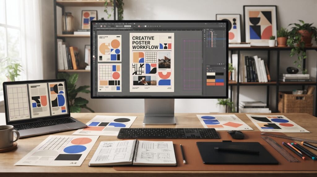
A creative poster design tutorial can help beginners understand how typography, images, color, spacing, and composition work together to communicate one clear message. Poster design may look simple because everything appears on a single page, but creating an effective poster requires careful decisions about what viewers should notice first, what information matters most, and how every visual element supports the overall idea.
Posters can be created for many purposes, including:
- Events
- Concerts
- Exhibitions
- Products
- School projects
- Business promotions
- Social campaigns
- Movies
- Conferences
Although each poster may have a different style, strong poster design follows several fundamental principles.
This creative poster design tutorial explains those principles in a practical way so new designers can create posters that feel intentional rather than randomly decorated.
Start Your Creative Poster Design Tutorial With a Clear Purpose
Before opening design software, understand what the poster needs to accomplish.
Ask:
What is this poster trying to communicate?
- A concert poster may need to communicate excitement.
- A business event poster may need to feel professional.
- A fashion poster may focus heavily on photography and typography.
Knowing the purpose helps determine the visual direction.
Write down the most important information before designing.
This might include:
- Main title
- Date
- Location
- Supporting details
- Call to action
- Website or contact information
Avoid giving every piece of information equal importance.
A poster needs hierarchy.
Define the Target Audience
A good poster should communicate with a specific group of people.
Consider:
- Age
- Interests
- Industry
- Visual preferences
- Where the poster will appear
A poster for a children’s event should probably look different from a poster advertising a corporate seminar.
Audience also influences choices such as:
- Colors
- Typography
- Photography
- Illustration
- Complexity
Designing for everyone often creates a generic result.
Instead, create something visually relevant to the intended audience.
Build a Visual Concept Before Designing
One of the most useful lessons in any creative poster design tutorial is to begin with a concept rather than decoration.
A concept is the central visual idea behind the poster.
For example, a music festival poster might use:
Sound waves + oversized typography + vibrant gradients
A sustainable event might use:
Natural textures + green tones + organic shapes
A technology conference might use:
Structured grids + geometric graphics + futuristic typography
The concept gives the poster a consistent direction.
Without one, designers often keep adding visual elements because the composition feels incomplete.
Use Visual Hierarchy in Poster Design
Visual hierarchy tells viewers where to look first.
A typical poster hierarchy might be:
Main headline → Main image → Key information → Supporting details → Call to action
Hierarchy can be created using:
- Size
- Weight
- Color
- Contrast
- Position
- Spacing
Your most important element should usually have the strongest visual presence.
- If the event name matters most, make it larger.
- If a product is the main attraction, allow the product image to dominate.
A viewer should understand the general message within a few seconds.
Creative Poster Design Tutorial for Typography
Typography can become one of the strongest visual elements in a poster.
You can use typography to create:
- Personality
- Contrast
- Movement
- Structure
- Emphasis
Beginners sometimes use too many typefaces because they want the design to look creative.
This usually creates visual confusion.
Try starting with one or two font families.
Create Typographic Contrast
You can build contrast through:
- Large and small type
- Bold and regular weights
- Uppercase and lowercase
- Tight and open spacing
For example:
Large bold headline
followed by:
Smaller regular supporting text
creates a simple but effective hierarchy.
The poster does not need many fonts when size and weight already provide enough contrast.
Experiment With Oversized Typography
Large typography is especially effective in contemporary poster design.
A headline can extend across most of the page.
Letters may even interact with:
- Images
- Shapes
- Borders
- Background elements
Oversized text can create a strong visual identity without requiring complicated illustrations.
However, readability should remain important.
Creative typography should support communication rather than hide it.
Use a Grid to Organize Your Poster
A grid provides invisible structure.
It helps designers align:
- Headlines
- Images
- Text blocks
- Logos
- Decorative elements
A simple grid might contain:
- Two columns
- Three columns
- Four columns
Beginners do not need a complicated editorial grid.
Even basic alignment can make a poster look much more professional.
Break the Grid Carefully
Once the structure feels organized, you can intentionally break it.
For example, an image might extend across several columns.
A headline might slightly overlap another element.
Breaking the grid can create energy.
However, it works best when the underlying structure is already clear.
Also Read: Photoshop Poster Effects Tutorial for Better Designs
Creative Poster Design Tutorial for Color
Color strongly influences how a poster feels.
A palette might communicate:
- Energy
- Luxury
- Calmness
- Technology
- Nature
- Youthfulness
Instead of choosing many unrelated colors, build a controlled palette.
For example:
- Cream + black + orange
- Navy + electric blue + white
- Beige + burgundy + muted pink
These combinations give the design a more deliberate appearance.
Use Contrast for Important Information
Contrast helps important elements stand out.
You can create contrast using:
- Light against dark
- Bright against neutral
- Warm against cool
- Saturated against muted
If every element uses a bright color, nothing feels especially important.
Use strong colors selectively.
Choose Images That Support the Message
Photography and illustration should add meaning rather than simply fill empty space.
Ask:
What does this image contribute?
Images may establish:
- Mood
- Context
- Product focus
- Personality
- Story
Avoid using several unrelated images unless the concept specifically requires a collage.
One strong image can often create greater impact.
Try Creative Image Cropping
You do not always need to show the entire photograph.
Interesting crops can make ordinary images feel more dynamic.
Try:
- Close-up faces
- Partial objects
- Images extending outside the canvas
- Large background photography
- Circular or geometric crops
Cropping also helps control where viewers focus.
An unusual crop can become part of the poster’s visual identity.
Combine Images and Typography
A useful technique in a creative poster design tutorial is allowing images and typography to interact.
Instead of treating them as completely separate elements, try:
- Text overlapping photography
- Images appearing behind letters
- Typography following image shapes
- Objects partially covering headlines
These relationships can create depth.
However, make sure important text remains readable.
The interaction should look intentional rather than accidental.
Use Negative Space in Poster Design
Beginners often feel pressure to fill every empty area.
Empty space is not wasted space.
Negative space can:
- Improve readability
- Create focus
- Add sophistication
- Separate information
- Reduce visual clutter
A poster with one strong headline, one photograph, and generous empty space may communicate more effectively than one containing dozens of graphic elements.
Allow the composition room to breathe.
Add Shapes and Graphic Elements Carefully
Simple graphic elements can strengthen a poster concept.
These might include:
- Lines
- Circles
- Frames
- Arrows
- Geometric shapes
- Patterns
- Abstract forms
Use these elements to support hierarchy or guide the viewer’s eye.
For example, a line might connect the event title to the date.
A colored rectangle might highlight important information.
Decorative elements should have a purpose.
Creative Poster Design Tutorial for Composition
Composition refers to how everything is arranged inside the poster.
A balanced composition does not necessarily mean everything must be centered or symmetrical.
Designers can create:
Symmetrical Composition
Elements feel evenly distributed.
This often creates a stable and formal appearance.
Asymmetrical Composition
Different elements balance each other through size, color, and visual weight.
This can create a more dynamic result.
Centered Composition
The primary elements are positioned near the middle.
This works particularly well for simple promotional posters.
Experiment with multiple arrangements before choosing one.
Also Read: How to Make a Poster Design That Looks Eye-Catching
Create Movement Through the Layout
A poster should guide the viewer through its information.
Use:
- Alignment
- Scale
- Directional shapes
- Image placement
- Typography
- Spacing
Imagine the viewer’s eye moving through the design.
- Where does it begin?
- Where does it go next?
- Where does it finish?
A good poster creates a natural visual path.
Keep Supporting Information Readable
Creative layouts still need to communicate practical information.
Details such as:
- Dates
- Addresses
- Websites
- Ticket information
- Contact details
should remain easy to understand.
Do not make supporting text unnecessarily tiny.
Strong design combines creativity with usability.
Build Contrast Without Creating Clutter
Contrast is essential to this creative poster design tutorial, but contrast does not mean making every element dramatically different.
Choose specific areas to emphasize.
For example:
- Bold headline + quiet supporting information
- Bright image + neutral typography
- Dark background + one vivid accent color
Controlled contrast creates clearer communication.
Create Multiple Poster Variations
Do not stop after your first composition.
Duplicate the design and test alternatives.
Change:
- Headline placement
- Image size
- Color palette
- Alignment
- Crop
- Typography scale
You may discover a much stronger solution after several experiments.
Professional design often involves comparison and refinement rather than immediately finding the perfect layout.
Review Your Poster From a Distance
Poster design is often viewed from farther away than websites or brochures.
Zoom out on your screen.
Ask:
- Can I identify the main message?
- Is the headline readable?
- Is there a clear focal point?
- Does anything look too crowded?
- Does the design still feel balanced?
If your main message disappears when the design becomes smaller, the hierarchy may need improvement.
Common Poster Design Mistakes
Beginners should watch for several common problems.
Too Many Fonts
Multiple unrelated typefaces create visual noise.
Too Much Information
A poster is not a full brochure.
Prioritize essential content.
Weak Hierarchy
Viewers should immediately understand what matters most.
Poor Alignment
Random positioning makes the design feel unfinished.
Too Many Colors
A controlled palette often produces a stronger result.
Low Contrast
Important information must remain visible.
Overdecorating
More graphic elements do not automatically produce a better poster.
Creative Poster Design Tutorial Checklist
Before exporting your final poster, review:
- Clear purpose
- Defined target audience
- Strong visual concept
- Obvious focal point
- Clear hierarchy
- Consistent typography
- Controlled color palette
- Useful imagery
- Clean alignment
- Effective grid
- Balanced spacing
- Readable supporting information
- Good contrast
- Consistent graphic style
- Correct spelling
- Correct dates and details
- High-quality images
- Appropriate export settings
A short review can prevent simple mistakes from weakening an otherwise strong design.
Practice Different Poster Styles
The best way to improve poster design is through repetition.
Try creating posters using different approaches.
For example:
- Minimalist
- Typographic
- Editorial
- Swiss-inspired
- Retro
- Experimental
- Geometric
- Photography-based
- Illustration-based
Repeating the same style may improve execution, but exploring different visual systems can improve your overall design thinking.
Also Read: AI Poster Design: How Designers Can Create Better Posters
Final Thoughts
A creative poster design tutorial should teach more than how to place text and images on a page.
Good poster design begins with communication.
Understand the purpose.
Identify the audience.
Create a visual concept.
Then use typography, color, imagery, grids, contrast, and spacing to build a clear visual hierarchy.
Beginners sometimes believe professional poster design requires complicated effects.
It usually does not.
A strong concept combined with good typography and careful composition can create a much more memorable result than unnecessary decoration.
Use grids to establish structure.
Experiment with oversized typography.
Allow images and text to interact.
Use negative space confidently.
Most importantly, create several versions and compare them.
Every poster gives you an opportunity to practice composition, hierarchy, typography, and visual communication.
By following this creative poster design tutorial and applying the principles consistently, beginners and new designers can gradually develop posters that feel clearer, more creative, and more professionally designed.
For high-quality fonts to boost your income, check out Letter Crafted. Our professional fonts are perfect for branding, marketing, and content creation. So, don’t miss this opportunity.