
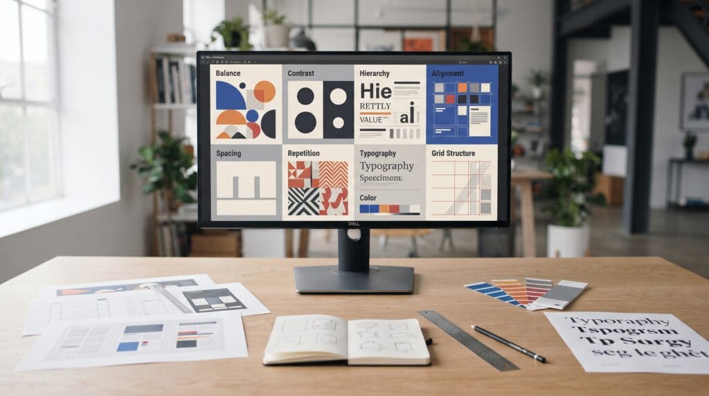
Graphic design principles help designers organize visual elements so information feels clear, balanced, intentional, and easier to understand. Beginners often focus first on software, effects, fonts, or colors, but strong design depends more on the decisions behind those elements. A simple composition that uses hierarchy, contrast, alignment, and spacing well can often look more professional than a complicated design filled with unnecessary decoration.
These principles can be applied to many types of work, including:
- Posters
- Branding
- Social media graphics
- Packaging
- Presentations
- Websites
- Editorial layouts
- Advertising
- Marketing materials
Understanding graphic design principles gives designers a reliable framework for making better choices instead of arranging elements randomly.
The goal is not to follow every rule rigidly.
It is to understand why visual relationships work so you can use or break them intentionally.
Why Graphic Design Principles Matter
Design is a form of communication.
Every visual choice affects what people notice, understand, and remember.
Without clear structure, viewers may struggle to answer simple questions such as:
- What should I read first?
- Which information is most important?
- Which elements belong together?
- Where should I look next?
Strong graphic design principles help solve these problems.
They create order.
They also make a design easier to scan and more enjoyable to use.
A visually attractive design can still fail if the message is difficult to understand.
Good design combines aesthetics with communication.
Graphic Design Principles for Visual Hierarchy
Visual hierarchy determines the order in which people notice information.
A basic hierarchy might look like:
Headline → Supporting image → Subheading → Body text → Secondary details
Designers can create hierarchy through:
- Size
- Weight
- Color
- Position
- Contrast
- Spacing
A large bold headline naturally attracts more attention than small body text.
A bright accent color may draw attention toward a button or call to action.
Give One Element Priority
One of the most common beginner mistakes is making too many elements equally strong.
If every element is:
- Large
- Bold
- Bright
- High contrast
nothing feels important.
Choose one primary focal point.
Then create supporting levels around it.
Strong hierarchy makes a design feel easier to understand almost immediately.
Graphic Design Principles for Balance
Balance describes how visual weight is distributed across a composition.
Visual weight can come from:
- Size
- Color
- Darkness
- Detail
- Position
- Texture
There are two common approaches.
Symmetrical Balance
Symmetrical designs distribute visual weight evenly.
This can create a feeling of:
- Stability
- Formality
- Order
- Calmness
Symmetry works well for elegant or traditional layouts.
Asymmetrical Balance
Asymmetrical design uses different elements that still feel visually balanced.
For example:
Large image on the left + smaller text blocks on the right
can create balance without mirroring the composition.
Asymmetry often feels more dynamic and contemporary.
Understanding balance is one of the most useful graphic design principles because it helps prevent layouts from feeling visually heavy on one side.
Graphic Design Principles for Contrast
Contrast creates differences between elements.
These differences help viewers identify what matters.
Contrast can come from:
- Large versus small
- Dark versus light
- Bold versus thin
- Warm versus cool
- Simple versus detailed
For example, a large dark headline above smaller gray body text creates an obvious hierarchy.
Contrast can also make layouts more visually interesting.
Use Contrast With Purpose
Do not create contrast everywhere.
Reserve strong contrast for important elements.
If every section uses extreme color changes or oversized typography, the design may become noisy.
Controlled contrast is more effective than constant contrast.
Graphic Design Principles for Alignment
Alignment helps create relationships between elements.
Text, images, icons, and shapes should usually connect visually with something else on the page.
Common alignment types include:
- Left alignment
- Center alignment
- Right alignment
- Edge alignment
- Baseline alignment
Even small alignment inconsistencies can make a design feel unfinished.
Imagine three text blocks that begin at slightly different positions.
Each block might look fine alone, but together they create visual disorder.
Use guides and grids to keep relationships clear.
Use Grids for Better Structure
Grids provide an invisible framework for arranging content.
They can include:
- Columns
- Rows
- Margins
- Modules
- Baselines
A simple two-column or three-column grid can significantly improve layout quality.
Grids are especially useful for:
- Magazines
- Websites
- Brochures
- Posters
- Presentations
A grid does not need to make the design feel rigid.
It creates structure first.
You can break the grid intentionally later.
Graphic Design Principles for Proximity
Proximity means placing related elements close together.
This helps viewers understand which information belongs together.
For example:
A product title should usually appear closer to its product image than to unrelated information.
Likewise:
A caption should remain near the image it describes.
Spacing can communicate relationships without adding:
- Borders
- Lines
- Boxes
This makes layouts feel cleaner.
Separate Different Content Groups
If two sections serve different purposes, create more distance between them.
Small gap:
Related content
Large gap:
New section
Proximity is one of the simplest graphic design principles, but it can dramatically improve organization.
Also Read: Summer Graphic Design Style Guide for Better Seasonal Branding
Graphic Design Principles for Repetition
Repetition creates consistency.
Designers can repeat:
- Colors
- Shapes
- Typography
- Spacing
- Image treatments
- Icon styles
- Lines
Repeated patterns help viewers learn the visual system.
For example, every section heading might use the same:
- Font
- Size
- Color
- Spacing
This makes the design easier to scan.
Repetition is particularly important across multiple pages or screens.
Create Rhythm Through Repetition
Repetition can also create rhythm.
Imagine a magazine layout containing several image and text sections.
If each section follows a related spacing and alignment pattern, the reader experiences a predictable visual flow.
However, repetition should not create boredom.
You can keep the system consistent while introducing variation in:
- Images
- Scale
- Layout direction
- Emphasis
The goal is consistency without unnecessary sameness.
Graphic Design Principles for White Space
White space, also called negative space, is the empty area around visual elements.
It does not need to be literally white.
Negative space may be:
- Black
- Beige
- Blue
- Any background color
Its purpose is to give elements room to breathe.
White space can:
- Improve readability
- Create focus
- Separate sections
- Increase perceived quality
- Reduce clutter
Beginners often try to fill every empty area.
This usually makes designs feel crowded.
A confident layout often contains more empty space than a beginner expects.
Graphic Design Principles for Typography
Typography is one of the most important elements in visual communication.
Typography affects:
- Personality
- Hierarchy
- Readability
- Mood
- Structure
Start with a simple system.
For example:
- Headline
- Subheading
- Body text
- Caption
Each level should be clearly different but visually related.
Limit the Number of Fonts
Too many unrelated typefaces can make a design feel chaotic.
One or two type families are often enough.
Create variation using:
- Weight
- Size
- Case
- Spacing
A single font family with multiple weights can produce a complete hierarchy.
Pay Attention to Line Length and Spacing
Typography is not only about choosing a font.
You should also consider:
- Line length
- Line spacing
- Letter spacing
- Paragraph spacing
Long lines can be difficult to read.
Tight line spacing can make paragraphs feel crowded.
Good typography should feel comfortable before it feels decorative.
Graphic Design Principles for Color
Color influences both emotion and hierarchy.
A palette might communicate:
- Energy
- Calmness
- Luxury
- Nature
- Technology
- Playfulness
Use a controlled palette rather than selecting colors independently.
A simple system might include:
- Primary color
- Secondary color
- Neutral colors
- Accent color
Strong graphic design principles use color to organize attention rather than simply decorate the page.
Use Color Contrast Carefully
A bright accent color can highlight:
- Buttons
- Headlines
- Important data
- Calls to action
However, if every element uses a strong accent, nothing stands out.
Also consider readability.
Text should remain easy to read against the background.
Visual style should never reduce basic usability.
Also Read: Winter Graphic Design Style Guide for Better Seasonal Branding
Graphic Design Principles for Scale and Proportion
Scale refers to the size relationship between visual elements.
Large elements usually receive more attention.
Small elements feel secondary.
Proportion determines whether those size relationships feel appropriate.
For example:
A small headline above a very large paragraph may create confusing hierarchy.
Instead, important elements should usually receive stronger scale.
Experiment with dramatic scale differences.
A very large number or headline can create visual impact without requiring extra decoration.
Graphic Design Principles for Movement
Movement describes how the viewer’s eye travels through the composition.
Designers can guide attention using:
- Direction
- Alignment
- Scale
- Repetition
- Image placement
- Shapes
Ask:
Where should the eye begin?
Then:
Where should it move next?
A successful composition creates a natural visual path.
Movement becomes especially important in:
- Posters
- Landing pages
- Advertisements
- Editorial spreads
The viewer should not need to search randomly for the next piece of information.
Use Emphasis to Create a Focal Point
Emphasis makes one element stand out.
A focal point might be:
- Headline
- Image
- Product
- Number
- Button
- Illustration
You can create emphasis through:
- Scale
- Contrast
- Color
- Position
- Isolation
For example, one bright button on an otherwise neutral page immediately attracts attention.
Avoid creating several equally powerful focal points unless the composition specifically requires it.
Graphic Design Principles for Unity
Unity means that different elements feel like parts of the same design.
You can create unity through:
- Consistent typography
- Related colors
- Repeated shapes
- Similar image treatments
- Consistent spacing
A composition may contain many different elements while still feeling cohesive.
Unity is especially important in brand identity systems.
A website, brochure, social post, and packaging design may look different, but they should still feel connected.
Know When to Break Graphic Design Principles
Design principles are not absolute laws.
Experienced designers sometimes:
- Break grids
- Use unusual alignment
- Create extreme scale
- Use unexpected color
- Overlap typography
However, these choices work best when they are intentional.
Breaking a grid because you understand the structure is different from ignoring alignment completely.
The same applies to every graphic design principle.
Learn the rule first.
Then decide when breaking it creates a stronger result.
Common Graphic Design Principle Mistakes
Weak Hierarchy
Everything competes for equal attention.
Inconsistent Alignment
Elements feel disconnected.
Poor Spacing
Content feels crowded or random.
Too Many Fonts
Typography loses consistency.
Too Many Colors
The palette becomes difficult to control.
Weak Contrast
Important elements disappear.
No Focal Point
The viewer does not know where to look.
Ignoring White Space
The design becomes visually exhausting.
Graphic Design Principles Checklist
Before finishing a design, review:
- Clear visual hierarchy
- Balanced composition
- Strong contrast
- Consistent alignment
- Logical proximity
- Useful repetition
- Enough negative space
- Consistent typography
- Controlled color palette
- Appropriate scale
- Natural visual movement
- Clear focal point
- Strong unity
- Readable text
- Intentional use of grids
You do not need every principle to be equally obvious.
The goal is to create a design that feels organized, purposeful, and easy to understand.
Practice Graphic Design Principles With Simple Exercises
The best way to understand design principles is through practice.
Try creating one poster several times.
Version one might focus on:
Contrast
Version two:
Hierarchy
Version three:
White space
Version four:
Asymmetrical balance
Use the same content each time.
This helps you see how changing one principle affects the entire composition.
You can also analyze designs you admire.
Ask:
- Where is the focal point?
- How is hierarchy created?
- What grid is being used?
- How much white space appears?
- Which colors repeat?
Studying existing work helps turn abstract principles into visible decisions.
Also Read: Seasonal Autumn Design Trends for Better Visual Campaigns
Final Thoughts
Graphic design principles give designers a foundation for making stronger visual decisions.
You do not need complicated effects to create professional work.
Start with clear hierarchy.
Use alignment to build relationships.
Apply proximity to organize information.
Create contrast where attention is needed.
Use repetition to build consistency.
Give elements enough white space.
Choose typography and colors with intention.
Think about balance, scale, movement, and unity across the entire composition.
Most importantly, remember that these principles work together.
A layout may use excellent typography but still fail because the hierarchy is weak.
A strong color palette may still feel confusing when spacing is inconsistent.
Professional design comes from combining several graphic design principles into one coherent system.
The more you practice them, the less they feel like separate rules.
Eventually, they become part of how you naturally evaluate a composition.
By understanding and applying these graphic design principles, beginners can create visual work that feels clearer, more balanced, more intentional, and more professional across almost any design project.
For high-quality fonts to boost your income, check out Letter Crafted. Our professional fonts are perfect for branding, marketing, and content creation. So, don’t miss this opportunity.