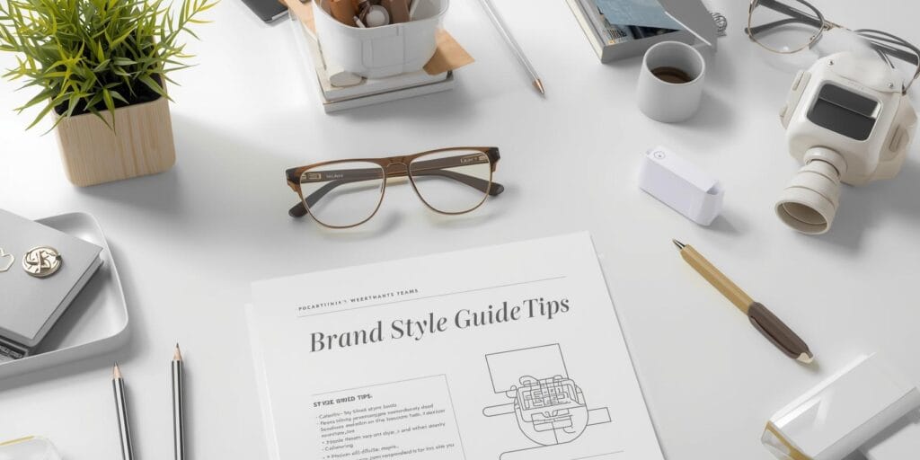
Why Brand Style Guide Tips Matter for Every Team
If your marketing feels inconsistent from channel to channel, start with brand style guide tips that bring order and speed to your process. A usable guide reduces revisions, keeps tone and visuals aligned, and helps new contributors ship work that looks and sounds on-brand. In this practical walkthrough, you’ll get brand style guide tips for structure, voice, visual rules, examples, governance, and rollout so your team can move faster with fewer debates. By the end, you’ll know exactly how to build, socialize, and maintain guidelines that scale.
Brand Style Guide Tips for Setting the Right Scope
Don’t try to document everything at once. Prioritize the sections you actually use weekly. These brand style guide tips help you define a minimum viable guide (MVG):
Start with the essentials: mission, audience snapshots, voice pillars, logo rules, color, typography alternatives (if any), imagery direction, and file delivery.
Add “guardrails, not fences”: state what to do and show what not to do.
Keep it modular: each section should stand alone for quick sharing in Slack or email.
Scope Checklist: What Goes in Version 1
Brand purpose (one paragraph) and three value statements
Audience quick cards (3-5 bullets each)
Voice pillars with do/don’t examples
Logo usage and clearspace rules
Primary/secondary colors with contrast notes
Image direction and icon style
Template links and export specs
Brand Style Guide Tips for Positioning and Messaging
Clear positioning saves time later. Document a short, consistent message backbone your team can reuse.
Positioning line: one sentence explaining what you do and why it matters
One-liner formula: “We help (audience) achieve (outcome) with (difference).”
Proof points: 3-5 bullets that back the promise (awards, data, features)
CTA language: 2-3 approved calls to action suited for site, ads, and email
Messaging Grid
Create a simple grid with three rows (Problem, Solution, Outcome) and three columns (Website, Social, Email). Fill each cell with a single sentence. This forces consistency wherever copy appears.
Brand Style Guide Tips for Voice and Tone
Voice is your brand’s personality, tone is how that voice adapts to context. Give teams concrete examples they can copy.
Voice pillars: e.g., Clear, Warm, Credible
Do/Don’t table: “Do use short verbs.” “Don’t pad with buzzwords.”
Tone map: define tone for help docs (calm), ads (energetic), and legal pages (precise)
Re-write Examples
Include three side-by-sides: “Off-brand” vs “On-brand.” Teams learn fastest from comparisons.
Brand Style Guide Tips for Logo and Lockups
Make logo use impossible to get wrong.
Clearspace rule: minimum padding measured by the logo’s x-height or icon width
Min size: pixel/print thresholds to keep marks legible
Lockups: horizontal, stacked, icon-only show when to use each
Backgrounds: approved backgrounds and contrast requirements
Misuse gallery: stretch, shadow, tilt, outline show and forbid
File Delivery Rules
Centralize master files. Label exports clearly (e.g., Brand-Logo_Primary_RGB.png, Brand-Logo_Icon_White.svg). Link to a single source of truth (DAM, Drive, or Notion).
Also Read: Your Brand, Defined: How to Design Identity That Connects
Brand Style Guide Tips for Color Systems
Color fails are common, solve them at the source.
Core palette: 1 primary, 2-3 supporting colors
Accessibility: provide AA/AAA text-on-background pairings and examples
States: success, warning, error, info colors with usage contexts
Ratios: guidance for how often each color appears in UI or ads
Hand-Off Specs
Document HEX, RGB, CMYK, and Pantone (if you print). Add a compact “Do not adjust tints without approval” note.
Brand Style Guide Tips for Imagery and Iconography
Images and icons shape the vibe more than anything else.
Photography direction: lighting, composition, diversity, candid vs staged
Illustration: line weight, shapes, texture tolerance, motion possibilities
Iconography: grid size, corner radius, stroke thickness, filled vs outline
Do/Don’t board: cluttered vs clean, cliché vs authentic
Sourcing and Credits
List approved stock libraries, credit rules, and model-release notes. Add alt-text guidance for accessibility.
Brand Style Guide Tips for Layout and Spacing
Consistency in spacing = instant polish.
8-point or 4-point grid: pick one and stick to it
Container widths: max content width for web and decks
Headline/body rhythm: line lengths, leading, and paragraph spacing
Buttons and cards: corner radii, padding, and shadow policy
Template Starter Kit
Ship page templates, presentation slides, social post frames, and email modules teams can copy.
Brand Style Guide Tips for Content Types
Different channels need different constraints.
Website: hero copy length, CTA placement, image ratios
Email: preheader rules, button hierarchy, footer compliance
Social: safe zones for text, short caption styles, hashtag tone
Ads: headline limits, mandatory disclaimers, logo placement
Editorial Calendar Notes
Define post frequency, seasonal themes, and review checkpoints so the guide ties directly to execution.
Brand Style Guide Tips for Governance and Workflow
A great guide fails without ownership.
Owners: name a content owner and a design owner
Change log: version number, date, and summary of edits
Submission flow: how teams request new assets or exceptions
Review SLAs: timeframes for feedback so launches don’t stall
Training Plan
Quarterly 30-minute refreshers. New-hire onboarding with a 10-minute quiz. Short Loom videos to demo common tasks.
Also Read: What Local Businesses Teach Us About Smarter Branding
Brand Style Guide Tips for Accessibility and Compliance
Bake inclusion into the rules.
Contrast testing: WCAG AA minimums for text and UI elements
Alt text and captions: concise, descriptive, no keyword stuffing
Motion sensitivity: offer reduced-motion variants for animations
Legal lines: trademark usage, third-party logos, and disclaimers
Pre-Flight Checklist (Accessibility)
Contrast pass
Focus states visible
Alt text written
Link text descriptive (no “click here”)
Brand Style Guide Tips for Rollout and Adoption
If people don’t use the guide, it doesn’t exist.
Single link: host in one place and pin it
TLDR pages: one-page quick-starts for social, web, and decks
Templates first: lead with files people need today
Office hours: 30 minutes weekly for questions and edge cases
Measure Adoption
Track template downloads, request volume, and brand QA issues. Fewer corrections over time means the guide is working.
Brand Style Guide Tips for Audits and Iteration
Brands evolve. Your guide should too.
Quarterly light audit: fix small issues, add examples
Annual deep audit: refresh visuals and messaging as strategy shifts
Feedback loop: collect notes from support, sales, and content teams
Retire rules: if no one uses a rule, remove or rewrite it
Versioning Etiquette
Use semantic versions (1.3.2). Tag major changes and message the team with a short “What changed and why” summary.
Brand Style Guide Tips – Put It All Together
Here’s a practical construction order you can finish in days, not months:
Purpose & Positioning
Voice & Tone with examples
Logo, Lockups, and Misuse
Color with accessibility pairs
Imagery and Icons
Layout and Spacing
Channel Rules and Templates
Governance, Training, and Change Log
Keep it lean. Add depth only where teams actually need it.
Also Read: 10 Successful Brand Awareness Campaign Examples
Conclusion
The best brand style guide tips are the ones your team can act on immediately. Document the minimum, show examples, host everything in one place, and keep ownership clear. With these brand style guide tips, you’ll cut revision cycles, protect brand equity, and help every contributor produce work that feels like it came from one confident voice and to be brand identity. Start with the essentials this week, socialize the link, and iterate. Your future projects and your sanity will thank you.
For high-quality fonts to boost your income, check out Letter Crafted. Our professional fonts are perfect for branding, marketing, and content creation. So, don’t miss this opportunity.