
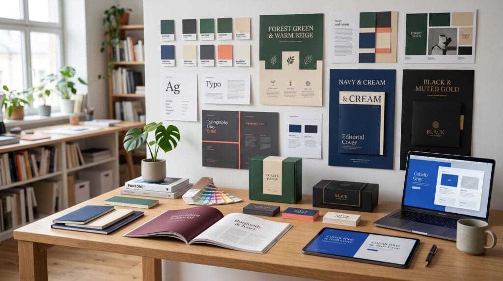
Choosing the right graphic design color combinations can make a visual project feel professional, balanced, and memorable. Color influences how people interpret a logo, website, package, poster, or social media graphic before they read a single word. A thoughtful palette can communicate trust, energy, creativity, luxury, warmth, or calmness, while an unsuitable combination may weaken readability and create visual confusion.
Professional color selection is not about following personal preferences or adding as many attractive colors as possible. Designers must consider the audience, message, industry, visual hierarchy, contrast, accessibility, and final medium.
The strongest palettes usually contain a limited number of colors with clearly defined roles. One color may dominate the composition, another can support it, and a contrasting accent can guide attention toward important information.
This guide explores reliable graphic design color combinations, practical hexadecimal codes, suitable use cases, and methods for turning inspiration into a consistent visual system.
Why Graphic Design Color Combinations Matter
Color can influence recognition, mood, usability, and perceived value. Customers may associate a dark neutral palette with sophistication, while a bright combination can feel energetic and youthful.
Strong graphic design color combinations help designers:
- Establish visual hierarchy
- Communicate brand personality
- Improve readability
- Create emotional impact
- Organize information
- Build brand recognition
- Differentiate products
- Guide attention
- Maintain consistency
- Strengthen visual storytelling
A professional palette should work across different applications. Colors that look attractive on a large monitor may appear differently in print, on mobile devices, or against various materials.
Designers should test every palette in realistic conditions rather than evaluating small color swatches alone.
Understanding the Roles Within a Color Palette
Before exploring specific combinations, assign a clear purpose to every color.
Primary Color
The primary color represents the main visual identity. It usually appears most frequently across backgrounds, logos, headings, packaging, or major interface elements.
Secondary Color
A secondary color supports the primary color and adds variety. It may appear in illustrations, sections, charts, or decorative elements.
Accent Color
An accent color attracts attention. It works well for buttons, promotional labels, highlights, prices, or important calls to action.
Neutral Colors
Neutral shades such as white, cream, gray, brown, and black provide balance. They help stronger colors remain readable and prevent the design from becoming overwhelming.
Professional graphic design color combinations often use one dominant color, one supporting color, one accent, and one or two neutrals.
1. Navy Blue and Warm Beige
Color palette:
- Navy: #172A46
- Warm beige: #E8DCCB
- Soft cream: #F8F4ED
- Muted gold: #B28B4A
Navy and beige create a reliable, sophisticated, and welcoming combination. Navy communicates confidence and stability, while beige softens the overall mood.
This palette works well for:
- Consulting businesses
- Interior design studios
- Premium services
- Hospitality brands
- Editorial websites
- Professional presentations
Use navy for headings and important brand elements. Beige can create soft backgrounds, while muted gold adds a refined accent.
This is one of the most versatile graphic design color combinations for businesses that want to look professional without appearing cold.
2. Charcoal Black and Soft White
Color palette:
- Charcoal: #242424
- Soft white: #F5F4F0
- Medium gray: #999999
- Accent red: #D94C45
Black and white create a timeless visual foundation. Replacing pure black and white with softer shades can make the design easier on the eyes.
This combination suits:
- Fashion branding
- Architecture portfolios
- Photography websites
- Creative agencies
- Luxury packaging
- Editorial layouts
Add one controlled accent color to highlight buttons, links, or important information. Avoid using the accent everywhere, or it will lose its impact.
3. Forest Green and Natural Cream
Color palette:
- Forest green: #244A38
- Sage: #9EAD97
- Natural cream: #F2EDE3
- Terracotta: #B9684F
Forest green and cream create a natural, calm, and trustworthy identity. Terracotta introduces warmth, while sage provides a gentle supporting shade.
These graphic design color combinations are suitable for:
- Sustainable products
- Wellness brands
- Organic food
- Home decor
- Gardening businesses
- Natural skincare
- Artisan packaging
Avoid relying on leaf icons and green colors alone to communicate sustainability. Combine the palette with clear messaging, responsible materials, and a distinctive visual concept.
4. Cobalt Blue and Bright Orange
Color palette:
- Cobalt blue: #2457D6
- Bright orange: #F47C35
- Light blue: #DCE8FF
- White: #FFFFFF
Blue and orange are complementary colors, creating strong contrast and visual energy.
Cobalt blue provides trust and structure, while orange adds friendliness and movement. This combination works particularly well for:
- Technology businesses
- Sports branding
- Education platforms
- Startup identities
- Mobile applications
- Event campaigns
Use orange as an accent rather than giving both colors equal dominance. A mostly blue interface with carefully placed orange buttons can create clearer hierarchy.
5. Burgundy and Blush Pink
Color palette:
- Burgundy: #702D3D
- Blush pink: #E9C5C9
- Warm white: #FAF5F2
- Deep brown: #382728
Burgundy and blush create a refined, romantic, and premium visual direction. The contrast feels elegant without becoming overly dramatic.
This palette suits:
- Beauty branding
- Wedding stationery
- Fashion labels
- Chocolate packaging
- Boutique hotels
- Floral businesses
Use burgundy for important typography or packaging surfaces. Blush can soften backgrounds and illustrations, while deep brown provides a readable alternative to black.
6. Teal and Coral
Color palette:
- Teal: #187A7A
- Coral: #F27F6F
- Pale aqua: #DDF1EE
- Off-white: #FAF9F5
Teal and coral create a fresh and balanced contrast. Teal feels stable and calm, while coral adds warmth and personality.
These graphic design color combinations work well for:
- Travel brands
- Wellness businesses
- Lifestyle products
- Creative studios
- Food packaging
- Social media graphics
The palette can feel playful or professional depending on typography, spacing, and proportions. Use more teal for a controlled business identity or more coral for an energetic consumer campaign.
Also Read: Top Color Trends in Graphic Design Designers Use Now
7. Purple and Golden Yellow
Color palette:
- Deep purple: #4A3475
- Golden yellow: #F2C14E
- Lavender: #D9D0EB
- Soft cream: #FBF8EF
Purple and yellow form another complementary combination. Deep purple communicates creativity and imagination, while golden yellow adds optimism.
This palette can support:
- Creative businesses
- Educational content
- Cultural events
- Children’s products
- Entertainment brands
- Personal development projects
Use the yellow carefully because it naturally attracts attention. It works well for highlights, icons, buttons, and small decorative details.
8. Terracotta and Dusty Blue
Color palette:
- Terracotta: #B65F4B
- Dusty blue: #71899E
- Sand: #DCCCB8
- Cream: #F5F0E8
Terracotta and dusty blue combine warmth with calmness. Their muted appearance creates a mature and approachable visual style.
This combination is effective for:
- Interior design
- Handmade products
- cafes
- Lifestyle blogs
- Artisan packaging
- Travel content
Because both colors are muted, use a darker neutral for body text to maintain sufficient contrast.
This is one of the best graphic design color combinations for projects that need to feel creative, natural, and contemporary.
9. Emerald Green and Soft Gold
Color palette:
- Emerald: #176B52
- Soft gold: #C9A45C
- Ivory: #F8F2E7
- Deep green: #123F33
Emerald and gold create a luxurious and established impression. This palette appears premium without relying entirely on black.
It works well for:
- Luxury food products
- Financial services
- Hotels
- Jewelry
- Premium beauty brands
- Formal invitations
Gold should be treated as an accent. In print, metallic foil can create a stronger premium effect than a flat digital gold color.
10. Sky Blue and Lemon Yellow
Color palette:
- Sky blue: #72B9E6
- Lemon yellow: #F6D84A
- Navy: #20344A
- White: #FFFFFF
Sky blue and yellow create a cheerful, clear, and accessible visual direction. Navy provides enough depth for readable text and stronger contrast.
These graphic design color combinations suit:
- Educational materials
- Children’s brands
- Summer campaigns
- Community programs
- Friendly technology products
- Social content
Avoid using yellow for small text against white because the contrast will often be too weak. Use it for backgrounds, icons, or larger decorative areas instead.
11. Red and Cream
Color palette:
- Classic red: #C73E36
- Cream: #F4E8D4
- Dark brown: #3D2925
- Muted orange: #D9824C
Red and cream produce a warm, confident, and slightly nostalgic appearance. The combination can reference vintage posters, traditional packaging, and heritage branding.
It works well for:
- Restaurants
- Coffee shops
- Food packaging
- Retro clothing
- Music projects
- Event posters
Cream reduces the harshness that can occur when red is paired with pure white. Dark brown creates a softer text color than black.
12. Soft Pink and Deep Green
Color palette:
- Soft pink: #E7B8C1
- Deep green: #264C3C
- Pale pink: #F5E4E7
- Warm gray: #817A75
Pink and green create a natural complementary relationship. Soft pink feels gentle and approachable, while deep green adds maturity and balance.
This palette suits:
- Floral branding
- Skincare
- Fashion
- Wellness
- Wedding design
- Boutique packaging
The combination can feel premium when paired with refined serif typography or more playful when combined with rounded fonts and illustrations.
13. Electric Blue and Neon Green
Color palette:
- Electric blue: #2047F4
- Neon green: #B7F52A
- Dark navy: #10172A
- Light gray: #ECEFF4
Electric blue and neon green create a bold, technology-focused aesthetic.
These graphic design color combinations can support:
- Gaming brands
- Technology startups
- Music events
- Sports products
- Digital campaigns
- Futuristic posters
Neon colors should be used sparingly because large areas can become tiring to view. Apply neon green to highlights and calls to action while using navy and gray for structure.
14. Brown and Powder Blue
Color palette:
- Chocolate brown: #594036
- Powder blue: #AFC9D6
- Oatmeal: #E8DDCF
- White: #FCFAF7
Brown and powder blue feel stable, relaxed, and slightly unexpected. Brown adds warmth and authenticity, while powder blue creates freshness.
This palette is suitable for:
- Coffee brands
- Men’s lifestyle products
- Home businesses
- Editorial projects
- Sustainable packaging
- Personal brands
Use oatmeal and white to create breathing room between the darker colors.
Also Read: Graphic Design Layout Ideas How to Use White Space Better
15. Monochromatic Blue
Color palette:
- Dark blue: #163A5F
- Medium blue: #3478A8
- Light blue: #8FC4DD
- Pale blue: #E3F1F7
A monochromatic palette uses several values of the same hue. This creates consistency and makes color decisions easier.
Monochromatic graphic design color combinations work well for:
- Corporate websites
- Dashboards
- Reports
- Healthcare
- Technology
- Professional services
Use differences in brightness and saturation to create hierarchy. A very dark blue can support headings, while lighter shades can separate sections and illustrate data.
How to Build Professional Graphic Design Color Combinations
A reliable palette often follows a simple distribution:
- 60% dominant color
- 30% supporting color
- 10% accent color
This guideline is not a strict rule, but it prevents every color from competing equally.
Begin with the project’s purpose and audience. Then choose:
- One primary color that reflects the desired personality.
- One secondary color that creates harmony or contrast.
- One accent color for important details.
- One light neutral.
- One dark neutral for text.
Apply the palette to realistic examples before approving it.
How to Test Color Combinations
Test your palette on:
- Logo variations
- Website buttons
- Social media posts
- Packaging
- Body text
- Headlines
- Icons
- Backgrounds
- Printed samples
- Mobile screens
Check how the colors behave at small sizes and under different lighting conditions.
A palette may look impressive in a large presentation but become unclear when used for small labels or mobile interface elements.
Accessibility in Graphic Design Color Combinations
Professional color selection must consider readability.
Use sufficient contrast between:
- Text and backgrounds
- Buttons and surrounding areas
- Links and body text
- Chart elements
- Form labels
- Status messages
Do not rely on color alone to communicate meaning. A green and red chart may be difficult for users with color vision differences.
Add labels, icons, patterns, or different line styles.
Accessibility does not limit creativity. It encourages designers to create stronger hierarchy and clearer communication.
RGB and CMYK Color Considerations
Digital and printed colors use different systems.
RGB
RGB is used for screens, websites, applications, social media, and digital presentations.
CMYK
CMYK is used for most professional printing processes.
Bright RGB colors, especially neon greens, blues, and oranges, may appear duller when converted to CMYK. Always test printed samples before approving packaging, brochures, or other physical materials.
For important brand colors, document:
- HEX
- RGB
- CMYK
- Pantone, when required
This helps maintain consistent graphic design color combinations across digital and printed applications.
Helpful Tools for Creating Color Combinations
Several tools can support palette development:
- Adobe Color for color-wheel exploration
- Coolors for fast palette generation
- Color Hunt for curated inspiration
- Canva Color Palette Generator for extracting colors from images
- WebAIM Contrast Checker for accessibility testing
- Figma for testing interface color styles
- Adobe Illustrator for print and vector applications
These tools can generate ideas, but designers should still refine each palette based on the audience and project requirements.
Common Color Combination Mistakes
1. Using Too Many Colors
A large palette is difficult to manage and may weaken brand recognition.
2. Giving Every Color Equal Importance
Assign clear roles to primary, secondary, accent, and neutral colors.
3. Ignoring Contrast
Attractive colors are not useful when text becomes difficult to read.
4. Choosing Colors Only From Trends
Trendy palettes may not suit the brand’s long-term identity.
5. Forgetting Print Testing
Screen colors can change significantly during printing.
6. Copying Competitors
Study industry expectations, but create a combination that remains distinctive.
7. Ignoring Cultural Context
Color meanings can differ between regions and audiences.
Graphic Design Color Combinations Checklist
Before approving a palette, confirm that:
- It reflects the intended personality.
- It appeals to the target audience.
- Every color has a defined role.
- Text remains readable.
- The palette works in RGB and CMYK.
- Accent colors attract attention appropriately.
- The design works without color alone.
- The colors remain recognizable at small sizes.
- The palette is different from direct competitors.
- Digital and printed versions have been tested.
- Accessibility contrast has been reviewed.
- The system can support future content.
Also Read: Graphic Design Typography Mistakes and How to Fix Them
Final Thoughts on Graphic Design Color Combinations
Professional graphic design color combinations balance personality, contrast, usability, and consistency. Navy and beige can communicate trust, while teal and coral create an approachable energy. Emerald and gold feel premium, and terracotta with dusty blue offers a warm contemporary style.
The best palette is not simply the most fashionable option. It is the one that supports the project’s message, audience, format, and long-term identity.
Begin with a small number of colors and assign each one a clear role. Test your selections across realistic applications, check accessibility, and compare digital and printed results.
By applying these principles, designers can create graphic design color combinations that look professional, strengthen visual communication, and remain effective across branding, packaging, websites, posters, and social media.
For high-quality fonts to boost your income, check out Letter Crafted. Our professional fonts are perfect for branding, marketing, and content creation. So, don’t miss this opportunity.