
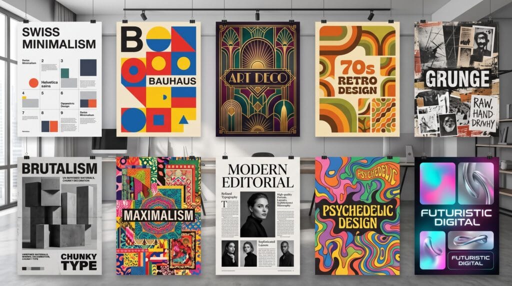
Graphic design styles give designers different visual languages for communicating ideas, emotions, and brand personalities. A minimalist poster can feel calm and sophisticated, while a maximalist layout may feel energetic and expressive. Retro graphics can create nostalgia, while futuristic design can suggest innovation and technology.
Understanding these differences helps designers choose a direction based on purpose rather than simply following visual trends.
Every style has recognizable characteristics involving typography, color, layout, imagery, texture, and composition. Some styles emphasize strict grids and clarity, while others intentionally break rules to create tension or personality.
The strongest designers understand multiple graphic design styles and know when each approach supports the message, audience, and medium.
This guide explores some of the most influential styles and explains what makes each one visually distinctive.
Why Understanding Graphic Design Styles Matters
Design style influences the way people interpret visual communication.
The same message can feel completely different depending on how it is presented.
A financial company using restrained typography and structured layouts may communicate stability. A music festival using expressive type, saturated color, and experimental composition may communicate energy and creativity.
Understanding graphic design styles can help designers:
- Develop stronger concepts
- Communicate brand personality
- Choose suitable typography
- Build effective color palettes
- Create consistent visual identities
- Design for specific audiences
- Explore new creative directions
- Avoid copying trends without purpose
- Present ideas more clearly to clients
- Build a more diverse portfolio
Designers do not need to follow one style rigidly. Many successful projects combine influences from several movements while maintaining a coherent visual system.
1. Minimalist Graphic Design
Minimalist design reduces visual elements to what is essential.
It often uses:
- Large areas of negative space
- Limited color palettes
- Simple typography
- Clear hierarchy
- Minimal imagery
- Strong alignment
The goal is not simply to make a design empty. Minimalism removes unnecessary distractions so important information receives more attention.
What Makes Minimalism Unique
Restraint is the defining characteristic.
Every element needs a clear purpose.
A minimalist poster may contain only one image, one headline, and a small amount of supporting information.
Among modern graphic design styles, minimalism works especially well for technology, architecture, luxury, wellness, editorial design, and premium branding.
2. Swiss or International Typographic Style
Swiss design developed around clarity, objectivity, and structure.
Common characteristics include:
- Grid-based layouts
- Sans serif typography
- Asymmetrical composition
- Strong hierarchy
- Clean photography
- Functional spacing
Typography often carries much of the visual identity.
Helvetica and other neutral sans serif families are strongly associated with this approach, although modern designers can use many other typefaces.
Best Uses
Swiss-inspired design works well for:
- Posters
- Editorial layouts
- Corporate identities
- Wayfinding
- Websites
- Information design
It remains one of the most influential graphic design styles because its principles continue to shape contemporary interface and editorial design.
3. Retro Graphic Design
Retro design takes inspiration from visual culture of previous decades.
A project might reference the 1950s, 1960s, 1970s, 1980s, or 1990s.
Characteristics vary depending on the era but may include:
- Vintage typography
- Faded colors
- Grain
- Halftones
- Old printing textures
- Geometric patterns
- Nostalgic illustrations
What Makes Retro Design Unique
Retro graphics intentionally create a feeling of familiarity.
A 1970s-inspired identity may use warm oranges, browns, curved lettering, and psychedelic shapes.
An 1980s design may feature neon colors, grids, chrome lettering, and futuristic imagery.
Retro graphic design styles are popular for music, fashion, food packaging, events, and lifestyle branding.
4. Vintage Graphic Design
Vintage design is related to retro but often aims for a more historically authentic appearance.
It may draw inspiration from:
- Old advertisements
- Letterpress printing
- Traditional signage
- Antique packaging
- Hand-painted labels
- Historical typography
Common colors include cream, burgundy, forest green, faded blue, brown, and muted gold.
Textures may imitate aged paper, ink imperfections, or worn surfaces.
Vintage design works particularly well for heritage brands, coffee shops, breweries, restaurants, barbershops, and handcrafted products.
5. Art Deco Graphic Design
Art Deco became influential during the 1920s and 1930s and remains a recognizable visual style.
Typical elements include:
- Strong symmetry
- Geometric shapes
- Elegant lines
- Gold accents
- Black backgrounds
- Decorative borders
- Tall display typography
Art Deco often communicates glamour, luxury, and sophistication.
Where Art Deco Works Well
This style can be effective for:
- Luxury branding
- Hotels
- Events
- Invitations
- Restaurants
- Fashion
- Packaging
Among classic graphic design styles, Art Deco remains distinctive because of its combination of geometry and decoration.
6. Bauhaus Graphic Design
Bauhaus design emphasizes function, simplicity, and geometric construction.
Visual characteristics can include:
- Circles, triangles, and squares
- Primary colors
- Strong typography
- Asymmetrical layouts
- Functional composition
- Simple forms
The Bauhaus philosophy encouraged designers to connect art with practical function.
Modern interpretations are often used for posters, cultural projects, editorial layouts, and creative branding.
Bauhaus remains influential because its ideas helped shape modern visual communication.
7. Brutalist Graphic Design
Brutalism intentionally rejects overly polished design conventions.
Common features include:
- Raw typography
- Strong contrast
- Unusual spacing
- Exposed grids
- Basic interface elements
- Unconventional layouts
- Limited decoration
A brutalist website may appear intentionally unfinished or structurally direct.
What Makes Brutalism Unique
The style creates tension by challenging expectations.
Instead of hiding structure, it often makes structure visible.
Brutalist graphic design styles can work well for experimental brands, fashion, art institutions, creative portfolios, music, and cultural projects.
However, accessibility and usability should remain important when applying brutalist ideas digitally.
8. Maximalist Graphic Design
Maximalism takes the opposite approach to minimalism.
It embraces visual abundance.
Designers may combine:
- Multiple colors
- Layered typography
- Patterns
- Illustrations
- Photography
- Decorative elements
- Experimental compositions
The key is intentional complexity rather than random clutter.
Creating Controlled Maximalism
A strong maximalist design still needs hierarchy.
Choose a focal point and organize supporting elements around it.
Without structure, the viewer may not know where to look.
Maximalist design works well for fashion, music, events, entertainment, youth brands, and expressive editorial projects.
Also Read: 20+ Modern Graphic Design Styles Designers Use Now
9. Grunge Graphic Design
Grunge design became especially visible in alternative music and youth culture during the 1990s.
It often uses:
- Distressed typography
- Rough textures
- Torn-paper effects
- Handwriting
- Dark photography
- Imperfect alignment
- Photocopy textures
Grunge intentionally rejects polished perfection.
The result can feel rebellious, raw, underground, or emotional.
Grunge graphic design styles remain useful for music artwork, posters, fashion graphics, streetwear, and experimental campaigns.
10. Psychedelic Graphic Design
Psychedelic design is associated with bold color, surreal forms, and visual movement.
Common features include:
- Warped typography
- Vibrant color combinations
- Organic shapes
- Optical effects
- Detailed illustrations
- Curved compositions
The style became especially recognizable through 1960s music posters but continues to evolve.
Modern psychedelic graphics can combine vintage influences with digital effects and contemporary typography.
This approach is particularly effective for music, festivals, fashion, beverages, and creative products.
11. Geometric Graphic Design
Geometric design builds compositions using controlled shapes and mathematical structures.
Elements may include:
- Circles
- Squares
- Lines
- Polygons
- Repeated patterns
- Modular grids
Geometric design can feel modern, technological, playful, or sophisticated depending on the palette and typography.
It works well for:
- Branding
- Packaging
- Posters
- Technology
- Architecture
- Editorial design
Among versatile graphic design styles, geometric systems are easy to adapt across multiple brand applications.
12. Flat Graphic Design
Flat design avoids realistic depth and focuses on simplified visual elements.
Typical characteristics include:
- Solid colors
- Simple icons
- Minimal shadows
- Clean typography
- Simplified illustrations
- Clear shapes
Flat design became especially influential in digital interfaces.
Its simplicity can improve visual clarity and make assets easier to adapt across screen sizes.
Modern flat design sometimes incorporates subtle gradients or shadows while maintaining simplified forms.
13. 3D Graphic Design
Three-dimensional design creates depth, volume, and physical presence.
Designers can use:
- 3D typography
- Product renders
- Abstract objects
- Inflated shapes
- Metallic materials
- Glass effects
- Realistic lighting
3D design has become increasingly popular in advertising, digital campaigns, social content, and technology branding.
Combine 3D With Typography
One effective approach is pairing detailed 3D objects with simple typography.
This creates contrast and keeps information readable.
3D graphic design styles can feel futuristic, playful, luxurious, or highly technical depending on materials and lighting.
14. Collage Graphic Design
Collage combines multiple visual sources into a single composition.
Elements can include:
- Photography
- Illustration
- Paper textures
- Handwriting
- Typography
- Scanned objects
- Geometric shapes
Digital collage can imitate handmade cut-and-paste techniques or create completely surreal compositions.
Collage works well for editorial design, posters, album artwork, social campaigns, and fashion.
The style is particularly useful when a project needs visual storytelling and personality.
15. Editorial Graphic Design
Editorial design organizes text and imagery for publications and content-driven layouts.
It commonly emphasizes:
- Strong grids
- Typographic hierarchy
- Photography
- Pull quotes
- Columns
- Page rhythm
- White space
Editorial style can range from restrained and traditional to highly experimental.
Modern brands increasingly borrow editorial design techniques for websites, social media, reports, and brand campaigns.
Editorial graphic design styles are particularly effective when storytelling is central to the project.
16. Hand-Drawn Graphic Design
Hand-drawn design introduces visible human imperfections.
It may use:
- Sketches
- Hand lettering
- Doodles
- Brush marks
- Organic illustrations
- Uneven lines
This style can make brands feel personal, approachable, creative, or handmade.
It works well for food brands, children’s products, lifestyle businesses, cafés, creative studios, and artisan packaging.
Digitally produced projects can still achieve a handmade feeling by using scanned artwork or carefully created brush textures.
17. Futuristic Graphic Design
Futuristic design suggests innovation, technology, and imagined future environments.
Common features include:
- Metallic typography
- Digital grids
- Neon colors
- Abstract 3D forms
- Glass effects
- Dark backgrounds
- Generative patterns
- Technical interface graphics
Futuristic graphic design styles work naturally for technology, gaming, AI, digital products, entertainment, and conceptual projects.
Avoid using every futuristic effect simultaneously.
A few well-chosen elements often create a stronger design.
Also Read: Retro Graphic Design Ideas That Make Your Posters Pop
18. Organic and Natural Graphic Design
Organic design takes inspiration from nature and imperfect physical materials.
Elements may include:
- Earthy colors
- Botanical illustrations
- Handcrafted textures
- Soft shapes
- Natural photography
- Recycled-paper effects
This approach can communicate sustainability, wellness, simplicity, or craftsmanship.
It works particularly well for skincare, food, wellness, environmental organizations, hospitality, and handmade products.
19. Corporate Graphic Design
Corporate design prioritizes clarity, consistency, and professionalism.
Common elements include:
- Structured grids
- Brand colors
- Consistent typography
- Professional photography
- Simple icons
- Clear charts
Corporate does not need to mean boring.
Modern corporate identities can use expressive color, distinctive typography, and strong photography while maintaining structure.
The key is building a system that works reliably across presentations, websites, reports, marketing, and internal communication.
20. Experimental Graphic Design
Experimental design deliberately explores unconventional combinations.
Designers may distort type, break grids, overlap information, use unusual image treatments, or create unexpected interactions.
It is less about following one defined visual language and more about testing boundaries.
Experimental graphic design styles are common in:
- Art
- Fashion
- Music
- Cultural institutions
- Creative portfolios
- Independent publishing
The challenge is maintaining enough communication for the design to remain useful.
Typography Across Different Graphic Design Styles
Typography often determines whether a visual style feels convincing.
- Minimalist design may use restrained sans serif typography.
- Vintage work may use serif, slab serif, or hand-lettered forms.
- Psychedelic design often uses warped display lettering.
- Brutalism may use oversized system fonts or intentionally awkward hierarchy.
- Luxury design may favor elegant serif typography with generous spacing.
Choose type based on the overall concept rather than selecting fonts separately from the visual style.
Color in Graphic Design Styles
Color also creates strong stylistic signals.
Examples include:
- Minimalism: neutral or limited palettes
- Retro: faded orange, brown, mustard, and teal
- Psychedelic: saturated contrasting colors
- Luxury: black, cream, deep green, and metallic accents
- Natural: sage, beige, terracotta, and earthy neutrals
- Futuristic: electric blue, violet, neon green, and metallic tones
These are starting points rather than strict rules.
Designers can create fresh results by using unexpected palettes within familiar graphic design styles.
Helpful Tools for Exploring Graphic Design Styles
Different software supports different creative approaches.
Adobe Illustrator
Useful for vector graphics, logos, geometric design, typography, and illustration.
Adobe Photoshop
Ideal for collage, image manipulation, textures, grunge effects, and experimental graphics.
Adobe InDesign
Strong for editorial layouts, magazines, reports, books, and typography-heavy projects.
Figma
Useful for digital design, layout systems, interface design, and collaborative visual exploration.
Procreate
Suitable for hand-drawn illustration, lettering, texture, and expressive digital artwork.
Blender
Useful for 3D typography, abstract forms, product visualization, and futuristic design.
Canva
Helpful for fast concept exploration, social graphics, simple layouts, and marketing content.
Use tools according to the design concept instead of forcing every style into one workflow.
Common Mistakes When Using Graphic Design Styles
1. Copying a Style Without Understanding It
Study the principles behind a visual movement rather than copying surface effects.
2. Mixing Too Many Styles
Combining several influences can work, but too many unrelated directions may weaken the concept.
3. Ignoring the Audience
An experimental layout may not be suitable for every client or message.
4. Sacrificing Readability
Visual personality should not make essential information impossible to understand.
5. Following Trends Too Closely
Trends change quickly. Build concepts around communication first.
6. Using Effects Without Purpose
Grain, gradients, distortion, or 3D effects should reinforce the concept.
Graphic Design Styles Checklist
Before choosing a visual direction, ask:
- What message needs to be communicated?
- Who is the target audience?
- What personality should the design express?
- Which style supports that personality?
- Does the typography match the direction?
- Does the color palette reinforce the concept?
- Is the composition clear?
- Are decorative elements purposeful?
- Does the style work across different formats?
- Is the design still readable?
- Does the style fit the brand?
- Can the visual system remain consistent?
- Does it feel distinctive rather than copied?
- Is the style appropriate for the medium?
- Will the design remain effective beyond a temporary trend?
Also Read: Festival Graphic Design Styles for Better Marketing Results
Final Thoughts on Graphic Design Styles
Different graphic design styles provide designers with a wide range of ways to communicate ideas visually.
Minimalism creates impact through restraint. Swiss design uses structure and clarity. Retro and vintage styles bring nostalgia, while Art Deco communicates elegance. Brutalism challenges conventional polish, maximalism embraces abundance, and futuristic design explores technology and imagined visual worlds.
No single style is better than another.
The right choice depends on the message, audience, brand personality, and medium.
Designers should study multiple graphic design styles instead of becoming dependent on one aesthetic. Understanding their history, typography, colors, layout principles, and typical applications makes it easier to choose visual directions intentionally.
You can also combine influences to create something more distinctive. A project might use Swiss-style grids with expressive 3D typography or combine vintage illustration with contemporary minimalist layouts.
The goal is not to follow a style perfectly. It is to understand why the style works and use those principles to communicate more effectively.
By exploring different graphic design styles, designers can expand their visual vocabulary, create more thoughtful concepts, and develop work that feels both distinctive and appropriate for its purpose.
For high-quality fonts to boost your income, check out Letter Crafted. Our professional fonts are perfect for branding, marketing, and content creation. So, don’t miss this opportunity.