
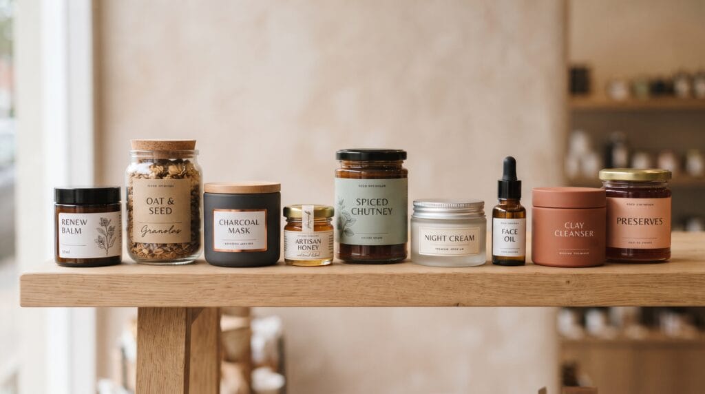
Creative jar packaging design ideas can help food and beauty brands transform a simple container into a recognizable part of their visual identity. Jars appear across many product categories, from sauces, jams, honey, coffee, and spices to skincare creams, body scrubs, candles, and cosmetic treatments. Because the basic structure can look similar from one product to another, details such as labels, typography, lid design, colors, materials, and finishes often determine whether a jar feels ordinary or distinctive.
A successful jar does not need complicated decoration.
In fact, some of the strongest packaging uses only a few carefully selected elements.
A clear glass container, confident typography, simple label, and memorable lid color may be enough to create strong shelf presence.
These jar packaging design ideas explore practical ways brands can make products feel more recognizable, professional, and appealing.
Why Jar Packaging Design Ideas Matter
Customers often judge packaging before they understand the product itself.
A jar may need to communicate:
- Brand
- Product category
- Flavor or variant
- Key benefit
- Quality
- Personality
within only a few seconds.
Packaging also influences expectations.
A heavy glass jar with a minimal label may feel premium, while a colorful illustrated jar can feel playful and approachable.
For beauty brands, packaging may communicate:
- Luxury
- Natural ingredients
- Clinical expertise
- Wellness
- Simplicity
For food brands, it may communicate:
- Freshness
- Craft
- Tradition
- Convenience
- Premium quality
Strong jar packaging design ideas connect these visual signals with the positioning of the product.
1. Jar Packaging Design Idea with Use Clear Glass as Part of the Design
Transparent glass can make the product itself part of the visual identity.
This works particularly well for:
- Honey
- Jam
- Spices
- Sauces
- Nuts
- Body scrubs
- Bath salts
The natural color and texture of the product can provide visual interest without requiring a large printed label.
For example, a honey brand could combine:
- Clear jar
- Small cream label
- Black typography
- Gold lid
The result can feel simple, warm, and premium.
Keep the Label Small
If the product looks attractive, avoid covering the entire jar.
A compact front label can leave more of the contents visible.
This creates a stronger connection between packaging and product.
2. Jar Packaging Design Idea with Create a Minimalist Label
Minimal labeling can make jar packaging feel more refined.
A simple system might include:
- Brand name
- Product name
- Variant
- Small supporting detail
Use generous negative space around the information.
For example, a skincare jar might feature a centered wordmark with a small product description underneath.
The visual simplicity can communicate confidence.
Minimalist jar packaging design ideas work especially well for beauty, wellness, gourmet food, and premium lifestyle brands.
3. Jar Packaging Design Idea with Use the Lid as a Branding Element
The lid offers another opportunity to build recognition.
Instead of treating it as a purely functional component, consider:
- Signature color
- Embossed logo
- Printed symbol
- Metallic finish
- Matte coating
- Pattern
A jar with a distinctive lid can remain recognizable even when the front label is partially hidden.
For example, a skincare range could use the same cream-colored jar with different lid colors for each product type.
This creates both consistency and differentiation.
4. Jar Packaging Design Idea with Explore Wraparound Labels
A wraparound label gives designers more room for storytelling.
The front can contain:
- Brand
- Product
- Main visual
while the side or back can include:
- Ingredients
- Product story
- Instructions
- Nutrition information
- Usage directions
This keeps the front visually clean while still providing practical information.
For food brands, wraparound labels can also create a stronger block of color on the shelf.
5. Jar Packaging Design Idea with Use Bold Typography
Typography can become the main design feature.
Instead of relying on illustrations or photography, use a strong product name to create shelf impact.
A label could feature:
STRAWBERRY
or
NIGHT CREAM
in large type.
This approach can feel direct and modern.
Oversized typography works particularly well when the brand wants to appear:
- Contemporary
- Youthful
- Editorial
- Confident
Among simple jar packaging design ideas, typography-led design is one of the easiest ways to create visual distinction.
6. Jar Packaging Design Idea with Create Flavor or Variant Color Coding
If you sell several products, color can help customers recognize each variation.
For example, a jam collection might use:
- Strawberry: Red
- Apricot: Orange
- Blueberry: Deep blue
- Fig: Purple
A beauty line could use:
- Hydration: Blue
- Brightening: Yellow
- Calming: Green
- Repair: Burgundy
Keep other elements consistent so customers still recognize the master brand.
Color coding makes product families easier to navigate.
7. Jar Packaging Design Idea with Use Botanical Illustration
Botanical artwork works naturally with products based on plants, ingredients, herbs, or fruits.
Possible illustration styles include:
- Fine line drawing
- Vintage botanical artwork
- Minimal vector illustration
- Hand-drawn sketch
A jam jar could feature a delicate fruit illustration.
A face cream might use a subtle botanical branch representing a key ingredient.
Keep the artwork connected to the product rather than adding decorative plants without purpose.
Strong jar packaging design ideas use illustration to reinforce the product story.
Also Read: Luxury Packaging Design for Better Marketing Results
8. Jar Packaging Design Idea with Try an Apothecary-Inspired Style
Apothecary aesthetics can create a timeless and carefully crafted impression.
Common elements include:
- Amber glass
- Cream paper labels
- Serif typography
- Small borders
- Black ink
- Simple ingredient information
This approach works especially well for:
- Skincare
- Candles
- Herbal products
- Bath products
- Specialty food
The design can feel traditional without appearing old-fashioned when typography and spacing remain clean.
9. Jar Packaging Design Idea with Use Matte Containers
Not every jar needs to be transparent.
Matte finishes can create a more controlled and premium visual identity.
Consider:
- Matte black
- Soft white
- Muted green
- Beige
- Terracotta
Matte cosmetic jars can feel especially sophisticated when combined with subtle typography.
A beauty brand might use:
Soft beige jar + black wordmark + satin lid
for a calm, premium aesthetic.
The material finish itself becomes part of the branding.
10. Jar Packaging Design Idea with Add Metallic Details
Metallic accents can add a premium feeling when used carefully.
Options include:
- Gold foil
- Silver foil
- Copper lid
- Metallic ink
- Foil-stamped symbol
Avoid adding metallic effects everywhere.
One small detail is often enough.
For example, a premium face cream might use a matte white jar with a thin gold line around the label.
This creates elegance without overwhelming the design.
11. Jar Packaging Design Idea with Use Kraft Labels for a Natural Look
Kraft paper can support a natural or handcrafted identity.
It works well for:
- Honey
- Coffee
- Spices
- Jam
- Nut butter
- Handmade skincare
Combine kraft with:
- Black typography
- Dark green accents
- Simple illustration
- Rubber-stamp graphics
Keep the design organized.
A natural look should still feel intentional and professional.
12. Jar Packaging Design Idea with Add a Custom Label Shape
Labels do not always need to be rectangular.
Alternative shapes can create a recognizable packaging feature.
Consider:
- Arch
- Circle
- Oval
- Shield
- Vertical strip
- Die-cut shape
For example, an arched label can give a food jar a classic feel, while a narrow vertical label may feel more contemporary.
The shape should support readability and production.
Do not make it complicated purely for decoration.
13. Jar Packaging Design Idea with Use Handwritten Details
Handwritten typography can add warmth and personality.
It may work well for:
- Homemade food
- Artisan products
- Small-batch goods
- Natural beauty products
Use handwritten styles selectively.
For example:
Clean serif brand name + handwritten flavor name
can create a strong balance between professionalism and personality.
Avoid using script fonts for long descriptions because readability can suffer.
14. Jar Packaging Design Idea with Keep Beauty Packaging Clinical and Clean
Some skincare brands benefit from a more clinical visual language.
A clean skincare jar could use:
- White container
- Black typography
- Small scientific-style details
- Precise spacing
- Limited color
This can communicate:
- Expertise
- Performance
- Trust
- Precision
Clinical jar packaging design ideas should still have enough personality to remain recognizable.
The goal is clarity, not anonymity.
15. Jar Packaging Design Idea with Create Premium Food Packaging
Gourmet products can use subtle design to communicate quality.
For example, a premium sauce jar might combine:
- Dark glass
- Cream label
- Serif typography
- Small illustration
- Metallic lid
A specialty honey product might use:
- Clear glass
- Minimal label
- Embossed lid
- Warm neutral colors
Premium design often depends more on materials, proportions, and typography than on decorative graphics.
Also Read: Food Packaging Design for Brands That Want Better Results
Create a Strong Front-of-Pack Hierarchy
Customers should immediately understand what they are looking at.
A practical hierarchy could be:
- Brand
- Product name
- Flavor or product type
- Key benefit
- Supporting information
Do not make every element equally large.
One visual message should lead.
Clear hierarchy makes jar packaging design ideas more effective on crowded shelves.
Design the Side and Back Carefully
The back or side label often contains more detailed information.
Food products may require:
- Ingredients
- Nutrition facts
- Storage information
- Barcode
- Weight
- Contact information
Beauty products may include:
- Ingredients
- Directions
- Warnings
- Volume
- Product information
Keep the typography readable.
The functional information should still follow the same visual system as the front.
Build a Consistent Jar Product Family
A strong packaging system should make it easy to expand.
Keep consistent:
- Jar shape
- Logo position
- Typography
- Label size
- Layout
Then vary selected elements such as:
- Color
- Illustration
- Flavor
- Lid
- Variant name
This creates a recognizable family.
Customers should be able to identify both the brand and individual products quickly.
Test Jar Packaging on the Shelf
Always test packaging in realistic conditions.
Compare prototypes with competing products.
Check:
- Visibility
- Readability
- Color contrast
- Product recognition
- Brand recognition
Look at the jar from several distances.
A design that looks beautiful on a computer screen may become difficult to understand on a crowded shelf.
For ecommerce brands, also test thumbnail images.
The packaging needs to remain recognizable in small online product images.
Consider the Unboxing Experience
Beauty and premium food products may also be sold inside secondary packaging.
Think about how the jar works with:
- Boxes
- Tissue paper
- Shipping materials
- Inserts
- Thank-you cards
The same typography, colors, and visual language should continue across these elements.
This creates a more complete customer experience.
Common Jar Packaging Design Mistakes
Covering Too Much of a Beautiful Product
If the contents provide visual appeal, let customers see them.
Using Too Many Fonts
One or two strong typefaces are usually enough.
Making Important Text Too Small
Packaging still needs to communicate clearly.
Adding Too Many Claims
Prioritize the most meaningful information.
Ignoring the Lid
The lid can contribute significantly to recognition.
Following Trends Too Closely
Create a system that can remain useful beyond one design trend.
Ignoring Production Requirements
Always consider printing, labeling, filling, shipping, and durability.
Jar Packaging Design Ideas Checklist
Before finalizing your design, check that you have:
- Defined the target customer
- Researched competitor packaging
- Selected an overall design direction
- Chosen a suitable jar material
- Created clear label hierarchy
- Selected readable typography
- Defined a color system
- Designed the lid
- Considered product visibility
- Tested custom label shapes
- Created variant differentiation
- Designed side or back information
- Reviewed regulatory requirements
- Tested printed prototypes
- Checked shelf visibility
- Checked ecommerce thumbnails
- Created scalable product-family rules
- Extended branding to secondary packaging
Every element should support either communication, recognition, or product experience.
Also Read: Sustainable Packaging Design for Better Marketing Results
Final Thoughts
The strongest jar packaging design ideas combine attractive visuals with practical packaging decisions. A memorable jar can be created through clear typography, thoughtful colors, distinctive lids, unusual label shapes, elegant materials, or simply a strong relationship between the container and the product inside.
Start by deciding what the brand should communicate.
A premium skincare product may require a completely different approach from an artisan jam, natural body scrub, or gourmet sauce.
Then choose a small number of design elements that support that personality.
Keep the information hierarchy clear.
Create enough variation to distinguish products while maintaining a consistent brand system.
Most importantly, test the design in the environments where customers will actually see it.
Effective jar packaging design ideas should work on retail shelves, ecommerce pages, social media, and in customers’ homes.
When packaging structure, typography, color, materials, labels, and brand positioning work together, a simple jar can become a powerful visual asset that helps products stand out and strengthens long-term brand recognition.
For high-quality fonts to boost your income, check out Letter Crafted. Our professional fonts are perfect for branding, marketing, and content creation. So, don’t miss this opportunity.