
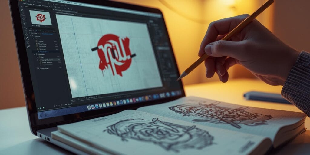
Most beginner logos don’t fail because the designer has “no talent.” They fail because the designer hasn’t learned how logos behave in the real world. A logo has to work small and large, in one color, on a phone screen, on a printed label, and beside other brand elements. Once you understand that, you start spotting logo design mistakes quickly, and your work levels up fast.
This guide covers the most common logo design mistakes students make and gives practical fixes you can apply immediately. If you’re a freelancer, these fixes also help reduce revisions and make your work easier to defend in client presentations.
Logo Design Mistakes Start with Weak Problem Definition
The first mistake happens before you draw anything like designing without a clear brief. Without a brief, the logo becomes decoration.
Fix: write a one-page logo brief
Before sketching, define:
brand category and audience
brand personality (3 adjectives)
what the logo needs to communicate
where it will be used (web, packaging, signage, app icon)
competitors you must not resemble
A clear brief prevents half of all logo design mistakes because it gives you a target.
Logo Design Mistakes When The Concept is Too Literal
Beginners often pick the most obvious symbol, a camera for photography, a tooth for a dentist, a coffee cup for a café. Literal icons can work, but they usually become forgettable.
Fix: find a smarter symbol
Try one level deeper:
benefit symbol (speed, calm, trust)
process symbol (craft, precision, motion)
story symbol (origin, place, heritage)
abstract form that feels on-brand
If you still want literal, simplify it heavily and make it yours through shape language and proportions. This reduces logo design mistakes that lead to generic logos.
Logo Design Mistakes from Adding Too Much Detail
Logos are not illustrations. Too many lines, textures, and tiny shapes will collapse at small sizes.
Fix: do the “small-size test” early
Shrink your logo to:
favicon size (16-32px)
Instagram profile size
small packaging label size
If it breaks, simplify:
remove inner detail
reduce strokes
strengthen silhouette
increase negative space
Detail is one of the most common logo design mistakes because it looks “cool” in artboard view and fails in real use.
Logo Design Mistakes with Poor Silhouette and Recognition
If a logo doesn’t have a strong silhouette, it won’t be recognizable at a glance.
Fix: test the silhouette in one color
Turn your logo into a solid black shape:
Does it still read?
Is it unique?
Is it balanced?
If not, adjust:
simplify outline
remove fragile thin parts
make the shape more iconic
Strong silhouette fixes many logo design mistakes in one move.
Logo Design Mistakes in Typography Choice
Students often choose fonts based on what looks trendy rather than what fits the brand. Or they mix too many fonts in one mark.
Fix: choose type based on brand personality
Use simple associations:
modern and clean → geometric or humanist sans
premium and editorial → refined serif
playful and friendly → rounded sans or soft serif
heritage and craft → classic serif or slab
And keep it simple:
one primary type style for the wordmark
no unnecessary effects
Typography is a huge source of logo design mistakes because it sets the tone instantly.
Also Read: 25+ Aesthetic Fonts for Logo with a Modern and Timeless Look
Logo Design Mistakes with Kerning and Letter Spacing
Kerning errors make logos feel amateur fast. Even non-designers can feel “something is off.”
Fix: do optical kerning, not automatic kerning
zoom in and adjust letter pairs manually
watch problem pairs like: AV, WA, TA, LY, To, Yo
check rounded letters next to straight letters
Then do the “squint test”:
squint your eyes and see if gaps look uneven
Kerning is one of the most common logo design mistakes in wordmarks.
Logo Design Mistakes with Alignment and Balance
Many student logos feel unstable because of tiny misalignments like the icon sits too high, the wordmark looks off-center, spacing is inconsistent.
Fix: use a simple alignment system
align icon and type by optical center
keep consistent spacing using one unit (often x-height or cap height)
ensure baseline alignment is stable
balance visual weight, not just measurement
A logo can be perfectly centered mathematically and still look wrong optically. Fixing balance reduces logo design mistakes dramatically.
Logo Design Mistakes from Relying On Color to Make it Work
If your logo only works in full color, it’s not a strong logo yet. Printing, embroidery, stamps, and small use cases will expose this.
Fix: build in black and white first
Create:
one-color version
reverse version for dark backgrounds
grayscale version (optional)
When the mark works in one color, color becomes a bonus, not a crutch. This eliminates a major category of logo design mistakes.
Logo Design Mistakes When The Logo Doesn’t Match The Brand Category
A logo can be beautiful and still wrong for the audience. A playful mascot might not fit a serious legal brand. A luxury serif might not fit a youth streetwear label.
Fix: do a “category fit” check
Ask:
Does this feel like the right industry?
Would the target customer trust it?
Does it look too similar to competitors?
Does it clash with price positioning (budget vs premium)?
Category mismatch is one of the most expensive logo design mistakes because it breaks trust immediately.
Also Read: Logo Color Palette How to Choose 3 Brand Colors
Logo Design Mistakes from Copying Trends Too Closely
Trends can be fun, but logos should last. If your logo depends on a trend effect, it may feel outdated fast.
Fix: aim for timeless structure
strong silhouette
clear type choice
clean spacing rules
minimal effects
You can still be modern. Just don’t rely on gimmicks. Trend dependency is a silent logo design mistakes problem for students.
Logo Design Mistakes in Presentation to Clients or Reviewers
A good logo can look bad if it’s presented poorly. Students often show one logo on a white background and call it done.
Fix: present the logo as a system
Show:
primary logo
secondary logo (stacked or horizontal)
icon-only version
one-color and reverse versions
small-size test
2-3 realistic mockups (website header, packaging, signage)
This doesn’t just make it look better. It proves you understand real-world use and prevents logo design mistakes in delivery.
Logo Design Mistakes with Missing Versions and Lockups
Beginners often deliver one version of a logo. Real brands need variations.
Fix: create a basic logo kit
At minimum:
primary lockup
secondary lockup
icon/monogram
clear space rule
minimum size rule
file exports for print and web
Missing variations is one of the most common logo design mistakes that causes problems later.
Logo Design Checklist Before Final Export
Use this checklist every time:
Works at small size
Works in one color
Strong silhouette
Clean kerning and spacing
Optical balance feels stable
Matches brand personality and audience
Not too similar to competitors
Includes basic logo system versions
Exported correctly (SVG/PDF for vector, PNG for web)
If you run this checklist, you’ll avoid most logo design mistakes.
Also Read: Simple Logo Design Ideas: Guide for Startups and Shops
Final Thoughts
The fastest way to improve is to stop thinking of a logo as art and start thinking of it as a tool. A good logo is clear, scalable, and consistent in real use. Fix the common logo design mistakes above and your work will instantly look more professional and become a new style logo in this year.
For high-quality fonts to boost your income, check out Letter Crafted. Our professional fonts are perfect for branding, marketing, and content creation. So, don’t miss this opportunity.