
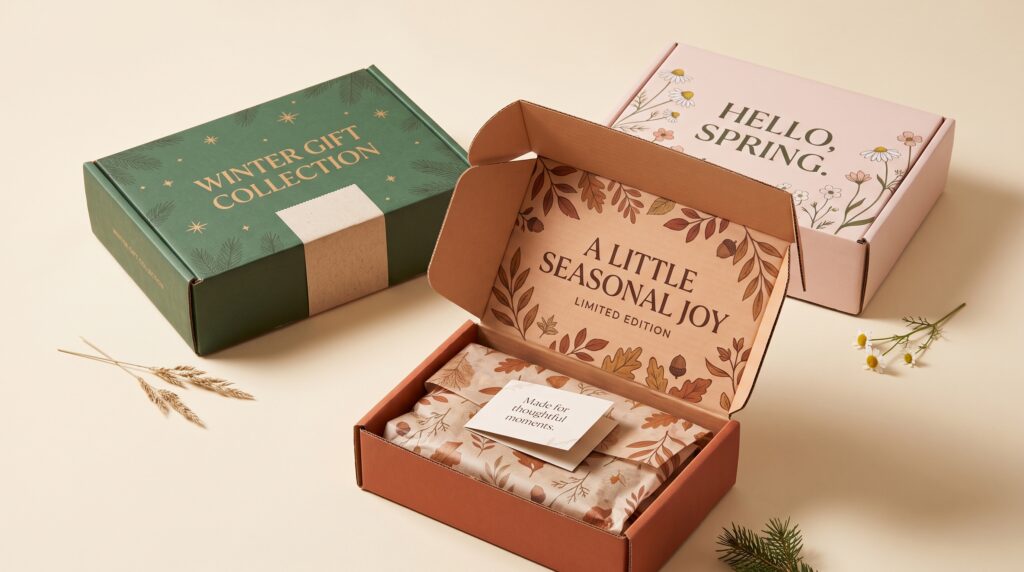
Mailer box design gives seasonal gifts and limited editions a recognizable presentation before customers see the products inside. A coordinated palette, thoughtful opening sequence, or carefully placed illustration can make a collection feel distinct. The design still needs to support protection, handling, and clear communication rather than relying on decoration alone.
Seasonal packaging also needs to fit the business behind it. A beautiful concept may become difficult to manage if it requires too many components or leaves large quantities of dated packaging unused.
This guide explores practical creative directions for ecommerce brands. Use the ideas to develop a seasonal identity that feels special while remaining connected to your everyday brand.
Start Mailer Box Design With a Seasonal Story
A seasonal collection needs a direction before it needs a pattern.
Describe what makes the release different. It might celebrate a particular occasion, introduce a limited assortment, or present familiar products as a gift.
That purpose should guide the visual treatment.
Choose One Clear Creative Theme
A spring collection might explore fresh growth through restrained botanical shapes. A winter gift set could focus on warmth through color and texture.
Avoid placing every seasonal symbol on the same box.
Effective mailer box design gives the collection a coherent story. Choose a few relevant elements and repeat them deliberately instead of treating every panel as space for another idea.
Use a Seasonal Palette Without Losing Recognition
Color can distinguish a release while preserving its relationship with the main brand.
You do not have to replace every familiar element to make the packaging feel new.
Keep a Connection With the Core Identity
Retain an established color, logo treatment, or layout structure.
Then introduce a seasonal accent through the sleeve, interior, or supporting materials.
For example, a brand that regularly uses cream and charcoal might add muted terracotta for an autumn gift collection.
With mailer box design, this approach creates variation without making the release look like it belongs to an unrelated company. Review the palette beside both the products and your existing packaging.
Try a Seasonal Sleeve Around a Standard Box
A removable sleeve can give an existing box a different appearance.
It may suit a business that uses the same underlying structure for several collections.
The sleeve should contribute to the presentation without making the opening awkward.
Design the Sleeve Around the Actual Structure
Check its position, fit, and removal.
Make sure it does not hide information customers need or interfere with the closure.
A sleeve can carry the seasonal illustration while the main box retains the everyday identity.
This mailer box design idea also gives you flexibility. If the collection changes, you may be able to update the outer treatment without redesigning every packaging component.
Create a Coordinated Interior Print
The inside of a mailer offers another moment in the opening experience.
A restrained interior pattern can connect the box with the collection without making the outside busy.
Use Pattern With a Clear Purpose
Repeat a small group of shapes, such as leaves, stars, or abstract curves.
Keep the scale suitable for the available space and avoid placing important artwork across folds without reviewing the result.
A quiet exterior paired with an expressive interior can create a useful contrast.
Good mailer box design considers how the customer encounters each surface. The interior should feel connected to the rest of the package rather than like a separate decorative exercise.
Also Read: Modern Snack Packaging Design Trends for Better Branding
Build Mailer Box Design Around the Product Arrangement
The products should influence the structure and visual presentation.
A gift set containing several items may need a clear arrangement so customers understand the collection when they open it.
Begin with the actual contents.
Plan the First Open View
Place the products and supporting components inside a physical sample.
Check what appears first and whether anything shifts or becomes hidden.
A coordinated presentation can include fitted compartments or other suitable protective elements, but those details need to match the products and shipping conditions.
For mailer box design, the most attractive arrangement is not automatically the most practical. Test how the complete package performs rather than judging an empty mockup.
Use Illustrations to Suggest the Season
Illustration can establish a seasonal atmosphere without depending on literal holiday imagery.
A collection may feel more distinctive when the visual language relates to the brand’s own character.
Explore Subtle Seasonal References
Consider:
- Abstract botanical shapes.
- Simple landscape details.
- Repeated geometric stars.
- Flowing lines inspired by changing weather.
- Small illustrations connected to the product assortment.
Choose the direction that fits the release.
Thoughtful mailer box design uses imagery to support recognition and mood. A limited collection does not need an entirely different illustration style if the existing one can adapt naturally.
Add a Simple Seal or Label
A small label can introduce the collection’s identity while keeping the main box restrained.
It can also provide a consistent focal point across several packaging sizes.
However, its role should be clear.
Test Placement and Opening
Decide whether the label is decorative, communicates information, or contributes to the closure.
Check that it adheres appropriately to the selected surface and remains readable after normal handling.
Do not assume a decorative seal provides shipping protection.
In mailer box design, small details deserve practical testing. A carefully positioned label can look considered, but it should not become a frustrating extra step in opening the package.
Give Limited Editions a Distinctive Marker
A limited release may benefit from a consistent detail that distinguishes it from the standard range.
That detail could be a special panel, an accent color, or a clearly presented collection name.
Keep the distinction accurate.
Make the Difference Easy to Understand
Explain what is limited: the assortment, design, production run, or availability period.
Avoid decorative numbering that implies a specific production quantity unless it reflects the actual release.
Clear mailer box design helps customers understand what makes the collection different.
The marker should remain visible enough to be useful without competing with the main brand or essential product information.
Also Read: Supplement Label and Packaging Design Guide for Better Branding
Coordinate Tissue Paper and Cards
Supporting materials can connect the product arrangement with the box.
They should have a purpose rather than simply increasing the number of layers.
A small card or tissue treatment may be enough.
Limit the Number of Competing Details
If the box interior already contains an expressive print, choose quieter supporting materials.
A plain card can provide useful information without introducing another pattern.
Review whether each component adds meaning, protection, or necessary communication.
With mailer box design, a coordinated package often feels more intentional than a crowded one. Remove elements that add handling work without improving the customer’s experience.
Develop Mailer Box Design Variations for Different Gifts
A seasonal collection may include several gift sizes or product combinations.
The packaging should help customers recognize the shared identity while distinguishing the options.
A consistent system makes those relationships clearer.
Define What Stays and What Changes
Keep the logo position, illustration style, and general layout connected.
Use a controlled variation, such as one accent color or panel, to identify each option.
Test the system across the smallest and largest boxes before approving it.
These mailer box design variations should look related without becoming impossible to tell apart. Avoid relying only on subtle color changes when the customer also needs clear descriptive information.
Check Seasonal Details Before Production
A seasonal concept can create avoidable problems if dates, collection names, or printing positions are wrong.
Review the artwork on the supplier’s actual template.
Inspect a Complete Packaging Sample
Check:
- Panel orientation.
- Fold positions.
- Closure areas.
- Artwork near edges.
- Space for shipping information.
- Product fit.
- The full opening sequence.
Use real contents rather than substitutes where possible.
Practical mailer box design includes this review before ordering a larger quantity. A polished digital image cannot confirm how the finished package folds, closes, or presents the products.
Plan for the End of the Season
Seasonal packaging needs an exit plan as well as a launch plan.
Before committing to quantities, consider how much of the design becomes unusable after the occasion passes.
An undated theme may remain relevant longer than a prominently printed year.
You can also keep highly specific seasonal details on adaptable components where that suits the structure.
Discuss production quantities and storage needs within your own operation.
The goal is a special presentation that fits the release without creating unnecessary leftover materials or complicated future updates.
Also Read: Bakery Packaging Design Ideas for Beautiful Branding
Conclusion – Make Seasonal Packaging Feel Distinctive and Useful
Mailer box design works best when the seasonal idea, product arrangement, and practical structure support one another.
Start with a clear theme. Keep a recognizable connection with your brand, then choose a few details that give the release its own character.
Test the complete package before production and consider what happens after the season ends.
A memorable gift presentation does not need decoration on every surface. It needs a coherent idea, thoughtful handling, and a clear place for the products inside.
For high-quality fonts to boost your income, check out Letter Crafted. Our professional fonts are perfect for branding, marketing, and content creation. So, don’t miss this opportunity.