
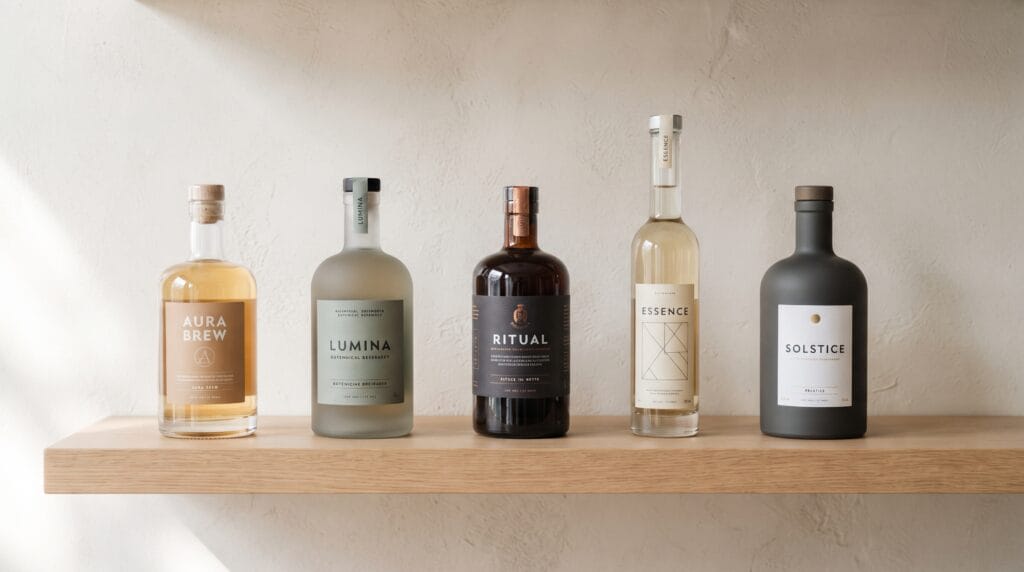
Minimalist bottle packaging design can help beverage brands create a stronger shelf presence without relying on complicated graphics, excessive colors, or oversized visual elements. A simple bottle can attract attention through proportion, typography, color, material, and carefully controlled details. When every element has a clear purpose, the packaging can feel more premium and easier for customers to recognize.
Minimal packaging does not mean removing personality.
Instead, it means deciding which visual elements matter most and giving those elements enough space to work.
A bottle with one distinctive color, a confident wordmark, and a clearly organized label can sometimes stand out more effectively than packaging filled with illustrations, claims, badges, and decorative patterns.
These minimalist bottle packaging design ideas explore practical ways beverage brands can create clean, memorable packaging with stronger shelf appeal.
Why Minimalist Bottle Packaging Design Works
Retail shelves are visually busy.
Customers may see dozens of competing products within a few seconds.
Many brands respond by adding more:
- Colors
- Illustrations
- Claims
- Badges
- Patterns
- Typography
However, visual simplicity can create contrast when surrounding products are crowded.
A minimalist bottle may use only:
- One main typeface
- A limited color palette
- A small graphic element
- Clear product information
- Generous negative space
This makes the product easier to process visually.
The approach can work particularly well for:
- Water
- Juice
- Coffee
- Tea
- Functional beverages
- Premium soft drinks
- Wellness drinks
- Specialty beverages
The strongest minimalist bottle packaging design systems combine simplicity with enough distinctiveness to avoid looking generic.
1. Minimalist Bottle Packaging Design Idea with Use a Simple Wordmark
Typography can become the main visual element on a minimalist bottle.
Instead of adding a complicated illustration, consider building the label around a strong wordmark.
The brand name might appear:
- Large and centered
- Vertically along the bottle
- Small with generous spacing
- Wrapped around the label
A simple wordmark can communicate confidence because it does not compete with unnecessary decoration.
Create Strong Typographic Hierarchy
Keep the information easy to scan.
A label hierarchy might include:
- Brand name
- Beverage type
- Flavor or variety
- Important product information
- Volume
Avoid giving every line the same visual weight.
One or two elements should lead the composition.
2. Minimalist Bottle Packaging Design Idea with Limit the Color Palette
Color can create recognition even when the rest of the packaging is simple.
Instead of using many colors, choose a focused palette.
For example:
- Cream + dark brown
- White + sage green
- Black + warm beige
- Clear glass + vivid orange
- Soft gray + cobalt blue
A limited color palette makes the bottle easier to recognize across different products.
Use Color to Identify Flavors
If the brand sells several flavors, keep the overall design consistent while changing one color.
For example:
- Lemon: Yellow
- Berry: Burgundy
- Lime: Green
- Peach: Soft orange
The customer can identify the variation without losing the master brand identity.
This is one of the most practical minimalist bottle packaging design strategies for expanding a beverage range.
3. Minimalist Bottle Packaging Design Idea with Use Clear or Frosted Glass
The bottle material can become part of the visual identity.
Clear glass works particularly well when the beverage itself has an attractive natural color.
It allows the product to become part of the design.
A juice brand, for example, could pair:
- Clear glass
- White label
- Small black typography
- Natural juice color
The result can feel fresh and uncomplicated.
Frosted glass can create a softer and more premium appearance.
It works especially well for brands that want a:
- Wellness
- Luxury
- Botanical
- Modern
positioning.
4. Minimalist Bottle Packaging Design Idea with Create a Small Front Label
A label does not always need to cover most of the bottle.
A compact front label can create more negative space and allow the bottle material to remain visible.
A small label could contain only:
- Brand
- Product type
- Flavor
Additional information can appear on a separate back label.
This approach can make a product feel carefully designed rather than overloaded.
Experiment With Label Shape
Minimal labels do not have to be rectangular.
Consider:
- Narrow vertical labels
- Small circular labels
- Square labels
- Tall strips
- Wraparound bands
An unusual but simple shape can become recognizable without requiring extra decoration.
5. Minimalist Bottle Packaging Design Idea with Make One Graphic Element the Hero
Minimalism does not require removing all graphics.
Instead, choose one visual idea and let it dominate.
That could be:
- A circle
- A line
- A leaf
- A geometric symbol
- An abstract fruit shape
- A wave
- A simple illustration
For example, a sparkling water brand could use one large colored circle on every bottle.
The circle changes color for each flavor while typography and layout remain consistent.
This creates a flexible system with very few elements.
A successful minimalist bottle packaging design often depends on one memorable visual device rather than several competing ideas.
6. Minimalist Bottle Packaging Design Idea with Use Oversized Typography
Large typography can make minimalist packaging highly visible from a distance.
Instead of using many small decorative elements, allow the product name or brand name to fill much of the label.
Oversized typography can feel:
- Bold
- Modern
- Editorial
- Confident
This works especially well for beverage brands targeting younger or design-conscious audiences.
Keep secondary information smaller so the primary typography remains dominant.
Explore Vertical Typography
Most beverage labels use horizontal text.
Vertical typography can create a different shelf silhouette.
For example, the brand name could run from the bottom toward the neck of the bottle.
This approach may work particularly well on:
- Tall water bottles
- Cold brew bottles
- Tea bottles
- Slim beverage containers
Always test readability before finalizing the direction.
Visual distinction should not make the product difficult to identify.
Also Read: Creative Chocolate Packaging Design Ideas for Better Branding
7. Minimalist Bottle Packaging Design Idea with Let the Bottle Shape Stand Out
Packaging design is not limited to graphics.
The physical bottle can become the main brand asset.
Consider details such as:
- Tall proportions
- Short wide proportions
- Rounded shoulders
- Square profiles
- Flat sides
- Unusual neck shapes
If the bottle silhouette is distinctive, the label can remain extremely simple.
A recognizable shape can also help the product stand out when customers view it from across a shelf.
Keep Function in Mind
A beautiful bottle still needs to work.
Evaluate:
- Grip
- Pouring
- Storage
- Shipping
- Shelf efficiency
- Label application
- Production costs
The best packaging balances visual distinction with everyday practicality.
8. Minimalist Bottle Packaging Design Idea with Use Matte Finishes
Matte surfaces can create a soft, contemporary appearance.
Possible applications include:
- Matte bottle coating
- Matte label stock
- Frosted film
- Uncoated paper
Matte finishes can make muted colors and simple typography feel more sophisticated.
However, consider the environment where the bottle will be used.
Cold beverages may experience moisture and condensation, so labels and finishes should remain durable.
Material selection should support both the visual concept and real-world use.
9. Minimalist Bottle Packaging Design Idea with Combine Neutral Colors With One Accent
Neutral palettes can create a calm visual foundation.
Try combinations such as:
- White + black + orange
- Cream + brown + green
- Gray + white + electric blue
- Beige + charcoal + red
The accent color can highlight:
- Flavor
- Logo
- Product name
- Small symbol
- Cap
This creates visual interest without overwhelming the packaging.
One controlled accent is often enough to make minimalist bottle packaging design feel distinctive.
10. Minimalist Bottle Packaging Design Idea with Use the Bottle Cap as a Brand Element
The cap is easy to overlook, but it can contribute to recognition.
You might use:
- Signature brand color
- Flavor-specific colors
- Embossed symbol
- Contrasting finish
For example, a mostly white bottle with a bright red cap can create a memorable silhouette.
The cap can become especially useful when bottles are viewed from above in:
- Refrigerators
- Retail displays
- Coolers
Small structural details can strengthen the overall identity.
11. Minimalist Bottle Packaging Design Idea with Use Subtle Illustration
Illustration can still fit within minimal packaging when used with restraint.
Possible approaches include:
- Single line drawing
- Small botanical illustration
- Simple fruit silhouette
- Abstract ingredient symbol
Rather than covering the entire label, use the illustration as a supporting element.
For a botanical drink, a delicate leaf drawing could appear beneath the product name.
The illustration adds personality while preserving plenty of negative space.
12. Minimalist Bottle Packaging Design Idea with Use Negative Space Intentionally
Empty space is an active design element.
It can help important information stand out.
Instead of filling every available area, allow space around:
- Logo
- Product name
- Flavor
- Graphic elements
Negative space can also create a more premium impression.
When the label feels calm and controlled, the customer can process information more quickly.
However, empty space alone does not create good design.
The remaining elements must still be carefully aligned and proportioned.
13. Minimalist Bottle Packaging Design Idea with Use Natural Materials
For brands focused on natural ingredients or sustainability, material choices can support the visual story.
Possible directions include:
- Recycled paper labels
- Uncoated label stock
- Natural-colored paper
- Clear glass
- Recycled glass
- Reduced secondary packaging
The design could combine natural materials with simple typography and muted colors.
Avoid adding environmental claims unless they accurately reflect the packaging and production process.
The visual direction should support truthful communication.
Also Read: Supplement Label and Packaging Design Guide for Better Branding
14. Minimalist Bottle Packaging Design Idea with Create a Strong Product Family
A beverage brand may eventually sell several products.
Your packaging should make it clear that they belong together.
Keep core elements consistent:
- Logo position
- Typography
- Bottle shape
- Label size
- Information hierarchy
Then vary selected elements such as:
- Color
- Flavor name
- Illustration
- Small symbol
This makes the product range easier to recognize.
A scalable minimalist bottle packaging design system should work just as well for ten products as it does for one.
15. Minimalist Bottle Packaging Design Idea with Focus on Front-of-Pack Clarity
Customers should not need to study the bottle to understand what it contains.
The front should communicate essential information quickly.
Prioritize:
- Brand
- Product type
- Flavor
- Key differentiation
Keep secondary information for other areas where appropriate.
Do not allow minimalism to remove information customers genuinely need.
A beautiful bottle that creates confusion will struggle to communicate effectively on the shelf.
Test Minimalist Bottle Packaging Design on a Real Shelf
Never judge packaging only on a large computer screen.
Place test designs beside competing products.
Review the bottle from:
- Close range
- Several feet away
- Different angles
- Different lighting
Ask:
- Can I recognize the brand?
- Can I understand the product?
- Does the bottle stand out?
- Is the typography readable?
- Does it look too similar to competitors?
Shelf testing can reveal problems that are difficult to notice in isolated mockups.
Build the Visual Identity Beyond the Bottle
The bottle should feel connected to the rest of the brand.
Extend the same design language to:
- Shipping boxes
- Multipacks
- Website
- Social media
- Advertising
- Point-of-sale displays
- Delivery packaging
Use the same:
- Typography
- Colors
- Graphic elements
- Photography style
This turns packaging into part of a complete brand experience.
Strong minimalist bottle packaging design works best when it belongs to a recognizable visual system.
Common Minimalist Bottle Packaging Design Mistakes
Making the Design Too Generic
Removing too many distinctive elements can make the bottle look like every other minimalist brand.
Using Typography That Is Too Small
Minimal does not mean microscopic.
Important information still needs to be readable.
Relying Only on White
Minimalism can use bold colors too.
The key is control, not lack of color.
Ignoring Shelf Competition
Always compare the design against real competitors.
Adding Too Many Claims
Prioritize information instead of turning the front label into a list.
Forgetting Practical Requirements
Production, durability, labeling, shipping, and storage all matter.
Minimalist Bottle Packaging Design Checklist
Before finalizing your bottle packaging, check that you have:
- Defined the target customer
- Studied competing bottles
- Selected a distinctive visual concept
- Created clear information hierarchy
- Simplified the color palette
- Selected readable typography
- Tested the logo at small sizes
- Considered bottle shape
- Chosen appropriate materials
- Used negative space intentionally
- Created clear flavor differentiation
- Tested label durability
- Reviewed cap design
- Created product-family rules
- Tested the bottle on a shelf
- Checked readability from a distance
- Reviewed the design in different lighting
- Extended the identity to digital branding
Minimal packaging should still communicate clearly and perform reliably.
Also Read: Packaging Color Psychology Guide for Better Brand Perception
Final Thoughts
The strongest minimalist bottle packaging design ideas are not simply about removing decoration. They are about creating a clear hierarchy where every remaining element contributes to recognition, communication, or product appeal.
Start with one strong idea.
That might be bold typography, a distinctive bottle shape, a recognizable color, a compact label, or a simple graphic symbol.
Then remove elements that compete with it.
Use negative space carefully, keep information organized, and make sure the design remains readable from a realistic shopping distance.
Most importantly, test the packaging in context.
A bottle must compete with other products, work under different lighting conditions, and remain functional throughout manufacturing, shipping, storage, and use.
When simplicity is combined with strong branding and practical decisions, minimalist bottle packaging design can create a product that feels modern, memorable, and confident while achieving better shelf appeal.
For high-quality fonts to boost your income, check out Letter Crafted. Our professional fonts are perfect for branding, marketing, and content creation. So, don’t miss this opportunity.