
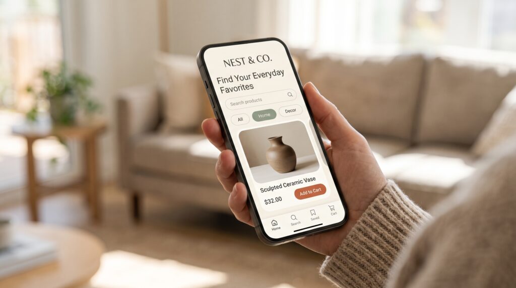
Mobile shopping app design shapes how people discover products, understand their options, and complete a purchase. A beautiful interface can attract attention, but shoppers also need clear prices, useful product information, and controls that behave predictably. When those details work together, the experience becomes easier to navigate from the first screen to the order confirmation.
Start by considering the questions shoppers bring to each stage. What can I find here? Is this the right product? What will I pay? What happens after ordering? This guide explains how to turn those questions into practical interface decisions, using a fictional home-goods shopping app as an example.
Start Mobile Shopping App Design With Clear User Tasks
Before drawing screens, identify the main tasks your app should support. A shopper may arrive with a specific item in mind, browse a category, compare alternatives, or return to check an order.
Map those journeys separately. Searching for a replacement lamp requires a different starting point from browsing gifts without a specific idea.
For each journey, write down what the person needs to know and what could prevent progress.
Design exercise: Map the steps involved in finding a bedside lamp, choosing its finish, checking delivery information, and placing an order. Include questions and possible interruptions alongside the screens.
Build Mobile Shopping App Design Around Useful Navigation
Navigation should help shoppers understand where they are and how to move elsewhere. Choose labels that describe destinations clearly, such as Home, Categories, Saved, and Account.
Keep the main navigation stable across browsing screens. If a destination disappears unexpectedly, returning to an earlier task becomes harder.
Within categories, use names that match the products people expect to find. Avoid relying on decorative icons without supporting labels.
In mobile shopping app design, navigation also includes the way back. Returning from a product page should preserve useful browsing context, including the shopper’s position in a list.
Design exercise: Test whether someone can find lighting products without instructions.
Give the Homepage a Clear Purpose
A shopping homepage can introduce the range, highlight relevant collections, and provide quick access to common tasks. It does not need to display every promotion at once.
Establish a clear reading order. Make search easy to locate, show recognizable category entry points, and give promotional content enough context to be useful.
For the home-goods example, a collection called “Small-Space Lighting” communicates more than an unexplained lifestyle photograph.
Avoid allowing banners to push essential navigation out of view.
Design exercise: Create a homepage with one main promotional section, several category shortcuts, and a recently viewed area. Check whether the screen still makes sense without its promotional images.
Make Search and Filters Work Together
Search supports shoppers who can describe what they want. Filters help them narrow the available options.
Give the search field a clear label or familiar prompt. After a search, show the query and make it easy to edit.
Choose filters according to the category. Lamps might need dimensions, finish, bulb compatibility, and price. A clothing category would require different attributes.
Good mobile shopping app design keeps applied filters visible and provides a clear way to remove them.
When a combination returns no products, explain the situation and offer useful adjustments.
Design exercise: Search for a brass lamp, apply a price limit, then revise the search without losing relevant choices unnecessarily.
Also Read: Mobile UI UX Design Tips for Better Notifications and Alerts
Create Product Cards That Support Comparison
Product cards should communicate enough information to help someone decide which item deserves a closer look.
Use consistent image proportions and show the product name, price, and relevant variation information. If ratings appear, explain their context clearly rather than displaying an isolated number.
Make sale pricing understandable. Shoppers should be able to distinguish the current price from any reference price.
Treat product-card consistency as part of mobile shopping app design, particularly when names have different lengths. A long title should not cover another control or hide the price.
Design exercise: Compare cards containing short names, long names, unavailable products, and items with several finishes.
Explain Product Choices Before Asking for Commitment
A product page needs to answer practical questions as well as present attractive images.
Show what the shopper is buying, which option is selected, what it costs, and whether it is available. Provide dimensions and other details in a format people can scan.
For a lamp, include measurements, materials, and what is supplied. Photographs should help explain scale and appearance.
Effective mobile shopping app design makes required selections obvious. If a finish must be chosen, explain that before someone tries to add the item.
Design exercise: Ask a tester to identify the selected finish, total item price, and product dimensions without assistance.
Make Cart Editing Clear and Predictable
The cart is a place to review a decision. Shoppers should be able to change quantities, remove items, and confirm variations without starting over.
Show the selected product options alongside each item. Update the relevant totals after edits and provide visible feedback.
If an item becomes unavailable, explain which item is affected and what choices remain.
In mobile shopping app design, price clarity needs attention throughout the cart. Distinguish the item subtotal from delivery charges, discounts, and other applicable costs. If a cost depends on an address, explain when it will be calculated.
Design exercise: Increase a quantity, remove an item, and check whether the updated summary remains understandable.
Simplify Mobile Shopping App Design at Checkout
Checkout should request the information needed to complete the order in a clear sequence.
Group related fields and use labels that remain visible while people type. Explain formatting requirements where necessary, and avoid asking for the same information twice.
If account creation is optional, present that choice honestly. Do not make an optional step appear mandatory.
Before the final action, show the delivery address, selected items, shipping choice, and payable amount.
Strong mobile shopping app design also gives the final button a specific label. The wording should make it clear that the next action places an order or initiates payment.
Design exercise: Review checkout using a long address and an invalid field entry.
Also Read: Homepage Design Structure for Better UX and Engagement
Design Helpful Feedback for Errors and Waiting
Shopping includes moments when a request takes time or something goes wrong. Plan those states alongside the main journey.
While adding an item, show that the action is processing and prevent accidental duplicate requests where appropriate. Afterward, confirm the result.
For errors, explain the problem near the affected field or action. Preserve information that remains valid.
Payment uncertainty needs particular care in mobile shopping app design. A connection interruption should not automatically be described as a failed payment. Show only the status the system can confirm and provide a safe next step.
Design exercise: Prototype a loading state, an address error, and an order whose status requires checking.
Keep Shopping Interfaces Readable and Accessible
Readability matters across prices, descriptions, controls, and status messages. Use clear typography and enough contrast to distinguish information comfortably.
Do not rely on color alone to communicate selection or an error. Pair visual styling with labels, icons, or explanatory text.
Allow layouts to accommodate enlarged text and longer translations. Interactive elements need space around them so nearby actions are easier to distinguish.
Accessibility belongs throughout mobile shopping app design, including product galleries, filters, and checkout.
Design exercise: Review the interface with enlarged text and without product images. Check whether essential information and actions remain available.
Extend Mobile Shopping App Design Beyond the Purchase
The experience continues after an order is placed. Confirmation should explain what happened and where the shopper can find the details again.
Separate payment status, order status, and delivery status where they represent different information. Avoid implying that a package has shipped when the order has only been received.
Make support and cancellation or return information easy to locate. Present the actual options available for that order.
Design exercise: Create an order-details screen that answers four questions. What did I order? What is its current status? What happens next? Where can I get help?
This helps connect the purchase flow with the service that follows.
Test Mobile Shopping App Design With Complete Journeys
Individual screens can look convincing while the overall journey remains confusing. Test connected tasks rather than asking only whether the interface looks appealing.
Observe Product Discovery
Ask someone to find a lamp that fits a particular space and budget. Watch which information they look for and which labels they misunderstand.
Review Cart and Checkout Decisions
Ask the tester to change a finish, revise a quantity, and explain the final price. Note hesitation as well as mistakes.
Include Recovery Tasks
Test an unavailable item, a rejected address, and an interrupted checkout. Check whether the person understands what has been saved and what they should do next.
Use the findings to revise the underlying component or interaction, then test again.
Also Read: Website Header Design Ideas for a Strong First Impression
Conclusion – Create a Shopping Experience People Can Understand
Thoughtful mobile shopping app design connects product discovery, clear information, manageable choices, and reliable feedback. Each stage should answer the shopper’s current questions while making the next step understandable.
Begin with one complete journey and realistic product content. Test long names, unavailable options, changing totals, and interrupted actions before polishing every visual detail.
A useful interface helps people understand what they are choosing, what they will pay, and what happens afterward. Those are practical goals you can evaluate throughout the design process.
For high-quality fonts to boost your income, check out Letter Crafted. Our professional fonts are perfect for branding, marketing, and content creation. So, don’t miss this opportunity.