
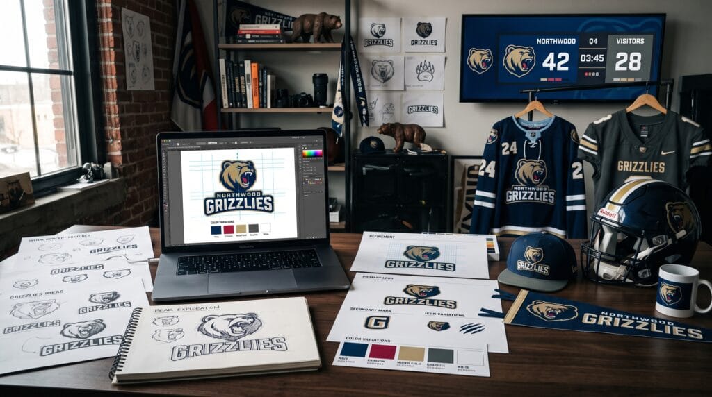
Strong sports logo design helps a team communicate confidence, energy, history, and personality before players even enter the field. A recognizable sports logo can appear on uniforms, merchandise, social media, stadium signage, tickets, websites, and promotional materials while creating a visual symbol that supporters can identify immediately.
Sports branding presents a unique design challenge. The logo needs to feel distinctive at large sizes while remaining recognizable when embroidered onto a cap or displayed as a small social media icon. It also needs enough personality to separate one club from another without becoming unnecessarily complicated.
The best sports logo design ideas combine memorable symbols, bold typography, meaningful colors, and a flexible structure. Whether you are developing an identity for a football club, basketball team, baseball organization, school athletics program, or local sports academy, the logo should reflect the character of the team.
This guide explores practical sports logo concepts and explains what makes each direction effective.
Why Sports Logo Design Matters
A sports logo often becomes the most recognizable visual element of a team.
Supporters may wear it on jerseys, hats, scarves, bags, stickers, and other merchandise. Players see it on uniforms and equipment, while sponsors and media use it across promotional materials.
Effective sports logo design can help:
- Build team recognition
- Create supporter loyalty
- Communicate personality
- Strengthen merchandise
- Improve uniform design
- Unify multiple teams
- Create consistent social graphics
- Represent regional identity
- Differentiate the club
- Establish a professional image
A successful logo should also remain relevant beyond one season.
Following short-lived visual trends too closely can create an identity that feels outdated quickly.
Start Sports Logo Design With Team Personality
Before sketching animals, shields, or initials, define what the club represents.
Possible characteristics might include:
- Powerful
- Fast
- Fearless
- Traditional
- Competitive
- Modern
- Disciplined
- Energetic
- Community-focused
- Elite
These words influence the visual direction.
A historic football club may benefit from a traditional badge, while a young basketball academy could use a cleaner, more energetic symbol.
Understanding personality helps prevent sports logo design from becoming a collection of random athletic symbols.
1. Mascot Sports Logo Design
Mascot logos are among the most recognizable approaches in sports branding.
Common mascot subjects include:
- Lions
- Tigers
- Eagles
- Wolves
- Bears
- Bulls
- Sharks
- Falcons
- Panthers
- Mythical creatures
Animals are popular because they naturally communicate traits such as strength, speed, aggression, intelligence, or endurance.
Keep the Mascot Distinctive
Avoid creating another generic roaring lion simply because lions symbolize power.
Look for ways to personalize the illustration through:
- Facial structure
- Angles
- Shapes
- Team colors
- Regional influences
- Hidden initials
A good mascot sports logo design should remain recognizable even when some details are removed.
2. Shield and Badge Sports Logos
Shield logos can communicate tradition, strength, competition, and heritage.
This format works particularly well for:
- Football clubs
- Rugby teams
- School athletics
- Sports academies
- Community clubs
A badge might contain initials, founding year, mascot, regional symbol, or sport-specific element.
Simplify the Badge Structure
Avoid placing too many symbols inside the shield.
A strong hierarchy might include:
- Club initials
- One main symbol
- Club name
- Optional founding year
The overall silhouette should remain recognizable from a distance.
Badge-based sports logo design is particularly useful when a club wants a traditional identity with modern execution.
3. Monogram Sports Logo Design
Monograms combine two or more letters into one distinctive symbol.
This direction works well when the team name has recognizable initials.
For example, initials can be:
- Interlocked
- Overlapped
- Mirrored
- Stacked
- Combined through negative space
- Constructed geometrically
Monograms often feel more timeless than highly detailed mascots.
Make the Letters Ownable
Do not simply type two letters in a font and call it a logo.
Modify the letterforms.
Adjust terminals, proportions, angles, and connections until the monogram feels specific to the club.
Monogram sports logo design works particularly well for baseball, basketball, collegiate athletics, and premium club identities.
4. Lettermark Sports Logos
A lettermark focuses on one main letter or a small group of initials.
This is useful for teams with long names.
The letter can become a powerful visual symbol when customized carefully.
Designers can use:
- Slanted forms for speed
- Sharp angles for aggression
- Wide letterforms for strength
- Rounded shapes for approachability
- Custom cuts for movement
A simple lettermark can be extremely versatile.
It can appear on helmets, caps, apparel, digital icons, and equipment without losing readability.
5. Minimalist Sports Logo Design
Not every sports identity needs an aggressive mascot or complex crest.
Minimal sports logo design uses simplified shapes to create a cleaner contemporary identity.
A minimalist mark may contain:
- One animal silhouette
- A simplified monogram
- A geometric symbol
- One athletic reference
- Abstract motion lines
The challenge is creating enough personality with fewer elements.
Minimal sports logos often work well for modern academies, fitness organizations, esports-adjacent teams, and new clubs that want a flexible identity.
6. Vintage Athletic Logo Design
Vintage sports branding can communicate heritage and nostalgia.
Common visual elements include:
- Varsity lettering
- Script typography
- Collegiate fonts
- Classic mascots
- Circular badges
- Established dates
- Distressed textures
A vintage direction can work particularly well for clubs with long histories or teams that want an old-school athletic identity.
Separate Logo From Texture
Distressed effects may look attractive on apparel, but the core logo should usually remain clean.
Create a strong vector mark first.
Textures can then be added selectively to merchandise or promotional graphics.
This keeps the sports logo design versatile.
7. Modern Geometric Sports Logos
Geometric logos use clean construction, sharp forms, symmetry, and simplified shapes.
This style can make a club feel modern and disciplined.
A geometric animal mascot, for example, can be built using:
- Triangles
- Angular curves
- Negative space
- Repeated proportions
- Symmetrical forms
Geometric sports logo design can work well across uniforms and digital platforms because the shapes remain clear at different sizes.
Avoid making geometry overly complicated.
A strong silhouette should still come first.
8. Speed-Inspired Sports Logo Design
Movement is central to many sports.
Designers can suggest speed using:
- Forward angles
- Italic typography
- Motion lines
- Extended letterforms
- Sharp cuts
- Dynamic silhouettes
This approach works especially well for racing, athletics, cycling, football, basketball, and other fast-moving sports.
Be careful with generic swooshes.
Movement should feel connected to the identity rather than added as a decorative effect.
Also Read: Unique Funny Mascot Logo Prompts for Better Branding
9. Regional Sports Logo Ideas
Sports clubs often represent more than players. They may represent a city, school, region, or community.
Regional identity can provide meaningful visual inspiration.
Possible elements include:
- Local animals
- Architecture
- Mountains
- Rivers
- Historical symbols
- Regional plants
- Cultural patterns
- Geographic shapes
A team from a coastal city might incorporate waves or a local marine animal.
A mountain-region club could use peaks as part of a monogram.
Regional elements make sports logo design more specific and emotionally relevant to supporters.
10. Sports Equipment Logo Design
Sport-specific equipment can provide simple visual clues.
Examples include:
- Basketballs
- Baseball bats
- Footballs
- Hockey sticks
- Tennis rackets
- Racing helmets
- Boxing gloves
The main risk is predictability.
A basketball alone is unlikely to create a distinctive identity.
Combine equipment with lettering, negative space, or an unexpected visual concept to create something more memorable.
11. Negative Space Sports Logos
Negative space allows designers to hide secondary symbols inside the main logo.
For example:
- A ball hidden between initials
- A lightning bolt inside an animal silhouette
- A letter created between two shapes
- A regional landmark hidden inside a badge
This can make a seemingly simple logo more memorable.
Negative-space sports logo design requires careful construction because the secondary idea should not make the primary symbol harder to understand.
12. Esports-Inspired Sports Logos
Traditional sports increasingly borrow visual ideas from esports.
These logos often feature:
- Aggressive mascots
- Sharp geometry
- Bold outlines
- Dark palettes
- High contrast
- Angular typography
This direction can appeal to younger audiences.
However, avoid copying the same exaggerated mascot style used by hundreds of teams.
Simplification and custom typography can create a more distinctive identity.
13. Heritage Sports Club Logos
Teams with long histories can use their heritage as a design advantage.
Historical identities may include:
- Founding dates
- Traditional colors
- Old club symbols
- Local emblems
- Historic initials
A redesign does not necessarily need to replace everything.
Designers can simplify an old crest while preserving important recognizable features.
This creates continuity between past and present.
Heritage-focused sports logo design should respect supporter attachment to existing symbols.
14. Typography-First Sports Logos
Some identities can be built primarily around lettering.
Typography-first sports logos may use:
- Bold condensed type
- Varsity lettering
- Custom scripts
- Wide geometric fonts
- Angular display typography
Custom lettering can make the team name itself become the visual symbol.
This approach is useful for clubs that do not need a mascot.
Customize the Typeface
Alter standard fonts through:
- Custom terminals
- Cut corners
- Extended strokes
- Ligatures
- Unique letter connections
- Custom numerals
These modifications make the typography more ownable.
15. Circular Sports Logo Design
Circular logos create a compact format that works well on patches, merchandise, and social profiles.
The outer ring can contain:
- Team name
- Location
- Founding year
- Motto
The center may contain a mascot, lettermark, or symbol.
Circular sports logo design is especially useful for community clubs, academies, and vintage athletic identities.
Keep small text readable and avoid squeezing too much information into the border.
16. Abstract Sports Symbols
An abstract symbol can communicate movement, unity, energy, or strength without directly depicting a mascot or sport.
For example, shapes may represent:
- Players moving together
- Wings
- Flames
- Speed
- Shields
- Victory
Abstract marks can give a team a more contemporary identity.
However, the symbol should be simple enough to remember.
Avoid creating shapes that require long explanations before they make sense.
17. Crown and Championship-Inspired Logos
Crowns, stars, laurels, and trophy-inspired elements can communicate excellence and ambition.
They may work for elite clubs, tournament organizations, and championship-focused brands.
Use these symbols selectively.
Adding a crown to every sports logo does not automatically create prestige.
The symbol should connect naturally to the identity or history of the organization.
Also Read: Ecommerce Logo Design That Make Your Brand Look Professional
18. Sports Academy Logo Design
Sports academies often need identities that feel professional but welcoming.
The logo may need to appeal to athletes, parents, coaches, and sponsors.
Useful directions include:
- Clean badges
- Modern monograms
- Simplified mascots
- Academic-style crests
- Strong typography
Academy sports logo design should also work across training uniforms, certificates, facilities, social media, and educational materials.
Sports Logo Typography
Typography has a major influence on how powerful a sports identity feels.
Condensed Sans Serif Fonts
Condensed lettering can communicate speed, energy, and competitiveness.
Slab Serif Fonts
Slab serifs can feel strong, traditional, and athletic.
They work especially well for collegiate identities.
Varsity Fonts
Varsity-inspired typography immediately creates an athletic association.
Use it carefully to avoid making every team look similar.
Custom Lettering
Custom typography offers the strongest opportunity for uniqueness.
The best sports logo design often modifies familiar athletic structures into something specific to the team.
Choosing Colors for Sports Logo Design
Team colors need to work across uniforms, merchandise, print, digital media, and environments.
Common associations include:
- Red for energy and intensity
- Blue for confidence and stability
- Black for strength and authority
- Orange for energy and enthusiasm
- Green for growth or regional connections
- Gold for achievement and prestige
- Purple for distinction and creativity
Avoid choosing colors based entirely on psychological associations.
Competitor differentiation and regional meaning may be more important.
Build a Flexible Palette
Define:
- Primary color
- Secondary color
- Neutral colors
- Optional accent color
Too many competing colors can weaken recognition.
Test Sports Logos in One Color
A powerful logo should usually remain recognizable without gradients or multiple colors.
Testing a design in black and white reveals whether the core shape is strong.
This matters for:
- Embroidery
- Engraving
- Stamps
- Small merchandise
- Single-color printing
If the logo only works because of special effects, simplify it.
Sports Logo Design for Uniforms
Uniform application should be considered from the beginning.
Test the logo on:
- Jerseys
- Shorts
- Caps
- Helmets
- Training shirts
- Jackets
Small details may disappear when embroidered.
Extremely thin lines can also create production problems.
Strong sports logo design considers real-world applications rather than existing only as a presentation mockup.
Create Multiple Sports Logo Variations
A complete sports identity usually needs more than one version.
Consider developing:
- Primary logo
- Secondary logo
- Monogram
- Mascot symbol
- Wordmark
- One-color version
The main crest may appear on formal materials, while a simplified monogram could work better on a cap.
A flexible system increases consistency across different applications.
Helpful Tools for Sports Logo Design
Several professional tools can help designers develop and present sports identities.
Adobe Illustrator
Illustrator is ideal for creating vector logos, mascot shapes, monograms, custom lettering, and production-ready artwork.
Affinity Designer
Affinity Designer provides vector design tools suitable for logo development, illustration, and sports branding.
Procreate
Procreate is useful during early mascot sketching and hand-drawn concept development.
Designers can sketch freely before rebuilding selected concepts as vectors.
Adobe Photoshop
Photoshop can help create jersey mockups, merchandise presentations, promotional visuals, and textured applications.
Figma
Figma can help organize brand systems, presentation layouts, and digital applications of sports identities.
Canva
Canva can be useful for creating supporting social graphics and simple club marketing materials once the primary identity has been established.
Placeit
Placeit can help preview logos on jerseys, hats, merchandise, and promotional mockups.
Tools should support the design process, but strong concepts and construction remain more important than software.
Common Sports Logo Design Mistakes
1. Adding Too Much Detail
Highly detailed mascots may fail at small sizes.
2. Using Generic Sports Symbols
A ball and shield alone may not create a memorable identity.
3. Copying Professional Teams
Use existing sports identities for research, not imitation.
4. Choosing Too Many Colors
A focused palette usually creates stronger recognition.
5. Using Unmodified Fonts
Customizing typography helps create a more distinctive identity.
6. Ignoring Small Applications
Always test the logo on caps, icons, jerseys, and embroidery.
7. Relying on Effects
Gradients, shadows, and 3D effects should not compensate for weak logo construction.
8. Forgetting the Supporters
A sports identity represents a community as well as an organization.
Sports Logo Design Checklist
Before approving a sports logo, confirm that:
- Team personality is clearly defined.
- The main symbol is recognizable.
- The design feels distinctive.
- Typography matches the team personality.
- Colors work across uniforms and digital media.
- The logo works in one color.
- Small details remain visible.
- The design can be embroidered.
- The silhouette is recognizable.
- The identity works on merchandise.
- A simplified logo variation exists.
- Regional elements are meaningful.
- The design avoids unnecessary effects.
- The logo does not imitate another team.
- All fonts and visual assets are properly licensed.
Also Read: Startup Logo Ideas for Payments Apps: Simple and Secure
Final Thoughts on Sports Logo Design
The strongest sports logo design ideas create a clear connection between the team’s personality, history, supporters, and visual identity.
Mascots can communicate strength and energy. Shields can reinforce tradition, while monograms create simple and highly versatile symbols. Geometric marks can feel modern, and regional elements can give a club a deeper connection with its community.
Do not begin by decorating a logo with every sports-related symbol you can find.
Start with the team.
Understand its values, competitive personality, audience, location, and history. Then choose the visual direction that communicates those qualities most effectively.
Keep the core shape simple enough to work on a jersey, social icon, cap, banner, or stadium sign. Develop secondary variations so the identity can adapt without losing recognition.
Typography, color, mascot illustration, and badge structure should feel like parts of one system.
Ultimately, successful sports logo design gives players and supporters a symbol they are proud to represent. When the identity is distinctive, versatile, and meaningful, it can become much more than a logo. It becomes a lasting visual symbol of the team.
For high-quality fonts to boost your income, check out Letter Crafted. Our professional fonts are perfect for branding, marketing, and content creation. So, don’t miss this opportunity.