
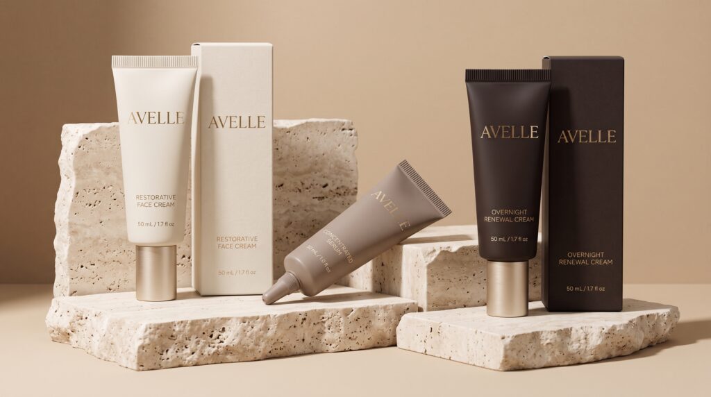
Tube packaging design can give creams and suitable serum formats a refined presentation while supporting everyday handling and dispensing. A premium appearance may come from balanced proportions, clear information, and a carefully considered finish. It should also connect with how the product behaves inside the package and how customers use it.
Not every formula belongs in the same tube. Before developing the visual direction, confirm that the proposed structure, materials, and dispensing system suit the specific product.
This guide explores creative and practical decisions for luxury skincare packaging. Use the ideas to shape a focused brief, compare samples, and develop a presentation that remains coherent beyond the initial mockup.
Start Tube Packaging Design With the Formula
The product should influence the package before decoration begins.
A thick cream and a more fluid serum may need different openings, closures, and handling arrangements. The name of the category alone does not determine the right container.
Begin with the actual formula.
Define the Product and Dispensing Needs
Discuss the product’s characteristics with the formulation and packaging teams.
Consider how much the customer should dispense, how they will hold the tube, and how the opening should function.
Effective tube packaging design develops around a suitable packaging system. A visually appealing concept still needs appropriate compatibility and performance testing before production.
Do not assume that two products can share a structure simply because they belong to the same range.
Define What Luxury Means for the Brand
Luxury skincare does not have one required appearance.
A brand might emphasize scientific precision, quiet comfort, contemporary design, or a tactile experience. Those directions can lead to different visual choices.
Describe the intended character before selecting finishes.
Choose a Focused Creative Direction
Use a short set of qualities that you can explain.
For example, a precise and restrained identity may favor clear panels and controlled spacing. A warmer direction might introduce cream tones and subtle surface texture.
Thoughtful tube packaging design connects those choices with the brand’s offer.
Avoid collecting unrelated premium-looking details without deciding what holds them together. Coherence matters more than the number of decorative treatments.
Use Tube Packaging Design to Create Clear Hierarchy
A tube provides a limited area for communication, often on a curved surface.
Customers need to identify the brand and product without rotating the package repeatedly to understand the basics.
The layout should establish a clear order.
Prioritize the Main Information
Define the relationship between the brand name, product name, variant, and supporting details.
Reserve enough space for the information applicable to the product and its market.
Test the composition with actual wording rather than placeholder lines.
Good tube packaging design balances visual restraint with useful communication. A spacious front panel should not depend on moving essential information into an unreadable block elsewhere.
Review the complete package, including any outer carton.
Explore Restrained Colors With Useful Contrast
Cream, charcoal, deep green, and muted accent colors can provide possible directions for a premium range.
None of them creates luxury automatically.
The effect depends on the combination, layout, material, and surrounding identity.
Compare Color on the Proposed Surface
A color may appear different on a flexible tube than on a paper carton.
Review samples under ordinary lighting, not only a carefully arranged studio setup.
Check that the product name and important details remain distinguishable.
With tube packaging design, subtlety should not make identification difficult. A restrained palette can still provide strong contrast and a clear relationship between the main elements.
Also Read: How to Keep Packaging Design Consistency Across Product Lines
Use Finishes Selectively
A surface treatment can add character, but it should serve the identity and practical experience.
Matte, glossy, and metallic elements create different visual effects. Their appearance also depends on the underlying material and production method.
Compare the real options.
Give Each Finish a Clear Purpose
You might emphasize a small identity detail rather than covering the entire tube with a special effect.
If a finish is used, check how it behaves around curves and during expected handling.
Consider a version without that treatment too.
Practical tube packaging design should remain recognizable without relying entirely on reflection or texture. A dramatic mockup can hide weaknesses in the basic layout.
Make Closures Part of the Visual System
The closure affects the tube’s proportions and the way customers interact with it.
Its shape, color, and position should relate to the rest of the package.
Appearance is only one part of the decision.
Review Opening, Closing, and Dispensing
Handle a suitable sample and consider the complete sequence.
Is the closure understandable? Does the proposed format suit the way the product is intended to be used?
Check whether decorative choices interfere with grip or practical operation.
For tube packaging design, the closure should feel integrated rather than selected separately at the end. A coordinated package connects the body, shoulder, opening, and cap through both appearance and function.
Distinguish Products Without Fragmenting the Collection
A skincare range may include several creams or tube-compatible treatments.
Customers should recognize the shared brand while identifying the individual product.
A consistent system can support both needs.
Use Controlled Product Variations
Keep the main layout stable.
Then vary a defined element, such as an accent panel, a small symbol, or a clearly presented product name.
Avoid relying on color alone to distinguish the range.
These tube packaging design choices should be tested across all products. A system that works beautifully for a short name may need adjustment when another item has longer wording.
Review the full collection together.
Consider How the Tube Looks During Use
A tube is handled and may change shape as its contents are dispensed.
A design that looks balanced when full may appear different later.
This does not make the format unsuitable, but it deserves attention.
Inspect More Than the Front-Facing Mockup
Review how the artwork sits near the shoulder, side areas, and sealed end.
Consider whether important information becomes difficult to read when the tube is held or changes shape.
Use realistic samples wherever possible.
Thoughtful tube packaging design acknowledges the package’s working life. The customer encounters it repeatedly, not only in the ideal condition used for launch photography.
Also Read: Packaging Color Psychology Guide for Better Brand Perception
Adapt Tube Packaging Design for Smaller Formats
Travel sizes and sample tubes create a different information challenge.
Shrinking the full-size artwork can make details too small and weaken the hierarchy.
Treat the smaller format as a deliberate variation.
Preserve Recognition While Adjusting the Layout
Retain familiar colors, identity elements, and product naming.
Reconsider the arrangement according to the available printable area and required content.
Discuss constraints with the supplier before approving artwork.
Effective tube packaging design keeps the small version related to the collection without forcing it to reproduce every visual detail. Clarity should remain part of the premium experience at every size.
Coordinate Tubes With Cartons and Gift Sets
If an outer carton or gift presentation is part of the offer, it should feel connected to the tube.
The components do not need identical artwork, but their relationship should be understandable.
Each surface has a different role.
Build a Clear Packaging Family
Use shared colors, spacing principles, and identity elements.
Let the carton support additional information where appropriate, while keeping the tube understandable after the outer package is removed.
Check the complete opening sequence.
For tube packaging design, a coordinated gift set should also make the products easy to distinguish. Presentation should not create confusion about which item is which or how the collection fits together.
Review Samples Before Committing to Production
A digital concept cannot confirm material feel, dispensing behavior, or production accuracy.
Build a sample review into the process.
Create a Focused Review Checklist
Inspect:
- Product and packaging compatibility.
- Closure operation.
- Dispensing behavior.
- Artwork placement.
- Color and finish consistency.
- Readability around the curved surface.
- Relevant handling and delivery performance.
Separate visual approval from technical testing.
Useful tube packaging design depends on both. The creative team can evaluate hierarchy and character, while the relevant specialists assess whether the packaging system performs appropriately for the formula.
Document issues before revising the design.
Keep the Premium System Manageable
A new collection can become difficult to maintain when every product uses a different cap, finish, and layout.
Consider how future updates and additions will work.
Create a reference covering approved colors, placement rules, and product variations.
Keep production files organized and identify which artwork is current.
Also consider whether a decorative feature adds enough value to justify its complexity. A simpler system can still feel considered when the proportions, information, and materials work together.
Consistency is easier to preserve when each choice has a clear purpose.
Also Read: Creative Soap Packaging Ideas That Make Your Brand Stand Out
Conclusion – Create Luxury Packaging That Works Beyond the Presentation
Tube packaging design brings the formula, structure, visual identity, and customer interaction into one package.
Start with product requirements, then develop a focused creative direction. Use clear hierarchy, considered contrast, and selective finishes to support the intended character.
Test the complete system with realistic samples before production.
A premium tube does not need decoration on every surface. It needs a coherent presentation and a practical experience that remain convincing when customers hold, open, and use the product.
For high-quality fonts to boost your income, check out Letter Crafted. Our professional fonts are perfect for branding, marketing, and content creation. So, don’t miss this opportunity.