
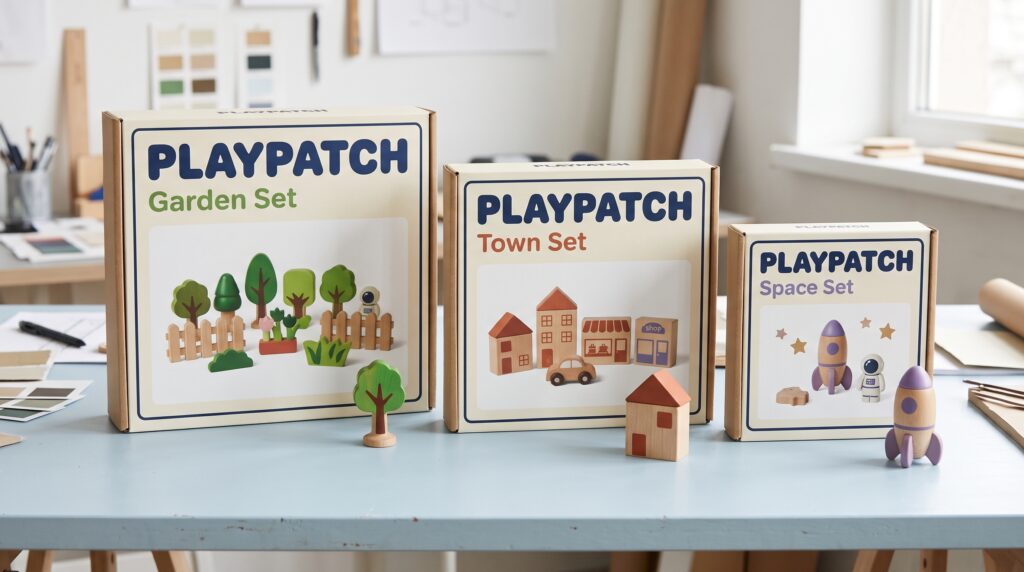
Toy packaging design helps shoppers recognize your brand while understanding what makes each set different. When a range grows, that balance can become harder to maintain. A small starter kit, a large playset, and a special edition may need different boxes, yet they should still look like members of the same family.
Without shared rules, small choices begin to pull the range apart. Logos move between corners. Product names change size. Similar colors identify unrelated sets. Eventually, customers have to work harder to understand how the products connect.
Consistency starts with deciding what stays familiar and what can change. This guide explains how to build a practical system that supports both brand recognition and the personality of each toy.
Give Toy Packaging Design a Clear Brand Foundation
Before creating individual boxes, define the visual features that belong to the whole brand.
Start with the logo, main colors, typography, illustration approach, and overall tone. Decide whether the range should feel energetic, gentle, adventurous, imaginative, or precise.
Turn those ideas into visible choices. For example, an adventurous range might use bold product names, lively character poses, and angled graphic shapes. A calmer creative range might use softer colors and open layouts.
Keep the foundation simple enough to repeat. A system built around a few strong features is easier to apply than one with dozens of decorative rules.
Write a short description of the intended look. This gives designers and suppliers a shared reference when new sets enter development.
Separate Brand Elements From Set Differences
Consistent toy packaging design needs room for variety. Every box does not have to use the same image or background color.
Divide the visual system into three levels:
- Brand elements that remain consistent across the whole range.
- Collection elements that identify a theme or product family.
- Set elements that explain the individual item.
The logo and core typography might stay fixed. A collection could use a shared color band or character group. Each set would then have its own name, product image, and contents.
This structure helps teams make decisions quickly. Instead of redesigning everything for a new product, they can focus on the parts that genuinely need to change.
Create a Repeatable Front Panel Layout
The front panel should establish a familiar reading order.
Decide where shoppers will find the brand, collection name, product name, and main image. Give each a clear role rather than allowing several elements to compete for attention.
For toy packaging design, a useful layout might place the logo near the top, the product name beneath it, and the main toy image in the central area. Supporting details can occupy a consistent lower section.
Treat this as a flexible arrangement. A tall box and a wide box need different proportions, but the information should still feel organized in the same way.
Keep the Information Hierarchy Familiar
Check the layout at a glance. Can someone quickly identify the brand and tell one set from another?
If a decorative theme title overwhelms the actual product name, adjust the hierarchy. Consistent emphasis matters as much as consistent placement.
Build Color Rules for the Whole Range
Color can help distinguish collections, but it needs a clear purpose.
Choose a core brand palette first. Then decide how additional colors will identify themes, difficulty levels, or other meaningful product groups.
Avoid assigning colors casually. If green represents one collection on a small box and a different collection on a large box, the system becomes confusing.
Document color references and intended uses. Include examples of backgrounds, text combinations, and accents so designers can see how the palette works together.
Toy packaging design should also remain understandable without color alone. Pair collection colors with names, symbols, or other visible identifiers. This gives shoppers more than one way to recognize the correct set.
Also Read: Common Packaging Design Mistakes and How to Avoid Them
Set Typography Rules That Scale
Typography is one of the easiest places for a growing range to drift.
Choose a small number of type styles and assign each a job. Product names, collection labels, descriptions, and supporting details should follow a repeatable pattern.
Define a hierarchy rather than one fixed size for every package. A large playset needs different text sizes from a compact accessory box.
In toy packaging design, consistency comes from the relationship between those sizes. The product name should retain a similar level of prominence across formats.
Plan for Long Names and Multiple Languages
Test the system with your longest likely product name. Also allow space for translated copy where needed.
Prepare an approved alternative for tight layouts. Avoid shrinking text unpredictably whenever a name becomes difficult to fit.
Use One Approach to Product Images
A range can share colors and typography yet still look disconnected because of its images.
Decide how toys will be photographed or illustrated. Set expectations for background treatment, camera angle, lighting, shadows, and scale.
If packaging uses scenes of play, define how those scenes should look. Some sets should not appear in elaborate environments while others sit against plain white without a clear reason.
Consistent toy packaging design also requires accurate product presentation. Make it clear what belongs to the set and what serves as background decoration.
Keep approved image examples in the guidelines. Visual references often explain the intended treatment more clearly than a long written description.
Adapt the System Across Different Box Shapes
A packaging system should work beyond its first sample.
Test it on a small box, a wide carton, a tall package, and any windowed formats in the range. Look for elements that become cramped, disconnected, or difficult to read.
Create layout families for these formats. Each family can adjust proportions while keeping the same brand features and reading order.
For toy packaging design, this is more practical than forcing one template onto every structure.
Review side and back panels too. Packages may appear sideways on shelves, stacked in storage, or photographed from an angle. Repeat key identifiers where useful so the set remains recognizable beyond its front face.
Make Related Sets Easy to Tell Apart
Consistency should help shoppers choose, not make every item look interchangeable.
Give each set a distinct product name and a clear main image. If the range includes similar-looking kits, explain the difference in plain language.
You might highlight a theme, included model, or relevant contents. Use those details consistently rather than inventing a different badge style for every launch.
Toy packaging design works best when a customer can answer two questions quickly, “Does this belong to the range I know?” and “Is this the set I want?”
Place several designs together during review. Differences that seem obvious on separate screens may disappear when the boxes sit beside each other.
Also Read: Packaging Design Strategy for Better Shelf Impact and Branding
Organize Artwork and Shared Assets
Even good guidelines can fail when teams work from outdated files.
Keep approved logos, color references, templates, images, and icons in one clearly organized location. Make the current versions easy to identify.
Use a practical file naming system that includes the product, package format, market, and artwork version. Avoid vague names such as “final new version.”
Assign someone to maintain the shared assets and retire outdated files.
For toy packaging design, this matters whenever several designers or suppliers contribute to the range. A central source reduces the chance of an old logo or incorrect template returning during a rushed update.
Review Physical Samples Before Approval
Screens cannot show every feature of a finished package.
Print layouts at actual size and make folded mockups where practical. Check text, image scale, panel alignment, and areas affected by folds or windows.
Compare the samples together under similar lighting. Look at whether the colors, finishes, and overall contrast feel related.
Physical reviews help reveal toy packaging design differences that are easy to miss when artwork is viewed at different zoom levels.
Ask suppliers how material and printing choices may affect the intended appearance. If different formats use different substrates, agree on an acceptable visual relationship rather than assuming every surface will look identical.
Use a Short Packaging Consistency Checklist
A shared checklist keeps reviews focused and helps new team members understand the system.
Before approving a set, confirm that:
- The correct logo and clear space are in place.
- Collection colors follow the agreed rules.
- Product names use the approved hierarchy.
- Images match the range’s visual approach.
- The individual set is easy to distinguish.
- Side and back panels use the correct templates.
- Copy and artwork versions are current.
- Relevant product information has received the appropriate review.
Keep visual consistency checks alongside the other approvals your packaging needs. They serve different purposes, and each deserves clear ownership.
A short checklist that people use regularly is more valuable than an extensive document that never enters the review process.
Also Read: Packaging Design Process Guide for Better Results
Keep the System Useful as the Range Grows
Your first packaging guidelines do not need to predict every future product. They need to provide a clear foundation and a sensible way to handle new situations.
When an unusual set arrives, identify which existing rules still work. Adjust only what the format requires, then record the approved solution for future use.
Review the whole range occasionally. Look for exceptions that have become common and rules that no longer help.
Start by placing three current packages side by side. Note what connects them, what makes them distinct, and what seems accidental. Use those observations to build a stronger system, one that makes every new set feel familiar while giving customers a clear reason to choose it.
For high-quality fonts to boost your income, check out Letter Crafted. Our professional fonts are perfect for branding, marketing, and content creation. So, don’t miss this opportunity.