
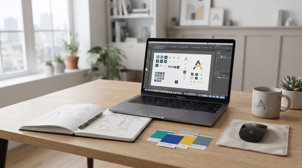
A strong favicon logo design can make a website feel more complete, recognizable, and professional. Although a favicon is tiny, it appears in important places such as browser tabs, bookmarks, shortcuts, and sometimes search or mobile interfaces. Because users often have several tabs open at once, a clear favicon can help them recognize your website quickly without reading the full page title.
A favicon should not simply be a smaller copy of a complex logo.
It usually needs to be simplified.
Fine typography, detailed illustrations, long brand names, and complicated symbols can disappear when reduced to a very small size.
This guide explains how to create an effective favicon logo design that remains clear, recognizable, and consistent with the rest of your brand.
Why Favicon Logo Design Matters
Favicons may be small, but they contribute to the overall website experience.
A good favicon can support:
- Brand recognition
- Browser tab identification
- Visual consistency
- Website credibility
- Bookmark recognition
- Professional presentation
Imagine having ten browser tabs open.
Several websites may use generic blank icons while one uses a clear, distinctive brand symbol.
The recognizable favicon makes that tab easier to find.
This is why favicon logo design should be treated as part of your broader visual identity rather than as a last-minute website detail.
Start With Your Existing Brand Identity
Before designing a favicon from scratch, review your current logo system.
Look for elements that remain recognizable when isolated.
These might include:
- Brand initials
- Monogram
- Simple symbol
- Geometric icon
- Distinctive letter
- Simplified logo mark
For example, if your full logo contains a wordmark and symbol, the symbol may already be suitable for favicon use.
If your logo consists only of a long business name, you may need to create a compact secondary mark.
Choose the Most Recognizable Element
Do not automatically use the entire logo.
Ask:
- Which element represents the brand best?
- Which shape remains visible at small sizes?
- Can users recognize it without the full wordmark?
- Does it still feel connected to the main identity?
A successful favicon logo design usually focuses on one strong visual idea.
Simplify the Shape for Favicon Logo Design
Small-scale design requires simplicity.
Details that look attractive in a full-size logo may disappear in a favicon.
Consider removing:
- Thin lines
- Small text
- Decorative flourishes
- Complex shadows
- Detailed illustrations
- Multiple overlapping shapes
The favicon should remain easy to understand even when viewed very small.
A useful test is to zoom out until the icon is close to browser-tab size.
If the shape becomes unclear, simplify it further.
Avoid Miniaturizing Complex Logos
One of the most common mistakes is shrinking the complete logo into a square.
For example, a logo containing:
- Brand name
- Tagline
- Symbol
- Decorative border
may look good on a website header but become completely unreadable as a favicon.
Instead, extract one recognizable element.
This makes the favicon cleaner and more useful.
Use Strong Contrast in Favicon Logo Design
Contrast helps small icons remain visible.
A favicon may appear against:
- Light browser interfaces
- Dark browser interfaces
- Colored backgrounds
- Mobile home screens
Use clear separation between the icon and its background.
For example:
- Dark symbol on light background
- Light symbol on dark background
- Bright brand color with contrasting mark
Avoid subtle combinations where the foreground and background are too similar.
Strong contrast is especially important because favicon details are already visually compressed.
Use Brand Colors Carefully
Your favicon should generally connect to the main brand palette.
However, you do not need to use every brand color.
A small icon often works better with:
- One main background color
- One symbol color
or even:
- A single-color symbol
Reducing the number of colors can improve clarity.
One of the most practical favicon logo design decisions is choosing the simplest color combination that still feels recognizably yours.
Consider a Letter or Monogram in Favicon Logo Design
If your brand does not have a suitable symbol, use a letter.
Initial-based favicons can work well for:
- Agencies
- Blogs
- Personal brands
- Software businesses
- Professional services
- Online stores
For example:
M for a brand beginning with M
or:
DM for a two-word brand
Keep the typography simple.
A distinctive letterform can create recognition without requiring a complicated icon.
Customize the Letter When Possible
A standard letter placed in a square may feel generic.
Small custom details can make it more memorable.
You could adjust:
- Stroke width
- Corners
- Letter spacing
- Shape
- Negative space
The goal is to create something recognizable without losing readability.
Design Inside a Square Format
Favicons are commonly displayed in square areas.
That means your symbol should fit comfortably inside a square composition.
Avoid shapes that become too narrow or too wide.
For example, a very long horizontal logo may appear tiny because the entire width must fit inside the square.
A compact symbol usually works better.
Leave enough space around the icon so it does not touch the edges.
Use Balanced Padding
Too much padding makes the favicon look small.
Too little padding makes it feel crowded.
Try several versions with different internal margins.
The goal is to make the symbol feel large enough to recognize while still having room to breathe.
Also Read: Logo Variation Tips for New Businesses and Digital Products
Test at Very Small Sizes for Favicon Logo Design
Favicon design should be judged at its actual viewing size.
A design that looks excellent at 500 pixels may fail at 16 or 32 pixels.
Test the icon at:
- 16 × 16 px
- 32 × 32 px
- 48 × 48 px
- Larger mobile icon sizes
Check whether:
- The main shape is still visible
- Thin lines disappear
- Negative space closes
- Letters become unreadable
- Colors remain distinct
Testing small sizes is one of the most important parts of favicon logo design.
Use Pixel-Aware Shapes
At extremely small sizes, curved and diagonal shapes can lose clarity.
You may need to simplify proportions slightly.
For example:
- Increase thin strokes
- Enlarge small gaps
- Reduce tiny corners
- Simplify internal shapes
The favicon does not always need to be mathematically identical to the main logo.
Small-scale adjustments can improve visual clarity while preserving the overall identity.
Create Multiple Versions for Favicon Logo Design
A modern website may need several favicon or icon versions.
Useful variations can include:
- Standard favicon
- Dark-mode version
- Light-mode version
- App icon
- Touch icon
- Social profile icon
The core symbol should remain consistent.
However, background colors or contrast may need to change depending on where the icon appears.
Creating a small favicon system is more flexible than relying on a single file.
Keep Favicon Branding Consistent
Your favicon should feel connected to other brand touchpoints.
Compare it with:
- Website logo
- Social media profile image
- App icon
- Email avatar
- Packaging symbol
These elements do not have to be identical, but they should clearly belong to the same visual family.
Consistent iconography helps strengthen brand recognition.
Choose the Right File Formats for Favicon Logo Design
Favicons can use several file formats depending on the website and browser environment.
Common options include:
- ICO
- PNG
- SVG
Each has different advantages.
ICO
ICO is a traditional favicon format and can include multiple icon sizes in one file.
PNG
PNG works well for simple raster favicons and supports transparency.
SVG
SVG can remain sharp at different sizes because it uses vector graphics.
However, your website setup may still require additional formats for compatibility.
A practical implementation often includes more than one version.
Use Transparent Backgrounds Carefully
Transparency can work well when the symbol itself has strong contrast.
However, a transparent favicon may become difficult to see against certain browser themes.
Test it against both light and dark backgrounds.
Sometimes using a solid brand-colored background produces more consistent results.
Make the Icon Distinctive in Favicon Logo Design
Browser tabs often display several icons side by side.
If your favicon looks too similar to many others, it may be difficult to recognize.
Avoid overly generic symbols when possible.
For example:
- Generic globe
- Basic star
- Common speech bubble
- Standard shopping cart
can easily blend into surrounding icons.
Try to connect the favicon to something unique about your brand.
This could come from:
- Logo shape
- Brand initials
- Custom symbol
- Distinct color
- Recognizable negative space
A distinctive favicon logo design improves recognition without needing complicated detail.
Match the Website Personality for Favicon Logo Design
The favicon should reflect the visual personality of the website.
For example, a luxury brand may use:
- Minimal monogram
- Refined typography
- Neutral colors
A playful children’s brand might use:
- Rounded shapes
- Bright colors
- Friendly iconography
A technology business might use:
- Geometric forms
- Clean lines
- Bold contrast
Consistency between favicon and website personality makes the overall experience feel more intentional.
Favicon Logo Design for Personal Brands
Personal websites can also benefit from strong favicon branding.
Options include:
- Initials
- Signature letter
- Personal monogram
- Simple symbol
- Portrait-inspired icon
For designers, writers, developers, photographers, or consultants, a monogram is often enough.
Keep it clean and easy to recognize.
A favicon can reinforce your personal identity across browser tabs and bookmarks.
Also Read: Unique Funny Mascot Logo Prompts for Better Branding
Favicon Logo Design for Ecommerce Websites
Ecommerce websites often benefit from using their most recognizable brand mark.
Suitable options include:
- Brand icon
- Product-related symbol
- Monogram
- Simplified logo mark
Avoid using tiny product photography.
Photographs usually contain too much detail for small favicon dimensions.
A simple graphic symbol will usually remain clearer.
Favicon Logo Design for Blogs
Blogs can use:
- First letter of the blog name
- Monogram
- Simple editorial symbol
- Brand mark
For example, a home decor blog could use a simplified house-inspired symbol.
A technology blog might use a geometric monogram.
The icon should remain aligned with the blog’s wider design system.
Use Negative Space Carefully
Negative space can make icons feel clever and distinctive.
However, very small negative spaces may disappear.
If your logo uses a small internal gap, enlarge it slightly for the favicon version.
Test whether the negative-space element remains visible at 16 or 32 pixels.
If it disappears completely, consider simplifying the mark.
Common Favicon Logo Design Mistakes
Using the Full Logo
Long wordmarks usually become unreadable.
Adding Too Much Detail
Small icons need simple shapes.
Ignoring Small-Size Testing
Always inspect the favicon at realistic dimensions.
Using Too Many Colors
A limited palette usually creates better clarity.
Choosing Thin Lines
Fine strokes may disappear at small sizes.
Ignoring Dark Mode
Test the icon against different browser backgrounds.
Using a Generic Symbol
Try to create something more connected to your specific brand.
Forgetting Brand Consistency
Your favicon should belong to the same visual identity as the rest of the website.
Favicon Logo Design Checklist
Before publishing your favicon, check that you have:
- Selected a recognizable brand element
- Simplified the logo
- Removed unnecessary details
- Used strong contrast
- Limited the color palette
- Tested a monogram if needed
- Used a square-friendly composition
- Added balanced padding
- Tested 16 × 16 px
- Tested 32 × 32 px
- Tested larger sizes
- Checked thin lines
- Checked negative space
- Created suitable file formats
- Tested transparency
- Tested light backgrounds
- Tested dark backgrounds
- Compared it with your main logo
- Checked browser-tab appearance
- Checked mobile appearance
Small improvements can make a noticeable difference at favicon size.
Keep Your Favicon Updated With Your Brand
If your company changes its logo, color palette, or visual identity, review the favicon too.
Do not leave an outdated icon in browser tabs after launching a new brand system.
When rebranding, update:
- Website favicon
- Mobile icons
- App icons
- Social avatars
- Saved shortcut graphics
A consistent update prevents customers from seeing two different identities.
Also Read: Typography Logo Trends You Should Follow for Better Results
Final Thoughts
A professional favicon logo design is a small but valuable part of website branding. It helps users identify your site more quickly, supports visual consistency, and makes browser tabs, bookmarks, and digital shortcuts feel more polished.
Start with the strongest recognizable element from your existing identity.
Simplify it.
Increase contrast.
Remove unnecessary detail.
Then test the icon at the smallest sizes where users will actually see it.
The best favicon logo design is not necessarily the most creative or complicated version. It is the design that remains recognizable, readable, and connected to the wider brand even when reduced to only a few pixels.
Create multiple versions when necessary, test both light and dark environments, and keep your favicon updated as your brand evolves.
When designed carefully, favicon logo design can strengthen website recognition and contribute to a more professional digital identity without requiring a large or complicated branding project.
For high-quality fonts to boost your income, check out Letter Crafted. Our professional fonts are perfect for branding, marketing, and content creation. So, don’t miss this opportunity.