
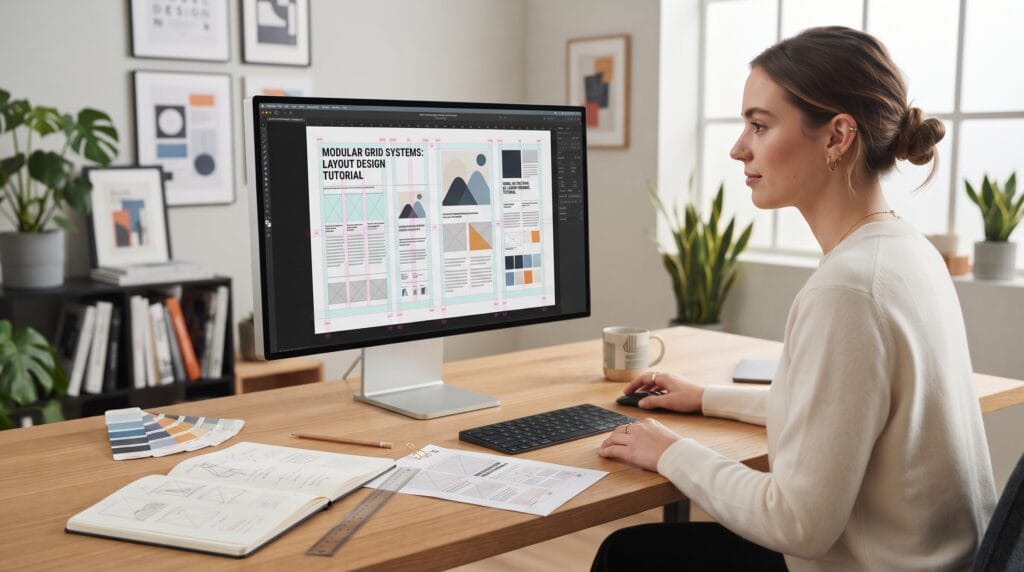
A layout design tutorial helps designers understand how visual elements should be arranged so information feels clear, balanced, and easy to follow. Good layout design is not simply about making a page look attractive. It determines how quickly viewers understand the message, what they notice first, and how naturally their eyes move through the content.
Layout appears everywhere in graphic design.
You can find it in:
- Posters
- Brochures
- Magazines
- Websites
- Social media graphics
- Packaging
- Presentations
- Advertisements
- Editorial pages
Different projects require different visual styles, but the basic principles remain similar.
Designers need to control alignment, spacing, scale, hierarchy, balance, and visual flow.
This layout design tutorial explains those principles step by step in a practical way so designers can create layouts that feel intentional instead of random.
Start Your Layout Design Tutorial With a Clear Purpose
Before arranging text, images, and graphics, understand what the design needs to communicate.
Ask:
What should the viewer understand first?
- A product advertisement may need to highlight the product.
- A magazine page may need to guide readers through a long article.
- A poster may need to communicate an event name immediately.
- A presentation slide may need to simplify complex information.
The purpose should influence every design decision.
Before opening your design software, list the important content.
This might include:
- Headline
- Supporting text
- Images
- Logo
- Call to action
- Contact information
- Captions
- Decorative elements
Once the content is clear, you can decide how much visual importance each element deserves.
Use Visual Hierarchy in Layout Design
Visual hierarchy determines what viewers notice first, second, and third.
Without hierarchy, every element competes for attention.
This creates confusion.
A simple hierarchy might look like:
Headline → Image → Subheading → Body text → Supporting details
Hierarchy can be created using:
- Size
- Color
- Weight
- Contrast
- Position
- Spacing
For example, a large bold headline naturally attracts more attention than a small paragraph.
The most important information should usually receive the strongest visual emphasis.
A successful layout design tutorial should always begin with hierarchy because it gives structure to the entire composition.
Layout Design Tutorial for Grid Systems
Grids are one of the most useful tools in graphic design.
A grid creates an invisible structure that helps designers organize content.
Common grid types include:
- Single-column grids
- Multi-column grids
- Modular grids
- Baseline grids
You do not need a complicated system for every project.
Even a simple two-column or three-column grid can dramatically improve alignment.
Use Columns for Organization
Columns help control where text and images appear.
For example, a brochure may use three columns.
A magazine page might use four or six columns.
A website may use a flexible multi-column system.
Columns allow different elements to align with one another even when their sizes are different.
This creates visual consistency.
Learn When to Break the Grid
Grids provide structure, but designs do not need to follow them rigidly.
Once the layout feels organized, you can intentionally break the grid.
For example:
- An image may extend across several columns
- A headline may overlap an image
- A shape may move outside the normal alignment
- A large number may extend into the margin
Breaking the grid can add energy and personality.
However, it works best when the underlying layout is already structured.
Random placement does not automatically create an experimental design.
Layout Design Tutorial for Alignment
Alignment creates visual relationships between elements.
Text, images, icons, and shapes should usually align with something.
Common alignment options include:
- Left alignment
- Center alignment
- Right alignment
- Edge alignment
- Baseline alignment
Poor alignment is one of the fastest ways to make a layout feel unfinished.
For example, if three text blocks begin at slightly different positions, the page may look messy even when each block is individually attractive.
Use guides and grids to maintain consistency.
Use Spacing as a Design Tool
Spacing is just as important as typography and color.
Good spacing helps viewers understand which elements belong together.
Use spacing to separate:
- Different sections
- Headings and paragraphs
- Images and captions
- Primary and secondary information
A common mistake is placing every element too close together.
This makes the design feel crowded.
Another mistake is using inconsistent spacing.
For example, if one heading has a large gap below it and another has a small gap, the page may feel visually unstable.
A strong layout design tutorial treats spacing as part of the design system, not as empty leftover space.
Create Consistent Spacing Rules
Instead of guessing every gap individually, create a simple spacing system.
For example:
- Small space for related elements
- Medium space between groups
- Large space between sections
This creates rhythm across the design.
Consistency is especially useful when designing:
- Multi-page brochures
- Presentations
- Websites
- Editorial layouts
- Brand templates
A spacing system helps separate content without making every decision from scratch.
Also Read: Figma Grid Tutorial: How to Create Better UI Layouts
Layout Design Tutorial for Typography
Typography plays a major role in layout structure.
Text can create hierarchy through:
- Font size
- Weight
- Line spacing
- Letter spacing
- Alignment
- Width
Start by defining clear levels.
For example:
- Headline
- Subheading
- Body text
- Caption
Each level should look noticeably different but still feel part of the same system.
Control Line Length
Very long lines can be difficult to read.
Very short lines can feel fragmented.
For body text, aim for comfortable line lengths that allow the eye to move naturally.
Narrower text columns often improve readability in editorial designs.
This is one reason newspapers and magazines commonly use multiple columns.
Create Contrast Between Elements
Contrast helps viewers distinguish information.
You can create contrast through:
- Large and small sizes
- Bold and light type
- Dark and light colors
- Simple and detailed elements
- Image and empty space
A layout without contrast can feel flat.
However, too much contrast creates competition.
Choose one or two strong focal points instead of making everything visually intense.
For example:
Large headline + small body text
is often more effective than giving every line a different size.
Layout Design Tutorial for Balance
Balance refers to how visual weight is distributed across the composition.
A design can use:
Symmetrical Balance
Elements are distributed evenly around a central axis.
This creates a stable and formal feeling.
Asymmetrical Balance
Different elements balance one another even though they are not identical.
For example:
Large image on the left + smaller text blocks on the right
can still feel balanced.
Asymmetrical layouts often look more dynamic and contemporary.
Understand Visual Weight
Different elements carry different amounts of visual weight.
Large objects usually feel heavier.
Dark colors may feel heavier than light colors.
Bright colors can attract more attention.
Complex images may feel heavier than simple shapes.
When arranging a layout, imagine each element adding weight to the page.
If one area feels too heavy, balance it using another element or more negative space.
Use Negative Space Effectively
Negative space is the empty area around elements.
It is not wasted space.
Negative space can:
- Improve readability
- Create focus
- Separate content
- Make designs feel premium
- Reduce clutter
Beginners sometimes try to fill every available area.
This usually weakens the layout.
Allow important elements enough room to breathe.
A simple design with generous spacing can often feel more professional than a crowded design containing many decorative elements.
Layout Design Tutorial for Images
Images should support the message rather than simply fill space.
Consider:
- Image size
- Crop
- Position
- Relationship with text
- Visual direction
A large image can become the main focal point.
Several smaller images may work better for comparison or storytelling.
Use Cropping Strategically
Creative cropping can improve a layout.
Try:
- Full-bleed images
- Close-up crops
- Partial objects
- Images extending outside the frame
- Geometric crops
The crop should help direct attention toward the important part of the image.
Avoid cropping faces, products, or important details awkwardly.
Build a Strong Focal Point
Every successful layout needs a clear place for the eye to begin.
A focal point might be:
- Large headline
- Strong image
- Bold color block
- Oversized number
- Unique graphic element
The focal point should connect directly to the main message.
Once the viewer notices it, the layout should guide them naturally toward supporting information.
This visual journey is called visual flow.
Also Read: Caption Writing Tutorial for Better Social Media Results
Layout Design Tutorial for Visual Flow
Visual flow describes how the viewer’s eye moves through a design.
You can create flow using:
- Alignment
- Direction
- Repetition
- Scale
- Spacing
- Image positioning
Ask yourself:
Where does the eye begin?
Then:
Where does it move next?
Finally:
Where does it finish?
A well-designed layout should not force viewers to search for important information.
The structure should guide them naturally.
Use Repetition to Create Consistency
Repeated design elements help unify a layout.
You can repeat:
- Colors
- Shapes
- Type styles
- Lines
- Icons
- Spacing
- Image treatments
Repetition creates a visual language.
For example, every section heading in a brochure might use the same font size, color, and spacing.
Consistency helps viewers understand the structure quickly.
Avoid Too Many Design Elements
One of the most important lessons in a layout design tutorial is knowing what to remove.
A design can become cluttered when it includes too many:
- Fonts
- Colors
- Shapes
- Images
- Borders
- Decorative effects
Ask whether each element serves a purpose.
If an element does not improve communication, hierarchy, or visual interest, consider removing it.
Simplification often makes a design stronger.
Create Several Layout Variations
Do not rely on your first idea.
Duplicate the page and test different compositions.
Try changing:
- Image placement
- Headline size
- Column structure
- Text width
- Alignment
- Color blocks
- Negative space
Comparing several variations helps reveal which structure communicates best.
Professional layout design usually involves iteration.
The first version is often only the beginning.
Common Layout Design Mistakes
Weak Hierarchy
If everything has similar size and weight, viewers do not know where to look.
Inconsistent Alignment
Elements should share clear visual relationships.
Uneven Spacing
Random gaps can make layouts feel unfinished.
Too Many Fonts
Use typography intentionally.
Overcrowding
Leave enough negative space.
Poor Image Cropping
Make sure the important subject remains visible.
Ignoring the Grid
A grid helps create order.
Too Many Focal Points
Choose one primary area of emphasis.
Layout Design Tutorial Checklist
Before finishing your design, review:
- Clear communication goal
- Strong visual hierarchy
- Consistent grid
- Clean alignment
- Controlled spacing
- Appropriate typography
- Readable body text
- Balanced composition
- Effective contrast
- Strong focal point
- Useful negative space
- Consistent image treatment
- Natural visual flow
- Repeated design patterns
- Correct content
- High-quality images
- Appropriate export settings
This checklist can help identify problems that are easy to miss while working closely on a design.
Practice Layout Design With Different Projects
The best way to improve layout skills is to practice with different formats.
Try creating:
- Poster layouts
- Magazine spreads
- Social media graphics
- Brochures
- Presentation slides
- Landing pages
- Product advertisements
Each format teaches different lessons.
Editorial design improves grids and typography.
Posters improve hierarchy and scale.
Presentations improve simplicity.
Web layouts improve structure and responsiveness.
The principles from this layout design tutorial can be adapted to all of them.
Also Read: Simple Photo Editing Tutorial for Clean and Aesthetic Photos
Final Thoughts
A layout design tutorial is not only about learning where to place images and text.
Good layout design is about creating relationships between elements.
- Use grids to provide structure.
- Use alignment to create consistency.
- Use spacing to separate information.
- Use typography to establish hierarchy.
- Use contrast to create emphasis.
- Use negative space to make important elements easier to notice.
Most importantly, think about how the viewer experiences the design.
- Where should they look first?
- What should they understand next?
- What information should they remember?
Strong graphic design does not happen because every available space is filled.
It happens because every element has a reason to be there.
By practicing the principles in this layout design tutorial, designers can create compositions that feel cleaner, clearer, more balanced, and more professional across almost any type of graphic design project.
For high-quality fonts to boost your income, check out Letter Crafted. Our professional fonts are perfect for branding, marketing, and content creation. So, don’t miss this opportunity.