
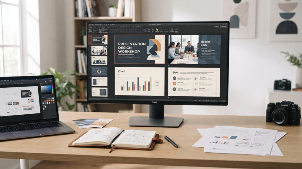
A presentation design tutorial can help students, professionals, and new designers turn ordinary slides into clear and visually engaging presentations. Good slide design is not about adding more decoration. It is about organizing information so the audience can understand the message quickly, follow the story easily, and remember the most important ideas.
Presentations are used for many purposes, including:
- Business meetings
- School assignments
- Sales pitches
- Project updates
- Conferences
- Training sessions
- Portfolio presentations
- Research reports
- Client proposals
Although the content may change, many presentation design principles remain the same.
Strong presentations use clear hierarchy, consistent layouts, readable typography, controlled color, useful visuals, and simple storytelling.
This presentation design tutorial explains how to combine those elements so your slides look more professional and communicate more effectively.
Start Your Presentation Design Tutorial With a Clear Goal
Before designing slides, decide what the presentation needs to achieve.
Ask:
What should the audience understand, remember, or do after this presentation?
- A sales presentation may need to persuade.
- A project update may need to explain progress.
- A school presentation may need to communicate research clearly.
- A training presentation may need to teach a process.
Knowing the goal helps you decide what information belongs in the deck.
Avoid adding slides simply because you have more information available.
Every slide should support the main purpose.
Build the Presentation Story Before Designing
One of the most useful lessons in a presentation design tutorial is to organize the story before styling the slides.
Start by creating a simple structure.
For example:
Introduction → Problem → Evidence → Solution → Benefits → Next Step
Another presentation might use:
Background → Research → Findings → Recommendations → Conclusion
This structure gives the audience a clear path.
Without a logical story, even beautifully designed slides can feel confusing.
Create a Slide Outline
Before designing, write a short outline.
It might include:
- Title slide
- Introduction
- Main problem
- Supporting data
- Key insight
- Proposed solution
- Benefits
- Summary
- Call to action
The outline helps you identify unnecessary information before spending time on design.
Presentation Design Tutorial for Visual Hierarchy
Visual hierarchy determines what people notice first.
A slide might contain:
- Headline
- Supporting sentence
- Image
- Chart
- Number
- Caption
These elements should not all have equal visual importance.
The audience should immediately know where to look.
You can create hierarchy using:
- Size
- Weight
- Color
- Contrast
- Position
- Spacing
For example, the slide headline may be large and bold, while supporting details are smaller and quieter.
A clear hierarchy makes slides easier to scan.
Keep One Main Idea Per Slide
Many weak presentations try to communicate too much at once.
A single slide might contain:
- Three charts
- Five paragraphs
- Several icons
- Multiple headlines
The audience then has to decide what matters.
A better approach is to give each slide one primary message.
Ask:
What is the one thing I want the audience to understand from this slide?
If the answer includes several unrelated ideas, consider separating them into multiple slides.
Simple slides often communicate complex ideas more effectively.
Presentation Design Tutorial for Slide Layout
Layout determines where information appears on the slide.
A strong layout creates structure and balance.
Common layouts include:
- Large headline with supporting text
- Split image and text
- Full-screen image
- Large number with explanation
- Two-column comparison
- Chart with key takeaway
- Quote or statement slide
Do not use the same layout for every slide.
However, the overall presentation should still feel consistent.
Use a Grid for Better Alignment
A grid can help organize slide elements.
You might use:
- Two columns
- Three columns
- Equal margins
- Consistent text widths
A grid keeps slides aligned even when the content changes.
For example, headlines can always begin at the same horizontal position.
Charts and images can align with the same edges.
This creates a cleaner and more professional appearance.
Presentation Design Tutorial for Typography
Typography has a major effect on how professional slides look.
Your presentation usually needs only a small number of text styles.
A basic system may include:
- Presentation title
- Slide headline
- Supporting text
- Caption
Avoid using too many unrelated fonts.
One type family with several weights may be enough.
Use Large, Readable Type
Presentations are viewed from farther away than websites or documents.
Text must therefore be larger.
Do not design slides as though the audience will read them from a laptop screen.
Important information should remain readable from the back of a room.
Use short sentences whenever possible.
Replace paragraphs with concise statements.
Avoid Putting Full Documents on Slides
Slides should support the speaker.
They should not become pages of a report.
Large blocks of text force the audience to choose between:
- Reading
- Listening
Usually they cannot do both effectively.
Instead of writing:
A long paragraph explaining every detail
try using:
One strong sentence
followed by:
Three short supporting points
More detailed information can be placed in notes, handouts, or supporting documents.
Presentation Design Tutorial for Color
Color can create visual consistency and emotional tone.
Start with a simple palette.
For example:
- Navy + white + light blue
- Cream + black + muted orange
- Charcoal + white + green
You generally need:
- Background color
- Main text color
- Secondary text color
- Accent color
The accent color should highlight important information.
Avoid using every color available in the software.
A limited palette usually looks more polished.
Maintain Strong Contrast
Text must remain readable against the background.
Dark text works well on light backgrounds.
Light text can work on dark backgrounds.
Avoid combinations with weak contrast, especially for small text.
Readability should always come before decoration.
Also Read: Social Media Design Tutorial with Simple Tips and Examples
Use Images With a Clear Purpose
Images can make a presentation more engaging, but they should support the message.
Use images to:
- Show a product
- Explain a concept
- Create mood
- Provide context
- Demonstrate an example
Avoid adding generic imagery simply because the slide feels empty.
One strong image can often create more impact than several unrelated pictures.
Presentation Design Tutorial for Charts and Data
Charts should make data easier to understand.
They should not force the audience to analyze every number.
Use a chart when you want to show:
- Change over time
- Comparison
- Distribution
- Ranking
- Relationship
Remove unnecessary visual elements.
Simplify:
- Grid lines
- Labels
- Legends
- Borders
- Decorative effects
Then highlight the important data point.
Add a Clear Takeaway
Do not label a slide only:
Sales Performance
Instead, communicate the insight.
For example:
Sales Increased Strongly in the Second Half
This helps the audience understand why the chart matters.
The headline should communicate the conclusion whenever possible.
Use Icons Carefully
Icons can help simplify ideas.
They work well for:
- Features
- Categories
- Benefits
- Processes
- Services
Use icons that share a consistent style.
Avoid mixing:
- Outline icons
- Filled icons
- Cartoon illustrations
- Realistic symbols
A consistent visual language makes the presentation feel more intentional.
Presentation Design Tutorial for Negative Space
Negative space is the empty area around design elements.
It helps slides feel:
- Cleaner
- Easier to read
- More focused
- More professional
Beginners often enlarge content until every part of the slide is filled.
This usually creates clutter.
Allow space around:
- Headlines
- Images
- Charts
- Text blocks
Empty space helps important content stand out.
Use Consistent Margins
Slides look more organized when elements maintain similar distances from the edges.
Set consistent margins for:
- Headlines
- Body text
- Images
- Charts
- Page numbers
If one headline begins near the edge while another begins much farther inside, the deck may feel inconsistent.
Consistency across slides is just as important as the design of individual slides.
Presentation Design Tutorial for Visual Consistency
A professional presentation should feel like one system.
Repeat visual rules throughout the deck.
Keep consistent:
- Typography
- Colors
- Grid
- Margins
- Icon style
- Image treatment
- Chart style
- Spacing
This does not mean every slide must look identical.
Layouts can change while the visual system remains recognizable.
For example, a title slide and chart slide may look very different but still use the same typography and color palette.
Use Repetition to Create Structure
Repeated design elements help the audience understand the presentation.
You might repeat:
- Section labels
- Slide numbers
- Accent lines
- Headline positions
- Background treatments
Repetition creates rhythm.
It also reduces design decisions because you do not need to reinvent every slide.
Presentation Design Tutorial for Section Slides
Long presentations benefit from section dividers.
A section slide can introduce a new topic using:
- Large number
- Short title
- Full-screen image
- Strong color background
For example:
01 Research
02 Strategy
03 Execution
Section slides give the audience a visual break and make the overall structure easier to follow.
Also Read: Content Creation Tutorial for Better Workflow and Creativity
Create Better Title Slides
The title slide creates the first impression.
Keep it simple.
Include only essential information such as:
- Presentation title
- Subtitle
- Presenter name
- Date
- Organization
Avoid trying to summarize the entire presentation on the opening slide.
A strong title, clean typography, and one visual element are often enough.
Design Strong Closing Slides
The final slide should feel intentional.
Avoid ending with a random content slide.
A closing slide might contain:
- Main takeaway
- Call to action
- Contact details
- Thank-you message
- Next steps
For a business presentation, the closing slide should make the desired action clear.
For an educational presentation, it may summarize the core lesson.
Presentation Design Tutorial for Visual Storytelling
Slides should work together as a sequence.
Imagine the deck as a visual story.
For example:
Problem → Evidence → Opportunity → Solution → Result
The audience should understand why each slide follows the previous one.
Transitions between topics should feel logical.
This makes the presentation easier to remember.
Use Animation and Transitions Carefully
Animation can help direct attention.
It can be useful when:
- Revealing steps
- Comparing stages
- Showing a process
- Introducing data gradually
However, unnecessary movement can distract the audience.
Avoid using many different transition styles.
Simple fades or controlled reveals are usually enough.
Animation should support communication rather than become entertainment.
Review Slides in Presentation Mode
Designers often review slides only while editing.
Instead, view the complete deck in presentation mode.
Check:
- Text readability
- Image quality
- Slide pacing
- Transitions
- Alignment
- Consistency
- Overall story
You may notice problems that were not obvious while editing individual slides.
Common Presentation Design Mistakes
Too Much Text
Slides become difficult to scan.
Tiny Typography
Audience members cannot read it from a distance.
Weak Hierarchy
Important information does not stand out.
Inconsistent Layouts
Every slide feels unrelated.
Too Many Colors
The deck becomes visually noisy.
Decorative Charts
Complex charts can hide the real insight.
Random Images
Visuals should support the message.
Too Many Animations
Movement should have a clear purpose.
Presentation Design Tutorial Checklist
Before presenting, review:
- Clear presentation goal
- Logical story structure
- One main idea per slide
- Strong visual hierarchy
- Consistent grid
- Clean alignment
- Readable typography
- Short text blocks
- Controlled color palette
- Strong contrast
- High-quality imagery
- Simplified charts
- Consistent icons
- Useful negative space
- Consistent margins
- Section dividers
- Clear opening slide
- Strong closing slide
- Minimal animation
- Correct spelling and data
This checklist can help you identify small issues that reduce the professional quality of the deck.
Practice Presentation Design With Different Topics
The best way to improve presentation design is through repeated practice.
Try creating presentations for:
- Business proposals
- School projects
- Portfolio presentations
- Product launches
- Marketing reports
- Research studies
- Company updates
- Training sessions
Different presentation types teach different design skills.
- Business decks teach clarity.
- Portfolio decks teach visual storytelling.
- Research presentations teach data visualization.
- Training presentations teach information structure.
The principles from this presentation design tutorial can be adapted to all of them.
Also Read: How to Make a Clean and Effective Business Card Design
Final Thoughts
A presentation design tutorial should teach more than how to make attractive slides.
Professional presentation design is about communication.
Start with the story.
Decide what the audience needs to understand.
Then build slides around one clear idea at a time.
Use hierarchy to guide attention.
Use grids and alignment to create structure.
Use typography to establish order.
Use color carefully.
Choose images that add meaning.
Simplify charts so the important insight becomes obvious.
Most importantly, avoid filling every slide with unnecessary information.
Professional slides often look simple because the designer has carefully decided what to remove.
By following this presentation design tutorial, students and professionals can create presentations that feel cleaner, more organized, easier to understand, and more visually convincing.
Strong slide design does not compete with the message.
It makes the message easier to see.
For high-quality fonts to boost your income, check out Letter Crafted. Our professional fonts are perfect for branding, marketing, and content creation. So, don’t miss this opportunity.