
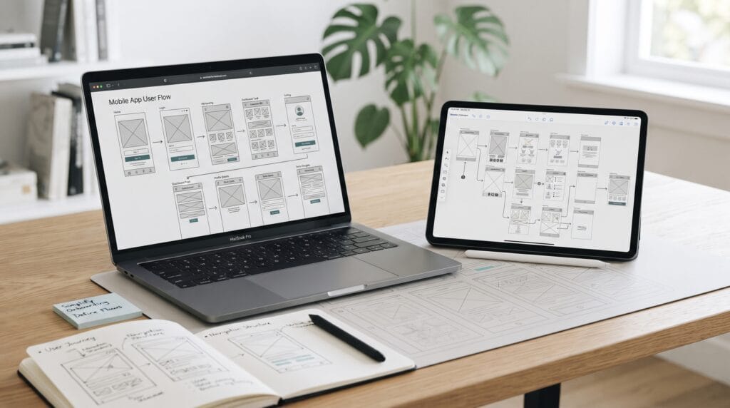
Wireframe tools help UX designers transform early ideas into structured interface plans before spending time on detailed colors, typography, illustrations, and visual effects. A wireframe acts like a blueprint for a website or application. It shows where content, navigation, buttons, forms, images, and other interface elements may appear while keeping attention on usability and structure.
This early stage is important because changing a simple grayscale wireframe is usually easier than rebuilding a polished interface.
Designers can use wireframes to explore:
- Navigation
- Page structure
- Mobile screens
- User flows
- Information hierarchy
- Form layouts
- Calls to action
- Content placement
Good wireframe tools also make it easier to communicate ideas with product managers, developers, clients, and other stakeholders.
Instead of discussing an abstract idea, the team can look at a screen and ask whether the proposed structure actually makes sense.
Why Wireframe Tools Matter in UX Design
Wireframing gives designers a chance to focus on usability before visual styling begins.
Imagine designing an ecommerce checkout.
You could immediately create beautiful product cards, colors, shadows, and typography.
However, if the checkout flow contains unnecessary steps, the visual polish does not solve the underlying problem.
A wireframe helps designers answer questions such as:
- What information belongs on this screen?
- What should users notice first?
- Which action should be primary?
- Where should navigation appear?
- What happens after the user taps a button?
- Is anything missing?
Figma describes wireframes as basic blueprints that help teams align around requirements, essential pages, components, and flows before detailed design.
That is why wireframe tools are useful long before developers begin implementing the interface.
Use Wireframe Tools to Plan User Flows
A wireframe should rarely exist as one isolated screen.
Users move through a sequence of screens to accomplish goals.
For example, an account creation flow might look like:
Welcome → Sign Up → Enter Details → Verification → Success
An ecommerce purchase might follow:
Product → Cart → Checkout → Payment → Confirmation
Mapping these screens together helps designers understand how the interface behaves as a complete experience.
Look for Unnecessary Steps
After mapping a flow, ask:
Can the user accomplish this goal with fewer steps?
You may discover:
- Duplicate forms
- Unnecessary confirmation screens
- Repeated information
- Hidden navigation
- Dead ends
Good wireframe tools make these problems easier to identify before they reach high-fidelity design.
Wireframe Tools for Low-Fidelity Planning
Low-fidelity wireframes are intentionally simple.
They usually rely on:
- Boxes
- Lines
- Placeholder text
- Basic icons
- Grayscale colors
The goal is not to create something beautiful.
The goal is to decide what belongs on the screen.
Low-fidelity wireframes are useful when:
- Exploring several ideas
- Discussing information architecture
- Reviewing navigation
- Testing early workflows
- Collecting stakeholder feedback
Because the design looks unfinished, reviewers may also focus more on structure instead of debating colors or decorative details.
Balsamiq for Fast Low-Fidelity Wireframes
Balsamiq is particularly focused on low-fidelity interface planning. Its own documentation describes the product as a UI design tool for creating wireframes and rough digital sketches before code is written.
It can be useful when you want screens to look deliberately unfinished.
That makes it suitable for:
- Early brainstorming
- Client discussions
- Product workshops
- Navigation planning
- Rough page structures
Balsamiq now also supports AI-assisted workflows that can generate editable wireframes and user flows from descriptions, screenshots, sketches, or code.
However, the traditional low-fidelity approach remains valuable because it encourages teams to discuss functionality before appearance.
Wireframe Tools for Collaborative UX Design
Modern product design is rarely completed by one person.
UX designers may need feedback from:
- UI designers
- Developers
- Product managers
- Researchers
- Marketing teams
- Clients
Collaboration features can therefore be just as important as drawing tools.
Useful capabilities include:
- Comments
- Shared canvases
- Live editing
- Version history
- Presentation modes
Collaborative wireframe tools can reduce the need to export new files every time the design changes.
Figma for Wireframing and Interface Design
Figma is a practical option when teams want to move from wireframes into detailed UI design within the same environment.
Figma supports wireframes at different fidelity levels, shared components, templates, prototyping, and real-time collaboration. It also allows teams to explore early concepts in FigJam and then move into more structured interface design.
This makes Figma useful for workflows such as:
User flow → Low-fidelity wireframe → High-fidelity UI → Prototype
Designers can gradually replace placeholders with:
- Real typography
- Brand colors
- Components
- Images
- Icons
without completely rebuilding the project in another tool.
Wireframe Tools for Brainstorming and Workshops
Sometimes the earliest UX work does not need polished screen design.
Teams may need to brainstorm:
- User journeys
- Feature ideas
- Content structure
- Navigation
- Information architecture
This is where collaborative whiteboards can be valuable.
A large canvas lets designers place wireframes beside:
- Sticky notes
- Research findings
- Flowcharts
- Questions
- User personas
Seeing everything together can help the team understand the wider product experience.
Also Read: UX Design Tools You Should Know for Better Results
Miro for Wireframes and User Flows
Miro combines wireframing with its broader collaborative whiteboard environment.
Its current wireframing tools are designed for creating app and website wireframes alongside sticky notes, references, and user-flow mapping.
This can make Miro especially useful during:
- Design workshops
- Discovery sessions
- Team brainstorming
- Early product planning
For example, designers can place a user journey at the top of the board and position corresponding wireframes underneath each stage.
That creates a visual connection between user behavior and interface structure.
Wireframe Tools for Higher-Fidelity Prototypes
Not every wireframe needs to remain static.
Once the basic structure works, designers may want to test interactions.
A prototype can demonstrate what happens when someone:
- Opens a menu
- Selects an item
- Completes a form
- Changes a setting
- Moves between screens
Interactive wireframes are particularly useful when the usability question depends on behavior rather than layout alone.
For example, a static checkout screen may look clear.
However, only an interactive prototype reveals whether the transition between cart, payment, and confirmation actually feels natural.
UXPin for Wireframes and Interactive Prototypes
UXPin can be useful when a team wants to move from early wireframes into more advanced interactive prototypes.
Its current wireframing workflow supports creating early screens, gathering feedback, and progressing into higher-fidelity interactive prototypes without changing tools.
UXPin also supports more advanced prototype behaviors such as interactions, variables, and component states.
That makes it worth considering when interaction design is an important part of the project.
Choose Wireframe Tools Based on Project Stage
There is no single best wireframing application for every project.
Choose based on the problem you are solving.
- For very early exploration Paper sketches or Balsamiq.
- Collaborative workshops Miro can help connect screens with research and user flows.
- For teams moving directly into polished UI Figma offers a natural transition from wireframe to final interface.
- For more advanced interaction testing UXPin can provide deeper prototype behavior.
The best wireframe tools are the ones that support your design process without creating unnecessary complexity.
Start With User Goals Before Drawing Screens
Do not begin wireframing by immediately creating a home screen.
First identify what users are trying to accomplish.
For example, a travel app user may want to:
- Search destinations
- Compare accommodations
- Save favorites
- Make reservations
- Manage bookings
Those goals should influence the screens you create.
If a screen does not support a meaningful user task, ask why it exists.
This keeps the wireframe focused on experience rather than arbitrary page creation.
Build the User Flow Before Detailed Wireframes
Create a simple flow diagram first.
For example:
Home → Search → Results → Product Detail → Checkout
Then create a wireframe for each important stage.
This helps prevent situations where designers create attractive individual screens that do not connect logically.
A strong flow establishes:
- Entry points
- Decisions
- Actions
- Success states
- Error states
- Exit points
After the flow is clear, detailed interface planning becomes easier.
Use Wireframe Tools for Information Hierarchy
Wireframes help determine what users should notice first.
A typical product screen might contain:
Product name → Image → Price → Main action → Supporting information
Do not give every element equal visual weight.
Even grayscale wireframes can create hierarchy through:
- Size
- Position
- Spacing
- Grouping
- Alignment
For example, a larger button can represent the primary action while a smaller text link represents a secondary action.
The structure should communicate priority before color is introduced.
Also Read: UI/UX Design Tools for Faster Feedback and Better UX
Keep Wireframes Simple at the Beginning
One common mistake is making early wireframes too detailed.
Designers begin adding:
- Exact font choices
- Brand colors
- Shadows
- Detailed icons
- Photography
The wireframe gradually becomes a mockup.
That may happen later, but early exploration benefits from simplicity.
Simple screens are faster to:
- Edit
- Compare
- Rearrange
- Discuss
- Replace
This encourages experimentation.
Create Several Wireframe Variations
Do not commit immediately to the first layout.
Create different approaches.
For example:
- Variation A: Large hero section
- Variation B: Search-first interface
- Variation C: Category navigation first
Comparing alternatives helps designers understand the tradeoffs.
You can evaluate each option based on:
- Clarity
- Navigation
- Content priority
- User effort
Good wireframe tools should make duplication and experimentation easy.
Use Realistic Content When Possible
Simple placeholders are useful at the beginning.
However, overly generic content can hide design problems.
For example:
Lorem ipsum
does not reveal whether a real product title will fit.
As the wireframe develops, replace placeholders with realistic examples.
Test:
- Long headlines
- Short headlines
- Large numbers
- Empty states
- Error messages
- Multiple list items
Realistic content helps reveal layout limitations earlier.
Plan Mobile Wireframes Carefully
Mobile screens have limited space.
UX designers must decide what deserves priority.
Consider:
- Thumb-friendly actions
- Bottom navigation
- Screen height
- Scrolling
- Form input
- Keyboard appearance
- Sticky controls
Do not simply shrink a desktop wireframe.
Mobile experiences may require completely different hierarchy.
For example, desktop filters may appear in a sidebar, while mobile filters may open in a separate panel.
Include Empty and Error States
Wireframes often show only ideal scenarios.
Real products also need states such as:
- No results
- Empty cart
- Failed payment
- Lost connection
- Invalid input
- Loading
- Permission denied
These states affect the user experience.
Include them during interface planning rather than leaving them until development begins.
Test Wireframes Before Visual Design
Wireframes can support early usability testing.
Give a user a task such as:
Find a product and add it to the cart.
Then observe what happens.
Do not immediately explain the interface.
Watch whether they understand:
- Navigation
- Labels
- Buttons
- Screen sequence
Early testing can identify major usability problems before the team spends time polishing the visual design.
Common Wireframe Tool Mistakes
Choosing Tools Before Understanding the Workflow
Start with the UX problem, not the software.
Making Wireframes Too Polished
Early wireframes should encourage structural feedback.
Designing Isolated Screens
Connect screens into complete flows.
Ignoring Error States
Users do not always follow the ideal path.
Adding Too Much Detail Too Early
Focus on hierarchy and behavior first.
Skipping User Testing
A logical-looking wireframe can still confuse real users.
Treating Wireframes as Final Specifications
Wireframes should evolve as the team learns more.
Wireframe Tools Checklist for UX Designers
Before moving into detailed UI design, review whether your wireframes include:
- Clear user goals
- Important user flows
- Navigation
- Primary actions
- Secondary actions
- Information hierarchy
- Forms
- Mobile behavior
- Empty states
- Error states
- Success states
- Realistic content
- Consistent components
- Stakeholder feedback
- Basic usability testing
Do not worry if early wireframes look simple.
Their value comes from the decisions they help the team make.
Also Read: UI UX Consistency for More Professional Interfaces
Final Thoughts
Wireframe tools are not simply applications for drawing gray boxes.
They help UX designers think through the structure of a digital experience before visual details make changes more expensive.
- Use them to map user flows.
- Organize content.
- Clarify navigation.
- Compare alternative layouts.
- Plan mobile behavior.
- Discuss ideas with stakeholders.
- Test important interactions.
Different projects may benefit from different wireframe tools.
- Balsamiq can support fast low-fidelity exploration.
- Miro can help teams connect wireframes with flows and collaborative planning.
- Figma can take a project from early wireframes toward polished interface design and prototyping.
- UXPin can be useful when more advanced interactions become important.
The software itself, however, is only part of the process.
The strongest wireframe begins with a clear understanding of what the user wants to accomplish.
Map that journey first.
Then design the screens that support it.
Test the flow, remove unnecessary complexity, and refine the structure before spending time on visual polish.
When used thoughtfully, wireframe tools can help UX teams make better interface decisions earlier, reduce avoidable design rework, and create clearer user flows before development begins.
For high-quality fonts to boost your income, check out Letter Crafted. Our professional fonts are perfect for branding, marketing, and content creation. So, don’t miss this opportunity.