
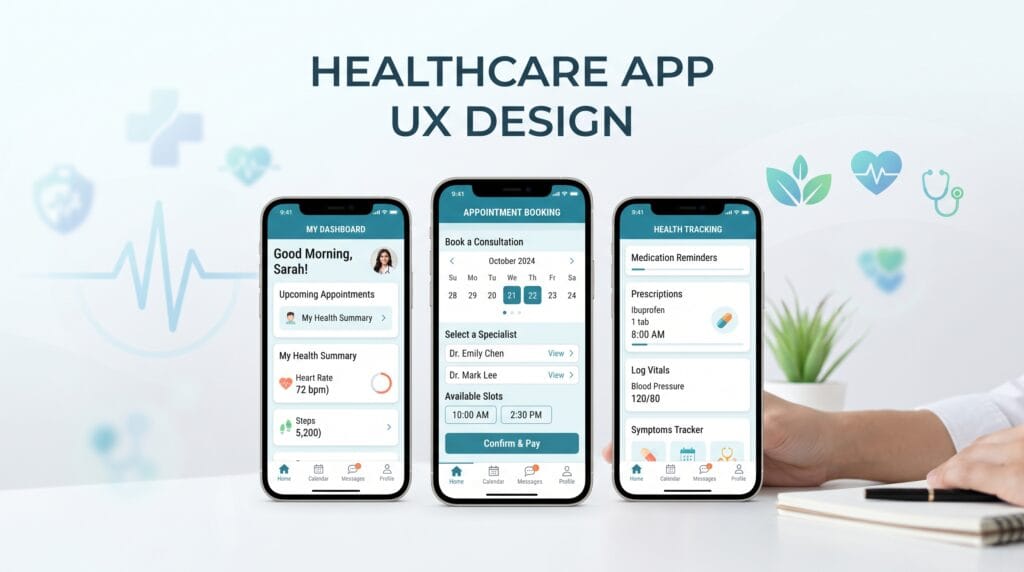
Healthcare app UX plays an important role in how easily patients can understand information, schedule appointments, communicate with providers, manage medications, complete forms, and access digital healthcare services. Unlike many ordinary apps, healthcare products often involve personal information, unfamiliar terminology, time-sensitive decisions, and users who may already feel stressed or unwell. That makes clarity, trust, accessibility, and error prevention especially important.
A healthcare application may include:
- Appointment booking
- Telehealth visits
- Patient records
- Medication reminders
- Test results
- Secure messaging
- Insurance information
- Symptom tracking
- Wellness programs
- Provider directories
Each feature may seem straightforward individually.
However, poor navigation, confusing labels, small text, or unclear status messages can quickly make the experience frustrating.
Good healthcare app UX should reduce unnecessary effort and help users feel confident about what they are doing.
Start Healthcare App UX With Patient Needs
Healthcare products should begin with the people using them, not with the feature list.
Different users may have very different needs.
A healthcare app could be used by:
- Young adults
- Older patients
- Caregivers
- Parents
- People with disabilities
- Patients managing chronic conditions
- Healthcare professionals
Their digital confidence may also vary significantly.
Before designing the interface, understand common user goals.
These might include:
- Booking an appointment quickly
- Checking a test result
- Finding a doctor
- Renewing a prescription
- Sending a message
- Updating insurance information
Prioritize these high-value tasks.
The most important actions should never be hidden behind unnecessary menus or complicated navigation.
Healthcare App UX Should Build Trust
Trust is fundamental in healthcare design.
Users may be sharing sensitive personal information, reviewing medical results, or making decisions about care.
The interface should therefore feel stable, professional, and predictable.
Trust can be strengthened through:
- Clear navigation
- Consistent terminology
- Professional visual design
- Transparent privacy information
- Familiar interaction patterns
- Clear confirmation messages
Avoid visual styles that feel unnecessarily playful when users are dealing with serious information.
That does not mean healthcare applications must look cold.
A calm, approachable visual system can feel both professional and human.
Use Clear Language in Healthcare App UX
Healthcare terminology can be difficult to understand.
Designers should work with healthcare and content specialists to simplify language where appropriate.
Instead of filling interfaces with technical terminology, use labels that users can understand quickly.
For example, a navigation label such as:
Appointments
may be easier to understand than a more complicated clinical term.
When technical terminology is necessary, consider adding:
- Short explanations
- Tooltips
- Supporting descriptions
- Help links
Clear language is an important part of healthcare app UX because users should not need specialist knowledge simply to navigate the product.
Create Simple Healthcare App Navigation
Navigation should reflect the tasks patients perform most often.
A mobile healthcare app might prioritize:
- Home
- Appointments
- Messages
- Records
- Profile
Avoid adding too many primary navigation items.
Secondary features can live inside relevant sections.
For example, insurance information might appear inside the profile rather than occupying a permanent navigation tab.
Keep Important Tasks Easy to Reach
Common actions should require as few unnecessary steps as possible.
If booking an appointment is one of the main reasons people use the app, it should be highly visible.
The same principle applies to:
- Contacting support
- Joining telehealth appointments
- Viewing results
- Managing prescriptions
Good navigation reduces the time users spend searching.
Healthcare App UX for Appointment Booking
Appointment scheduling is one of the most common healthcare workflows.
A good flow should make the process easy to understand.
A typical sequence might be:
Choose service → Select provider → Choose date → Select time → Confirm
Each screen should clearly show what the user has already selected.
Avoid presenting too many choices at once.
Show Important Appointment Details
Before confirmation, display:
- Provider
- Service
- Date
- Time
- Location
- Visit type
For virtual appointments, clearly identify that the visit is online.
After booking, provide an obvious confirmation state.
Users should never wonder whether the appointment was successfully created.
Healthcare App UX Should Prevent Errors
Error prevention is especially important in healthcare interfaces.
Users may be entering:
- Personal information
- Medication details
- Appointment information
- Insurance data
- Health measurements
Forms should help people avoid mistakes before submission.
Useful techniques include:
- Clear field labels
- Helpful examples
- Input validation
- Confirmation screens
- Review steps
Avoid using vague error messages such as:
Something went wrong.
Instead, explain what happened and what the user can do next.
For example:
The appointment time is no longer available. Please choose another time.
Clear recovery instructions make errors less stressful.
Design Better Healthcare Forms
Healthcare applications often contain long forms.
Poorly designed forms can create frustration and abandonment.
Simplify forms whenever possible.
Group related information into sections such as:
- Personal information
- Contact details
- Medical information
- Insurance
Avoid asking for the same information repeatedly.
If the system already knows the user’s name or date of birth, prefill it when appropriate and safe to do so.
Use Persistent Field Labels
Avoid relying only on placeholder text.
Once users begin typing, placeholders disappear.
Persistent labels make it easier to review information.
Clearly indicate:
- Required fields
- Optional fields
- Errors
- Completed sections
Good form design is a major part of effective healthcare app UX.
Also Read: Ecommerce UI UX Design for Better Navigation and Search
Healthcare App UX for Accessibility
Healthcare products should be usable by as many people as possible.
Accessibility should be considered throughout the design process rather than added after the interface is finished.
Important areas include:
- Text size
- Contrast
- Touch target size
- Screen reader support
- Keyboard accessibility
- Clear focus states
- Simple language
Users may also have temporary limitations.
Someone may be using the application:
- Without glasses
- With one hand
- In bright sunlight
- While feeling unwell
- During a stressful situation
Designing for accessibility often improves usability for everyone.
Use Readable Typography
Small text can be particularly problematic in healthcare apps.
Important information such as:
- Appointment times
- Instructions
- Medication details
- Results
- Warnings
should remain easy to read.
Create a clear typography hierarchy.
For example:
- Page title
- Section heading
- Primary information
- Secondary information
Avoid using light font weights for important body text.
Typography should prioritize readability over visual trends.
Healthcare App UX and Color
Color can help users understand status and hierarchy.
For example:
- Green may indicate success
- Red may indicate an error
- Orange may indicate a warning
- Blue may indicate information
However, color should not be the only signal.
Combine it with:
- Icons
- Labels
- Messages
- Shapes
This helps users who have difficulty distinguishing certain colors.
Use Calm Visual Systems
Healthcare apps often benefit from controlled color palettes.
Common visual directions include:
- Blue
- Teal
- Green
- Neutral gray
- Soft white
However, there is no rule requiring every healthcare product to use blue.
Brand colors can work effectively as long as readability, contrast, and semantic meaning remain clear.
Design Clear Health Data Displays
Health information can quickly become overwhelming.
Users may need to understand:
- Test results
- Trends
- Measurements
- Progress
- Activity
- Medication history
Do not present raw numbers without context when additional explanation would help.
A dashboard might use:
- Simple charts
- Clear labels
- Trends
- Status indicators
- Short explanations
Avoid overwhelming users with too many charts on one screen.
Show the most useful information first.
Healthcare App UX for Test Results
Test results can be sensitive and difficult to interpret.
Designers should be careful not to imply medical meaning beyond what the product is intended to communicate.
The interface can focus on clarity.
For example:
- Clearly label the test
- Show the date
- Present the result
- Provide relevant supporting information
- Offer an appropriate next action
Depending on the product, that action might be:
Contact your healthcare provider
or:
View details
The interface should not make the user search for important context.
Healthcare App UX for Medication Features
Medication-related screens require particularly careful design.
A medication list may include:
- Medication name
- Dosage
- Frequency
- Schedule
- Instructions
Present this information consistently.
For reminders, allow users to clearly distinguish between:
- Upcoming
- Completed
- Missed
Avoid creating interactions where an accidental tap could easily record the wrong action.
Important actions may require confirmation when appropriate.
Design Better Healthcare Notifications
Notifications can support:
- Appointment reminders
- Medication reminders
- New messages
- Results
- Care plan updates
However, too many notifications can create fatigue.
Allow users to control appropriate notification preferences.
Also consider privacy.
A lock-screen notification may be visible to people nearby.
Avoid revealing unnecessary sensitive information in notification previews.
Also Read: Startup Website Design Checklist for a Strong First Launch
Healthcare App UX for Secure Messaging
Messaging can help patients communicate with healthcare organizations.
A good interface should make conversations easy to understand.
Show:
- Sender
- Date
- Conversation history
- Message status
- Attachments
Users should also understand whether messaging is appropriate for urgent situations.
If the service is not intended for emergencies, communicate that limitation clearly in the interface.
Show System Status Clearly
Users should always understand what the application is doing.
Examples include:
- Uploading document
- Message sent
- Appointment confirmed
- Information saved
- Connection lost
Without clear feedback, users may repeat actions because they are unsure whether something worked.
This can create duplicate bookings, messages, or submissions.
Strong system feedback makes healthcare app UX more predictable.
Protect Privacy Through UX Design
Privacy is not only a technical issue.
Design decisions also influence how users handle sensitive information.
Helpful approaches include:
- Clear sign-out options
- Sensible session handling
- Explicit consent flows
- Appropriate visibility controls
- Privacy-conscious notifications
- Clear permission requests
Ask for permissions only when the user understands why they are needed.
For example, request camera access when the user wants to scan a document rather than requesting it immediately after app installation.
Design for Older Users
Many healthcare applications have significant numbers of older users.
Avoid assuming every user has strong digital experience.
Helpful design choices include:
- Large touch targets
- Readable text
- Simple navigation
- Familiar icons
- Clear button labels
- Fewer hidden gestures
Avoid interfaces that depend heavily on tiny icons or complicated swiping patterns.
Clear buttons such as:
Book Appointment
are often easier to understand than abstract icons.
Healthcare App UX for Caregivers and Families
Some patients depend on family members or caregivers.
Healthcare products may therefore need to support multiple roles.
A caregiver experience might require access to:
- Appointments
- Medications
- Messages
- Health information
The interface should clearly communicate:
- Whose information is being viewed
- What permissions the caregiver has
- Which actions are available
Role clarity helps prevent users from acting on the wrong account or patient record.
Test Healthcare App UX With Real Users
Healthcare applications should be tested with people who resemble the intended audience.
Usability testing can reveal:
- Confusing labels
- Difficult navigation
- Small text
- Hidden actions
- Unexpected errors
- Long forms
Observe whether users can complete common tasks such as:
- Booking an appointment
- Finding a result
- Sending a message
- Updating information
Do not focus only on whether users eventually finish.
Also measure how easily and confidently they complete the task.
Common Healthcare App UX Mistakes
Too Much Medical Terminology
Use plain language where possible.
Complicated Navigation
Prioritize common patient tasks.
Small Typography
Important information needs strong readability.
Long Forms
Remove unnecessary questions and divide complex forms logically.
Poor Error Messages
Explain what happened and how to recover.
Weak Confirmation States
Make successful actions obvious.
Using Color Alone
Combine color with text or icons.
Ignoring Accessibility
Accessibility should be part of the entire design process.
Excessive Notifications
Give users meaningful control.
Hiding Important Information
Critical actions should be easy to find.
Healthcare App UX Checklist
Before finalizing a healthcare interface, review:
- Clear patient goals
- Simple navigation
- Trustworthy visual design
- Plain language
- Accessible typography
- Strong color contrast
- Large touch targets
- Clear appointment flows
- Simple forms
- Helpful error messages
- Confirmation states
- Accessible health data
- Clear medication information
- Useful notifications
- Privacy-conscious interactions
- Secure messaging clarity
- Caregiver considerations
- Device testing
- Accessibility testing
- Usability testing
Not every healthcare product requires the same features, but these principles provide a useful foundation.
Also Read: UX Design Tips for Better Accessibility and Usability
Final Thoughts
Strong healthcare app UX should make digital healthcare feel clearer, safer, and easier to navigate.
Start with the patient’s most important goals.
Make common actions easy to find.
Use plain language.
Build accessible typography and color systems.
Simplify forms.
Provide clear confirmation messages.
Prevent avoidable errors whenever possible.
Healthcare applications often serve people during moments when they may feel uncertain, distracted, or stressed.
That makes simplicity especially valuable.
The best healthcare app UX does not force users to learn complicated interface patterns before they can accomplish basic healthcare tasks.
Instead, the product guides them naturally.
It explains what is happening.
It communicates what happens next.
It gives users confidence that their actions were completed successfully.
By combining accessibility, usability, privacy awareness, trust, clear navigation, and careful error prevention, designers can create healthcare app UX that supports better patient experiences while making digital healthcare services easier to understand and use.
For high-quality fonts to boost your income, check out Letter Crafted. Our professional fonts are perfect for branding, marketing, and content creation. So, don’t miss this opportunity.