
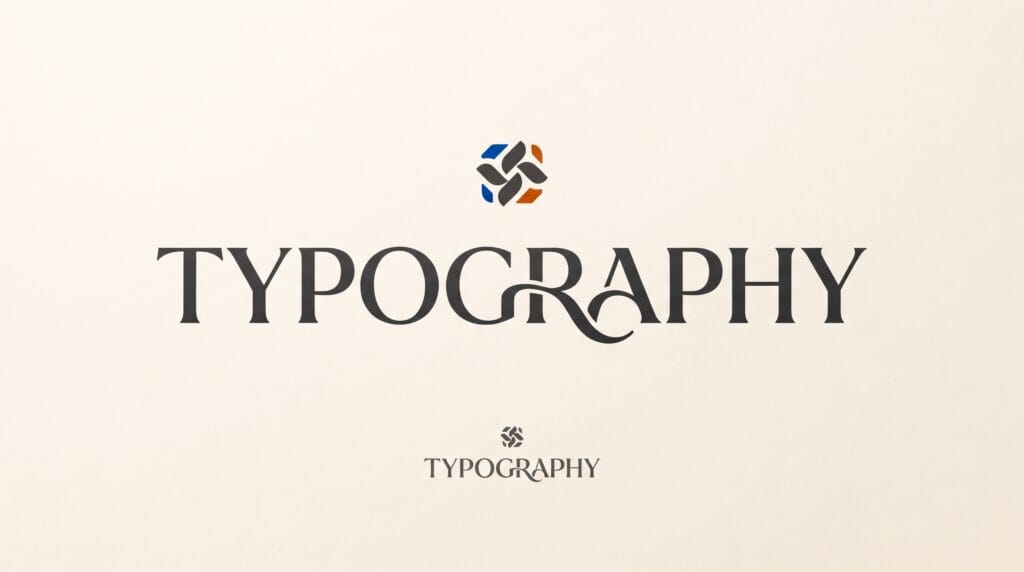
Logo typography ideas can completely change how a brand feels before customers even understand the company name. Typography influences personality, recognition, readability, and visual tone. A logo using a refined serif may feel elegant and established, while a bold geometric sans serif may communicate modernity, confidence, and simplicity.
Typography is especially important in:
- Wordmarks
- Lettermarks
- Combination logos
- Monograms
- Signature-style identities
Choosing a font is only the beginning.
Professional logo typography often involves adjusting:
- Spacing
- Weight
- Width
- Letter shapes
- Proportions
- Connections
- Alignment
The strongest logo typography ideas use type as part of the identity rather than treating it as text placed beside a symbol.
This guide explores practical ways designers can choose, modify, and refine typography for stronger logo design.
Start Logo Typography Ideas With Brand Personality
Before searching through hundreds of fonts, define what the brand should communicate.
Ask:
- Is the brand modern or traditional?
- Premium or affordable?
- Serious or playful?
- Minimal or expressive?
- Technical or handmade?
Write several personality keywords.
For example: Elegant, Refined, Timeless or Bold, Energetic, Youthful.
These words make font selection easier.
Without a clear direction, designers may choose typefaces simply because they look attractive.
Strong logo typography ideas begin by matching typography to the brand rather than following personal taste.
Logo Typography Ideas Using Serif Fonts
Serif typefaces include small finishing strokes on letterforms.
They can communicate:
- Tradition
- Elegance
- Authority
- Heritage
- Editorial sophistication
Serif typography works well for:
- Luxury brands
- Fashion
- Publishing
- Hospitality
- Professional services
However, not every serif feels traditional.
High-contrast serifs can feel fashionable and elegant.
Heavier slab serifs may feel bold and confident.
Softer serifs can feel friendly or literary.
Refine Serif Details
When using serif fonts in logos, pay attention to:
- Thin strokes
- Sharp terminals
- Contrast
- Small details
Very delicate serifs may disappear when a logo is reduced.
Always test the wordmark at smaller sizes.
Logo Typography Ideas With Sans Serif Fonts
Sans serif typefaces remove traditional serif details.
They often feel:
- Clean
- Modern
- Direct
- Minimal
- Digital
Sans serif typography is common in:
- Technology
- Startups
- Fashion
- Architecture
- Creative studios
- Digital products
A geometric sans serif may feel structured and precise.
A humanist sans serif can feel warmer and more approachable.
A condensed sans serif may create a stronger editorial or industrial personality.
Among logo typography ideas, sans serif options provide a flexible foundation because small custom changes can completely alter their character.
Use Bold Typography for Stronger Recognition
Bold letterforms create visual confidence.
They can work well when a brand needs to feel:
- Powerful
- Youthful
- Energetic
- Sporty
- Direct
Bold typography is also useful when logos must remain visible from a distance.
Examples include:
- Signage
- Packaging
- Apparel
- Social media avatars
However, heavy fonts require careful spacing.
Letters that are too close together may merge visually.
Give bold letterforms enough room to remain clear.
Logo Typography Ideas With Script Fonts
Script typefaces imitate handwriting or calligraphy.
They can communicate:
- Elegance
- Personality
- Craftsmanship
- Romance
- Creativity
Script logos are often suitable for:
- Beauty brands
- Bridal businesses
- Boutique stores
- Personal brands
- Handmade products
The biggest concern is readability.
Highly decorative scripts can become difficult to read, especially at small sizes.
Simplify Script Letterforms
Professional script logos often use customized letterforms.
Designers may:
- Shorten swashes
- Simplify loops
- Adjust connections
- Improve spacing
- Redraw individual letters
The goal is to preserve personality without sacrificing clarity.
Logo Typography Ideas With Display Fonts
Display fonts are designed to create strong visual character.
They may include:
- Unusual proportions
- Decorative shapes
- Experimental details
- Bold structures
Display typography can work well for brands that need a distinctive personality.
Examples include:
- Music
- Entertainment
- Food
- Fashion
- Creative industries
However, strong display fonts can dominate the entire identity.
Use them carefully.
A distinctive typeface may already provide enough personality without additional symbols.
Create Better Wordmarks
A wordmark uses the company name itself as the primary logo.
This makes typography the central visual element.
Strong wordmarks depend on:
- Font choice
- Letter spacing
- Custom details
- Proportion
- Rhythm
Do not simply type the brand name and consider the logo finished.
Explore several variations.
Change:
- Weight
- Width
- Case
- Spacing
- Specific letters
Many successful logo typography ideas begin with an existing typeface but become distinctive through careful customization.
Adjust Kerning for Professional Logo Typography
Kerning is the spacing between individual letter pairs.
Automatic spacing may work well for paragraphs but can look uneven in logos.
Certain combinations often require adjustment.
Examples might include:
- AV
- TA
- LY
- WA
Look at the negative space between letters rather than measuring every distance numerically.
The goal is visual rhythm.
Check the Wordmark as a Shape
Step back from the screen.
Instead of reading the brand name, look at the overall silhouette.
Ask:
- Does one area feel too open?
- Are some letters crowded?
- Does the word feel balanced?
Good kerning can make even a simple typeface feel more professional.
Also Read: 3D Logo Design Trends and Examples That Stand Out
Logo Typography Ideas With Custom Letterforms
Custom letterforms can make a logo more distinctive.
You do not need to redraw every character.
Sometimes modifying one or two letters is enough.
Possible adjustments include:
- Cutting a terminal
- Changing a crossbar
- Extending a stem
- Connecting two letters
- Simplifying a curve
- Altering a corner
For example, a unique letter A or R may become a recognizable feature of the identity.
Strong logo typography ideas often use small custom details rather than excessive decoration.
Create a Custom Ligature
A ligature combines two letters into one connected form.
This can work especially well with repeated or visually compatible characters.
For example:
Two initials may share:
- A stem
- A curve
- A crossbar
Ligatures are useful for:
- Wordmarks
- Monograms
- Fashion logos
- Personal brands
However, readability should remain the priority.
If customers cannot understand the letters, the customization may be too complex.
Use Letter Removal Carefully
Some modern logos remove small sections of letters.
This can create:
- Negative space
- Geometric character
- Minimalism
For example, a crossbar may disappear while the overall letter remains recognizable.
This technique can work well for technology and modern branding.
But do not remove so much information that the word becomes difficult to read.
Test the logo with people who have not seen it before.
Logo Typography Ideas Using Uppercase Letters
Uppercase typography can communicate:
- Strength
- Structure
- Authority
- Modernity
It works particularly well for:
- Luxury brands
- Corporate identities
- Architecture
- Fashion
- Technology
Uppercase wordmarks often benefit from increased letter spacing.
This can create a more premium and controlled appearance.
However, extremely wide spacing may reduce readability.
Balance style with recognition.
Lowercase Typography for a Friendlier Brand
Lowercase wordmarks often feel:
- Approachable
- Modern
- Informal
- Friendly
They are common in:
- Technology
- Consumer brands
- Creative businesses
- Lifestyle companies
Rounded lowercase letterforms can create an especially soft personality.
Lowercase typography can also make long brand names feel less visually heavy.
Mix Uppercase and Lowercase Carefully
Title case or mixed-case typography can feel more natural and readable.
It may be suitable when the brand wants to appear:
- Professional
- Friendly
- Established
The capital letter creates an entry point while lowercase letters create rhythm.
There is no universal rule for capitalization.
Choose the version that supports the brand personality.
Logo Typography Ideas With Wide Letter Spacing
Increasing tracking can create:
- Elegance
- Minimalism
- Calmness
- Premium character
This works especially well with:
- Uppercase sans serif fonts
- Fashion identities
- Luxury branding
Wide spacing gives letters more visual breathing room.
However, avoid excessive spacing in long names.
The logo may become difficult to use in narrow spaces.
Condensed Typography for Compact Logos
Condensed fonts are narrower than standard typefaces.
They work well when:
- The name is long
- Horizontal space is limited
- The brand needs a strong editorial feel
Condensed typography can feel:
- Modern
- Industrial
- Bold
- Fashionable
It is especially useful for:
- Posters
- Apparel
- Packaging
When exploring logo typography ideas, test condensed fonts at several sizes because narrow letters can lose clarity when reduced.
Also Read: Typography Logo Design How to Make Logos Look Expensive
Combine Logo Symbol and Typography
In a combination logo, the symbol and wordmark should support each other.
The typography should not feel unrelated to the icon.
Look for connections in:
- Geometry
- Stroke weight
- Corner style
- Proportion
- Personality
For example, a rounded icon may pair better with softer letterforms than with an extremely sharp, aggressive typeface.
You can create subtle visual consistency without making both elements identical.
Balance the Weight of Symbol and Wordmark
If the icon is heavy but the typography is extremely thin, the logo may feel unbalanced.
Likewise, a delicate symbol can disappear beside very bold lettering.
Test several combinations.
Compare:
- Icon size
- Typeface weight
- Wordmark height
- Spacing
The symbol and typography should feel like one identity.
Use Color to Support Logo Typography
Typography should work in black and white first.
Once the structure is strong, explore color.
Color can emphasize:
- One letter
- Initials
- A keyword
- The symbol
Avoid using too many colors in a wordmark.
A complicated color system may reduce flexibility.
Simple logo typography ideas often become stronger with one primary color and one neutral.
Test Logo Typography at Small Sizes
Typography can look beautiful when enlarged but fail when reduced.
Check:
- Thin strokes
- Counters
- Letter spacing
- Custom cuts
- Decorative details
Reduce the logo to realistic applications.
For example:
- Mobile header
- Business card
- Social avatar
- Packaging label
If details disappear, simplify them.
Test Logo Typography in Black and White
A strong typographic logo should remain clear without special effects.
Remove:
- Gradients
- Shadows
- Outlines
- Textures
Then evaluate the letterforms.
Black-and-white testing reveals whether the structure is doing the real work.
Avoid Too Many Font Styles
A logo rarely needs multiple unrelated typefaces.
Using several fonts can make the identity feel inconsistent.
For most logos: One strong typeface or One primary typeface plus one subtle supporting style is enough.
The brand system can include additional fonts later for marketing and communication.
The logo itself should remain focused.
Common Logo Typography Mistakes
Choosing Fonts Only Because They Are Trendy
Trends can become outdated quickly.
Ignoring Kerning
Poor spacing makes professional fonts look unfinished.
Using Overly Decorative Type
Decoration should not reduce readability.
Mixing Too Many Styles
Consistency creates stronger recognition.
Over-Customizing Letters
Not every character needs modification.
Ignoring Small Sizes
Fine details may disappear.
Forgetting Brand Personality
Typography should support the brand, not simply look fashionable.
Logo Typography Ideas Checklist
Before finalizing a typographic logo, review:
- Clear brand personality
- Appropriate font category
- Strong readability
- Balanced kerning
- Consistent proportions
- Useful custom details
- Clear word silhouette
- Appropriate capitalization
- Controlled letter spacing
- Balanced symbol relationship
- Strong black-and-white version
- Small-size readability
- Flexible color options
- Distinctive appearance
- Professional vector construction
If several areas still feel weak, continue refining.
Also Read: Script Logo Fonts for Better Branding Results
Final Thoughts
Logo typography ideas are most effective when every letter supports the brand identity.
A professional wordmark does not require the most unusual font available.
It requires thoughtful decisions.
Choose typography based on personality.
Study the letterforms.
Improve the kerning.
Adjust proportions.
Customize only where it adds value.
Test the design at different sizes.
Then evaluate how the typography works with the rest of the visual identity.
Serif fonts can create elegance and tradition.
Sans serif fonts can feel clean and modern.
Scripts can communicate personality.
Display fonts can create stronger visual character.
However, the category alone does not determine the result.
The details matter.
Spacing, weight, proportion, curves, terminals, and custom letterforms can turn an ordinary typeface into something much more distinctive.
The strongest logo typography ideas often come from restraint.
One well-designed wordmark can be more memorable than a complicated identity filled with unnecessary effects.
By studying typography carefully and refining every visual relationship, designers can create logo systems that feel professional, readable, recognizable, and appropriate for the brand they represent.
For high-quality fonts to boost your income, check out Letter Crafted. Our professional fonts are perfect for branding, marketing, and content creation. So, don’t miss this opportunity.