
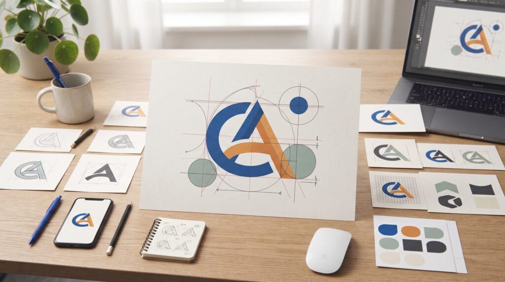
Icon logo design focuses on creating a simple visual symbol that can represent a brand clearly and consistently across many different applications. A professional icon logo may look simple when finished, but creating that simplicity usually requires careful decisions about shape, proportion, negative space, balance, scalability, and meaning.
Icon logos appear everywhere.
They may be used on:
- Websites
- Mobile apps
- Packaging
- Business cards
- Social media profiles
- Products
- Signage
- Advertising
Because the icon may sometimes appear without the company name, it needs to remain recognizable on its own.
The strongest icon logo design usually combines a clear idea with simple visual construction.
This guide explains how beginners can move from an early concept to a more polished and professional symbol.
Start Icon Logo Design With a Clear Brand Idea
Before drawing shapes, understand what the brand needs to communicate.
Ask questions such as:
- What does the business do?
- Who is the target audience?
- What personality should the brand have?
- What makes the company different?
- Where will the icon appear?
Then reduce the brand direction into a few keywords.
For example: Fast, Modern, Efficient or Natural, Calm, Premium.
These words can guide visual decisions later.
A technology brand may benefit from a structured geometric symbol.
A handmade lifestyle brand may need something softer and more organic.
Professional icon logo design begins with meaning before decoration.
Research Symbols Before Designing
Research helps you understand which visual ideas are already common in the industry.
Look at competing brands and identify repeated elements.
You might notice:
- Similar icons
- Repeated colors
- Familiar shapes
- Common visual metaphors
For example, technology companies may frequently use:
- Nodes
- Circuits
- Arrows
- Geometric letters
Wellness brands might use:
- Leaves
- Flowers
- Circles
- Natural forms
The goal is not to avoid every familiar symbol.
Instead, understand what exists so your concept does not accidentally become too similar to competitors.
Research also helps reveal opportunities for a more distinctive approach.
Sketch Many Icon Logo Design Ideas
Sketching is one of the fastest ways to explore concepts.
Avoid trying to make the first sketch perfect.
Create small thumbnails.
Experiment with:
- Initials
- Abstract shapes
- Symbols
- Monograms
- Negative space
- Geometric forms
- Object combinations
A good early icon logo design process values quantity before precision.
Try creating 20 or more quick ideas.
Many will not work.
That is normal.
One weak sketch may lead to another idea that becomes much stronger.
At this stage, focus on the concept rather than perfect curves.
Use Simple Shapes in Icon Logo Design
Simple shapes are easier to recognize and reproduce.
Common foundations include:
- Circles
- Squares
- Triangles
- Rectangles
- Lines
- Curves
These basic forms can be combined into more distinctive symbols.
For example:
Two circles may create a connection symbol.
A triangle can suggest:
- Direction
- Movement
- Stability
A square can communicate:
- Structure
- Reliability
- Order
The goal is not to create a logo from basic geometry simply because geometric logos are popular.
Use shapes when they support the concept.
Build a Strong Silhouette
A professional logo should have a recognizable overall shape.
Try filling the entire icon with black.
Then look at the silhouette.
Ask:
- Is the shape distinctive?
- Does it feel balanced?
- Can I recognize it quickly?
- Does it look too similar to another common symbol?
Strong silhouettes improve recognition.
This becomes especially important when the logo is viewed quickly or displayed at a small size.
A complicated internal detail cannot compensate for a weak outer shape.
Keep Icon Logo Design Simple
Beginners often try to include too many ideas in one symbol.
For example, a coffee delivery company might try to combine:
- Coffee cup
- Bean
- Delivery vehicle
- Road
- Location pin
The result may become difficult to understand.
A better approach is to choose one central idea.
Perhaps combine: Coffee cup + Motion or Bean + Location.
Professional icon logo design often becomes stronger when unnecessary ideas are removed.
Ask:
Can this detail disappear without weakening the concept?
If the answer is yes, consider removing it.
Use Negative Space Carefully
Negative space is the empty area around and inside shapes.
It can become an active part of the icon.
For example, two shapes may create a third hidden form between them.
Negative space can make a logo feel clever and memorable.
However, avoid forcing hidden symbols into every concept.
If the negative-space effect is too difficult to recognize, it may create confusion instead of value.
Keep the main shape readable even if viewers do not immediately notice the secondary idea.
Use Geometry to Improve Icon Logo Design
Geometry can help create consistency.
Circles and grids can guide:
- Curves
- Corners
- Spacing
- Proportions
- Repeated shapes
For example, if several corners use similar radii, the logo may feel more unified.
A construction grid can also help align different parts of the icon.
However, avoid treating geometry as proof that a logo is automatically professional.
Perfect circles cannot fix a weak concept.
Use geometry to refine the idea rather than replace creative thinking.
Also Read: 3D Logo Design Trends and Examples That Stand Out
Pay Attention to Optical Balance
Mathematical alignment and visual alignment are not always identical.
A circle placed at the exact center of a square may sometimes appear slightly low or high.
Typography has the same issue.
Designers often make small optical adjustments so the composition feels balanced.
Look at:
- Shape weight
- Empty space
- Direction
- Visual center
Trust measurement first, then evaluate with your eyes.
Professional icon logo design often requires small refinements that are difficult to calculate with numbers alone.
Convert the Best Concept Into Vector Artwork
Once you have selected the strongest sketch, recreate it as vector artwork.
Vector graphics can scale without losing quality.
This is essential because the same icon may need to appear:
- 24 pixels wide
- On a business card
- On packaging
- On a large sign
Build the artwork with clean paths.
Avoid unnecessary anchor points.
Too many points can create:
- Uneven curves
- Difficult editing
- Poor geometry
Simple vector construction is usually easier to refine.
Test Icon Logo Design in Black and White
Color can make a weak concept temporarily look more attractive.
That is why black-and-white testing is important.
Remove all:
- Gradients
- Shadows
- Textures
- Effects
Then examine the basic symbol.
Ask:
- Is it still recognizable?
- Does the shape remain clear?
- Is the contrast strong?
- Are internal spaces large enough?
If the icon only works with special effects, simplify it further.
Strong icon logo design should generally work as a flat single-color mark.
Test the Logo at Small Sizes
One of the most important tests is reducing the icon dramatically.
Try viewing it at:
- 64 pixels
- 48 pixels
- 32 pixels
- 24 pixels
Check whether:
- Lines disappear
- Gaps close
- Shapes merge
- Details become unclear
This matters for:
- App icons
- Favicons
- Social avatars
- Small packaging
You may need a simplified small-size variation.
A complex logo can sometimes have primary version and simplified icon version.
This improves flexibility.
Create Consistent Stroke Weight
If the icon uses outlines, pay attention to stroke thickness.
Random line weight can make the symbol feel unfinished.
Use consistent values where appropriate.
Also test whether lines remain visible at smaller sizes.
Thin strokes may look elegant at large scale but disappear when reduced.
Sometimes converting strokes into solid shapes provides more predictable results.
Use Rounded and Sharp Corners Intentionally
Corner style influences personality.
Rounded corners can feel:
- Friendly
- Soft
- Modern
- Approachable
Sharp corners may feel:
- Precise
- Strong
- Technical
- Energetic
Neither is automatically better.
Choose the treatment that matches the brand.
Consistency matters.
Randomly mixing several corner styles can reduce visual unity.
Pair Icon Logo Design With Typography
Many icon logos are initially used with a wordmark.
Typography should support the symbol.
Consider:
- Typeface style
- Weight
- Letter spacing
- Height
- Width
A bold geometric icon might pair well with a clean sans serif.
A refined symbol may work better with more elegant typography.
Do not let the font overpower the icon.
The symbol and wordmark should feel like parts of the same identity.
Create Balanced Spacing Between Icon and Wordmark
Spacing affects whether the logo feels unified.
If the gap is too large, the icon and name may look unrelated.
If the gap is too small, the composition may feel crowded.
Test several distances.
Also compare the visual weight of both elements.
A very large icon beside a small wordmark may create an awkward imbalance.
Refine the relationship rather than relying only on numerical measurements.
Also Read: Typography Logo Trends You Should Follow for Better Results
Add Color After the Shape Works
Once the black-and-white version is strong, explore color.
Color may communicate:
- Blue: Trust, technology, professionalism
- Green: Nature, growth, wellness
- Orange: Energy, creativity, friendliness
- Red: Strength, urgency, excitement
- Purple: Creativity, imagination, premium personality
Do not depend entirely on common color meanings.
Industry, audience, culture, and context also matter.
Professional icon logo design should remain recognizable even when the color changes.
Avoid Too Many Colors
Most icons benefit from a limited palette.
Try:
- One primary color
- One secondary color
- Neutral support colors
Too many colors can create unnecessary complexity.
A simple icon with one strong accent may be more memorable than a symbol containing five competing colors.
Always keep monochrome versions available.
Test Icon Logo Design on Different Backgrounds
The logo should work on:
- White
- Black
- Light colors
- Dark colors
- Photography
Create:
- Positive version: Dark logo on light background
- Reverse version: Light logo on dark background
Avoid complicated outlines or shadows just to make the logo visible.
Instead, prepare proper variations.
Test the Icon in Real Applications
Mockups can reveal practical problems.
Try placing the icon on:
- Website header
- App screen
- Business card
- Packaging
- Social profile
- Signage
Look for:
- Poor visibility
- Weak proportions
- Awkward spacing
- Small details
Mockups should be used for testing, not hiding problems.
Always evaluate the flat artwork as well.
Check Icon Logo Design for Originality
Before finalizing a symbol, compare it against existing logos.
Simple shapes can accidentally resemble other marks.
This is especially common with:
- Letters
- Arrows
- Leaves
- Abstract circles
- Geometric monograms
Search the market and review competitors.
If the concept feels too generic, explore ways to make the shape more distinctive.
Originality does not necessarily require extreme complexity.
Small structural decisions can create uniqueness.
Common Icon Logo Design Mistakes
Adding Too Many Details
Small elements disappear when the logo is reduced.
Starting With Color Too Early
Build the form first.
Copying Popular Logo Styles
Trends should inspire exploration, not imitation.
Overusing Geometry
A construction grid cannot replace a strong idea.
Ignoring Negative Space
Uneven gaps can make the symbol feel unbalanced.
Weak Small-Size Performance
Always test the icon at realistic dimensions.
Using Too Many Effects
Gradients, shadows, and 3D effects should not be required for recognition.
Icon Logo Design Checklist
Before finalizing the icon, check:
- Clear concept
- Relevant brand meaning
- Distinctive silhouette
- Simple construction
- Balanced proportions
- Clean negative space
- Consistent geometry
- Optical balance
- Professional vector paths
- Strong black-and-white version
- Good small-size readability
- Appropriate typography
- Balanced icon-to-wordmark spacing
- Controlled color palette
- Light and dark versions
- Real-world testing
- Original visual direction
If several areas still feel weak, continue refining before delivery.
Also Read: Logo Variation Tips for New Businesses and Digital Products
Final Thoughts
Icon logo design looks simple when it works well, but professional results depend on many small decisions.
- Start with the brand rather than the software.
- Develop a clear idea.
- Sketch many possibilities.
- Choose a strong silhouette.
- Reduce unnecessary details.
- Use geometry where it improves consistency.
- Pay attention to negative space and optical balance.
- Then build the concept carefully as vector artwork.
- Test it in black and white.
- Reduce it to small sizes.
- Combine it with appropriate typography.
- Add color only after the core form feels strong.
- Finally, test the symbol across realistic applications.
A successful icon logo design does not need complicated effects or dozens of visual ideas.
It needs clarity.
The strongest icon is often one that viewers can recognize quickly, remember easily, and understand as part of a consistent brand identity.
By practicing this icon logo design process repeatedly, beginners can improve their judgment, create cleaner symbols, and build logo work that feels more purposeful, scalable, and professional.
For high-quality fonts to boost your income, check out Letter Crafted. Our professional fonts are perfect for branding, marketing, and content creation. So, don’t miss this opportunity.