Strong packaging design typography can completely transform how customers see a product. In modern branding, typography is not only about readability. Fonts also communicate personality, product quality, mood, and brand identity. Whether designing food packaging, beauty products, luxury labels, or ecommerce branding, typography plays a major role in visual presentation.
Many designers focus heavily on colors and illustrations while overlooking typography structure. However, even simple packaging can look premium when typography feels balanced and intentional. This is why understanding modern packaging design typography is essential for designers who want to create professional and memorable product branding.
Today, customers make quick buying decisions based on visual appearance. Packaging typography helps products stand out on crowded shelves and social media feeds. Strong typography systems improve hierarchy, readability, and overall branding consistency across different products and marketing platforms.
In this guide, you will learn practical packaging design typography principles, font pairing ideas, hierarchy strategies, readability techniques, luxury typography trends, and modern layout inspiration for better packaging design.
Why Packaging Design Typography Matters in Branding
Typography strongly affects first impressions.
Good packaging design typography helps products:
- Improve readability
- Increase shelf visibility
- Build stronger branding
- Create emotional connection
- Improve professionalism
- Support product recognition
Typography influences how customers perceive:
- Quality
- Trustworthiness
- Luxury
- Simplicity
- Playfulness
- Modernity
Strong typography creates stronger visual communication.
Packaging Design Typography and Visual Hierarchy
Visual hierarchy controls how people read packaging information.
Customers should quickly understand:
- Product name
- Brand identity
- Flavor or category
- Product benefits
- Supporting information
Good hierarchy is one of the most important parts of packaging design typography.
Typography Hierarchy for Product Packaging
Strong hierarchy usually includes:
- Large product titles
- Medium supporting text
- Small informational details
This structure improves readability and organization.
Examples include:
- Large coffee brand logo
- Medium flavor description
- Small ingredient information
Clear hierarchy helps packaging feel more professional.
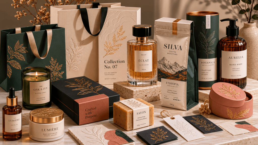
Serif Packaging Design Typography for Luxury Branding
In luxury packaging, serif fonts remain extremely popular.
Serif typography often feels:
- Elegant
- Premium
- Sophisticated
- Traditional
Luxury brands frequently use serif typography for:
- Perfume packaging
- Jewelry branding
- Fashion products
- Wine labels
- Premium skincare
Elegant Serif Typography Ideas for Packaging
Popular serif packaging styles include:
- Thin high-contrast serif fonts
- Editorial-inspired typography
- Minimal luxury layouts
- Gold foil typography systems
These packaging design typography styles create stronger premium perception.
Sans Serif Packaging Design Typography for Modern Products
With sans serif fonts, can create clean and modern packaging aesthetics.
Sans serif typography often feels:
- Minimal
- Professional
- Contemporary
- Accessible
Modern brands use sans serif fonts for:
- Technology products
- Wellness packaging
- Minimal skincare
- Ecommerce products
Minimal Packaging Typography Ideas
Minimal typography systems often use:
- Clean alignment
- Generous white space
- Limited font combinations
- Simple hierarchy
This helps products appear more refined and modern.
Packaging Design Typography for Food Branding
Food packaging typography needs strong visibility.
Food products compete heavily for attention on shelves, so typography must communicate quickly.
Good food packaging typography often includes:
- Bold headlines
- High contrast
- Friendly font styles
- Readable layouts
Playful Typography for Snack Packaging
Snack packaging often uses:
- Rounded display fonts
- Bold lettering
- Dynamic text layouts
- Bright color combinations
This creates:
- Energy
- Fun branding
- Better shelf appeal
Playful typography works especially well for youth-focused products.
Vintage Typography for Coffee Packaging
Coffee packaging often uses:
- Retro serif fonts
- Handwritten typography
- Earth-tone color systems
- Editorial-inspired layouts
Vintage typography creates warmth and authenticity.
Also Read: 25 Best Fonts for Skincare Products Packaging and Branding
Packaging Design Typography for Beauty Brands
Beauty branding often relies heavily on typography.
Good beauty packaging typography should feel:
- Clean
- Elegant
- Feminine
- Premium
- Modern
Minimal typography trends remain highly popular in beauty industries.
Luxury Beauty Packaging Typography Ideas
Popular beauty typography styles include:
- Thin serif fonts
- Minimal sans serif combinations
- Soft neutral layouts
- Spacious typography systems
Luxury beauty packaging often uses typography more subtly than food branding.
Packaging Design Typography and Font Pairing
Font pairing is one of the most important design skills.
Strong font combinations improve:
- Visual balance
- Readability
- Branding consistency
- Professional appearance
Good packaging design typography often combines two complementary typefaces.
Serif and Sans Serif Font Pairing Ideas
One popular combination includes:
- Serif headline fonts
- Sans serif supporting text
This creates:
- Strong hierarchy
- Modern contrast
- Elegant branding
Many luxury brands use this typography structure successfully.
Display Font Packaging Typography Ideas
Display fonts work well for:
- Product names
- Limited edition labels
- Seasonal packaging
- Bold branding campaigns
However, display fonts should be balanced carefully with readable secondary typography.
Packaging Design Typography and Readability
Readability is essential in product packaging.
Customers should easily understand:
- Product type
- Ingredients
- Instructions
- Branding
Poor readability weakens user experience significantly.
Readable Typography Layout Tips
Helpful readability strategies include:
- Strong contrast
- Proper spacing
- Clear hierarchy
- Limited font styles
- Consistent alignment
Even beautiful typography fails if customers cannot read it easily.
Minimal Packaging Design Typography Trends
Minimalism remains one of the strongest packaging trends.
Minimal typography often uses:
- Small font families
- Simple layouts
- Clean spacing
- Neutral palettes
Minimal packaging feels:
- Modern
- Elegant
- Professional
- Premium
This style works especially well for skincare and wellness branding.
Bold Packaging Design Typography Ideas
With bold typography, can creates strong visual impact.
Bold layouts often include:
- Oversized product names
- Large sans serif fonts
- High contrast colors
- Dynamic compositions
This style is popular in:
- Beverage packaging
- Streetwear branding
- Modern snack products
Bold typography improves visibility quickly.
Also Read: How to Create a Memorable Unboxing Experience for Your Brand
Packaging Design Typography for Ecommerce Brands
Modern ecommerce brands prioritize packaging aesthetics heavily because products appear frequently on:
Typography must look attractive both physically and digitally.
Social Media-Friendly Typography Layouts
Modern ecommerce typography often includes:
- Clean minimal fonts
- Editorial-inspired layouts
- Large product names
- Neutral color systems
This improves social media presentation significantly.
Packaging Design Typography Using White Space
White space improves typography balance.
Many beginners overcrowd packaging with too much information.
However, spacing helps:
- Improve readability
- Increase elegance
- Create premium feeling
- Reduce visual stress
Luxury brands often use large amounts of white space intentionally.
Best Tools for Packaging Design Typography
Modern tools help designers experiment with typography systems more efficiently.
1. Adobe
Professional tools include:
Adobe software provides advanced typography and print design control.
2. Canva
Useful for:
- Packaging mockups
- Font pairing experiments
- Branding layouts
- Typography presentations
Canva helps beginners create typography systems quickly.
3. Figma
Helpful for:
- Typography systems
- Branding organization
- Packaging layout planning
- Collaborative design workflows
Figma improves consistency across packaging projects.
Common Packaging Design Typography Mistakes
Many designers weaken packaging through typography mistakes.
1. Using Too Many Fonts
Too many typefaces create visual inconsistency.
Most packaging works best with:
- One primary font
- One supporting font
2. Weak Contrast
Poor contrast reduces readability.
Typography should remain readable in:
- Digital photography
- Mobile screens
3. Overcrowded Typography Layouts
Too much text creates visual confusion.
Clear spacing improves hierarchy and professionalism.
4. Ignoring Brand Personality
Typography should match the product mood and audience.
Luxury brands need different typography compared to playful snack products.
Future Trends in Packaging Design Typography
Typography trends continue evolving rapidly.
Popular trends include:
- Editorial-inspired typography
- Minimal sans serif systems
- AI-generated typography layouts
- Retro-inspired packaging fonts
- Large display typography
- Monochrome branding systems
Designers increasingly combine minimal layouts with expressive typography.
Also Read: 12 Most Sustainable Packaging Materials for a Greener Future
Final Thoughts on Packaging Design Typography
Strong packaging design typography helps products communicate clearly while building stronger visual identity and emotional connection with customers. Typography affects readability, branding, shelf visibility, and overall product perception more than many designers realize.
Modern packaging typography focuses on hierarchy, spacing, balance, readability, and strategic font pairing rather than excessive decoration. Whether creating luxury branding, food packaging, ecommerce products, or beauty labels, typography remains one of the most important parts of successful packaging design.
By understanding hierarchy, font psychology, contrast, and modern branding trends, designers can create packaging systems that feel more professional, memorable, and visually competitive in today’s market.
For high-quality fonts to boost your income, check out Letter Crafted. Our professional fonts are perfect for branding, marketing, and content creation. So, don’t miss this opportunity.