Choosing the right packaging design color ideas can completely change how customers see a product. In modern branding, color is often the first thing people notice before reading labels, product names, or marketing messages. Strong packaging colors help products stand out on shelves, improve brand recognition, and create emotional connection with buyers.
Today, designers use color strategically to communicate product personality, target audience, and brand value. Luxury products often use dark elegant tones, while playful brands use bright and energetic palettes. Minimal packaging may focus on soft neutrals, while eco-friendly products often use earthy natural colors. This is why understanding modern packaging design color ideas is extremely important for creative designers and branding projects.
Packaging design is no longer only about decoration. It plays a major role in marketing, storytelling, and customer psychology. Strong color systems can influence trust, product visibility, and even purchase decisions.
In this guide, you will discover creative packaging design color ideas, modern color palette trends, branding strategies, industry-specific inspiration, and practical design tips for better product presentation.
Why Packaging Design Color Ideas Matter in Branding
Color strongly influences buying behavior.
Good packaging design color ideas help products:
- Attract attention
- Improve shelf visibility
- Increase memorability
- Communicate product quality
- Support branding consistency
- Create emotional connection
Customers often judge products quickly based on visual appearance alone.
Strong packaging colors help businesses appear more:
- Premium
- Trustworthy
- Playful
- Modern
- Luxurious
This is why packaging color strategy matters in modern branding.
Modern Packaging Design Color Ideas for Minimal Branding
Minimal branding remains one of the strongest packaging trends today.
Minimal packaging usually uses:
- Neutral palettes
- Simple typography
- Clean layouts
- Soft contrast
Minimal color systems often feel:
- Elegant
- Modern
- Professional
- Premium
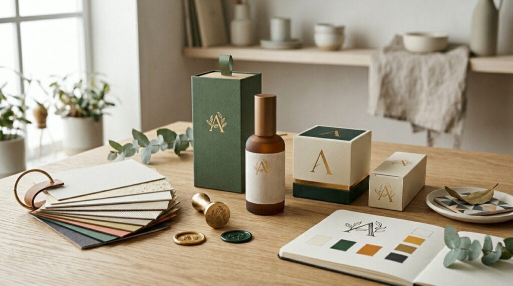
Neutral Packaging Design Color Ideas
Popular neutral palettes include:
- Beige and cream
- White and gray
- Soft brown tones
- Warm ivory colors
These palettes work especially well for:
- Skincare products
- Luxury candles
- Organic products
- Wellness brands
Neutral packaging often creates calm and sophisticated visual presentation.
Monochrome Packaging Design Color Ideas
Monochrome color systems use variations of one primary color.
Examples include:
- Black and charcoal
- Blue gradients
- Green tonal palettes
- Soft pink monochrome
Monochrome packaging helps brands appear more consistent and refined.
Luxury Packaging Design Color Ideas for Premium Products
Luxury packaging focuses heavily on elegance and exclusivity.
Premium products often use:
- Black backgrounds
- Metallic gold accents
- Deep navy tones
- Matte textures
- Minimal typography
Luxury color palettes create stronger premium perception.
Black and Gold Packaging Design Color Ideas
Black and gold combinations remain one of the most popular luxury packaging styles.
This palette often feels:
- Elegant
- Expensive
- Dramatic
- High-end
Luxury cosmetics, jewelry, and premium beverages frequently use this style.
Dark Editorial Packaging Color Concepts
Dark luxury aesthetics often include:
- Charcoal tones
- Soft cinematic shadows
- Metallic foil accents
- Minimal compositions
These packaging design color ideas help products feel more exclusive and modern.
Food Packaging Design Color Ideas for Better Shelf Appeal
Packaging design for food requires attention-grabbing color systems.
Food brands often use colors that trigger appetite and excitement.
Examples include:
- Red for energy
- Yellow for happiness
- Orange for warmth
- Green for freshness
Color psychology strongly affects food branding success.
Bright Packaging Design Color Ideas for Snack Brands
Snack packaging often uses:
- Bold contrast
- Saturated colors
- Playful typography
- Dynamic compositions
Bright palettes help products stand out quickly in stores.
Organic Food Packaging Color Ideas
Organic and healthy brands usually use:
- Earthy green tones
- Beige neutrals
- Brown packaging accents
- Natural color palettes
These color systems communicate freshness and sustainability.
Beauty Packaging Design Color Ideas for Modern Branding
Beauty brands often rely heavily on visual presentation.
Strong packaging design color ideas help beauty products feel:
- Luxurious
- Clean
- Feminine
- Modern
- Premium
Pastel Packaging Design Color Ideas
Pastel palettes remain popular in:
- Skincare packaging
- Cosmetics branding
- Wellness products
- Lifestyle brands
Popular pastel combinations include:
- Soft pink and cream
- Lavender and white
- Peach and beige
- Mint green and ivory
Pastels help products feel soft and approachable.
Minimal Beauty Packaging Color Trends
Minimal beauty packaging often uses:
- White backgrounds
- Black typography
- Soft neutral accents
- Clean layouts
This creates professional and modern branding.
Also Read: Food Packaging Design for Brands That Want Better Results
Packaging Design Color Ideas for Kids Brands
Kids packaging often focuses on:
- Bright colors
- Fun illustrations
- High energy palettes
- Playful branding
Children’s products need packaging that feels visually exciting.
Colorful Packaging Ideas for Youth Branding
Popular kids brand palettes include:
- Yellow and blue
- Pink and turquoise
- Orange and green
- Rainbow-inspired colors
Bright packaging improves visual engagement significantly.
Packaging Design Color Ideas for Ecommerce Brands
Modern ecommerce brands often prioritize:
- Social media appeal
- Unboxing experience
- Photography aesthetics
- Branding consistency
Packaging must look attractive both in real life and online.
Instagram-Friendly Packaging Color Ideas
Modern ecommerce packaging often uses:
- Soft neutral palettes
- Minimal luxury tones
- Clean typography
- Editorial-inspired layouts
This helps products appear more photogenic on social media.
Seasonal Packaging Design Color Ideas
Seasonal packaging helps products feel timely and relevant.
Popular seasonal palettes include:
- Red and gold for holidays
- Orange and brown for autumn
- Pastels for spring
- Bright tropical tones for summer
Seasonal branding creates fresh customer interest.
Holiday Packaging Color Ideas
Holiday packaging often uses:
- Metallic textures
- Rich dark colors
- Festive contrast
- Decorative typography
This improves emotional connection during shopping seasons.
Packaging Design Color Ideas Using Contrast
Contrast improves visibility and readability.
Strong contrast helps:
- Highlight product names
- Improve logo visibility
- Create stronger hierarchy
- Increase shelf impact
Examples include:
- Black and white
- Navy and cream
- Red and beige
- Green and gold
Good contrast improves professional presentation.
Also Read: How to Create a Memorable Unboxing Experience for Your Brand
Typography and Packaging Design Color Ideas
Typography and color work together closely.
Good packaging systems combine:
- Readable typography
- Balanced contrast
- Consistent hierarchy
- Organized layouts
For example:
- Luxury serif fonts pair well with dark palettes
- Minimal sans serif fonts fit neutral packaging
- Playful display fonts work with colorful branding
Typography strongly affects how packaging colors feel emotionally.
Best Tools for Packaging Design Color Ideas
Modern design tools help creators experiment with packaging palettes more efficiently.
1. Canva
Useful for:
- Packaging mockups
- Color palette experiments
- Branding presentations
- Social media packaging visuals
Canva is beginner-friendly for quick design exploration.
2. Adobe
Professional tools include:
Adobe software provides advanced packaging and print design workflows.
3. Coolors
Helpful for:
- Color palette generation
- Branding color inspiration
- Packaging color combinations
- Visual color experimentation
Coolors helps designers discover balanced palettes faster.
Common Mistakes in Packaging Design Color Ideas
Many designers weaken packaging through poor color decisions.
1. Using Too Many Colors
Too many colors create visual confusion.
Simple palettes usually feel more professional.
2. Ignoring Product Audience
Different audiences respond differently to color systems.
Luxury buyers expect different packaging aesthetics compared to children’s products.
3. Weak Contrast
Poor contrast reduces readability and shelf visibility.
Strong hierarchy improves communication.
4. Following Trends Without Strategy
Trend-heavy palettes may become outdated quickly.
Timeless branding often performs better long term.
Future Trends in Packaging Design Color Ideas
Modern packaging trends continue evolving rapidly.
Popular trends include:
- Earth-tone packaging
- Soft luxury palettes
- AI-generated color systems
- Minimal monochrome branding
- Retro-inspired packaging
- Sustainable natural palettes
Brands increasingly focus on emotional storytelling through color.
Also Read: Packaging Design Using AI: Smarter, Faster, Better
Final Thoughts on Packaging Design Color Ideas
Strong packaging design color ideas help products attract attention, improve branding, and create stronger emotional connection with customers. Color affects how people perceive quality, personality, and trust before they even interact with the product itself.
Modern packaging design focuses heavily on balance, readability, visual hierarchy, and strategic color systems rather than random decoration. Whether designing for food brands, beauty products, ecommerce businesses, or luxury packaging, thoughtful color selection can dramatically improve product presentation.
By understanding contrast, color psychology, typography pairing, and modern branding trends, designers can create packaging systems that feel more memorable, professional, and visually competitive in today’s market.
For high-quality fonts to boost your income, check out Letter Crafted. Our professional fonts are perfect for branding, marketing, and content creation. So, don’t miss this opportunity.