
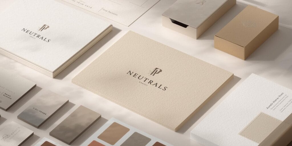
If you want your brand to feel premium, neutrals are your best friend. They create space, calm, and confidence. They also make everything else look more intentional: your typography, your photography, your product shots, even your packaging. The trick is that neutrals can look either expensive or boring depending on how you use them. This guide to branding colors shows how to build a neutral-forward palette that feels premium, modern, and consistent.
You’ll learn neutral roles, palette formulas, common mistakes, and examples you can apply to logos, websites, social templates, and packaging. If you’re a designer or founder, this branding colors approach helps you create a brand system that looks polished without relying on trendy colors.
Branding Colors and Why Neutrals Feel Premium
Neutrals feel premium because they don’t compete for attention. They create a quiet backdrop that makes your message and visuals feel more focused. In branding colors, premium often means:
controlled contrast
intentional whitespace
fewer competing tones
consistent application across touchpoints
Neutrals also pair well with high-quality materials, like paper textures, matte finishes, embossing, foil stamping, and clean UI layouts. A neutral system makes the brand feel “designed,” not improvised.
Branding Colors Neutral Categories You Should Know
Not all neutrals behave the same. In branding colors, it helps to think in categories so you can build balance.
1. Deep neutrals
Black, charcoal, deep navy, espresso brown
Use for: text, primary UI elements, premium backgrounds
2. Light neutrals
Ivory, cream, warm white, soft gray
Use for: backgrounds, whitespace, calm pages, packaging bases
3. Warm neutrals
Beige, sand, camel, taupe, clay
Use for: lifestyle warmth, beauty brands, fashion, interiors
4. Cool neutrals
Slate, cool gray, blue-gray, steel
Use for: tech, modern UI, minimalist brands, clean editorial looks
Knowing which neutral family you want is step one in building premium branding colors.
The Role System that Makes Neutrals Work
Premium brands rarely “pick colors.” They assign roles. This is the difference between random colors and real branding colors systems.
A simple neutral role system
Primary neutral: your main background or base tone
Secondary neutral: used for sections, cards, or alternate backgrounds
Text neutral: your default text color (often deep charcoal)
Accent color: used sparingly for highlights and CTAs
Support neutral: optional, for borders, dividers, subtle UI
When you define roles, your brand looks consistent even as you create new content.
1. Branding Colors Formula with Black, Ivory, and One Accent
This is the easiest premium formula to apply across web, print, and social.
How it works
Ivory or warm white as the main background
Charcoal or black for text and structure
One accent color for highlights and CTAs
Accent examples: gold, deep green, burgundy, cobalt, muted blush
Why it looks premium
The neutral contrast is strong and clean, and the accent becomes meaningful because it’s rare. This is a classic branding colors move for luxury and boutique brands.
Also Read: Brand Color Guide Checklist for Better Color Contrast
2. Branding Colors Formula with Warm Neutrals and Soft Contrast
This palette works well for brands that want premium but approachable.
How it works
Cream background
Taupe or cocoa for text
Sand or beige for sections
A muted accent (olive, rust, blush, navy)
Why it looks premium
Warm neutrals feel tactile and human. They pair beautifully with natural photography and product textures. In branding colors, warmth often signals comfort and craft.
3. Branding Colors Formula with Cool Neutrals for Modern Brands
If you want sleek, modern, and clean, cool neutrals are your best base.
How it works
White or cool light gray background
Charcoal text
Slate or steel for UI components
Accent color (electric blue, teal, lime, purple) used sparingly
Why it looks premium
Cool neutrals feel sharp and technical when used with clean typography and spacing. In branding colors, this palette is common for SaaS, apps, and design tools.
Branding Colors Examples of Premium Neutral Palettes
Here are practical neutral palette examples you can recreate quickly. (These are “direction examples,” not rules.)
1. Premium classic
Ivory + charcoal + gold accent
2. Modern minimal
White + black + cool gray + cobalt accent
3. Warm lifestyle
Cream + sand + cocoa + olive accent
4. Premium beauty
Warm white + taupe + blush + champagne accent
5. Boutique café
Off-white + espresso + muted green + copper accent
A good branding colors neutral palette is less about the exact hex values and more about consistency and contrast.
How to Use Neutrals for Branding Colors in Logos and Wordmarks
Neutrals are powerful for logos because they keep things timeless.
Logo rules for premium neutrals
Start with a one-color logo (black or deep charcoal)
Add a reverse version (white on dark)
If you use metallic (gold), treat it as a finishing option, not a required color
In branding colors, a logo that works in one color is a sign of real quality.
Also Read: Coffee Brand Colors That Look Great on Cups and Menus
How to Use Neutrals for Branding Colors in Websites and UI
This is where many brands accidentally make neutrals look “flat.” The fix is depth.
How to create depth without adding random colors
Use 2-3 neutral background levels (base, section, card)
Use subtle borders and dividers
Use spacing and typography to create hierarchy
Use one accent color for primary actions only
CTA rule for premium neutrals
If everything is neutral, your CTA should stand out through:
contrast (dark button on light background)
or a single accent color used consistently
This is one of the most practical branding colors lessons for founders building their own sites.
How to Use Neutrals for Branding Colors in Social Templates
Neutrals can look premium on social, but only if the layout is clean and readable.
Social template tips
Use a consistent background neutral (don’t change every post)
Use one strong type pairing (serif + sans or bold + regular)
Keep accents consistent: same highlight color, same badge style
Use photography with similar tones and lighting
In branding colors, consistency is what builds recognition. Neutral palettes make consistency easier.
Branding Colors Common Mistakes that Make Neutrals Look Boring
Neutrals look boring when:
contrast is too low (light gray on white)
everything is the same tone (no depth)
you use too many neutrals without a system
the typography is weak (neutrals expose typography)
accents are random and inconsistent
Quick fixes
increase contrast for text
add one darker neutral for structure
define a single accent for CTAs
tighten typography and spacing
Neutrals don’t create premium by themselves. The system does. That’s the real lesson in branding colors.
Branding Colors Quick Checklist for Premium Neutrals
Use this before you finalize your palette:
Do I have a primary background neutral?
Do I have a text neutral with strong readability?
Do I have 1-2 supporting neutrals for depth?
Do I have one accent color for highlights and CTAs?
Does it work in light mode and dark mode?
Does it look good on a mockup (website, packaging, post)?
Can my team apply it consistently?
If you can answer yes, your branding colors system is ready.
Also Read: Brand Voice 2026: The Best Voice Styles for 2026 Brands
Final Thoughts
Neutrals are a shortcut to premium branding because they make everything feel calmer, clearer, and more intentional. The key is using neutrals as a system, roles, contrast, depth, and one accent used consistently. If you want your brand to look more premium, start by fixing your neutral base first. Everything else gets easier after that.
For high-quality fonts to boost your income, check out Letter Crafted. Our professional fonts are perfect for branding, marketing, and content creation. So, don’t miss this opportunity.