
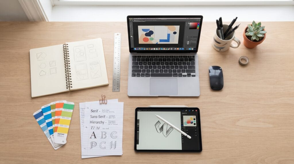
Graphic design for beginners can feel overwhelming because there are so many things to learn, from typography and color theory to layouts, images, software, and branding. However, you do not need to master everything before creating your first design. Understanding a few fundamental principles and practicing them consistently can help you build stronger visual communication skills step by step.
Graphic design is not simply about making something look attractive. Good design communicates information clearly, creates hierarchy, guides attention, and supports a specific purpose.
Whether you want to design social media posts, posters, logos, presentations, websites, or marketing materials, the same basic principles apply.
This guide explains what beginners should learn first and how to develop practical design skills without making the process unnecessarily complicated.
What Is Graphic Design for Beginners?
Before learning software, it helps to understand what graphic design actually means.
Graphic design is the process of using visual elements to communicate a message.
These elements may include:
- Typography
- Colors
- Photography
- Illustration
- Shapes
- Icons
- Lines
- Patterns
- Layout
- Negative space
A graphic designer organizes these elements intentionally.
For example, a restaurant poster should help viewers quickly understand what is being promoted, where it happens, and what action they should take.
A beautiful poster that hides this information is not effective graphic design.
For anyone learning graphic design for beginners, communication should always come before decoration.
Learn the Basic Principles of Graphic Design
Strong visual work is usually built on a small number of fundamental principles.
Beginners should understand these before worrying about advanced effects.
Visual Hierarchy
Hierarchy determines what people notice first, second, and third.
You can create hierarchy using:
- Size
- Weight
- Color
- Position
- Contrast
- Spacing
For example, a poster might use:
- Large headline
- Medium supporting information
- Small secondary details
If every element is equally large and bold, the viewer does not know where to look.
Contrast
Contrast helps separate visual elements.
You can create contrast between:
- Light and dark
- Large and small
- Bold and thin
- Serif and sans serif
- Bright and neutral colors
Contrast can make important information easier to notice.
Alignment
Alignment creates structure.
Text, images, icons, and other elements should feel intentionally connected rather than randomly placed.
Using consistent alignment can immediately make beginner designs look more professional.
Repetition
Repeating certain visual elements creates consistency.
For example, a brand might consistently use:
- The same heading style
- Similar button shapes
- A limited color palette
- Repeated graphic patterns
Repetition helps separate deliberate design systems from random decoration.
Graphic Design for Beginners Starts With Typography
Typography is one of the most important areas for new designers to understand.
Typography refers to how text looks and functions within a design.
This includes:
- Typeface choice
- Font size
- Weight
- Line spacing
- Letter spacing
- Alignment
- Hierarchy
Choosing attractive fonts is only one part of the process.
The text must also be readable.
Choose Fonts With a Clear Purpose
Different type styles communicate different personalities.
Serif Fonts
Serif fonts often feel:
- Classic
- Elegant
- Editorial
- Traditional
- Sophisticated
They can work well for luxury brands, magazines, editorial layouts, and formal communication.
Sans Serif Fonts
Sans serif fonts often feel:
- Modern
- Clean
- Simple
- Professional
- Contemporary
They are frequently used for websites, technology brands, presentations, and minimalist designs.
Script Fonts
Script fonts can communicate:
- Elegance
- Personality
- Romance
- Creativity
- Handmade character
However, decorative scripts should usually be used carefully because readability can quickly become a problem.
Display Fonts
Display typefaces are designed to attract attention.
They can be useful for:
- Posters
- Headlines
- Packaging
- Logos
- Social graphics
They are generally more effective in short text than long paragraphs.
Keep Font Pairings Simple
One common beginner mistake is using too many fonts.
You usually do not need five different typefaces in one composition.
Try starting with two:
- One font for headlines
- One font for body text
Sometimes one versatile font family with several weights is enough.
Limiting font choices creates stronger consistency.
Understand Color in Graphic Design for Beginners
Color influences both visual appeal and communication.
A good color palette should support the purpose and mood of the design.
For example:
- Warm colors such as red, orange, and yellow can feel energetic or friendly.
- Cool colors such as blue and green may feel calm, professional, or natural.
- Neutral colors such as white, black, beige, and gray can provide balance.
However, these associations are not universal. Context, culture, audience, and brand identity also influence how colors are perceived.
Start With a Limited Color Palette
Beginners often make designs complicated by adding too many colors.
Start with approximately three to five primary colors.
For example:
- One dominant color
- One secondary color
- One accent color
- One or two neutrals
This creates enough variation without making the composition chaotic.
Also Read: How to Create a Maximalist Graphic Design Style
Make Sure Text Has Enough Contrast
Readability should always matter.
Light gray text on a white background may look subtle, but it can become difficult to read.
Similarly, placing text over a busy photograph can reduce clarity.
Use strong contrast where important information needs immediate attention.
Graphic Design Layout Basics for Beginners
Layout determines how visual elements are arranged.
Good layouts feel organized even when they appear visually expressive.
One useful starting point is a grid.
A grid provides invisible guidelines for positioning content.
It can help organize:
- Headlines
- Text
- Images
- Buttons
- Icons
- Decorative elements
You do not need a complicated professional grid for every project.
Even simple columns and consistent margins can improve a design substantially.
Use Negative Space
Negative space, sometimes called white space, is the empty area around visual elements.
Beginners often feel that every empty area needs decoration.
It does not.
Negative space can:
- Improve readability
- Separate information
- Create hierarchy
- Make designs feel cleaner
- Direct attention
A simple layout with intentional empty space often looks more professional than one filled with unnecessary shapes and text.
Understand Visual Balance
Balance does not mean every composition has to be symmetrical.
There are two common approaches.
Symmetrical Balance
Elements are distributed evenly around a central axis.
This can create a formal, stable appearance.
Asymmetrical Balance
Different elements carry similar visual weight without being identical.
For example, a large photograph on one side might be balanced by several smaller text elements on the other.
Asymmetrical compositions often feel more dynamic.
Learn How to Use Images Effectively
Photography and illustration can dramatically influence a design.
Choose images that support your message rather than simply filling space.
Pay attention to:
- Image quality
- Composition
- Lighting
- Subject placement
- Color harmony
- Cropping
Avoid stretching photographs because it distorts proportions.
Crop them instead.
You should also consider where text will appear before selecting an image. A photograph with some natural negative space can make text placement much easier.
Graphic Design for Beginners and Branding
Branding provides a useful way to understand design consistency.
A visual brand might include:
- Logo
- Color palette
- Typography
- Photography style
- Icons
- Illustration style
- Graphic elements
- Layout rules
These components should work together.
For example, if a company wants to appear premium and sophisticated, playful cartoon graphics, random neon colors, and several unrelated fonts may create conflicting signals.
Consistency helps people recognize a brand.
Learning how brand systems work is therefore valuable even if you do not plan to specialize in logo design.
Best Graphic Design Tools for Beginners
You do not need every professional design application immediately.
Choose tools based on the projects you want to create.
Canva
Canva can be useful for:
- Social media graphics
- Presentations
- Posters
- Simple marketing materials
Its template-based workflow can help beginners understand composition while producing designs quickly.
Adobe Photoshop
Photoshop is primarily useful for raster-based design and image editing.
You can use it for:
- Photo manipulation
- Digital compositions
- Advertising graphics
- Social media visuals
- Textures
Adobe Illustrator
Illustrator is widely used for vector graphics.
It is suitable for:
- Logos
- Icons
- Illustrations
- Typography
- Packaging graphics
- Scalable artwork
Figma
Figma is particularly useful for digital interface design.
It can be used for:
- Website layouts
- App interfaces
- Wireframes
- Design systems
- Prototypes
Do not try to learn every tool simultaneously.
One of the best strategies for graphic design for beginners is choosing a primary application and using it repeatedly until the essential workflow feels comfortable.
Also Read: How to Choose Graphic Design Tools for Better Poster Design
Practice Graphic Design With Small Projects
You improve design skills by designing.
Watching tutorials can teach techniques, but practical projects help you understand how those techniques work together.
Good beginner projects include:
- Event poster
- Instagram post
- Business card
- Restaurant menu
- Book cover
- YouTube thumbnail
- Product advertisement
- Simple logo
- Landing page
- Presentation slide
Give yourself a realistic brief.
Instead of simply deciding to “make a poster,” create a fictional project such as:
Design a modern poster promoting a weekend coffee festival for young urban professionals.
A clear objective gives your design decisions context.
Study Good Graphic Design Examples
Looking at professional work can accelerate your learning.
Do not only ask:
Do I like this design?
Ask why it works.
Analyze:
- Where does your eye go first?
- How many fonts are used?
- How are elements aligned?
- How much negative space exists?
- Which colors dominate?
- How is hierarchy created?
- Why was the image cropped that way?
This transforms inspiration into education.
You can also recreate designs for personal practice to understand their structure, but avoid presenting copied work as original portfolio material.
Graphic Design for Beginners Should Focus on Simplicity
Beginners often assume more effects create better designs.
They may add:
- Multiple shadows
- Gradients
- Outlines
- Decorative shapes
- Textures
- Several fonts
- Numerous colors
None of these techniques is inherently wrong.
The problem appears when they are used without a purpose.
Before adding an element, ask:
Does this improve communication or hierarchy?
If the answer is no, consider removing it.
Simple design is not necessarily minimal design. It simply means that every visual element has a reason to exist.
Create Stronger Design Hierarchy
When reviewing a design, blur your eyes slightly or zoom out.
You should still be able to identify the dominant element.
For many designs, that might be:
- Headline
- Main visual
- Supporting message
- Call to action
- Secondary information
If everything demands equal attention, reduce the importance of less essential elements.
Good graphic design guides attention rather than forcing viewers to process everything at once.
Common Graphic Design for Beginners Mistakes
Understanding common mistakes can help you improve faster.
Using Too Many Fonts
Limit your typography and create variation through size and weight.
Poor Alignment
Check whether objects intentionally align with other elements.
Weak Contrast
Important information should be easy to see and read.
Overcrowding the Layout
Leave enough space around elements.
Using Low-Quality Images
Pixelated photography can make otherwise good work look unprofessional.
Following Trends Without Purpose
Trends can provide inspiration, but they should support the project’s audience and message.
Copying Instead of Learning
Study other designers, but gradually develop your own decision-making process.
Build a Beginner Graphic Design Portfolio
You do not need paying clients before building a portfolio.
Create fictional projects around realistic briefs.
For example:
- Branding for a coffee shop
- Poster for a music festival
- Packaging for organic skincare
- Social campaign for a fitness studio
- Website concept for a photographer
Show your strongest work rather than everything you have ever created.
Five excellent projects can communicate more skill than twenty unfinished experiments.
Where appropriate, explain the problem, concept, and design decisions behind each project.
A Simple Graphic Design for Beginners Learning Roadmap
If you are unsure where to begin, follow this order.
1. Learn Design Principles
Study hierarchy, contrast, balance, alignment, repetition, and spacing.
2. Study Typography
Learn font categories, hierarchy, readability, spacing, and pairing.
3. Understand Color
Practice creating limited palettes and maintaining sufficient contrast.
4. Learn Layout
Experiment with grids, margins, alignment, and negative space.
5. Master One Design Tool
Choose software relevant to your goals.
6. Complete Small Projects
Design regularly using realistic briefs.
7. Analyze Professional Work
Study why successful designs communicate effectively.
8. Build a Portfolio
Select your strongest projects and present them clearly.
9. Ask for Feedback
Useful criticism can reveal problems you no longer notice yourself.
10. Keep Practicing
Design skill develops through repetition and intentional experimentation.
Graphic Design for Beginners Checklist
Before finishing a design, check:
- Is the main message obvious?
- Does the design have clear hierarchy?
- Are the fonts readable?
- Am I using too many typefaces?
- Does the color palette feel consistent?
- Is there enough contrast?
- Are elements properly aligned?
- Is spacing consistent?
- Is there enough negative space?
- Are the images high quality?
- Does every decorative element have a purpose?
- Does the design fit the intended audience?
- Is the call to action easy to find?
- Does the composition still work at its intended size?
This checklist can prevent many common beginner mistakes.
Also Read: Best Art Deco Graphic Design Ideas for Luxury Brands
Final Thoughts on Graphic Design for Beginners
Learning graphic design for beginners does not require mastering every software tool, visual style, or design technique immediately.
Start with fundamentals.
Learn hierarchy, typography, color, alignment, spacing, imagery, and composition. Then apply those concepts repeatedly through small projects.
Your early designs may not look exactly how you imagined. That is normal when developing any creative skill.
Instead of trying to create perfect work immediately, compare each new project with your previous work.
Ask what improved and what still feels weak.
The strongest approach to graphic design for beginners is consistent practice combined with intentional observation. Study good work, understand why it succeeds, simplify unnecessary elements, and learn to make design decisions based on communication rather than decoration.
Over time, these fundamentals will make it easier to work on branding, posters, social media, packaging, websites, presentations, and other creative projects.
Good design is not about knowing every trick.
It is about communicating the right message clearly, intentionally, and visually.
For high-quality fonts to boost your income, check out Letter Crafted. Our professional fonts are perfect for branding, marketing, and content creation. So, don’t miss this opportunity.