
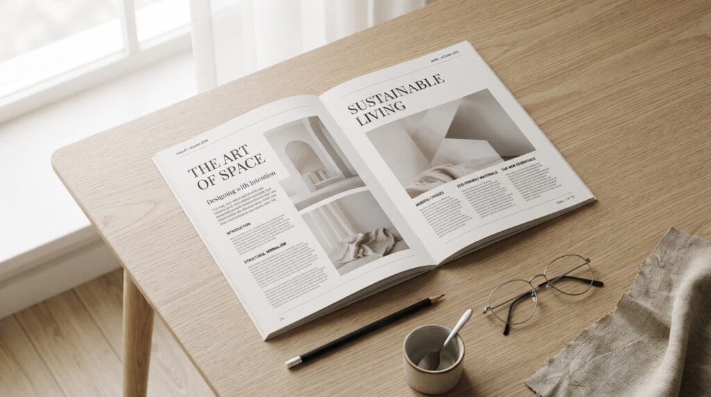
These minimalist graphic design ideas can help designers create visuals that feel clean, elegant, modern, and easy to understand. Minimalism is not simply about removing decoration. Strong minimalist design uses typography, spacing, color, imagery, and composition carefully so every element has a clear purpose.
A minimalist layout can still feel bold, expressive, and memorable. The key is deciding what deserves attention and removing anything that competes with the main message.
Whether you are working on branding, posters, packaging, editorial layouts, websites, or social media graphics, the following ideas can help you create more intentional visual work.
1. Use Generous White Space
White space is one of the most recognizable characteristics of minimalist design.
Allow enough room around:
- Headlines
- Images
- Logos
- Buttons
- Body text
- Decorative elements
Empty space gives important elements room to breathe.
It can also make a composition feel more premium and organized.
2. Build Minimalist Graphic Design Ideas Around One Focal Point
Choose one dominant element and let it lead the composition.
This might be:
- A large headline
- A photograph
- A logo
- A product
- A geometric shape
Everything else should support that focal point.
When several elements compete equally for attention, the design can quickly lose its minimalist character.
3. Use Oversized Typography
Large typography can replace decorative imagery.
Try using one short phrase as the main visual element.
A bold headline can create:
- Hierarchy
- Personality
- Movement
- Visual impact
Keep supporting information significantly smaller so the headline remains dominant.
4. Create a Monochrome Color Palette
A monochrome palette uses variations of one main color.
For example:
- Dark blue
- Medium blue
- Pale blue
- Off-white
This approach can create visual consistency without making the design feel completely flat.
Monochrome systems work particularly well for editorial graphics, branding, presentations, and posters.
5. Design With Black and White
Black-and-white layouts remain one of the simplest minimalist graphic design ideas.
Strong contrast can make typography and composition feel sophisticated.
Use black and white for:
- Posters
- Business cards
- Editorial pages
- Logos
- Packaging
You can introduce one accent color later if the design needs more emphasis.
6. Add One Accent Color
Instead of using several bright colors, choose one accent.
For example:
- Black, white, and orange
- Beige, cream, and green
- Gray, white, and red
Use the accent color for the most important information.
This could include a button, word, icon, label, or small graphic element.
7. Use a Strong Grid
Grids help minimalist layouts feel intentional.
A basic grid can control:
- Margins
- Columns
- Text placement
- Image size
- Alignment
Even expressive designs can benefit from invisible structure.
Minimalism often looks effortless because the underlying organization is strong.
8. Create Asymmetrical Layouts
Minimal design does not have to be centered.
Try placing a headline near one edge while balancing it with an image or smaller text block elsewhere.
Asymmetry can make simple compositions feel more dynamic.
The goal is balance rather than perfect symmetry.
9. Use Simple Geometric Shapes
Circles, rectangles, squares, and lines can create strong visual systems.
Use shapes for:
- Background blocks
- Frames
- Icons
- Dividers
- Patterns
Keep the geometry consistent so the composition feels intentional rather than decorative.
10. Experiment With Thin Lines
Thin lines can organize information without adding visual weight.
They work well as:
- Section dividers
- Image frames
- Decorative accents
- Navigation elements
This is particularly effective in editorial and luxury-inspired layouts.
11. Make Typography the Main Artwork
Some of the most effective minimalist graphic design ideas rely almost entirely on typography.
Instead of adding illustrations, explore:
- Scale
- Font weight
- Tracking
- Line breaks
- Alignment
- Repetition
A well-designed typographic composition can communicate more personality than several unrelated graphic elements.
12. Pair Only Two Fonts
Minimalist typography benefits from restraint.
Choose:
- One display font
- One body font
Or use one type family with multiple weights.
Too many typefaces can make a simple layout feel inconsistent.
Also Read: How to Use Brutalist Design in Modern Branding
13. Create High Contrast Between Text Sizes
Contrast between large and small type can create hierarchy without decoration.
For example:
A very large headline can sit beside tiny supporting information.
The contrast itself becomes part of the visual identity.
14. Use Lowercase Typography
Lowercase typography can create a softer, more contemporary feeling.
It often works well for:
- Creative studios
- Fashion brands
- Lifestyle businesses
- Modern editorial design
Combine lowercase type with generous spacing for an understated look.
15. Use One Strong Photograph
Instead of creating a collage, use one carefully selected image.
Choose photography with:
- Strong composition
- Clear subject
- Simple background
- Natural negative space
Allow the photograph to carry most of the visual storytelling.
16. Crop Images Dramatically
Minimalist design can still feel experimental.
Try cropping a portrait, product, or object so only part of it is visible.
A dramatic crop can create curiosity without adding extra elements.
This technique works especially well for fashion, beauty, editorial, and product design.
17. Use Photography With Negative Space
Look for images containing empty areas where typography can be placed naturally.
Examples include:
- Open sky
- Blank walls
- Simple tabletops
- Minimal studio backgrounds
This can help photography and typography feel integrated rather than layered randomly.
18. Create Minimalist Graphic Design Ideas With Icons
A small icon system can communicate information quickly.
Keep icons consistent in:
- Stroke width
- Size
- Corner style
- Detail level
Simple icons work well for websites, infographics, menus, presentations, and packaging.
19. Simplify Logo Applications
Minimal branding can become more effective when the logo has space around it.
Avoid surrounding the logo with unnecessary textures, patterns, slogans, and decorative graphics.
Instead, let the mark become the focal point.
Simple logo applications can feel more confident.
20. Design Minimal Business Cards
A business card does not need to contain every possible detail.
Consider including only:
- Name
- Role
- Website
- Logo
Use the reverse side for a logo or simple brand element.
Minimal information can improve readability and visual impact.
21. Create Simple Packaging Design
Packaging is a strong area for minimalist graphic design ideas.
Try using:
- One dominant color
- Small logo placement
- Simple typography
- Limited product information
- Clean label architecture
The challenge is maintaining clarity while still meeting practical and regulatory requirements.
Minimal packaging often feels premium because it avoids visual clutter.
22. Use Minimal Labels
For jars, bottles, boxes, or pouches, create labels with clear hierarchy.
Organize information into:
- Brand
- Product name
- Product variation
- Essential details
Do not give every piece of information the same visual weight.
23. Design Clean Posters
Minimalist posters can create strong impact with very few elements.
Try combining:
- One headline
- One photograph or shape
- Event details
- Plenty of empty space
A simple poster can stand out precisely because it avoids the visual noise common in promotional design.
24. Create Minimal Social Media Graphics
Social media graphics often become overcrowded.
Instead, use:
- One message
- One visual
- One branding element
Avoid trying to place an entire article inside one image.
The graphic should communicate a clear idea quickly.
Also Read: Best Art Deco Graphic Design Ideas for Luxury Brands
25. Use Editorial-Style Layouts
Editorial design provides excellent inspiration for minimalist work.
Experiment with:
- Narrow columns
- Large margins
- Small captions
- Large headlines
- Simple image placement
Editorial layouts can feel sophisticated without relying on decorative effects.
26. Try Minimalist Product Advertising
A product advertisement can use the product itself as the focal point.
Place the object against a simple background.
Then add only:
- Product name
- Short message
- Call to action
- Logo
This works particularly well for fashion, technology, cosmetics, and premium products.
27. Use Repetition Instead of Decoration
Repetition can create visual rhythm while maintaining simplicity.
Repeat:
- One shape
- One letter
- One line
- One small icon
- One photograph
Change scale or position slightly to create variation.
This is one of the more experimental minimalist graphic design ideas because it adds interest without adding many different elements.
28. Create Simple Data Visualizations
Charts and infographics can also benefit from minimalism.
Remove unnecessary:
- Borders
- Background effects
- Shadows
- Decorative icons
- Excessive labels
Highlight the most important number or comparison.
The goal is to help viewers understand the information quickly.
29. Use Natural Neutral Colors
Neutral palettes work well for understated visual identities.
Possible combinations include:
- Cream and charcoal
- Beige and brown
- Sage and off-white
- Warm gray and black
These palettes are particularly useful for:
- Interior brands
- Wellness businesses
- Fashion
- Beauty
- Lifestyle projects
Add contrast carefully so important text remains readable.
30. Remove One More Element
One of the simplest minimalist graphic design ideas is to review your finished design and ask:
What can I remove without weakening the message?
Try removing:
- An unnecessary icon
- A secondary color
- A decorative line
- Extra copy
- A redundant image
- An additional font
If the design becomes clearer, the removed element probably was not necessary.
Minimalism often improves through editing rather than adding.
How to Create Better Minimalist Graphic Design Ideas
Minimal design looks simple, but creating it well requires careful decision-making.
A composition with only a few elements makes every choice more visible.
Spacing, typography, alignment, and image quality become especially important.
Start With the Message
Before designing anything, identify the main communication goal.
Ask:
- What should viewers notice first?
- What should they understand?
- What action should they take?
Once the answer is clear, build the design around that purpose.
Limit Your Visual Ingredients
Set simple restrictions.
For example:
- Two fonts
- Three colors
- One photograph
- One geometric element
Constraints can make decision-making easier and create stronger visual consistency.
Create Clear Hierarchy
Minimalist design should never mean that all elements look the same.
Use scale, contrast, spacing, and position to distinguish important information from supporting content.
Minimalist Graphic Design Ideas for Branding
Minimalism can be especially effective in visual identity design.
A simple branding system may include:
- Clear logo
- Limited color palette
- Consistent typography
- Simple icon system
- Strong photography direction
- Flexible layout grid
However, minimal branding should still feel distinctive.
Removing everything until a brand looks generic is not the goal.
The strongest minimalist graphic design ideas combine simplicity with recognizable personality.
Minimalist Graphic Design Ideas for Digital Projects
Websites and digital interfaces benefit from clear visual hierarchy.
Minimal digital design may use:
- Large headings
- Short paragraphs
- Simple navigation
- Clear buttons
- Consistent spacing
- Limited colors
Avoid adding visual effects simply because the software makes them available.
Every animation, shadow, gradient, and decorative element should serve a purpose.
Common Minimalist Graphic Design Mistakes
Minimalism can become ineffective when designers misunderstand simplicity.
Using Too Little Contrast
Subtle design should still be readable.
Very light text on pale backgrounds may appear elegant but can reduce usability.
Making Everything Too Small
Minimalism does not mean tiny typography.
Large text and dramatic scale can strengthen simple compositions.
Removing Too Much Information
A design must still communicate clearly.
Do not remove essential details simply to make the layout look cleaner.
Making the Design Generic
Minimalism should still have personality.
Typography, composition, imagery, and color can create distinction without visual clutter.
Using Random Empty Space
White space should feel intentional.
Poorly positioned elements surrounded by empty areas do not automatically create good minimal design.
Minimalist Graphic Design Checklist
Before finishing your project, ask:
- Is the main message clear?
- Is there one obvious focal point?
- Does every element have a purpose?
- Is the typography readable?
- Am I using too many fonts?
- Is the color palette controlled?
- Is there enough contrast?
- Does the spacing feel consistent?
- Are elements aligned intentionally?
- Is the imagery necessary?
- Can anything be removed?
- Does the design still feel distinctive?
- Does it suit the target audience?
- Does it work at the intended size?
This checklist can help turn simple layouts into more thoughtful compositions.
Also Read: How to Create a Maximalist Graphic Design Style
Final Thoughts on Minimalist Graphic Design Ideas
The best minimalist graphic design ideas are not about making every design empty, white, or neutral.
Minimalism is about intention.
Every font, color, shape, image, and space should contribute to the message.
You can create minimalist work using bold typography, dramatic photography, asymmetrical grids, bright accent colors, geometric forms, or expressive compositions. What matters is that the design remains focused and controlled.
Start by identifying the most important element. Give it enough space, build a clear hierarchy around it, and remove anything that does not strengthen the communication.
As you practice these minimalist graphic design ideas, pay particular attention to typography, spacing, alignment, contrast, and composition. Those fundamentals become even more important when fewer visual elements are present.
Simple design does not mean effortless design.
When done well, minimalism can make posters feel stronger, branding more recognizable, packaging more premium, and digital experiences easier to understand.
The goal is not to add less simply for the sake of adding less.
The goal is to use exactly what the design needs and nothing that distracts from it.
For high-quality fonts to boost your income, check out Letter Crafted. Our professional fonts are perfect for branding, marketing, and content creation. So, don’t miss this opportunity.