
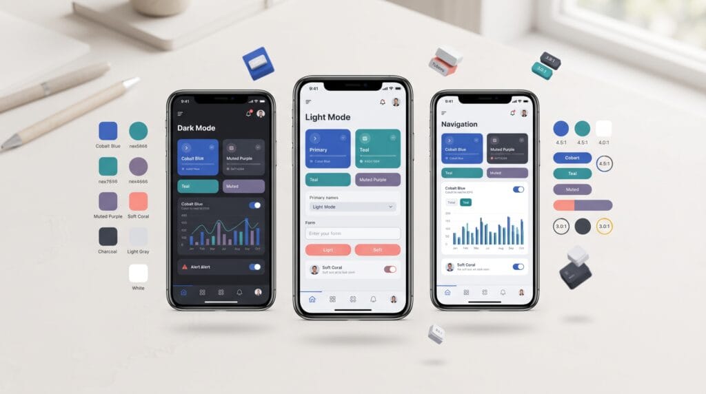
A mobile UI color palette does much more than make an app look attractive. Color helps users understand hierarchy, recognize interactive elements, identify system states, read content comfortably, and move through an interface with less confusion. When colors are selected only for visual appeal, even a beautiful app can become difficult to use.
Mobile interfaces have limited screen space, which makes every design decision more important.
Users need to quickly understand:
- What they can tap
- Which information matters most
- Whether an action succeeded
- Whether something went wrong
- Which content is selected
- Where one section ends and another begins
A well-planned mobile UI color palette supports all of these tasks while creating a consistent visual identity.
The following tips explain how UI designers can build a practical color system for clearer, more usable mobile experiences.
Start a Mobile UI Color Palette With Neutral Colors
Many designers begin by choosing a bright brand color.
However, neutral colors often form the largest part of an interface.
Neutral colors may be used for:
- Backgrounds
- Cards
- Dividers
- Borders
- Secondary text
- Disabled controls
- Input fields
- Navigation surfaces
A useful neutral system could include several levels from very light to very dark.
For example:
White → Light gray → Medium gray → Dark gray → Near black
These shades make it easier to establish hierarchy without introducing unnecessary colors.
Avoid Pure Black Everywhere
Pure black can create very strong contrast on bright white backgrounds.
For some interfaces, a very dark charcoal may feel softer and more comfortable for long reading sessions.
For example:
Instead of using completely black text on every surface, consider using near-black for primary content and softer gray for secondary information.
The exact choice should still meet your accessibility requirements.
Build a Mobile UI Color Palette Around One Primary Color
The primary color represents the main visual identity of the application.
It may appear in:
- Primary buttons
- Active navigation
- Selected controls
- Links
- Important highlights
- Progress indicators
Choose a color that works across different screen sizes and backgrounds.
A bright color may look excellent in a brand guide but become difficult to read when used behind small white text.
Always test the primary color inside actual interface components.
Create Multiple Primary Color Shades
Do not rely on only one version of your main color.
Create a small scale.
For example:
- Primary light
- Primary
- Primary dark
Additional variations can support:
- Hover or pressed states
- Subtle backgrounds
- Selected areas
- Borders
- Dark mode
This gives the mobile UI color palette more flexibility without introducing unrelated colors.
Use Secondary Colors With Restraint
A secondary color can add personality and help differentiate specific elements.
However, it should not compete constantly with the primary color.
Secondary colors may work well for:
- Illustrations
- Charts
- Tags
- Decorative accents
- Secondary actions
If every section uses a different bright color, visual hierarchy becomes weaker.
Users should be able to identify the primary action quickly.
A limited palette generally creates a more coherent mobile experience.
Mobile UI Color Palette Tips for Text Readability
Text is one of the most important areas where color affects usability.
A typical interface may require colors for:
- Primary text
- Secondary text
- Placeholder text
- Disabled text
- Links
- Error messages
Avoid using very light gray for important information simply because it looks minimalist.
Low-contrast text can become difficult to read, especially:
- Outdoors
- On smaller displays
- At low screen brightness
- For users with reduced vision
Create Clear Text Hierarchy
Primary text should usually have the strongest contrast.
Secondary text can be slightly softer.
Supporting details can use another level, but they should remain readable.
For example:
- Primary text: dark charcoal
- Secondary text: medium-dark gray
- Disabled text: lighter gray
The differences should be visible without sacrificing usability.
Mobile UI Color Palette and Contrast
Contrast is the difference between foreground and background colors.
It is essential for:
- Text
- Icons
- Buttons
- Form controls
- Navigation
- Status messages
A fashionable color combination may still fail if the foreground and background are too similar.
Always test real combinations rather than evaluating colors individually.
For example, yellow may look vibrant in a palette but become difficult to use with white text.
Changing either the text color or yellow shade may solve the problem.
Do Not Communicate Meaning With Color Alone
Color can communicate status, but it should not be the only signal.
Imagine a form where:
- Green means correct
- Red means incorrect
Users with certain forms of color vision deficiency may have difficulty distinguishing those states.
Add another indicator.
For example:
Red + error icon + explanatory message
or:
Green + check icon + success message
This makes the interface more understandable for more users.
Mobile UI Color Palette for Buttons
Buttons are among the most important interactive elements in a mobile interface.
Your mobile UI color palette should clearly distinguish between different action levels.
Primary Buttons
Use the strongest action color for the most important action.
Examples:
- Continue
- Save
- Buy
- Submit
- Create account
Secondary Buttons
Secondary actions should remain visible without competing with the primary button.
They might use:
- Outline styles
- Neutral backgrounds
- Softer accent colors
Destructive Buttons
Destructive actions such as Delete or Remove may use a semantic warning color.
However, color should be combined with clear wording.
Users should never need to guess what a destructive action does.
Also Read: UI Design Inspiration for Beautiful and Functional Layouts
Create Colors for Interaction States
Mobile components can have several states.
For example, a button may be:
- Default
- Pressed
- Selected
- Disabled
- Loading
A form field may be:
- Empty
- Active
- Completed
- Error
- Disabled
The mobile UI color palette should define these states consistently.
Do not create a new random shade each time you design another screen.
A systematic approach helps users learn how the interface behaves.
Use Semantic Colors Consistently
Semantic colors communicate meaning rather than branding.
Common examples include:
- Green: Success
- Red: Error or destructive action
- Yellow or orange: Warning
- Blue: Information
These meanings should remain consistent across the application.
If red represents errors on one screen, avoid using the same red as a decorative accent somewhere else.
Consistency reduces cognitive effort.
Users gradually learn what each color means.
Mobile UI Color Palette for Form Design
Forms contain many components that need clear color states.
These may include:
- Labels
- Inputs
- Borders
- Placeholder text
- Error messages
- Success indicators
- Disabled fields
When users select an input, provide a visible focus state.
For example, the border could change from neutral gray to the primary color.
If there is an error, the interface might show:
- Error-colored border
- Error icon
- Short message
This combination communicates the problem more clearly than color alone.
Use Color to Strengthen Visual Hierarchy
Color can help users understand which elements deserve attention.
Imagine a screen containing:
- Large headline
- Body content
- Primary button
- Secondary button
- Navigation
- Supporting information
If every element uses the same strong blue, hierarchy disappears.
Instead, reserve saturated colors for important interactions.
Use neutrals for most background and supporting content.
This creates a stronger focal point.
Keep Background Colors Simple
Background colors cover large areas of the mobile screen.
Therefore, they strongly influence the visual experience.
A simple system may include:
- Main background
- Elevated surface
- Card background
- Selected surface
- Overlay background
Using too many background shades can fragment the interface.
Subtle differences are often enough to separate sections.
For example, a very light gray background can contain white cards without requiring heavy borders.
Mobile UI Color Palette for Navigation
Navigation elements need clear active and inactive states.
A bottom navigation bar might use:
- Active icon: Primary color
- Inactive icon: Neutral gray
The active state should be easy to identify.
The same principle applies to:
- Tabs
- Segmented controls
- Menus
- Pagination
- Filters
Do not rely on extremely subtle differences.
Users should immediately know where they are.
Design a Mobile UI Color Palette for Dark Mode
Dark mode should not simply invert every color.
Colors behave differently against dark backgrounds.
Highly saturated colors can feel much brighter in dark environments.
A dark-mode system should define:
- Background
- Elevated surfaces
- Primary text
- Secondary text
- Borders
- Primary color
- Semantic colors
Avoid Pure Black for Every Surface
Using slightly different dark values can help create depth.
For example:
- Main background: near black
- Cards: slightly lighter charcoal
- Elevated components: another subtle dark level
This can establish hierarchy without relying entirely on borders and shadows.
Also Read: UX Writing Guide for Better User Engagement and Clarity
Test Brand Colors in Real UI Components
Brand guidelines often provide several colors.
Not all of them automatically work well in interface design.
A bright brand color may work perfectly in:
- Advertising
- Packaging
- Logos
but poorly as:
- Small text
- Button background
- Form border
- Navigation indicator
Test colors inside actual UI components.
Adjust the digital palette when necessary while preserving the overall brand identity.
Build Color Tokens for Better Consistency
Instead of naming colors according to appearance alone, use functional design tokens.
For example. Instead of:
Blue 500
you may also define:
Color Primary
Instead of:
Red 600
define:
Color Error
Other useful tokens might include:
- Background Primary
- Background Secondary
- Text Primary
- Text Secondary
- Border Default
- Action Primary
- Action Disabled
- Status Success
- Status Warning
- Status Error
Tokens make the mobile UI color palette easier to maintain when the product grows.
Keep Your Mobile UI Color Palette Scalable
A small application may begin with only a few screens.
Over time, it may gain:
- New features
- New components
- New interaction states
- New charts
- New themes
A scalable color system avoids creating random colors for every new requirement.
Before adding another color, ask:
Can an existing color already communicate this purpose?
If yes, reuse it.
Consistency is usually more valuable than unnecessary variety.
Test Color With Real Content
Placeholder designs can hide usability problems.
Test your palette using realistic:
- Headlines
- Paragraphs
- Product descriptions
- Prices
- Alerts
- Buttons
- Forms
- Notifications
Also test long content.
A color combination that looks attractive in one small card may become tiring when repeated across an entire app.
Real content gives you a better understanding of how the system performs.
Test the Mobile UI Color Palette Across Screens
Do not evaluate colors on only one screen.
Test the mobile UI color palette across:
- Home screens
- Product pages
- Settings
- Forms
- Modals
- Search
- Checkout
- Notifications
- Error states
You should also test on physical devices when possible.
Screens can differ in:
- Brightness
- Color reproduction
- Size
- Viewing conditions
A palette should remain functional across different contexts.
Common Mobile UI Color Palette Mistakes
Using Too Many Colors
Too many colors weaken consistency and hierarchy.
Choosing Colors Only for Style
Color should support usability as well as aesthetics.
Using Low-Contrast Text
Minimalism should never make essential information difficult to read.
Making Every Button Bright
Reserve the strongest emphasis for primary actions.
Ignoring Interaction States
Buttons and inputs need clear state changes.
Using Color as the Only Signal
Combine color with icons, labels, or other indicators.
Designing Dark Mode by Inverting Colors
Create a dedicated dark color system instead.
Adding Random Shades
Use predefined tokens and scales.
Mobile UI Color Palette Checklist
Before finalizing your app colors, review:
- Primary brand color
- Primary color variations
- Secondary color
- Neutral scale
- Main background
- Elevated surfaces
- Primary text
- Secondary text
- Disabled text
- Border colors
- Primary buttons
- Secondary buttons
- Disabled buttons
- Success color
- Warning color
- Error color
- Information color
- Form states
- Navigation states
- Light mode
- Dark mode
- Contrast
- Accessibility
- Color tokens
- Device testing
A consistent checklist helps prevent missing important UI states.
Also Read: UI UX Consistency for More Professional Interfaces
Final Thoughts
A mobile UI color palette should make an interface easier to understand, not simply more colorful.
Begin with strong neutral colors.
Choose one clear primary color and build useful variations around it.
Create readable text levels.
Use contrast to separate important information.
Reserve strong colors for meaningful actions.
Define semantic colors for success, warnings, errors, and information.
Most importantly, design color as a system.
Do not choose every shade independently.
Think about how colors behave across:
- Navigation
- Buttons
- Forms
- Cards
- Alerts
- Backgrounds
- Light mode
- Dark mode
A strong mobile UI color palette creates consistency across the entire product while helping users recognize actions and understand information more quickly.
Good mobile UI color design often feels effortless because users rarely need to think about why an element looks important or what a status means.
The design communicates those relationships naturally.
By building a thoughtful mobile UI color palette around readability, contrast, accessibility, hierarchy, and consistency, UI designers can create mobile interfaces that feel more polished while also being easier and more comfortable to use.
For high-quality fonts to boost your income, check out Letter Crafted. Our professional fonts are perfect for branding, marketing, and content creation. So, don’t miss this opportunity.