
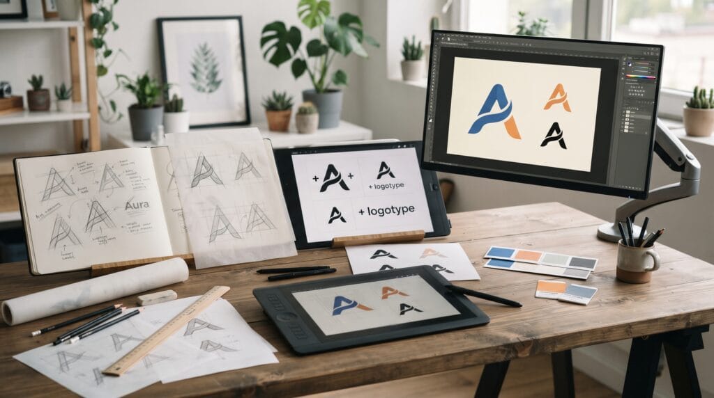
The logo design process gives beginners a clear framework for turning a rough idea into a professional visual identity. Strong logos rarely appear from opening design software and immediately drawing shapes. They usually develop through research, sketching, experimentation, evaluation, and refinement. Following a structured process can help new designers make better decisions and avoid relying only on inspiration.
A good logo needs to work in many situations.
It may appear on:
- Websites
- Packaging
- Business cards
- Social media
- Signage
- Products
- Advertising
Because of this, logo design is not simply about creating an attractive symbol.
The logo should represent the brand clearly while remaining practical, recognizable, and flexible.
Understanding the logo design process can help beginners create work with stronger reasoning behind every design decision.
Start the Logo Design Process by Understanding the Brand
Before sketching anything, understand what the business represents.
A logo should reflect the identity of the brand rather than the personal preferences of the designer.
Start by asking questions such as:
- What does the company do?
- Who is the target audience?
- What makes the business different?
- What personality should the brand communicate?
- Where will the logo be used?
- Who are the main competitors?
Try summarizing the brand in several words.
For example: Modern, Reliable, Approachable, Simple or Premium, Elegant, Traditional, Exclusive.
These words can become creative filters later.
If a concept looks interesting but does not match the brand personality, it may not be the right solution.
Research Before Creating Logo Concepts
Research is an important part of the logo design process because it helps designers understand the visual environment surrounding the brand.
Look at competitors and identify common patterns.
You might notice similar:
- Colors
- Symbols
- Typefaces
- Shapes
- Layouts
The purpose is not to copy competitors.
Instead, research helps you understand what already exists and where opportunities for differentiation may appear.
For example, if every competitor uses blue and a similar circular icon, repeating the same approach may make the new brand harder to distinguish.
Research can also reveal visual expectations within an industry.
A financial company and a children’s toy brand usually require very different visual approaches.
Create a Simple Creative Direction
After research, define the direction before designing.
You might create a short design statement such as:
Create a simple geometric logo that feels modern, trustworthy, and easy to recognize at small sizes.
This gives the project a clear target.
You can also build a small moodboard containing:
- Colors
- Typography
- Photography
- Shapes
- Textures
- Visual references
A moodboard should guide the overall feeling rather than become a collection of logos to copy.
Keep it focused.
Too many unrelated references can make the creative direction less clear.
Sketch Ideas During the Logo Design Process
Sketching allows you to explore ideas quickly without worrying about perfect curves or polished details.
Use:
- Pencil and paper
- Tablet
- Simple digital drawing tools
Focus on quantity first.
Try:
- Symbols
- Initials
- Monograms
- Abstract shapes
- Letter combinations
- Negative space
- Geometric forms
Do not spend twenty minutes perfecting your first idea.
Create many small sketches instead.
A useful early logo design process encourages exploration before commitment.
Your first concept may be predictable.
The tenth may be better.
The twentieth may reveal an unexpected direction.
Explore Different Logo Categories
Understanding basic logo categories can make concept development easier.
Wordmark
A wordmark uses the brand name as the primary visual element.
This approach relies heavily on typography.
It can work well for brands with distinctive names.
Lettermark
A lettermark uses initials or abbreviated letters.
This is useful when the full business name is long.
Symbol or Icon
A symbol represents the brand through a visual mark.
The symbol may be:
- Literal
- Abstract
- Geometric
- Conceptual
Combination Mark
A combination mark includes both a symbol and typography.
This approach provides flexibility because the elements may eventually be used together or separately.
Testing several categories during the logo design process can prevent the project from becoming locked into one idea too early.
Choose the Strongest Logo Concepts
After sketching, review the concepts instead of choosing based only on personal preference.
Ask:
- Does it match the brand?
- Is the idea clear?
- Is it distinctive?
- Can it work at small sizes?
- Is it too complicated?
- Does it resemble competitors?
- Can the concept work without color?
Choose a small number of promising directions.
Three strong concepts are usually more useful than twenty unfinished ones.
Avoid selecting multiple concepts that look almost identical.
Each direction should explore a genuinely different solution.
Also Read: Logo Color Palette How to Choose 3 Brand Colors
Build the Logo as Vector Artwork
Once a concept has been selected, recreate it using vector software.
Vector graphics are important because they can scale without losing quality.
A professional logo may need to appear on:
- Small app icons
- Business cards
- Websites
- Vehicle graphics
- Large signs
Build the shapes cleanly.
Pay attention to:
- Curves
- Corners
- Alignment
- Symmetry
- Proportions
- Negative space
Avoid adding unnecessary anchor points.
Cleaner vector construction generally makes the artwork easier to edit and refine.
Use Geometry Carefully in the Logo Design Process
Geometric construction can improve consistency, but not every logo needs to be created from perfect mathematical shapes.
Circles, squares, and grids can help establish:
- Proportion
- Alignment
- Repetition
- Balance
However, visual balance is sometimes more important than mathematical perfection.
Two objects can have identical dimensions but still appear visually unequal.
Designers often make small optical corrections so the result feels balanced to the eye.
Use geometry as a tool, not as a limitation.
Test the Logo in Black and White
Before developing a complex color palette, test the logo using only black and white.
This helps reveal whether the design depends too heavily on color.
A strong mark should usually remain recognizable without gradients or decorative effects.
Black-and-white testing can expose:
- Weak shapes
- Confusing overlaps
- Small details
- Poor negative space
- Inconsistent proportions
This is one of the simplest checks in the logo design process, but it can improve the final result significantly.
Choose Typography That Supports the Logo
Typography can determine how professional a logo feels.
Consider whether the brand needs a typeface that feels:
- Modern
- Elegant
- Friendly
- Technical
- Traditional
- Bold
The typography should complement the symbol rather than compete with it.
Pay attention to:
- Weight
- Letter spacing
- Width
- Height
- Character shapes
Sometimes a standard typeface provides the right foundation.
However, small customizations can make the wordmark more distinctive.
You might adjust:
- Individual letter spacing
- Terminals
- Crossbars
- Curves
- Letter connections
Do not modify letters without a reason.
Every adjustment should improve recognition, balance, or personality.
Add Color After the Structure Works
Color should strengthen the logo rather than rescue a weak concept.
Once the black-and-white version works, explore color.
Choose a palette that supports the desired brand personality.
For example:
- Blue: Trust, professionalism, technology
- Green: Nature, health, growth
- Orange: Energy, friendliness, creativity
- Black: Sophistication, strength, premium positioning
These associations are not universal rules.
Context matters.
Testing several controlled palettes can help reveal which direction suits the brand best.
Keep the Logo Design Process Focused on Simplicity
Beginners sometimes try to communicate every part of the business inside one logo.
For example, a coffee shop logo might include:
- Coffee cup
- Coffee beans
- Steam
- Building
- Spoon
- Decorative border
The result can become difficult to recognize.
A logo does not need to explain the entire company.
It needs to provide a memorable visual identifier.
Remove anything that does not strengthen the core concept.
Simple logos are usually easier to reproduce and recognize.
Also Read: Minimal Logo Design Techniques for Professional Results
Test Logo Scalability
A logo that looks excellent at 1000 pixels wide may fail at 24 pixels.
Reduce the logo to small sizes.
Check whether:
- Thin lines disappear
- Small gaps close
- Tiny details become unclear
- Letters remain readable
Then test the opposite.
Enlarge the logo and inspect the geometry.
A flexible logo design process should consider both small and large applications.
Test the Logo in Realistic Applications
Mockups can help evaluate how the identity behaves in context.
Test the logo on examples such as:
- Website header
- Business card
- Packaging
- Signage
- Social media avatar
However, do not let attractive mockups hide weaknesses.
A dramatic embossed logo on luxury packaging can make almost any concept look impressive.
Always return to the flat logo itself.
If the design only feels strong when shown with special lighting or expensive mockups, it may need further refinement.
Refine the Logo With Constructive Feedback
Feedback can reveal problems that the designer has stopped noticing.
Ask for specific observations instead of:
Do you like it?
Better questions include:
- Which concept feels most appropriate for the brand?
- Which symbol is easiest to recognize?
- Is anything difficult to understand?
- Does the typography match the intended personality?
Not every suggestion needs to be followed.
Good designers evaluate feedback against the original project goals.
The logo design process becomes stronger when revisions solve real communication problems rather than simply following random preferences.
Prepare Useful Logo Variations
A professional identity usually needs more than one file.
Useful versions may include:
- Primary logo
- Horizontal logo
- Stacked logo
- Symbol
- Wordmark
- Black version
- White version
- Color version
These variations help the identity work across different formats.
For example, the full logo may work on a website header while the symbol works better for a profile image.
Prepare Professional Logo Files
Final delivery should include appropriate formats for different uses.
Common formats may include:
- SVG: Scalable digital graphics
- PDF: Print and vector sharing
- PNG: Transparent digital use
- JPG: Simple image use when transparency is unnecessary
Depending on the project, designers may also provide editable source files.
Organize files clearly.
Instead of:
logo-final-new2-revised.png
use something structured, such as:
Brand-Primary-Logo-Color.png
Clear delivery makes the project feel more professional.
Common Logo Design Process Mistakes
Starting in Software Too Early
Sketch and explore before polishing.
Copying Competitors
Research should create understanding, not imitation.
Using Too Many Details
Complexity reduces flexibility.
Choosing Fonts Only Because They Look Stylish
Typography should match the brand.
Relying on Color
The core mark should work without color.
Ignoring Small Sizes
Test scalability early.
Presenting Too Many Concepts
Show the strongest directions.
Following Every Trend
Trends change faster than brand identities.
Logo Design Process Checklist
Before finalizing the project, review:
- Clear understanding of the brand
- Competitor research
- Defined creative direction
- Multiple sketches
- Distinct concepts
- Clean vector construction
- Strong black-and-white version
- Appropriate typography
- Controlled color palette
- Balanced spacing
- Recognizable silhouette
- Small-size testing
- Real-world application testing
- Useful logo variations
- Organized final files
If several areas feel weak, continue refining before delivery.
Also Read: Creative Bakery Logo Design Ideas That Look Professional
Final Thoughts
The logo design process is not about discovering a perfect symbol immediately.
It is a sequence of decisions.
- Understand the brand.
- Research the market.
- Develop a clear direction.
- Sketch many possibilities.
- Choose the strongest concepts.
- Build them carefully.
- Test typography and color.
- Evaluate scalability.
- Refine the details.
- Then prepare professional final assets.
Beginners often improve faster when they focus less on creating impressive effects and more on building a repeatable process.
A structured logo design process gives each decision a purpose and makes it easier to explain why a particular solution works.
With practice, research becomes faster, sketches become more focused, vector construction becomes cleaner, and visual judgment becomes stronger.
The result is not only a better logo.
It is a more reliable way of approaching every future identity project.
By following a thoughtful logo design process, beginners can move from random experimentation toward clearer concepts, stronger visual decisions, and more professional results.
For high-quality fonts to boost your income, check out Letter Crafted. Our professional fonts are perfect for branding, marketing, and content creation. So, don’t miss this opportunity.