
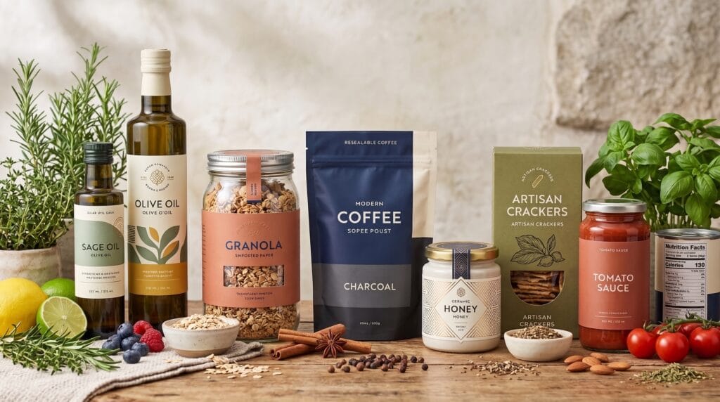
Modern food label design helps customers understand a product, recognize its brand, and make purchasing decisions within seconds. A successful label must communicate essential information clearly while creating enough visual interest to stand out on a crowded shelf. It should also work naturally with the container, packaging material, product category, and target audience.
Food labels have many responsibilities. They may need to display the product name, flavor, ingredients, nutrition information, net weight, preparation instructions, certifications, storage guidance, and brand story. Organizing these details without creating visual clutter requires careful typography, hierarchy, color, spacing, and structural planning.
The best modern food label design does more than decorate a package. It improves usability, reinforces brand positioning, and creates a consistent experience across different products. Whether you are designing labels for snacks, beverages, sauces, bakery products, coffee, or organic foods, the following ideas can help you build packaging that feels professional and memorable.
Why Modern Food Label Design Matters
Customers often see the label before they experience the product. The design creates expectations about taste, quality, price, ingredients, and brand personality.
A well-designed label can help a food business:
- Attract attention on shelves
- Communicate product benefits quickly
- Build trust with customers
- Differentiate flavors or varieties
- Support premium positioning
- Improve product recognition
- Create consistency across a product range
- Make essential information easier to find
Strong modern food label design balances marketing with functionality. A beautiful front panel may attract attention, but customers also need to find practical information without difficulty.
Designers should therefore consider the complete package rather than treating the label as an isolated graphic.
Start With the Product and Target Customer
Before choosing fonts, colors, or illustrations, define the product’s audience and market position.
Ask:
- Who is most likely to purchase the product?
- Is it affordable, premium, healthy, playful, or traditional?
- Where will it be sold?
- Which competing products will appear nearby?
- What information matters most to customers?
- Does the product have several flavors or sizes?
- What packaging material will be used?
- How much printable space is available?
A label for an artisan sauce should communicate differently from a label for a children’s snack. A premium chocolate brand may use restrained typography and rich materials, while an energetic beverage may require brighter colors and bolder visual elements.
Understanding the audience gives every modern food label design decision a clear purpose.
1. Minimalist Modern Food Label Design
Minimalist labels reduce visual clutter and focus attention on the most important information. They often use generous white space, limited colors, simple typography, and restrained graphics.
This style works well for:
- Organic foods
- Premium beverages
- Specialty coffee
- Natural snacks
- Health products
- Artisan ingredients
- Modern bakery items
Minimalism does not mean removing necessary information. Instead, it organizes content so customers can find what they need quickly.
Create Interest Without Overcrowding
A minimalist label can feel distinctive through:
- Custom typography
- Unusual spacing
- One bold color
- A small illustration
- Textured materials
- Embossing
- A unique label shape
The goal is to create clarity and personality without filling every available space.
2. Bold Typography for Better Shelf Visibility
Typography is often the most visible element of food packaging. A strong product name can remain recognizable from a distance and help customers identify the brand quickly.
Bold typographic modern food label design may use:
- Oversized product names
- Heavy sans serif fonts
- Expressive custom lettering
- Condensed display type
- Contrasting font weights
- Large flavor descriptions
- Vertical text arrangements
The main typeface should reflect the personality of the product. Rounded letters can feel friendly, while elegant serif typography may suggest craftsmanship or premium quality.
Avoid using decorative fonts for long descriptions, ingredients, or instructions. These areas require clear, readable type.
3. Color-Coded Food Label Systems
Color coding helps customers distinguish flavors, ingredients, product types, or dietary variations.
For example, one snack brand may use:
- Red for strawberry
- Yellow for lemon
- Green for apple
- Purple for grape
- Orange for mango
The logo, typography, and layout remain consistent while the primary color changes across each product.
This approach makes modern food label design more scalable. It allows new flavors to be introduced without redesigning the entire identity.
Keep the Brand Recognizable
Color should support the system rather than become the only method of identification. Some customers may have difficulty distinguishing certain colors, and products may also appear differently under store lighting.
Include clear flavor names, illustrations, or patterns so every variation remains easy to recognize.
4. Illustration-Based Food Labels
Custom illustration can make packaging feel original, friendly, and full of personality.
Illustrations may feature:
- Ingredients
- Recipes
- Landscapes
- Characters
- Farming scenes
- Abstract shapes
- Product origins
- Preparation methods
Illustrated modern food label design works particularly well for snacks, beverages, sauces, tea, coffee, bakery products, and children’s food.
The illustration style should match the brand. Loose hand-drawn artwork can communicate craftsmanship, while geometric illustration may feel modern and controlled.
Avoid adding too many visual elements. The product name and essential information should remain easy to find.
5. Ingredient-Focused Label Design
Food customers often want to understand what a product contains. Ingredient-focused labels make the main components part of the visual identity.
This can be achieved through:
- Ingredient photography
- Botanical drawings
- Simple icons
- Transparent packaging windows
- Large ingredient names
- Natural color palettes
- Short product descriptions
A tomato sauce label might feature a bold tomato illustration, while a granola package could highlight oats, nuts, and dried fruit.
Ingredient-focused modern food label design can communicate freshness and transparency. However, visual claims should accurately represent the product.
Also Read: Food Packaging Design for Brands That Want Better Results
6. Transparent and Honest Label Communication
Modern customers often examine ingredients, nutritional details, sourcing information, and dietary claims before purchasing.
Good labels should make important information accessible rather than hiding it inside extremely small text.
Consider highlighting:
- Main ingredients
- Allergen information
- Serving size
- Preparation instructions
- Storage requirements
- Origin
- Certifications
- Dietary suitability
Clear communication strengthens trust. It also helps the package feel more useful and customer-focused.
Avoid exaggerated phrases that are difficult to verify. Specific information is usually more convincing than broad marketing claims.
7. Sustainable Modern Food Label Design
Sustainable label design considers material use, adhesives, printing methods, inks, and disposal.
Possible approaches include:
- Recycled paper labels
- Reduced label sizes
- Wash-off adhesives
- Direct printing
- Limited ink coverage
- Removable sleeves
- Mono-material packaging systems
- Clear recycling instructions
Sustainable modern food label design should fit the overall packaging strategy. A recycled label provides limited benefit when attached to packaging that customers cannot easily separate or recycle.
Designers should communicate disposal instructions clearly and avoid unsupported environmental claims.
8. Vintage-Inspired Food Labels With Modern Structure
Vintage labels can create nostalgia, heritage, and a sense of craftsmanship. This style is popular for sauces, preserves, coffee, baked goods, confectionery, and traditional recipes.
Vintage-inspired elements may include:
- Decorative borders
- Badge layouts
- Serif typography
- Hand-lettered scripts
- Engraving-style illustrations
- Muted colors
- Stamp effects
- Heritage dates
To keep the result contemporary, simplify the layout and improve spacing. Traditional visual references should not make important information difficult to read.
A balanced modern food label design can combine nostalgic personality with present-day usability.
9. Premium Food Label Concepts
Premium labels often use controlled visual elements rather than excessive decoration.
Common features include:
- Elegant typography
- Dark or neutral color palettes
- Metallic foil
- Embossed details
- Uncoated paper
- Minimal illustrations
- Precise spacing
- High-quality printing
Premium packaging should still explain the product clearly. A visually sophisticated label can become confusing when the flavor or product type is hidden behind decorative language.
The strongest premium modern food label design combines restraint with one distinctive feature, such as custom typography, an unusual paper texture, or a recognizable symbol.
10. Playful Food Label Design
Playful labels can make products feel approachable and energetic. They are especially effective for snacks, candy, beverages, family products, and casual food brands.
Playful design may use:
- Bright colors
- Mascot characters
- Hand-drawn typography
- Unexpected patterns
- Humorous messages
- Illustrated ingredients
- Expressive shapes
- Creative flavor names
A playful package still needs a clear hierarchy. The customer should immediately understand what the product is and which flavor they are viewing.
Effective modern food label design creates excitement without sacrificing readability.
11. Photography-Led Food Labels
High-quality food photography can communicate taste, texture, freshness, and serving suggestions.
Photography-led labels are commonly used for:
- Frozen foods
- Ready meals
- Snacks
- Sauces
- Desserts
- Beverages
- Bakery products
The image should accurately represent the product. Styling that looks unrealistic may disappoint customers when they open the package.
Ensure that text remains readable when placed over photography. Use clear contrast, controlled backgrounds, or dedicated text areas rather than placing important details over busy images.
12. Custom Label Shapes and Structures
A label does not always need to be rectangular. Custom shapes can help packaging feel unique and improve recognition.
Possible formats include:
- Circular seals
- Arched labels
- Wraparound bands
- Die-cut ingredient shapes
- Hanging tags
- Neck labels
- Split front-and-back labels
- Transparent label sections
Custom-shaped modern food label design should work with the structure of the package. Consider curved surfaces, seams, lids, openings, and areas customers hold frequently.
Prototype the label on the actual container before approving production.
Also Read: 31 Creative Cookie Packaging Ideas for Personal & Commercial
Build a Strong Visual Hierarchy
Food labels contain many layers of information. Visual hierarchy helps customers process them in the right order.
A typical hierarchy may be:
- Brand name
- Product name
- Flavor or variety
- Main product benefit
- Net weight
- Supporting description
- Ingredients and nutritional details
- Instructions and manufacturer information
Use differences in size, weight, color, and spacing to separate these levels.
The most important information should not compete with minor details. Strong hierarchy is one of the foundations of professional modern food label design.
Choose Readable Typography
Small label areas can create typography challenges. Text may need to wrap around containers or fit into narrow panels.
To improve readability:
- Avoid extremely thin fonts
- Use sufficient contrast
- Keep line lengths manageable
- Increase spacing between sections
- Avoid long paragraphs in uppercase
- Use clear numerals
- Test the printed size
- Limit the number of typefaces
Two complementary fonts are often enough: one for branding and display text, and one for practical information.
Never rely entirely on a screen preview. Print the label at its intended dimensions to confirm that every element remains readable.
Design Consistent Product Variations
Food brands often sell several flavors, sizes, or product types. A consistent system helps customers recognize the family while understanding the differences.
Keep these elements consistent:
- Logo placement
- Typography
- Label dimensions
- Information hierarchy
- Illustration style
- Product naming
- Certification placement
- Back-label structure
Use colors, patterns, ingredient images, or small graphic changes to distinguish variations.
A coordinated range makes modern food label design more professional and improves shelf impact when several products appear together.
Common Food Label Design Mistakes
Avoid these frequent problems when designing food packaging.
1. Overcrowding the Front Panel
The front should communicate essential information quickly. Move detailed explanations to the side or back where appropriate.
2. Using Too Many Fonts
Multiple decorative typefaces create inconsistency and reduce readability.
3. Weak Contrast
Light text on pale backgrounds or small text over photography can be difficult to read.
4. Confusing Product Names
Customers should immediately understand what the package contains.
5. Inconsistent Flavor Variations
Every product should feel connected to the same brand family.
6. Ignoring the Container Shape
A flat label may distort, wrinkle, or hide information after being applied.
7. Using Unclear Claims
Health, quality, sourcing, and environmental statements should be accurate and specific.
8. Skipping Printed Prototypes
Colors, type sizes, and alignment may look different on the physical package.
Modern Food Label Design Process
A practical label design workflow may include these steps:
- Study the product and target market.
- Review competing packaging.
- Confirm the container dimensions.
- List all required information.
- Create a clear information hierarchy.
- Develop several visual directions.
- Select typography and colors.
- Build a flexible product system.
- Print full-size prototypes.
- Test the label on the container.
- Review readability and compliance.
- Prepare production-ready artwork.
This process keeps creative decisions connected to practical packaging requirements.
Modern Food Label Design Checklist
Before approving the final label, check that:
- The product name is immediately visible
- The brand is easy to recognize
- The flavor or variety is clear
- Typography remains readable
- Colors provide sufficient contrast
- Required information is included
- Product variations feel consistent
- The design fits the container properly
- Images represent the product accurately
- Materials and finishes support the concept
- Disposal guidance is easy to understand
- The final artwork has been printed and tested
Using this checklist can prevent costly production errors and improve the final modern food label design.
Also Read: Top Cosmetic Packaging Design Trends for Better Branding
Final Thoughts on Modern Food Label Design
The most effective modern food label design combines clear information, visual personality, practical structure, and consistent branding. Minimal layouts, expressive typography, illustrations, ingredient-focused graphics, premium materials, and color-coded systems can all create successful packaging when they match the product and audience.
Begin with strategy rather than decoration. Understand what customers need to know, how the package will be displayed, and which elements make the product different from competitors.
A strong label should attract attention without creating confusion. It should make ingredients and essential information easy to find while supporting the personality of the brand.
By developing a flexible hierarchy, testing physical prototypes, and applying consistent visual rules, designers can create modern food label design that inspires better packaging, strengthens product recognition, and builds lasting customer trust.
For high-quality fonts to boost your income, check out Letter Crafted. Our professional fonts are perfect for branding, marketing, and content creation. So, don’t miss this opportunity.