
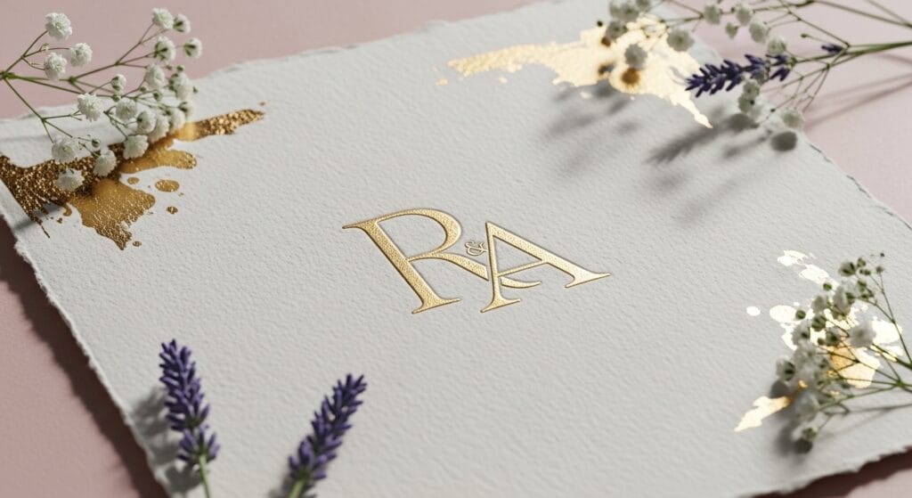
Luxury doesn’t come from adding more decoration. In wedding branding, luxury usually comes from restraint, like clean letterforms, balanced spacing, and small details that feel intentional. That’s why monogram logos are such a strong fit for wedding and bridal brands. They’re timeless, personal, and easy to apply across invitations, wax seals, ribbons, packaging, social icons, and watermarks.
In this guide, you’ll learn what makes monogram logos look luxury, which monogram styles work best for wedding brands, and practical rules you can follow to design monograms that feel premium, not crowded.
Monogram Logos Look Luxury When The Letters are The Hero
The fastest way to spot “cheap” monograms is when the design hides the letters under too many flourishes. In wedding branding, the initials should read clearly at a glance.
Luxury rule for monogram logos
If the letters are hard to read at small size, simplify.
If the monogram only works large, it’s not ready for real use.
A luxury wedding monogram should still look good on:
a small envelope stamp
a wax seal
an Instagram profile icon
a corner watermark on photos
This is the foundation of monogram logos that look luxury.
1. Monogram Logos Style with Classic Serif for Wedding Brands
Classic serif monogram logos feel expensive because they borrow the structure of editorial typography. They’re stable, refined, and readable.
Best for
bridal boutiques
photographers
wedding planners
stationery studios
How to design it
pick a serif with elegant contrast (thin + thick strokes)
use tight but clean letter spacing
keep the monogram simple, then add one small detail (like a thin border)
Tip: serif monograms often look most luxury when the strokes aren’t too thin. Ultra-thin lines can disappear in print.
2. Monogram Logos Style with Script that Feel Bridal and Romantic
Script monogram logos can look very luxury, but they can also look messy fast. The secret is choosing a script that’s clean, not overly swirly.
Best for
bridal makeup artists
wedding florists
luxury invitation designers
romantic wedding brands
How to design it
keep the script to 1-2 initials if possible
avoid extreme loops and long tails
use generous whitespace around the mark
create a simplified “small version” for icons
Tip: the more romantic the script, the more important spacing becomes. Spacing is what makes script monogram logos look premium.
3. Monogram Logos Style with Intertwined Letter that Look Custom
Intertwined monogram logos feel high-end because they look like custom craftsmanship. They work well for wedding brands because they feel personal and timeless.
Best for
luxury wedding planners
venues
bridal fashion labels
boutique hotels and villas
How to design it
start with two letters first, then add the third
overlap with purpose (not random)
keep stroke weights consistent
check readability at small sizes
Tip: if you use three initials, make one the “anchor” letter and let the others support it. This helps monogram logos stay readable.
4. Monogram Logos Style with Crest and Emblem for Wedding Aesthetics
Crests are popular in wedding branding because they feel traditional and ceremonial. They also work well on invitations, menus, and signage.
Best for
formal wedding brands
classic stationery
luxury bridal collections
heritage venues
How to design it
use a simple emblem shape (oval, shield, circle)
keep decorations minimal (one wreath, one divider line)
avoid tiny details that won’t print well
balance the emblem and the initials so neither dominates
Tip: the most luxury crest-style monogram logos are usually simpler than you think.
Also Read: 25+ Aesthetic Fonts for Logo with a Modern and Timeless Look
5. Monogram Logos Style with Minimal Line for Modern Weddings
Not every wedding brand needs classic romance. Minimal line monogram logos are perfect for modern couples and boutique brands.
Best for
modern wedding planners
minimalist bridal boutiques
editorial photographers
destination weddings
How to design it
use a clean sans or modern serif
keep strokes consistent and geometric
use negative space to create clever overlaps
avoid extra decoration
Tip: minimal monograms feel luxury when the proportions are perfect. Spend time on alignment and optical balance.
Monogram Logos that Look Luxury use Better Spacing and Optical Balance
Spacing is what makes luxury look expensive. Two monograms can use the same font and still feel totally different depending on spacing.
Spacing checklist for monogram logos
Are the letters evenly weighted visually?
Do any areas feel cramped?
Do curves and straight strokes create awkward gaps?
Does the monogram feel centered optically (not just mathematically)?
Quick test
Shrink your monogram to a small size and squint. If:
the monogram becomes a blob, simplify
gaps look uneven, adjust kerning/spacing
one letter dominates too much, rebalance size
This is how monogram logos become luxury-grade.
Monogram Logos that Look Luxury use a Limited Color System
Wedding branding often leans neutral for a reason, neutrals make typography feel premium. Many luxury monogram logos work best in one color.
Luxury color approach
primary: black, charcoal, deep navy, espresso
background: ivory, warm white, champagne
accent: gold (optional), muted blush, sage, dusty blue
Tip: treat metallic gold as a finishing option, not the core. Your monogram logos should still look perfect in black.
Monogram Logos Typography Pairings that Elevate The Brand
The monogram is the icon. You still need a wordmark for full branding.
Pairing rules
If the monogram is script, use a clean serif or sans wordmark
If the monogram is serif, use a minimal sans for supporting text
Keep the typography system to two fonts max
A good pairing makes your monogram logos usable across invitations, websites, and social posts without looking inconsistent.
Also Read: Typography Logo Design How to Make Logos Look Expensive
Monogram Logos Should Include Multiple Versions for Real-World Use
Clients and boutique owners don’t just need “the logo.” They need variations.
Essential logo set for monogram logos
primary monogram (main)
simplified icon monogram (small use)
crest/badge version (optional)
one-color version
reverse version (white)
clear space rule
minimum size rule
This is how your logos stay luxury in every context.
Monogram Logos Applications for Wedding and Bridal Brands
A luxury monogram feels more valuable when it’s shown in real use.
Where monogram logos shine
invitation suite (invite, RSVP, details card)
envelope seal or wax stamp
ribbon tags and gift packaging
menus and place cards
photo watermark
website favicon and social profile icon
Tip: design with application in mind. If you want your logos to look luxury, test them on these items early.
Monogram Logos Mistakes that Make Wedding Branding Look Cheap
Avoid these common issues:
too many flourishes and ornaments
ultra-thin lines that vanish in print
confusing overlaps that hide the initials
uneven spacing and awkward gaps
using trendy effects instead of clean shapes
relying on gold color to “feel luxury”
no simplified version for small sizes
If you fix these, your logos will instantly look more premium.
Monogram Logos Quick Design Checklist for Luxury Results
Use this checklist before final export:
readable at small size
works in one color
balanced spacing and optical center
clean silhouette
consistent stroke weight
includes at least 2-3 versions
tested on invitation mockups and a small icon
exported in SVG/PDF + PNG (transparent)
This is the fastest way to ensure your logos look luxury for wedding use.
Also Read: Logo Color Palette How to Choose 3 Brand Colors
Final Thoughts
Luxury wedding branding is about calm confidence, not heavy decoration. The best monogram logos feel refined because the letters are clear, spacing is balanced, and every detail is intentional. Build a simple monogram system, test it at small sizes, and show it in real wedding applications. That’s what turns initials into a luxury brand mark.
For high-quality fonts to boost your income, check out Letter Crafted. Our professional fonts are perfect for branding, marketing, and content creation. So, don’t miss this opportunity.