
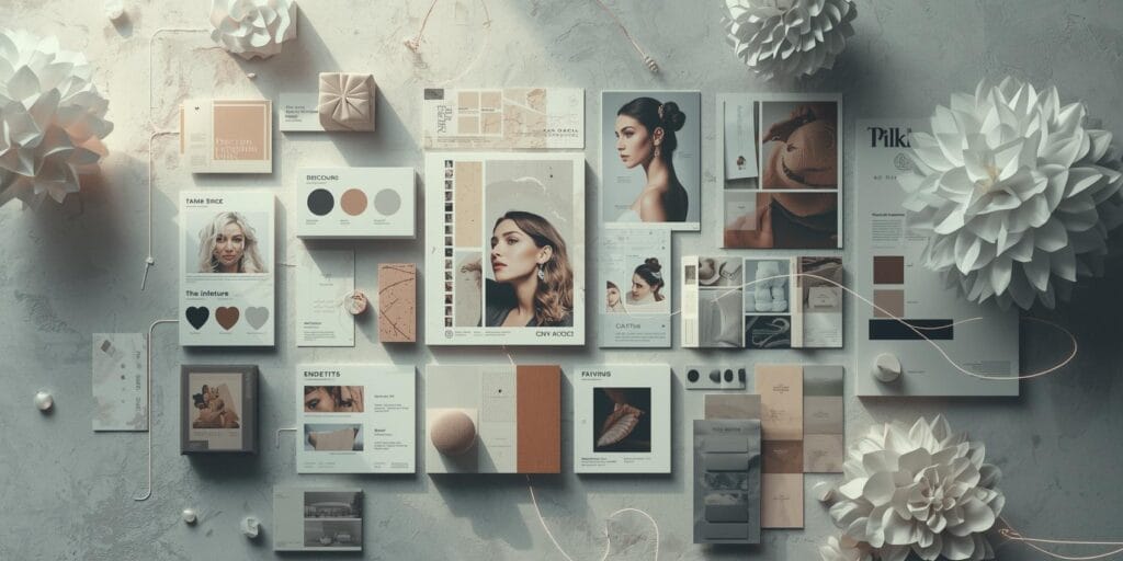
Moodboards can make or break a project. When they’re clear, clients approve direction faster, and the design team moves with confidence. When they’re messy, you get vague feedback, wasted iterations, and a brand that drifts. This ai design examples case study shows a practical way agencies and creatives can use AI to create better moodboards, better creative direction, and smoother approvals.
This is not about letting AI “design the brand.” It’s about using AI to explore options quickly, label directions clearly, and present moodboards in a way clients can understand. You’ll see how ai design examples fit into a real workflow, the prompt structure that keeps results consistent, and the lessons that improved the final outcome.
AI Design Examples Case Study Overview – The Project and Goal
The project scenario
A small brand needed a visual refresh and a content kit. The team had limited time for discovery, but the client wanted to “see options” before committing.
The moodboard problem
The first round of moodboards was too broad. It showed many nice references but didn’t create a clear decision. The client reacted with:
“I like this… but also that.”
“Can we mix everything?”
“Can you make it more premium, but still fun?”
That’s the exact moment where ai design examples help. You can generate variations fast, but still keep a clear structure and naming system.
The goal
Create 3 moodboard directions that are:
distinct from each other
easy to choose between
specific enough to become design rules
consistent across typography, color, imagery, and layout
This is the core purpose of this ai design examples case study.
1. AI Design Examples with Turn Client Words Into Usable Constraints
Most clients speak in adjectives. Designers need rules.
Input: Messy client adjectives
Example:
modern, premium, friendly, simple, a little playful
Output: Clear constraints
Using AI, the team translated those words into constraints like:
typography: modern serif + clean sans
color: neutral base + one accent color
spacing: generous whitespace, clean grid
imagery: soft lighting, minimal backgrounds
graphic elements: thin lines, minimal shapes
This is a key move in ai design examples. AI helps you transform vague language into a brief you can actually design from.
Prompt used (copy-paste style)
“Convert these brand adjectives into visual design rules.
Output: typography direction, palette direction, spacing rules, image style, graphic elements, and do/don’t list.
Adjectives: (paste). Audience: (paste).”
2. AI Design Examples with Generate Multiple Moodboard Directions Quickly
Instead of generating one moodboard and hoping it lands, the team generated three directions on purpose.
The 3-direction framework
Each direction must include:
a direction name (2-3 words)
5 keywords
palette guidance (role-based)
typography guidance (headline/body)
image guidance (lighting, subject, mood)
layout guidance (grid, margins, hierarchy)
This is how ai design examples become usable. You don’t just generate images, you generate a direction system.
Prompt used (direction generator)
“Create 3 moodboard directions for this brand.
For each direction: name, 5 keywords, palette roles, typography pairing, imagery rules, layout rules, and what to avoid.
Brand brief: (paste).”
3. AI Design Examples with Build Moodboards as “Decision Boards,” Not Inspiration Boards
The team changed the format from “pretty collage” to “decision board.”
Moodboard layout template (what the team used)
Title: direction name
Left column: 5 keywords + “what it should feel like”
Middle: 6-9 image tiles (style consistent)
Right column:
palette chips (primary/secondary/accent/neutrals)
typography notes
layout notes
icon/shape notes
Clients don’t approve aesthetics. They approve decisions. This is a major lesson in ai design examples workflows.
Also Read: 25 Graphic Design Tools for Beginners That Make Simple
AI Design Examples for The 3 Moodboard Directions that Worked
Below are three sample directions you can use as models.
1. Minimal Premium Studio
Keywords: calm, editorial, clean, confident, spacious
Palette: ivory + charcoal + soft gold accent
Type: refined serif headlines + modern sans body
Imagery: soft shadows, minimal props, premium product shots
Layouts: strong grid, lots of whitespace, clean borders
Why it works: it signals quality without trying too hard.
2. Warm Modern Craft
Keywords: warm, human, tactile, natural, friendly
Palette: cream + sand + cocoa + olive accent
Type: soft serif + friendly sans
Imagery: warm lighting, natural textures, hands and process shots
Layouts: simple blocks, gentle curves, subtle texture accents
Why it works: it feels approachable and trustworthy.
3. Bold Clean Pop
Keywords: bright, modern, energetic, simple, playful
Palette: white + black + one vibrant accent (cobalt or coral)
Type: bold sans headlines + simple body sans
Imagery: high contrast, clean backgrounds, strong color moments
Layouts: bold headline zones, strong hierarchy, clear CTA blocks
Why it works: it’s attention-friendly for social content.
These three directions are “moodboard-ready” ai design examples because they’re distinct and easy to choose between.
4. AI Design Examples with Run a “Difference Test” before Showing The Client
A common moodboard failure is when all directions look similar. The team used a simple test.
The difference test
Ask:
Does each direction have a unique palette logic?
Does each direction have a unique type personality?
If I hide the titles, can someone still tell these apart?
Does each direction have unique imagery rules?
If not, refine until the three boards are clearly different. This step is what makes ai design examples useful for agencies, it prevents “everything at once” feedback.
5. AI Design Examples to Guide Client Feedback with Structured Questions
Instead of asking “Which one do you like?” the team asked targeted questions:
Which direction matches your audience best?
Which feels most premium?
What 2 elements must we keep from your top choice?
Which one would you be proud to post daily?
Which feels most you?
This turns subjective reactions into usable decisions. It’s one of the best applications of ai design examples for client work.
6. AI Design Examples with Convert The Chosen Moodboard Into Brand Rules
After the client chose a direction, the team created a “rules page.”
What the rules page included
palette roles (primary/secondary/accent/neutrals)
typography hierarchy (H1/H2/body/caption)
spacing rules (margins, section gaps)
image rules (lighting, crops, backgrounds)
shapes/icons (line weight, corner radius)
do/don’t examples
This is where moodboards become production-ready. Without this, the moodboard stays “vibes.” The ai design examples workflow worked because it ended in rules.
Also Read: Graphic Design Typography Mistakes and How to Fix Them
What Improved (The Results)
This case study improved three things that agencies care about:
1. Faster alignment
Clear directions reduced back-and-forth because the client could pick a lane.
2. Cleaner revisions
Instead of random changes, revisions were anchored to the rules:
“Use the accent color only for CTA”
“Use the serif only for headlines”
“Keep backgrounds light and spacious”
3. More consistent output
Once the rules existed, the team could produce:
social templates
story layouts
hero banners
product mockups
without redesigning every time
That’s the practical value of ai design examples, consistency at speed.
Common Mistakes to Avoid When Using AI for Moodboards
AI can create noise if you don’t control it. Avoid these:
generating too many directions (3 is enough for most clients)
mixing styles inside one direction
using AI images without defining photo rules
presenting moodboards without labels and rules
letting clients “mix everything” without boundaries
The best ai design examples are curated. AI generates options, humans curate direction.
AI Design Examples with The Reusable Prompt Pack for Agencies
Here’s a mini prompt pack you can reuse:
1. Brief clarifier
“Turn these notes into a one-page brand brief with goals, audience, tone, and constraints.”
2. Vibe-to-rules
“Convert these adjectives into visual design rules and do/don’t guidelines.”
3. Direction builder
“Create 3 moodboard directions with names, keywords, palette roles, typography, imagery rules, and layout rules.”
4. Feedback guide
“Write 8 client-friendly questions to help them choose one moodboard direction.”
5. Rules page generator
“Convert the selected direction into a concise brand rules page with examples.”
This is a practical, repeatable ai design examples workflow.
Also Read: Top Color Trends in Graphic Design Designers Use Now
Final Thoughts
Better moodboards lead to better work because they create confident decisions early. In this ai design examples case study, AI didn’t replace the designer. It replaced the messy middle, like brainstorming without structure. The winning formula was simple, generate options fast, label directions clearly, then turn the chosen moodboard into rules the whole team can follow.
For high-quality fonts to boost your income, check out Letter Crafted. Our professional fonts are perfect for branding, marketing, and content creation. So, don’t miss this opportunity.