
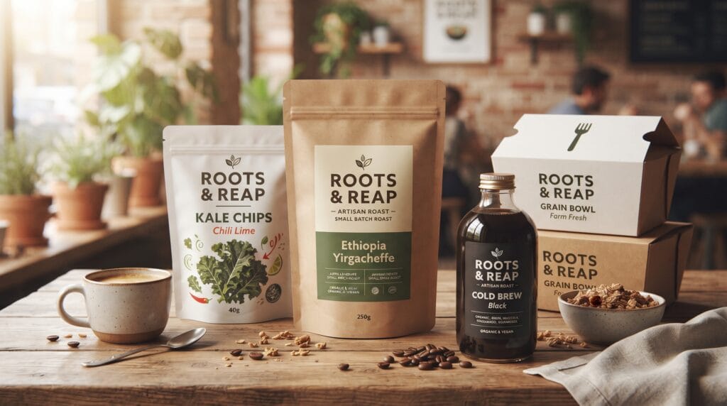
Packaging typography design is one of the most important elements in creating packaging that looks professional, communicates clearly, and supports a strong brand identity. Typography influences how customers notice a product, understand its benefits, recognize the brand, and decide what information matters first.
On packaging, type does much more than display words.
It helps create hierarchy, personality, trust, and visual structure.
A beautifully illustrated package can still feel weak if the typography is difficult to read or poorly organized. On the other hand, simple packaging can feel premium when its typography is thoughtful and well controlled.
For designers, learning how to manage type effectively can dramatically improve packaging results.
This guide covers practical packaging typography design principles for labels, boxes, pouches, bottles, jars, cartons, and other product packaging.
Understand the Role of Packaging Typography Design
Typography has several jobs on a package.
It may need to communicate:
- Brand name
- Product name
- Product category
- Flavor or variant
- Key benefits
- Ingredients
- Instructions
- Weight or volume
- Legal information
These elements should not compete equally for attention.
Good typography guides the viewer through the information in a deliberate order.
For example, a customer may first notice the brand, then the product type, followed by a flavor or benefit.
This sequence is called visual hierarchy.
Strong packaging typography design makes that hierarchy easy to understand.
Start With Clear Information Hierarchy
Before choosing fonts, determine which information matters most.
Create a simple priority list.
For example:
- Brand name
- Product name
- Product variant
- Main benefit
- Supporting details
- Regulatory information
This hierarchy helps determine:
- Font size
- Weight
- Position
- Color
- Spacing
The most important element should usually have the strongest visual presence.
Avoid making every line bold or large.
When everything demands attention, nothing stands out.
Choose Fonts That Match the Brand
Typography should support the personality of the product.
A font that works beautifully for luxury skincare may feel inappropriate for children’s snacks.
Think about the brand before choosing type.
Ask:
- Is the brand modern or traditional?
- Premium or affordable?
- Playful or serious?
- Natural or technical?
- Bold or understated?
The answers help narrow your options.
Serif Fonts in Packaging Typography Design
Serif fonts can communicate:
- Heritage
- Elegance
- Craftsmanship
- Authority
- Premium quality
They often work well for:
- Coffee
- Wine
- Chocolate
- Beauty products
- Artisan foods
- Luxury packaging
High-contrast serif styles can feel especially refined.
However, very thin strokes may disappear when printed at small sizes.
Always test the actual production scale.
Sans Serif Fonts for Modern Packaging
Sans serif fonts can create a cleaner and more contemporary appearance.
They are commonly used for:
- Technology products
- Supplements
- Skincare
- Modern food packaging
- Minimalist brands
They can communicate:
- Simplicity
- Clarity
- Efficiency
- Modernity
Geometric sans serif fonts often feel structured, while humanist sans serif fonts can feel softer and more approachable.
Script and Handwritten Typography
Script fonts can add personality and warmth.
They may work for:
- Handmade products
- Boutique brands
- Bakery packaging
- Beauty products
- Wedding-related goods
However, scripts require careful use.
Avoid using decorative scripts for long paragraphs or small ingredient lists.
They usually work best for short elements such as:
- Brand names
- Product variants
- Accent phrases
Readability should always remain a priority.
Display Fonts in Packaging Typography Design
Display fonts are designed to attract attention.
They can be useful for product names, campaign packaging, limited editions, or brands with strong personality.
Display typography might feel:
- Retro
- Bold
- Experimental
- Futuristic
- Playful
Use it strategically.
A highly expressive font may become overwhelming if it appears across every section of the package.
Balance it with a simpler supporting typeface.
Limit the Number of Fonts
Using too many fonts often makes packaging feel inconsistent.
In many cases, two typefaces are enough.
For example:
- Primary Typeface: Brand or product name
- Secondary Typeface: Supporting information
You can create additional variation through:
- Weight
- Size
- Capitalization
- Spacing
This often provides enough contrast without introducing another font family.
For simple packaging typography design, one versatile font family may even be sufficient.
Create Strong Font Pairings
When using two fonts, make sure they complement each other.
A good pairing often uses contrast.
For example:
- Serif + sans serif
- Bold display + neutral sans serif
- Elegant serif + simple geometric sans serif
Avoid combining fonts that are different enough to clash but too similar to create meaningful contrast.
The pair should feel intentional.
Always compare:
- Character proportions
- Stroke weight
- X-height
- Width
- Personality
Packaging Typography Design Needs Readability
Packaging is viewed quickly.
Customers may only spend a few seconds looking at a product.
Important information should therefore be easy to read.
Avoid:
- Excessively thin fonts
- Tiny text
- Decorative fonts for long information
- Low contrast
- Extremely condensed text
- Excessive letter spacing
Readability becomes even more important on small packages.
A design that looks clear at 200% zoom on a monitor may fail completely when printed.
Test Typography at Actual Size
This is one of the most useful habits in professional packaging design.
Print the artwork at 100% scale.
Then examine it from a realistic distance.
Ask:
- Can you read the product name immediately?
- Is the secondary information clear?
- Is the legal text still readable?
- Are the letters too thin?
- Does the hierarchy still work?
Screen previews can be misleading.
Actual-size testing reveals problems much earlier.
Also Read: Packaging Color Psychology Guide for Better Brand Perception
Use Size to Build Hierarchy
Font size is one of the simplest tools for establishing importance.
The main product name may be much larger than supporting information.
However, size should not be the only method.
Combine it with:
- Weight
- Color
- Position
- Spacing
- Typeface style
A small bold label can sometimes attract more attention than larger light text.
The goal is controlled contrast.
Use Font Weight Carefully
Different font weights can create hierarchy without requiring multiple typefaces.
For example:
- Bold: Product name
- Medium: Flavor or variant
- Regular: Supporting copy
- Light: Optional secondary details
Make sure lighter weights remain printable.
Fine strokes can disappear on textured papers or low-quality printing.
For critical information, regular or medium weights may be safer.
Improve Packaging Typography Design With Better Spacing
Spacing strongly affects readability and professionalism.
Pay attention to:
- Kerning
- Tracking
- Leading
- Margins
- Space between sections
Tight text can feel crowded.
Excessive spacing can make related information feel disconnected.
Use spacing to group information logically.
For example, a product name and flavor might sit close together, while nutritional information should have more separation.
Kerning Matters on Large Packaging Text
Kerning is the adjustment of space between individual characters.
Large product names make poor kerning very noticeable.
Letter pairs such as:
- AV
- WA
- To
- Yo
- LT
may require manual adjustment.
Do not rely entirely on default kerning.
Zoom out and judge spacing visually.
Good kerning makes the word feel balanced as one shape.
Use Tracking With Purpose
Tracking changes the overall spacing across a word or line.
Wider tracking can create an elegant or premium feeling, especially with uppercase typography.
However, excessive tracking can reduce readability.
Tight tracking can create a strong, compact appearance but may cause letters to collide.
Use tracking to support the brand personality, not simply as decoration.
Control Line Spacing
Line spacing, or leading, affects paragraphs and multi-line labels.
Too little leading creates visual congestion.
Too much leading makes information feel disconnected.
For packaging, clear information blocks are usually more important than dramatic editorial styling.
Test text at the real package size.
Use Contrast for Better Packaging Typography Design
Typography must separate clearly from the background.
High contrast combinations are easier to read.
Examples include:
- Black on white
- White on dark blue
- Dark green on cream
- Black on light yellow
Be cautious with combinations such as:
- Light gray on white
- Yellow on white
- Red on orange
- Thin white text over detailed photography
Contrast becomes especially important for small information.
Avoid Placing Important Text Over Busy Images
Photography and illustrations can compete with typography.
If important text must appear over an image, consider:
- Using a solid panel
- Adding more negative space
- Darkening the image
- Choosing a calmer area
- Increasing typographic contrast
Do not depend entirely on shadows or outlines to rescue unreadable text.
A cleaner composition usually produces better results.
Use Alignment Consistently
Alignment creates order.
Common options include:
- Left aligned
- Centered
- Right aligned
Centered typography can work well for symmetrical or premium packaging.
Left-aligned text often improves readability for larger blocks of information.
Avoid switching alignment repeatedly without a clear reason.
Consistency helps the package feel professionally structured.
Packaging Typography Design for Product Variants
Many products come in multiple versions.
Examples include:
- Flavors
- Scents
- Sizes
- Formulas
- Roast levels
Typography can help distinguish these variants.
You might vary:
- Color
- Product name
- Secondary font weight
- Position
- Label banner
Keep the overall typographic system consistent so customers still recognize the parent brand.
Variant differentiation should not destroy brand unity.
Typography for Minimal Packaging
Minimal packaging relies heavily on typography.
When there are fewer visual elements, every typographic detail becomes more noticeable.
Focus on:
- Precise spacing
- Strong hierarchy
- Clean alignment
- Quality typefaces
- Generous negative space
Minimal does not mean empty.
It means every element has a reason to exist.
For minimalist packaging typography design, small inconsistencies can become very visible.
Also Read: How to Keep Packaging Design Consistency Across Product Lines
Typography for Premium Packaging
Luxury packaging often uses typography carefully rather than excessively.
Common strategies include:
- Elegant serif fonts
- Wide letter spacing
- Small uppercase text
- Restrained color
- Strong negative space
Premium typography usually feels controlled.
Avoid adding decorative elements simply to make the packaging look expensive.
Refinement often comes from restraint.
Packaging Typography Design for Food Products
Food packaging often needs to balance personality with clarity.
Customers should quickly understand:
- What the product is
- What flavor it is
- Why it is different
Food typography can be more expressive than corporate packaging.
Hand lettering, retro type, bold display fonts, and playful styles may work well.
However, ingredient lists and nutritional information should remain highly readable.
Packaging Typography Design for Beauty Brands
Beauty packaging frequently uses typography to communicate positioning.
Premium skincare might use:
- Refined serif typography
- Minimal sans serif fonts
- Generous spacing
Youth-oriented beauty products may use:
- Bold display fonts
- Bright typography
- Playful combinations
The typography should match the product promise and target customer.
Packaging Typography Design for Coffee Brands
Coffee packaging is an excellent area for typographic experimentation.
Different typography can communicate:
- Specialty coffee
- Artisan roasting
- Premium quality
- Modern cafe culture
- Traditional craftsmanship
The hierarchy might include:
Brand Name
Coffee Origin
Roast Level
Processing Method
Tasting Notes
A clear structure helps customers compare different bags quickly.
Consider Packaging Shape
Typography does not exist separately from the package structure.
A label on a bottle behaves differently from text on a flat box.
Consider:
- Curved surfaces
- Folds
- Seams
- Edges
- Closures
- Windows
Avoid placing important typography where the package structure may distort it.
Prototype the design before production.
Leave Space Around Typography
Negative space improves clarity.
Do not push important text too close to:
- Package edges
- Cut lines
- Illustrations
- Other text blocks
Breathing room can make typography feel more intentional.
It can also improve the perceived quality of the packaging.
Consider Print Production Early
Beautiful typography can fail if production limitations are ignored.
Discuss with the printer:
- Minimum type size
- Minimum stroke width
- Ink limitations
- Registration tolerances
- Paper texture
- Printing method
Some fine details may reproduce perfectly on digital printing but poorly with another process.
Production awareness should be part of packaging typography design from the beginning.
Common Packaging Typography Design Mistakes
Avoid these frequent problems.
Too Many Typefaces
This creates inconsistency and visual noise.
Weak Hierarchy
Customers do not know what to read first.
Text That Is Too Small
Information may become difficult to read after printing.
Poor Contrast
Typography disappears into the background.
Excessive Decorative Fonts
The package becomes difficult to scan.
Ignoring Kerning
Large headlines look amateur when spacing is uneven.
Designing Only on Screen
Real-size printing often reveals unexpected problems.
Following Trends Too Closely
Trendy typography may become outdated quickly.
Packaging Typography Design Workflow
A structured process can improve consistency.
1. Organize the Content
List every piece of information required on the package.
2. Define Hierarchy
Rank information from most to least important.
3. Select Typography
Choose typefaces based on the brand personality.
4. Create Initial Layouts
Experiment with scale, alignment, and spacing.
5. Refine Font Pairing
Reduce unnecessary styles.
6. Check Readability
Review small text and contrast.
7. Print at Actual Size
Test the physical result.
8. Create Product Variants
Build a consistent system.
9. Review Production Requirements
Confirm minimum type sizes and technical limitations.
10. Finalize the Typography System
Document fonts, sizes, weights, spacing, and hierarchy.
This process makes future packaging extensions much easier.
Packaging Typography Design Checklist
Before approving your design, check:
- Is the brand name easy to identify?
- Is the product name clear?
- Is the hierarchy obvious?
- Are the fonts appropriate for the brand?
- Are you using too many typefaces?
- Is small text readable?
- Is the contrast strong enough?
- Is kerning balanced?
- Is tracking intentional?
- Is line spacing comfortable?
- Does the typography work at actual size?
- Does it remain clear on the final material?
- Are product variants consistent?
- Does the type avoid folds and seams?
- Does the design work in realistic retail conditions?
A simple checklist can prevent many avoidable errors.
Also Read: Packaging Design Strategy for Better Shelf Impact and Branding
Final Thoughts on Packaging Typography Design
Strong packaging typography design combines branding, readability, hierarchy, spacing, contrast, and production awareness.
Typography should never be treated as something added after the main packaging concept is complete.
It is part of the design itself.
Start by organizing the information and identifying what customers need to notice first. Then select typography that supports the personality of the brand.
Keep font combinations controlled.
Refine kerning, tracking, alignment, and spacing carefully.
Test every important decision at actual size.
The best packaging typography design is not always the most decorative. Often, the strongest packaging uses simple typography exceptionally well.
When hierarchy is clear, type is readable, and every element supports the brand, packaging becomes easier to understand and more memorable.
That combination can improve both visual quality and practical performance, helping a product communicate more effectively wherever customers encounter it.
For high-quality fonts to boost your income, check out Letter Crafted. Our professional fonts are perfect for branding, marketing, and content creation. So, don’t miss this opportunity.